This MS Power BI Tutorial helps you learn this tool, from basic charts to advanced reporting. The Power BI links below will show you the step-by-step approach to connecting with multiple data sources, data transformations, and creating reports like charts, tables, matrices, maps, etc., with screenshots. Use them to learn all the important concepts of the Microsoft Power BI tutorial step by step.
Microsoft Power BI is a cloud-based data analysis and analytics or reporting technology. It incorporates several powerful components, each having its own role in creating reports. For instance, connecting to data sources, data cleansing, analytics, calculations, sharing reports, consuming, etc.
What is Power BI?
Microsoft Power BI is one of the most popular Data Visualization tools and Business Intelligence Tools, and this tutorial explains everything about it.
Power BI is a collection of connectors, apps, and software services that work together for business users to convert large junk data into more meaningful insights. Typically, an Organization gets its data from Text, CSV files, Excel spreadsheets, databases, data warehouses, or the cloud.
Microsoft Power BI lets you connect with all kinds of data sources to get your data. The later step is to transform data, model data, visualize (charts), and then share them with anyone.
It also allows data analysts to publish reports for your organization. So that business users can access them using mobiles, tablets, etc. This Microsoft Power BI tutorial also explains these steps, so read this thoroughly to learn everything about this business intelligence tool.
Is Power BI difficult to learn?
I don’t think so. Power BI is very easy to understand, even for beginners, and this tutorial helps you understand. It is another interface with all the features if you are from an MSBI background or any BI tool.
Generally, the Power BI DAX part of the functions might be difficult to understand. However, practicing them will give the experience.
Can I learn Power BI on my own?
Yes. Following this tutorial or Microsoft’s material will help you learn independently. This Power BI tutorial started with the basics and moved to more advanced features that might help you crack interviews.
Basic Introduction of Power BI tutorial
This section of Microsoft Power BI covers establishing connections, preparing data, etc.
- Add, Rename, Duplicate, and Delete Pages
- Connect to SQL Server
- Connect to Multiple Excel Sheets
- Get Data from Excel Files
- Get Data from Text Files
- Load Data from Multiple Data Sources
- Remove Unwanted Columns from Tables
Power BI Transformations
We don’t get the data we can use directly in the reports in real time. Instead, we have to clean that data to meet our business standards. We have a query editor within the Desktop to perform all the needed operations. This section of the Microsoft Power BI tutorial explains most of the data transformations you need.
- Bins
- Change the Data Type of a Column
- Combine Multiple Tables
- Clusters
- Enter data or copy & Paste data from the clipboard
- Format Dates
- Groups
- Hierarchies
- Joins
- Pivot Table
- Query Groups
- Reorder or Remove Columns
- Rename Column Names
- Rename Table Names
- Split Columns
- UnPivot Table
After the data preparation, the next step will be creating a visual, which can be done by simply dragging fields.
Power BI Charts tutorial
You can see the small icons within the Power BI desktop visualization tab, each representing one chart. Simply clicking that image will create a chart, or dragging appropriate measures or dimensions will also create a basic chart.
The following is the list of charts that are available to work with. This section of the Microsoft Power BI covers each chart’s definition and configuration.
- Area Chart
- Bar Chart
- Card
- Clustered Bar Chart
- Clustered Column Chart
- Column Chart
- Donut Chart
- Funnel Chart
- Heat Map
- Line Chart
- Clustered Column and Line
- Line and Stacked Column
- Matrix
- Multi-Row Card
- Pie Chart
- Ribbon Chart
- Stacked Area
- Scatter Chart
- Stacked Bar Chart
- Stacked Column
- Table
- TreeMap
- Waterfall Chart
- 100% Stacked Bar
- 100% Stacked Column
- Map
- Filled Map
- R Script
The following Power BI tutorial section covers more charts and formatting options for data analytics. >> Charts Introduction
Power BI Filters tutorial
The following Power BI section explains the types of Filters with a practical example.
- Slicer
- Basic Filters
- Advanced Filters
- Top N Filters
- Filters on Measures
- Page-Level Filters
- Report Level Filters
- Drill through Filters
Power BI DAX and Modeling
DAX stands for Daa Analysis Expression Language. It is a powerful language, and you have to use it to write calculations. In Power BI Desktop, the Modeling tab is one of the powerful ones because here, you can create a new Table, Column, Parameter, and Measures. You can also manage and view Roles and the relationships between tables. To create a Measure or any calculated field, you must use DAX.
Power BI Calculated Fields
This section covers the calculated fields and DAX functions. Sometimes, we don’t get the columns that we need to perform visualization. In these situations, we can create calculated fields, as shown below. Then, we can write simple arithmetic operations within these columns or the most powerful Power BI DAX functions.
MS Power BI DAX tutorial
We have to use the DAX functional language formulas to create calculations on table data. Power BI DAX supports many built-in functions to work on Numeric, String, and Object data like any other language.
This section of the tutorial covers most of the commonly used Power BI DAX business analytics functions with examples.
- Aggregate Functions
- Date Functions
- Logical Functions
- Math Functions
- String Functions
- Trigonometric Functions
Power BI Dashboards tutorial
This section covers Dashboard creation, adding content like report items to the dashboard, deleting items, and publishing them.
- Register to Pro Service
- Connect Desktop with Service or Pro
- Dashboard Introduction
- Dashboard Actions
- Publish Desktop Reports
- Create a Workspace
- Favorites
Power BI Reports and Datasets
In this tutorial section, learn about Power BI report creation, dataset creation, etc.
- Add Title to Dashboard
- Add Video to Dashboard
- Adding Web Content to Dashboard
- Creating a Report using Excel Data
- Upload Excel Files to Dashboard
- Upload Workbook
- Pin Workbook to Dashboard
- Rename a Dataset
- Rename a Report
- Get Insights of a Dataset and Report
Power BI Work Sharing
This section of the tutorial covers the sharing of Work means, sharing reports, Dashboards, Power BI mobile apps, Workspaces, etc.
Power BI Q&A Section
Microsoft Power BI supports natural language queries for data Visualization, called FAQs.
Power BI Subscriptions
Power BI FAQ’s
These are the list of frequently asked questions. Use these tutorial hyperlinks to learn these Power BI topics.
- Add Alternative Row Colors to a Table
- Add Data Bars to Table
- Drill up and Drill Down Reports
- Sort Chart in Asc or Desc Order
- Show Empty Records in a Report
Power BI Advantages
- Create enterprise-level analytics with the click of a button.
- It allows you to create high-level reports for an individual or an organization.
- Although its low-cost and high-security platform encourages small companies, it is too powerful and a must-use product in large organizations.
- Power BI has many pre-built connectors to connect with famous databases, Excel, Access, SharePoint, etc.
- It is a tight competitor for Tableau. The kind of data visualizations or charts it offers has beaten Tableau easily. You can check its material.
- Backed by Microsoft, data security is an added advantage.
The Power BI WorkFlow
- The Power BI workflow typically begins with opening the Desktop and connecting to the data source.
- Data cleanup or transformation is an optional step.
- Building reports
- Publish them to Service and share them with other users.
- Access worksheets, reports, and dashboards from Mobile devices, interact with them, and comment on them.
Power BI Roles in an Organization
- You might use APIs to push data into datasets if you are a developer. Or you may use or embed the visual into your application.
- Some people work on Power BI Desktop or Report Builder to design and publish the reports to Service.
- If you are in a decision-making position, you might use the Mobile App to view Analytics to find what went right and wrong.
- A few members from the Administration work on Services to grant and revoke permissions to users and design lightweight reports within the workspace.
Power BI Architecture
It has a user-friendly environment, and it is straightforward to create reports. We can divide Power BI architecture into three elements, and this tutorial further divides it into three more.
- Desktop
- Service
- Power BI Mobile App
- DAX
- Reporting Server
- Report Builder
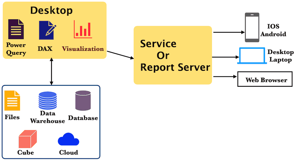
Power BI Desktop
When someone is talking about Power BI, it’s about the Desktop only. It is a lightweight and absolutely free tool that you can download, install, and use on your local machine.
The installation process consists mainly of the Next button, which we covered with screenshots. So please refer to Download and install Desktop to follow this tutorial or create our reports.
Power BI is a Windows-based desktop application helpful for connecting with data sources, transforming, preparing reports, and publishing them to service.
The most common uses of the Power BI Desktop tutorial includes
- Connect with many data sources, such as text files, databases, Excel files, etc., to import data.
- Data transformation, cleanups, or combining data from multiple data sources and assigning relationships are often called modeling.
- Create a report that combines one or more pages, each with its own chart.
- Design graphs, charts, and maps to illustrate the imported data visually.
- Publish reports to Power BI Services or Reporting Server.
- Finally, we can share those reports across the organization.
Power BI Desktop Interface
- Menu: It has all the common actions that we perform regularly. The Home tab has the option to connect with any data (Get Data), recent sources, visuals, publish to a server, etc.
- Report Navigation: Here, you can navigate between the report, underlying data in the data set, and the relationship between the tables. Use those three tabs to view or alter the data and their relationships.
- Report Designer Area: You drop or add charts or visuals to design and develop Power BI tutorial reports here. Check the section below.
- Page Navigation: It is a Tab based on navigation where you can shift from one report to another by selecting them. Remember, a report might have one or more pages, and each page has its own visual or chart.
- Fields Pane: This is where you see all the columns available to design reports. It displays all the fields or columns from the chosen data set to work. You must use these fields in the visual configuration pane to design a chart.
- Visualizations: It shows a tiny icon of all the available Power BI visuals or charts. Clicking those icons will generate that visual on the report designer. Microsoft also allows you to add your own chart or visual to this list.
- Visual configuration pane: After choosing the required chart from the Visualizations pane, you must configure it. This pane is all about adding fields such as the X-axis and Y-axis values. Apart from this, it has formatting options such as changing colors, adding a legend, adding tooltips, etc.
- Filters Pane: If you want to apply some filters to the page data or chart, then you have to use this pane. The Power BI desktop support filters range from page to report level, and we covered all of them in the filter sections.
Power Query
The Power Query combines connecting to different data sources, getting data or tables from those, transforming them as per the requirements, and loading them into the dataset. The first two steps, connecting and getting tables, can be done by the “Get Data” option in the Home tab. Then, when you click on the “Edit Queries” option, you have the chance to transform tables as per your need. It is a place where you have to apply all data transformations because it happens before data loads into Power BI.
Some of the everyday things that we do in this Power BI step include changing data type, combining data from multiple data sources, adding a new column, removing an existing column, etc.
The Power Query user interface
- Transformation Options: The Menu has different tabs, and by default, it opens with the Home tab with frequently used items. Each tab has other options for performing data transformations.
- Formula Pane: It is the place where you have to write a Power BI DAX query to transform data or data modeling. Or edit or alter the existing formula to clean the data.
- Data Preview: It displays the data (rows and columns) inside the selected table. It doesn’t display all the records, but it shows a preview to get an idea of its data.
- Queries Pane: List of all the tables available in a dataset. It divides the columns into dimensions, measures, and other queries (for unknown tables).
- Query Settings Pane: It has two options: you can change the properties of the selected column or undo/redo the applied steps to it. Because Power BI keeps a record of each step you have taken in data transformation. So, while applying the transformation, if you have made any mistakes or want to change something, you can use this pane to remove those steps at any point.
Power BI Service or Online
The Power BI Desktop, Power Query (Get Data), Transformation, and DAX components are useful for loading data, transforming it, and visualizing it in a meaningful chart. However, you need a service to deploy them so others can access them.
Although you can design reports using a Power BI desktop application, you need an online SaaS (Software as a Service) service to share your work across the organization.
To work with the service, you need an account and a Pro service subscription as well. Microsoft allows you to create a free account and provides a 60-day trial period. It might be helpful for users who want to learn or explore things.
It is where you publish your Power BI reports and dashboards and share them with your organization or others. Here, you can configure the subscription users, roles, Security, etc. We covered everything from registration to free trial to share reports in the Dashboard section.
The exciting feature is that you can create a report or dashboard right from the service itself using online data.
Power BI Mobile App
Microsoft provides a Power BI mobile app for Windows, Android, and IOS devices. It is a free app that users can install to consume business insights.
After you log in to the account, you can see all the workspaces shared. The best part is that you have the option to add annotations and share them with colleagues. For instance, if you see a sudden hike in production wastage or a drop in sales, you can simply point it out and share. By this, others can understand your concerns and explain accordingly.
Power BI Report Server
When you publish a report to the Service, it will be stored in the Power BI cloud server. However, it is not viable for organizations because they always prefer to keep their data and reports within the premises.
Microsoft has a Power BI Report Server that works like an SSRS tutorial (SQL Server Reporting Services Report Manager) to support this. Compared to Services, the Report Server has some limitations, but you have complete control.
Report Builder
A Report Builder is a tool you can download from the Microsoft Power BI website to create paginated reports and publish them to Service.
Power BI Vs. Query Vs. Pivot
The Power BI Pivot is also called DAX, and it is the brain/heart, or whatever you call it. The entire application depends on it because it turns data into information.
Power Query is the actual data that you want to transform and visualize. By using the Pivot, we can get data from different data sources. However, there are some situations (in fact, all the time) where we must perform cleanups and data transformations. In these situations, we have to use the Query to shape data.
Pivot is all about calculations and shows the calculated metrics, which might not be helpful from the business perspective. To create a chart or any visual, you need Power BI, and this tutorial explains all of them.