The Power BI Heat Map is useful for displaying the data along with the colors. By seeing the color, one can understand the profits easily. Let me show you how to create a Heat Map with an example.
Power BI Heat map use colors to represent the data graphically. The thickness of the color means more (high) data in that region. It shows the popularity of the data in color-coded. A heat map helps easily identify which month, state, or zone has good and bad profits.
For this Heat Map demonstration, we will use the SQL Data Source we created in our previous article. So, please refer to. the Connect to SQL Server and the List of Charts articles to understand the Power BI Data Source.
Steps before creating a heat map in Power BI
Heat maps, also known as density maps, use different colors to display data density. If you use it on a map, it shows the color density at each location. For instance, state or postcode-wise visits, sales, or orders. The most common one is displaying cyclone or hurricane movement.
You won’t find a heat map under Power BI Visualization by default. However, you have multiple options to create a heat map.
- Sign in using the official domain-specific email ID to get map specific and table specific heat maps from the marketplace.
- Use any third-party file that you downloaded in the system. Otherwise, use your own file from the system.
- Convert a Table or Matrix to a heat map using the conditional formatting of background colors.
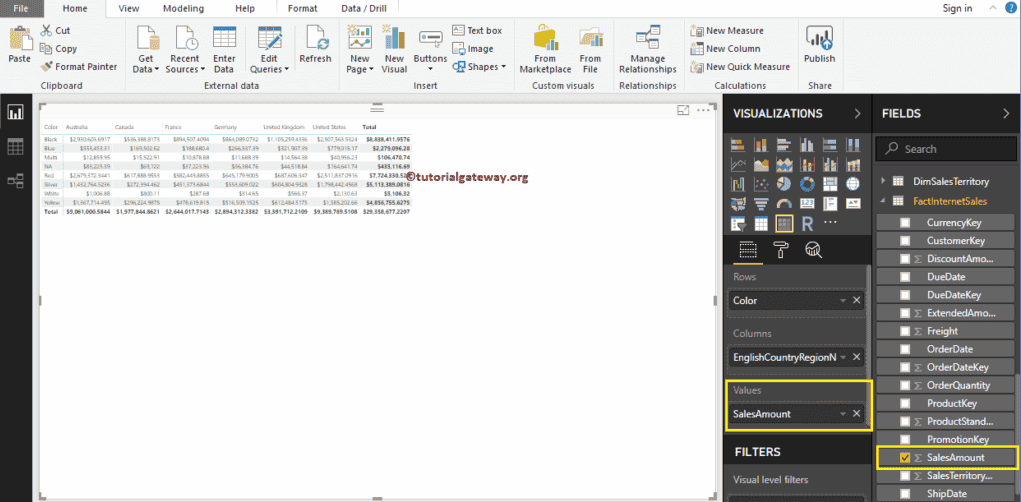
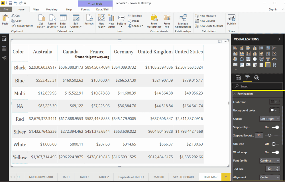
To create a Power BI heat map, first, click on the Matrix under the Visualization section. It automatically creates a Matrix with dummy data. Next, drag and drop the English Country Region Name to the Column Group and the product Color to the Row Group. Now, you can see a Matrix without values.
Next, let me drag the Sales Amount to the Values section. It automatically enables the Row totals and grand totals.
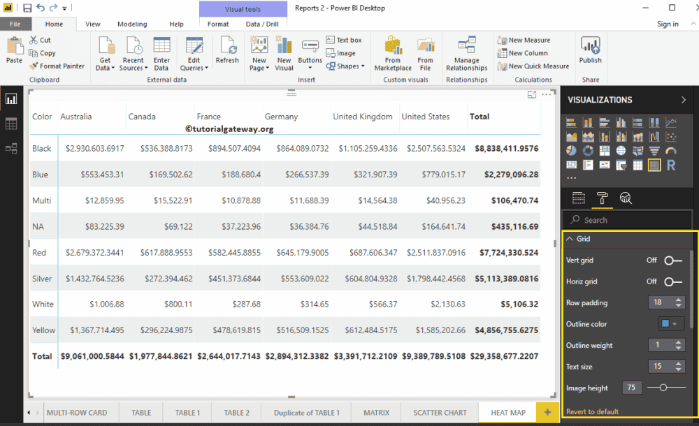
Please click on the Format button to convert this Matrix into a Heat map in Power BI. I suggest you refer to Format a Matrix article to understand the formatting options. First, go to the Grid Section. As you can see from the below screenshot, we changed the row padding to 18 and the text size to 15
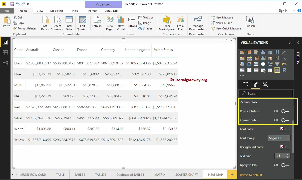
By toggling Row subtotals and column subtotals under the Subtotals section to Off, you can remove the Totals completely. So, let me remove them.
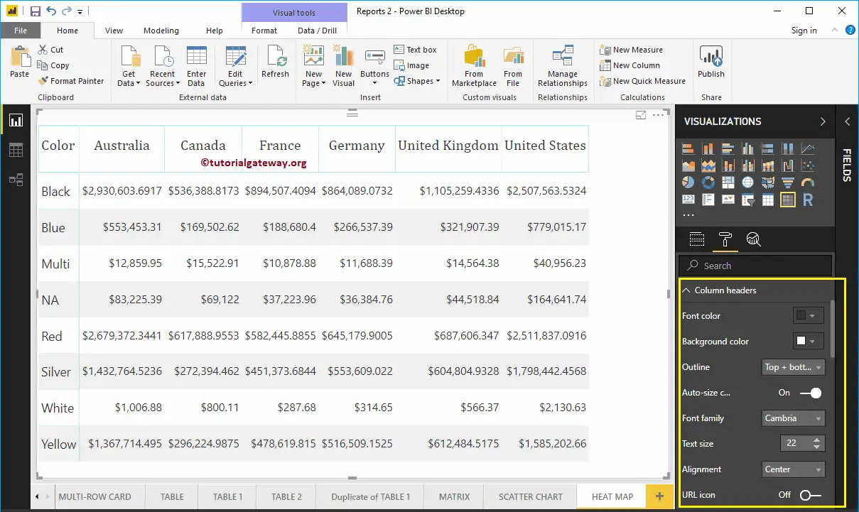
The column Header section of the Power BI Heat map helps us to alter the Headers. As you can see from the screenshot below, we changed the Font Family to Cambria. Next, Outline to Top + Bottom (Outline added to the top and bottom of a Header), Text Size to 22, and Header text alignment to center.
Heat map’s row Header section helps us format the Row Headers section. Here, we changed the Outline to Left + Right (Outline added to the Left and Right of the Header Column, i.e., Color). Next, the Font Family to Cambria, the Text Size to 22, and the text alignment to the center.
Create a heat map in Power BI
If you are using the marketplace heat map, click on the icon. Then, add geographic data (State, City, Country, Postal Code) to the Location ID and Numeric Measure to the values section. You have an option for the Latitudes.
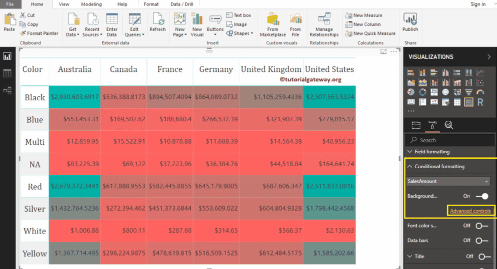
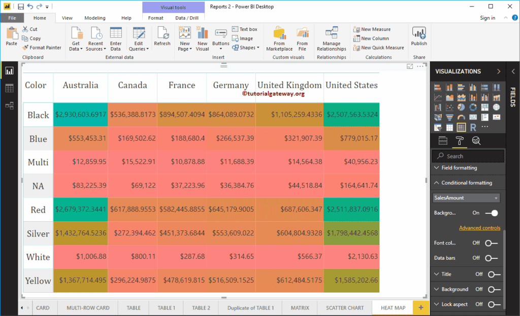
If converting a standard table to a heat map, use the conditional formatting option for the measure value. To connect that matrix to the heat map, go to the Conditional Formatting section to add colors to the Matrix Numeric column.
As you can see from the screenshot below, we selected the Sales Amount as the field and toggled the background color scale property to On. It adds a default color to the matrix. I mean the default color to Heat map.
Change Power BI Heat Map Color
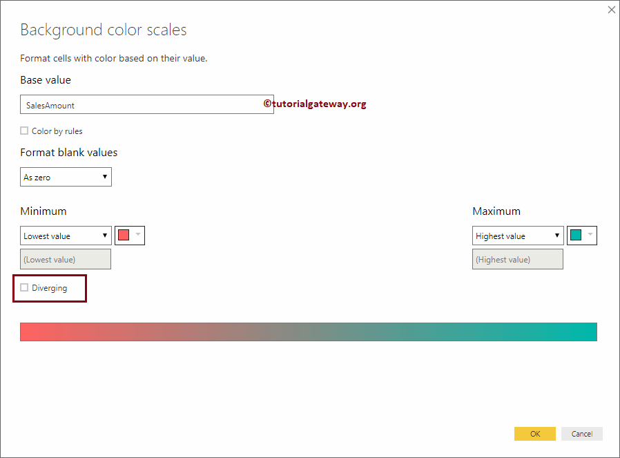
Click on the Advanced option to change the heat map color. It will open the following window. If you are interested in two colors, select the Minimum and maximum colors.
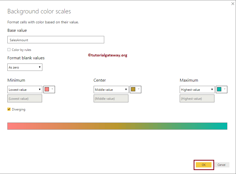
We check-marked the Diverging option. Next, we selected some random colors as the minimum, Center, and Maximum values.
Now, you see the Heat map with the selected colors.
Comments are closed.