Power BI Scatter Chart or Scatter plot is very useful to visualize the relationship between two sets of data. Let me show you how to create a Scatter Chart with examples.
For this Scatter Chart demonstration, we are going to use the SQL Data Source that we created in our previous article. So, please refer to the Connect to the SQL Server article to understand the Power BI Data Source.
How to Create a Scatter Chart in Power BI
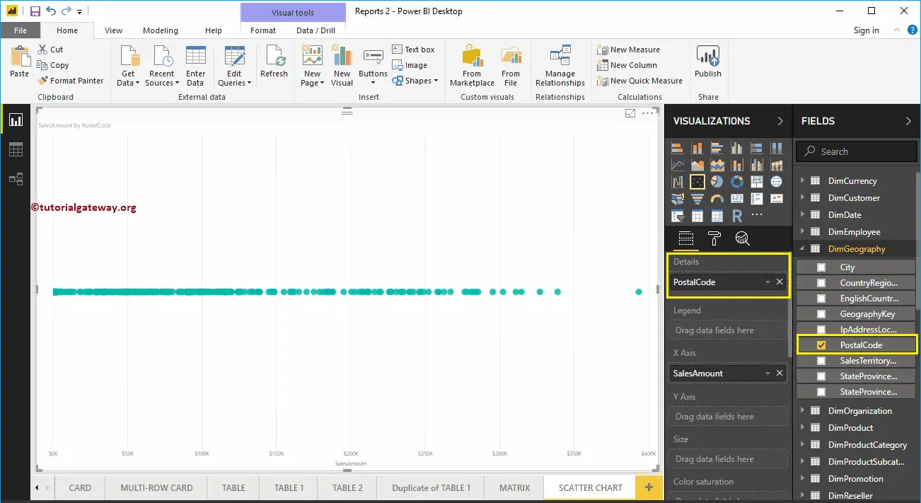
To create a Scatter Chart, first, Drag and Drop the Sales Amount from the Fields section to the Canvas region. It automatically creates a Column Chart. Next, click on the Scatter Chart under the Visualization section.
It automatically converts a Column Chart into a Scatter Chart, as shown below. Let me add the Postal Code to the Details section.
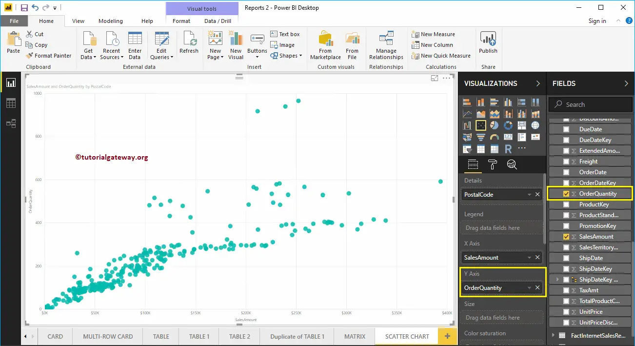
Next, we added the Order Quantity as the Y-Axis. Now you can see the proper Scatter Chart.
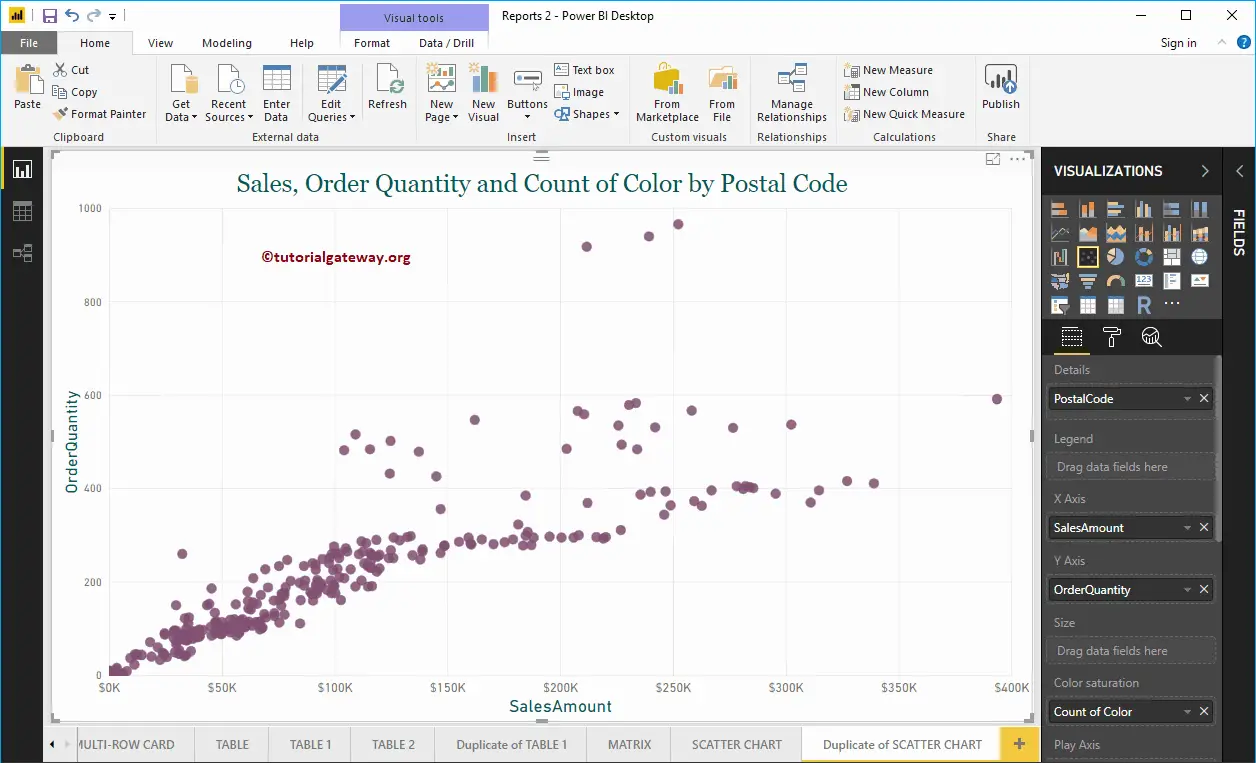
Let me do some quick formatting to this Scatter Chart.
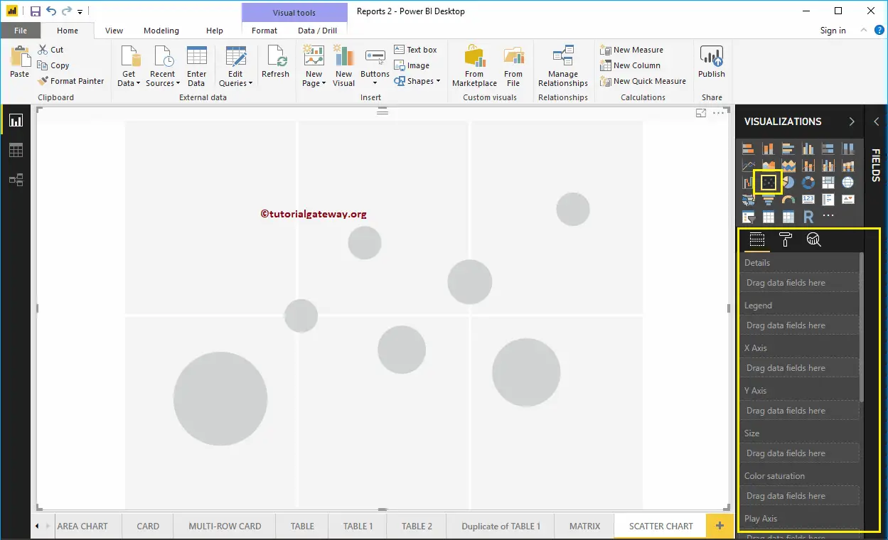
Create a Scatter Chart in Power BI Approach 2
First, click on the Scatter Chart under the Visualization section. It automatically creates a Scatter Chart with dummy data, as shown in the below screenshot.
To add data to the Power BI Scatter Chart, we have to add the required fields:
- Details: Please specify the Column that represents the Bubbles.
- Legend: Specify the Column that subdivides the Details data.
- X-Axis: Please specify the Column that represents the Horizontal Axis.
- Y-Axis: Column that represents the Vertical Axis.
- Size: Specify the Column that represents the Bubble’s size.
- Color Saturation: Any Numeric value that decides the color of the bubbles.
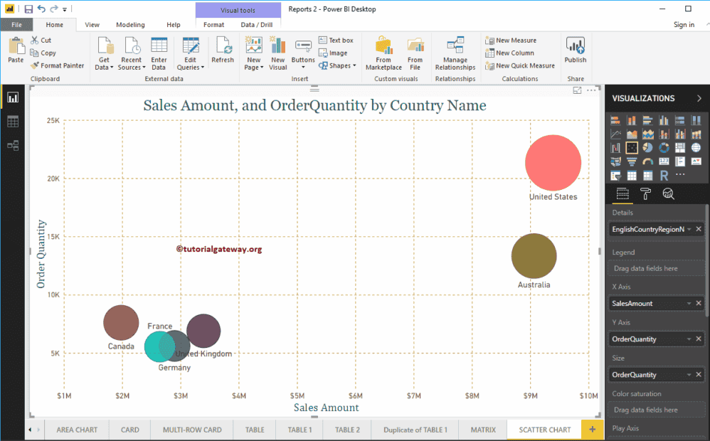
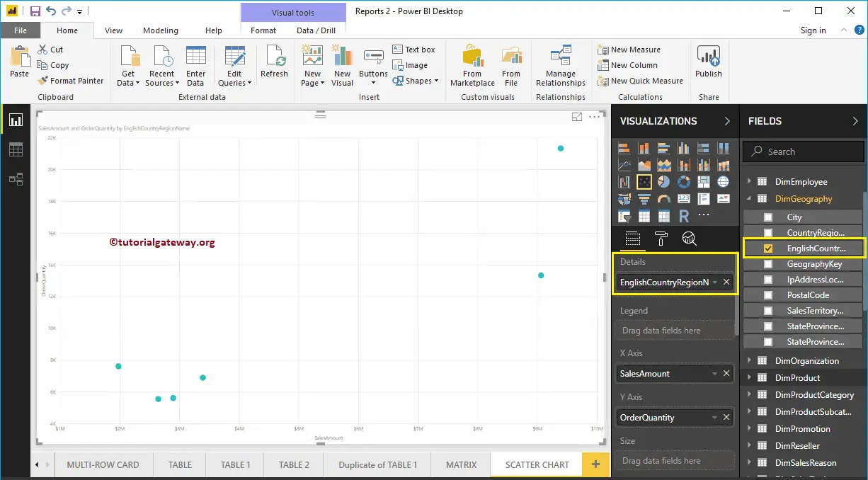
Let me drag the Sales Amount from the Fields section to the X-Axis section and the Order Quantity to the Y-Axis Section. Next, let me add the English Country Region Name to the Power BI Scatter Chart or plot Details section. You can do this by dragging Country to the Details section or simply checkmark the English Country Region Name column.
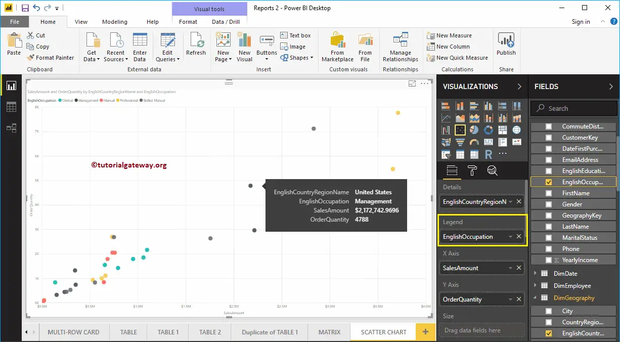
Let me add Customer English Occupation to the Legend section. Hovering over any circle shows information about the Country, Occupation, Sales Amount, and Total Product Cost.
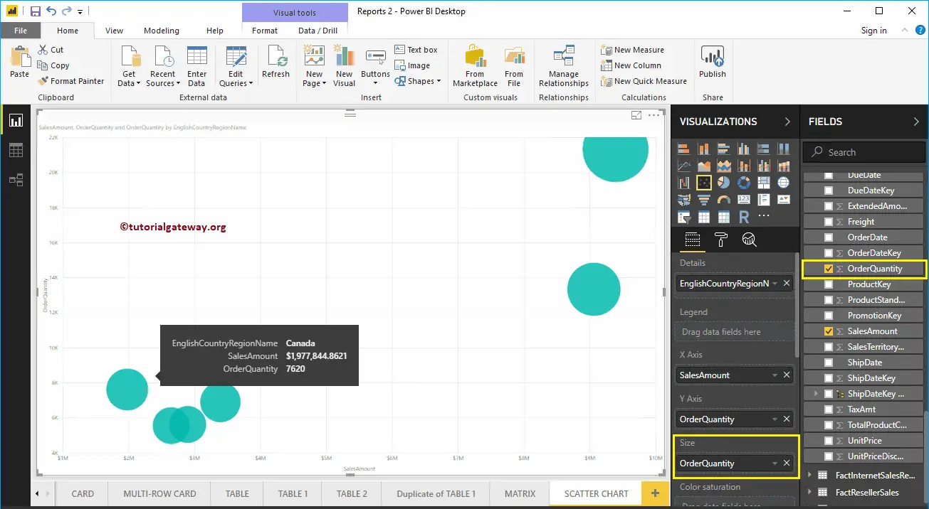
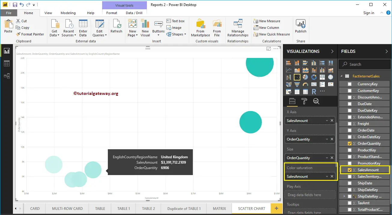
To demonstrate the Size section of a Power BI scatter chart, we removed the English Occupation from the Legend section. We added the Order Quantity to the Size section.
As you can see from the below screenshot, the size of the circle has changed as per the Order Quantity (number of orders)
To demonstrate the Color Saturation section, we added the Sales Amount to the Color Saturation section. As you can see from the below screenshot, the color of each circle has changed as per the Sales Amount
Let me do some quick formatting to this Scatter plot. I suggest you refer to the Format Scatter Chart article to understand the formatting options.