Power BI Column Chart is very useful for comparing categorical data visually. For example, if we want to compare Sales by Product Group or Color, we can use this column chart.
There are three different types of column charts: clustered, stacked, and 100% Stacked Column charts. For this demonstration, we will use the SQL Data Source that we created in our previous article. Please refer to the Connect to SQL Server article to understand the Power BI Data Source.
Power BI Column Chart Example
Column Charts help compare the changes between different groups over time. It also helps to illustrate the comparison between different categories against a measure of sales.
Selecting any measure or numeric value will automatically generate a Power BI column chart. Apart from format, you can choose a Clustered or Stacked column chart from the Visualization section and add Sales (Measure) to the Y-axis and Category dimension to the X-axis.
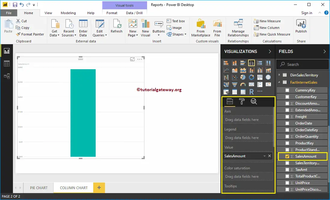
Drag and drop the Sales Amount from the Fields section to Canvas to automatically create a Column Chart, as shown in the screenshot below.
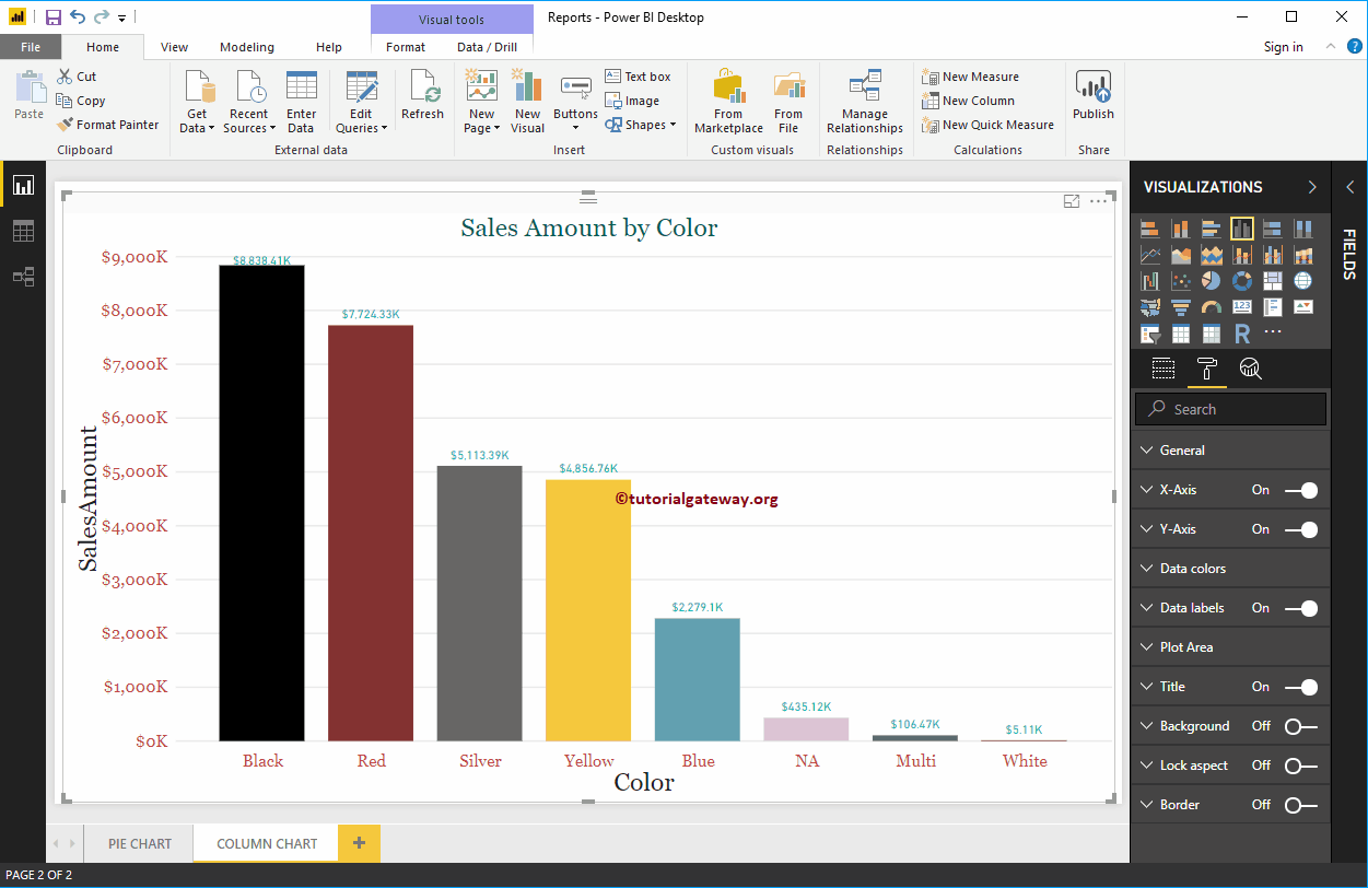
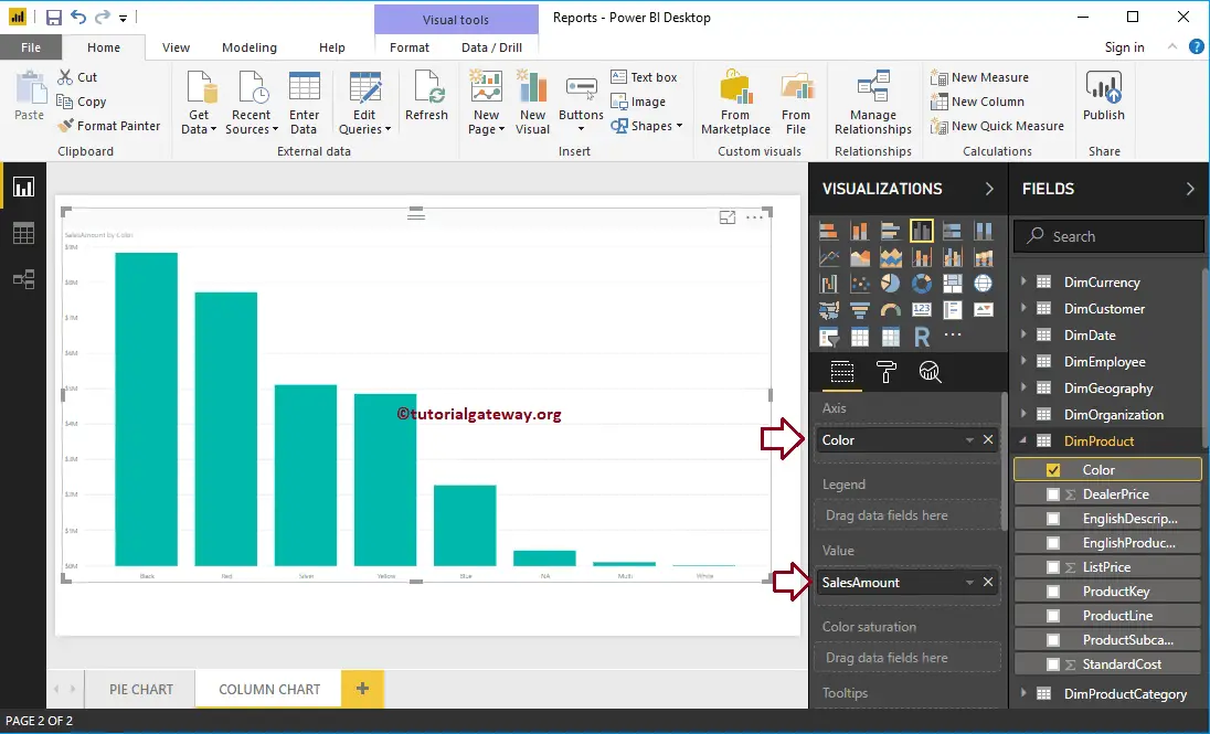
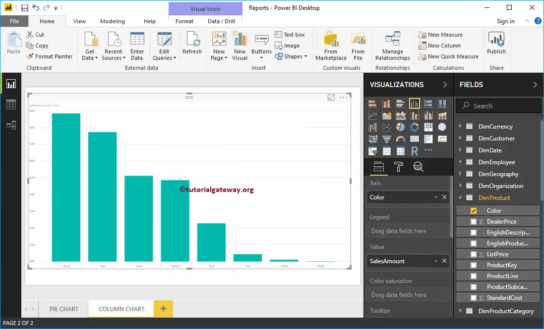
Next, let me add the Color field to the Axis to create a column chart that shows the Sales Amount by the product Color.
Create a Column Chart in Power BI using Visualization
When you click on the marked icon under the Visualization section, the desktop automatically creates a Column Chart, as shown in the screenshot below.
To add data to the Power BI Column Chart, we have to add the required fields:
- Axis: Please specify the Column that divides the Bars.
- Values: Any Numeric value, such as sales amount, Total Sales, Customer count, etc.
Let me drag the Sales Amount from the Fields section to the Values field. As you can see, it has created a column chart for you.
Next, add the Product Color to the Axis field. You can do this by dragging Color to the Axis section or Checkmark the Color column.
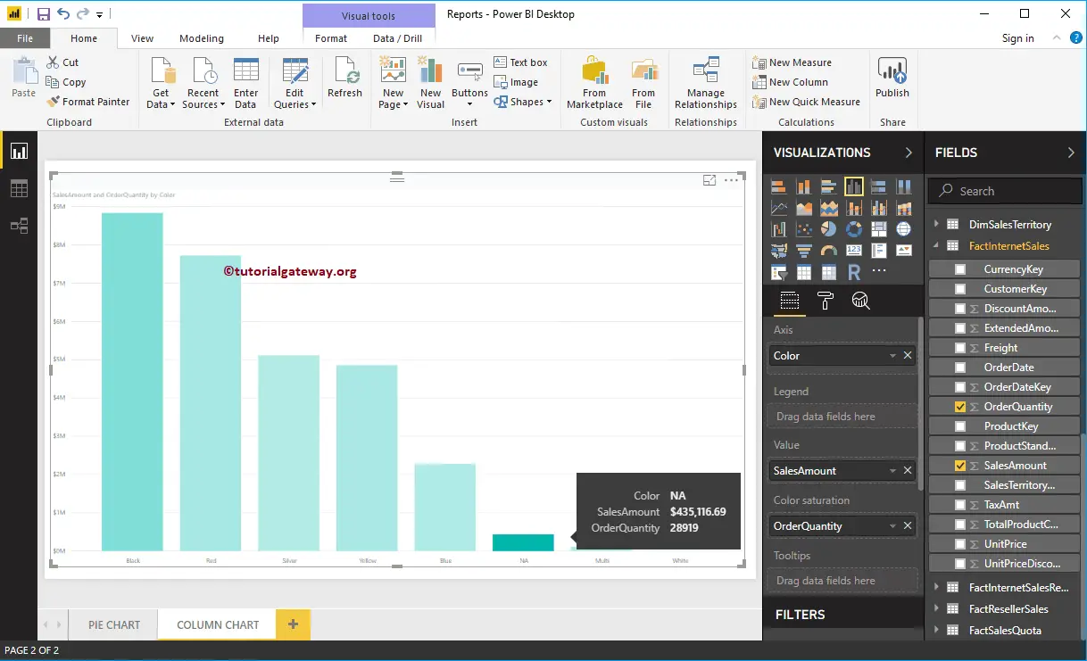
The Column chart has one more property called Color Saturation. Let me add Order Quantity to saturate the Color from Light to dark. From the screenshot below, all Product Colors apart from NA are light.
The Order Quantity is high for NA color products, but the sale amount is much lower. Whereas the Sales Amount of Black color products is High, the number of orders is very low.
Let me do some quick formatting to this Column Chart. I suggest you refer to the Format Column article to understand the steps involved in formatting Bar Colors, Data Color, Background Color, Title, Axis fonts, and colors.