A Power BI waterfall chart is also called a bridge chart. It uses a series of continuous vertical bar columns showing the profit (gain) or loss. The columns in this Waterfall chart are color-coded, where green represents the increase (positive), red means the decrease (negative), and blue for the total.
Power BI Waterfall Chart is very useful for visualizing the Sales or Profit over some time. Let me show you how to create a Waterfall Chart with an example. Before that let me explain when to use Waterfall charts.
- To examine the changes that happened to the total profits or any value.
- To identify or track the profit and loss of the whole business.
- It is helpful to show categorical or sequential data.
- To track the changes (money or number) across time, categories, or stages.
For this Waterfall Chart demonstration, we will use the Excel Data Source that we created in our previous article. So, Please refer to the Connect to Excel Multiple Excel Sheets and Charts article to understand the Power BI Data Source.
How to Create a Waterfall Chart in Power BI
In general, Waterfall charts show the profits over time or running totals. These charts help to understand the positive and negative outcomes of the changes.
To create a Waterfall Chart, first, Drag and Drop the Profit from the Fields section to the Canvas region. It automatically creates a Column, as shown below. Let me add the Product Sub-Category to the Axis section.
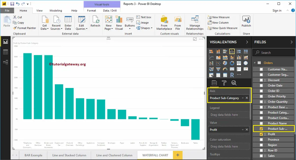
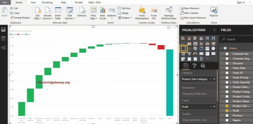
Click on the Power BI Waterfall Chart under the Visualization section will automatically convert a Column Chart.
Next, we added the Data Labels to see the increased or decreased profit amount. Under the sentiment colors, you can change these bar colors as well.
Create a Waterfall Chart in Power BI using Visualization
Click on the Waterfall icon under the Visualization will automatically create a dummy. In addition, adding a Numerical measure (Profit or money spent) to the y-axis and a series or dimension to a category section generates the actual waterfall chart. For example, if you add another dimension to the Breakdown section, it will explore the details of the bridge chart.
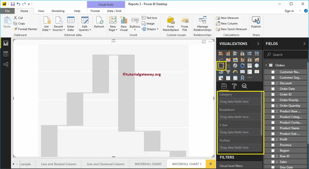
First, click on the Waterfall Chart under the Visualization section. It automatically creates it with dummy data, as shown in the screenshot below.
To add data to the Power BI Waterfall Chart, we have to add the required fields:
- Category: Please specify the Column that divides this plot (Horizontal axis column).
- Breakdown: Specify the Column that sub-divides the Details data.
- Y-Axis: Please specify the Metric Column that represents the Vertical Axis.
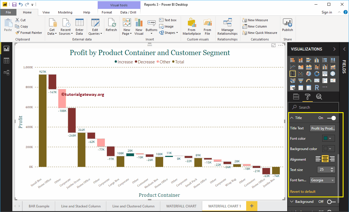
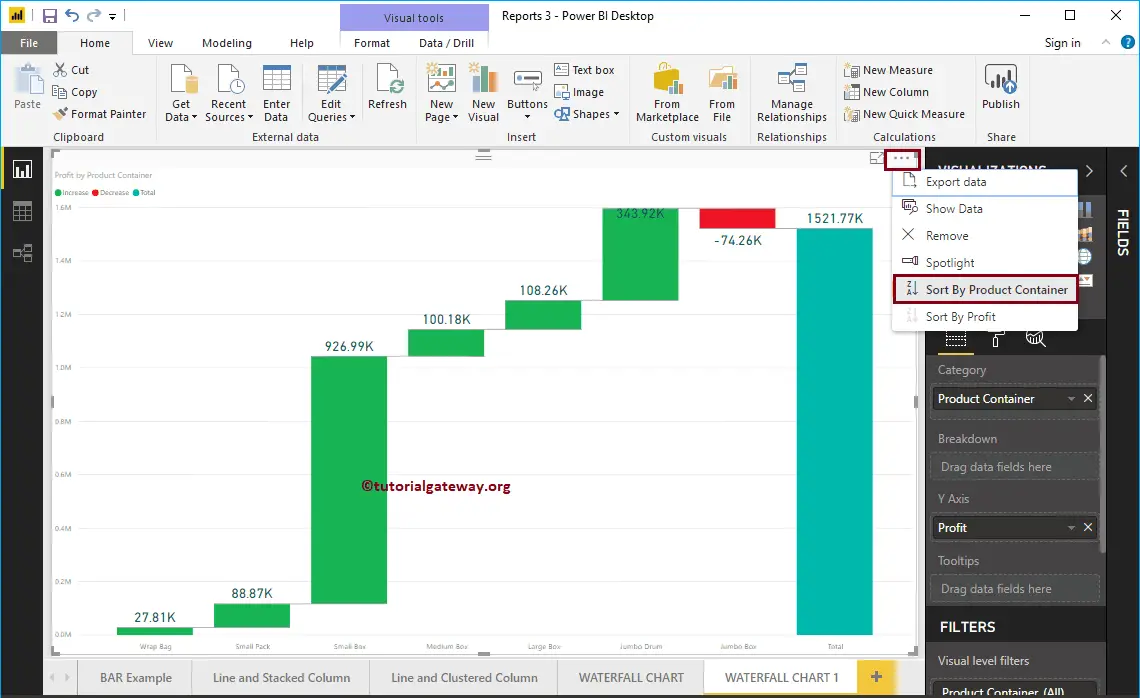
Let me drag the Profit from the Fields section to the Y-Axis section. Next, let me add the Product Container to the Category section. You can do this by dragging the Product Container to the Category section or simply checkmark the Product Container column.
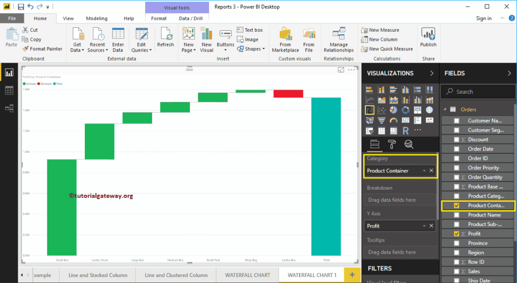
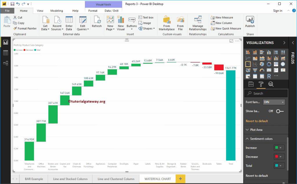
Next, we added the Data Labels so that you can see the increased profit.
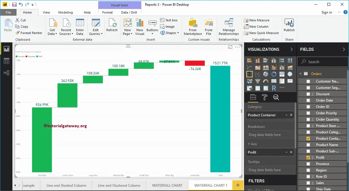
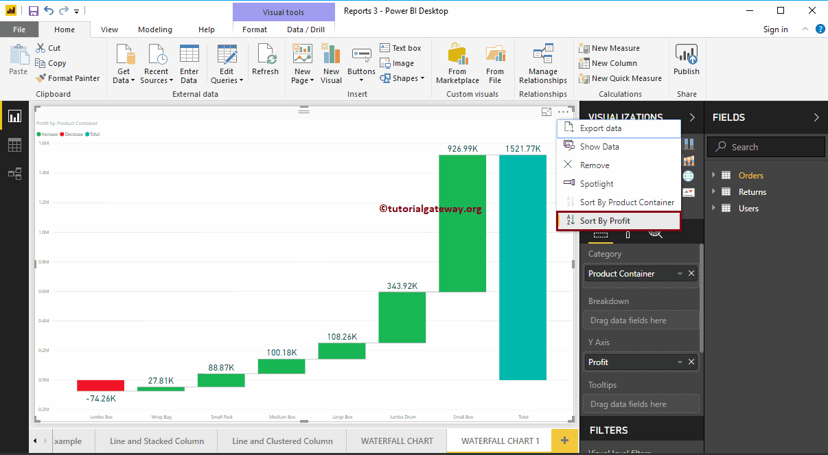
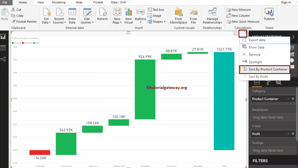
From the above screenshot, you can see that it is sorted by Profit in descending order. So, let me sort the chart by Profit in ascending order.
Sort the Power BI Waterfall Chart
To do this, click on the … (3 dots) in the top right corner and select the Sort By Profit option’s Left corner, as shown below.
This time, we sorted the data by Product Container in descending order.
This time, we sorted the data by Product Container in ascending order.
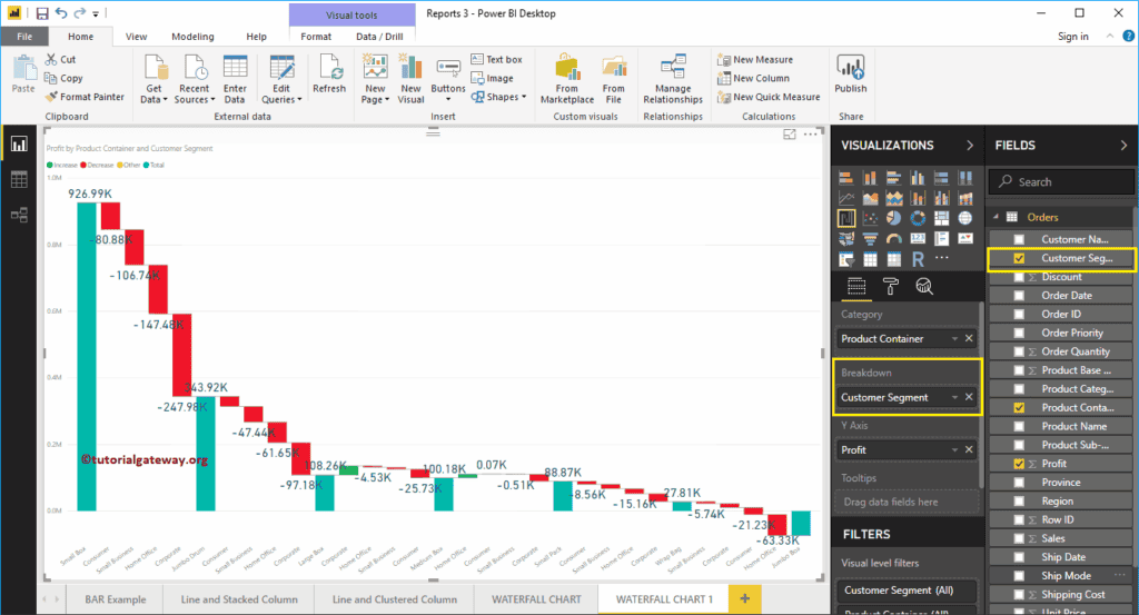
Explore or Breakdown the Waterfall Chart
Let me add a Customer Segment to the Breakdown section. As you can see from the screenshot below, it has been further divided based on the Customer Segment. Adding any hierarchy to the category section will enable drill-down action on waterfall chart—for instance, date hierarchy or geography.
Let me do some quick formatting to this Waterfall Chart. I suggest you check the Format Waterfall article to understand the formatting options.