How to Sort a Chart in Power BI with an example? To demonstrate the Sort a Chart, we are going to use the Column Chart that we created earlier.
Please refer to the Column Chart article to understand the Power BI column chart creation. It has the Color field on the Axis and the SalesAmount on the Values section and did some formatting.
How to Sort a Chart in Power BI Example
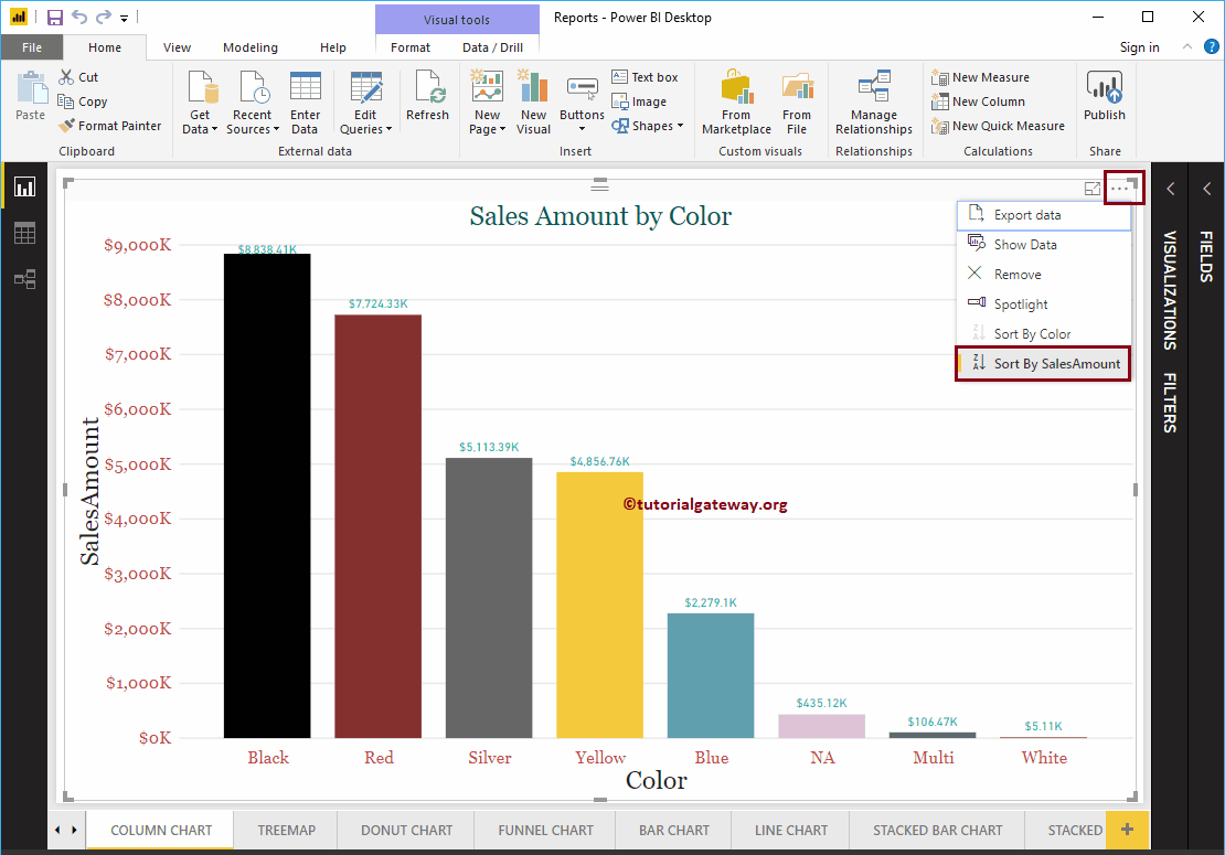
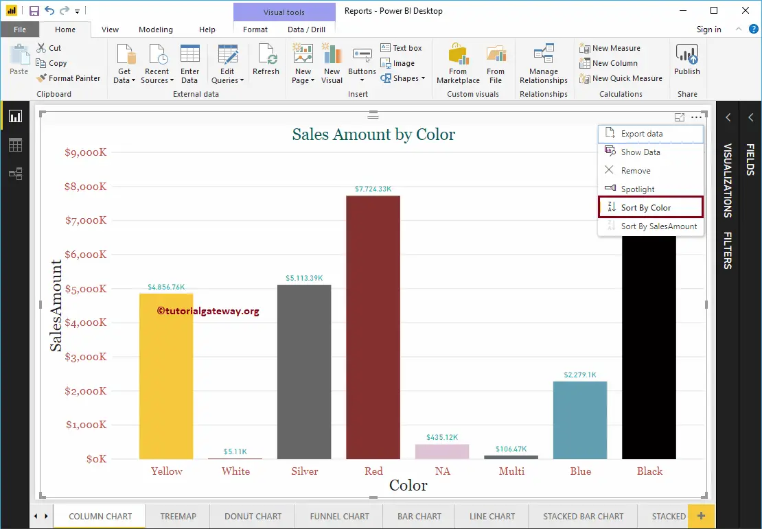
By default, every chart is sorted by the Metric Value (Numeric Value). Please click on the … (3 dots) in the top right corner to see the Sorting column.
From the screenshot below, you can see that the Sales Amount in Descending Order sorts the chart.
If you want to sort by Sales Amount in ascending order, then click on the left corner (the place where we marked)
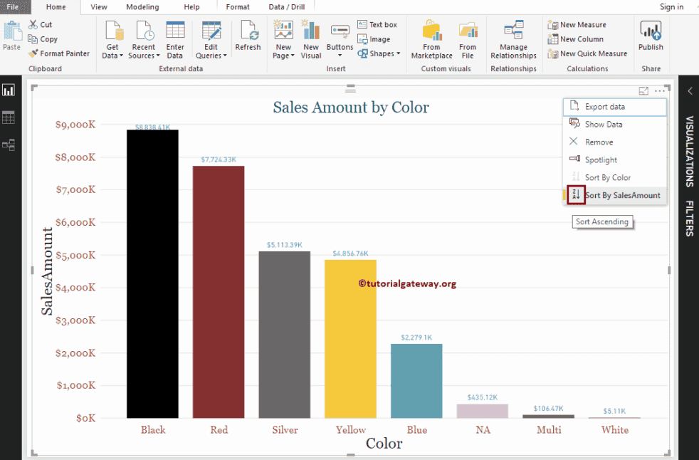
Now you can see, the chart is sorted by Sales Amount in Ascending Order. If you want to use the Dimension field (or any other field) as the sort option, then you select that field. Let me select the Sort by Color option
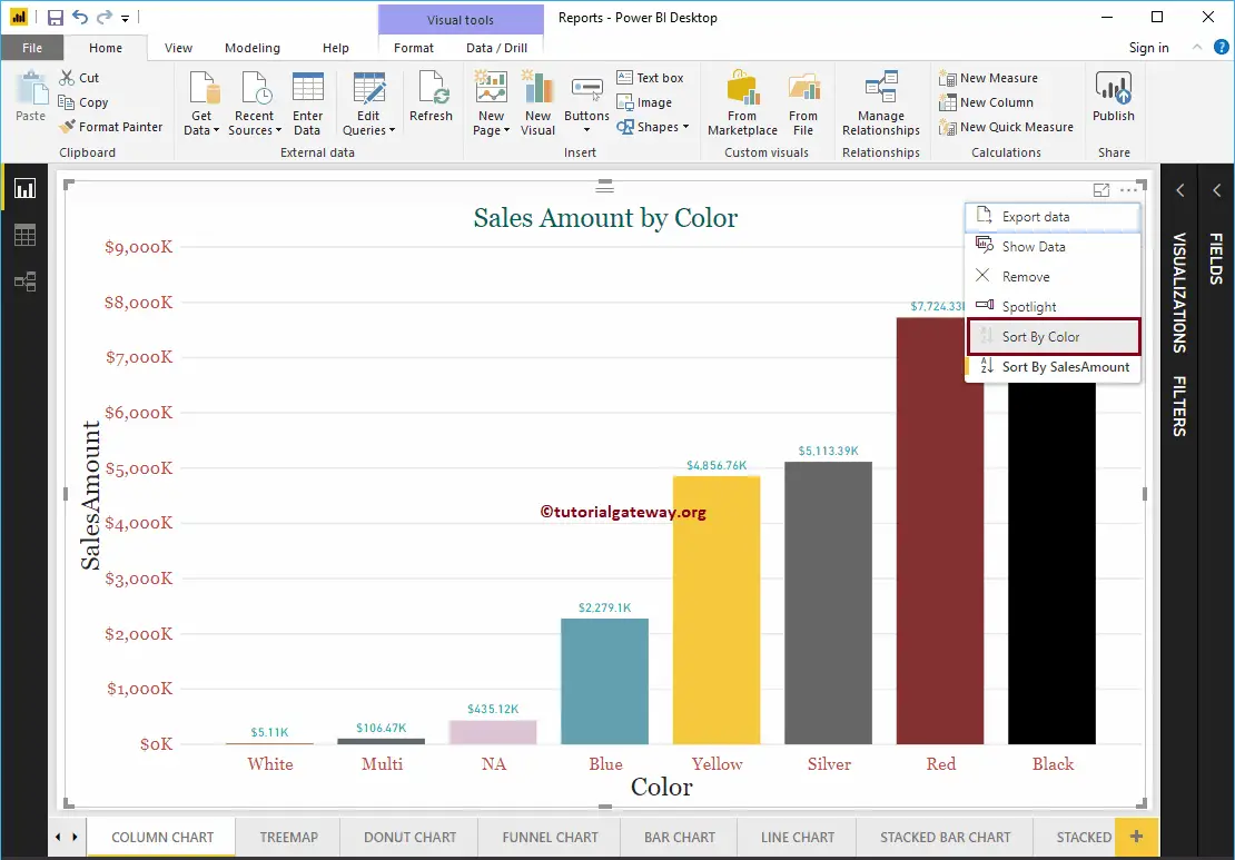
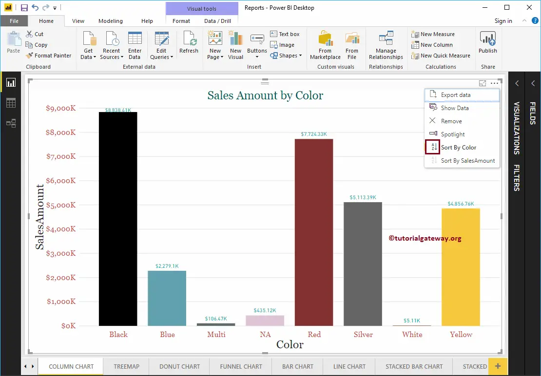
As you can see, the Power BI bar chart is sorted by color in descending order (default order).
You can click on the marked section to sort the chart by color in ascending order.
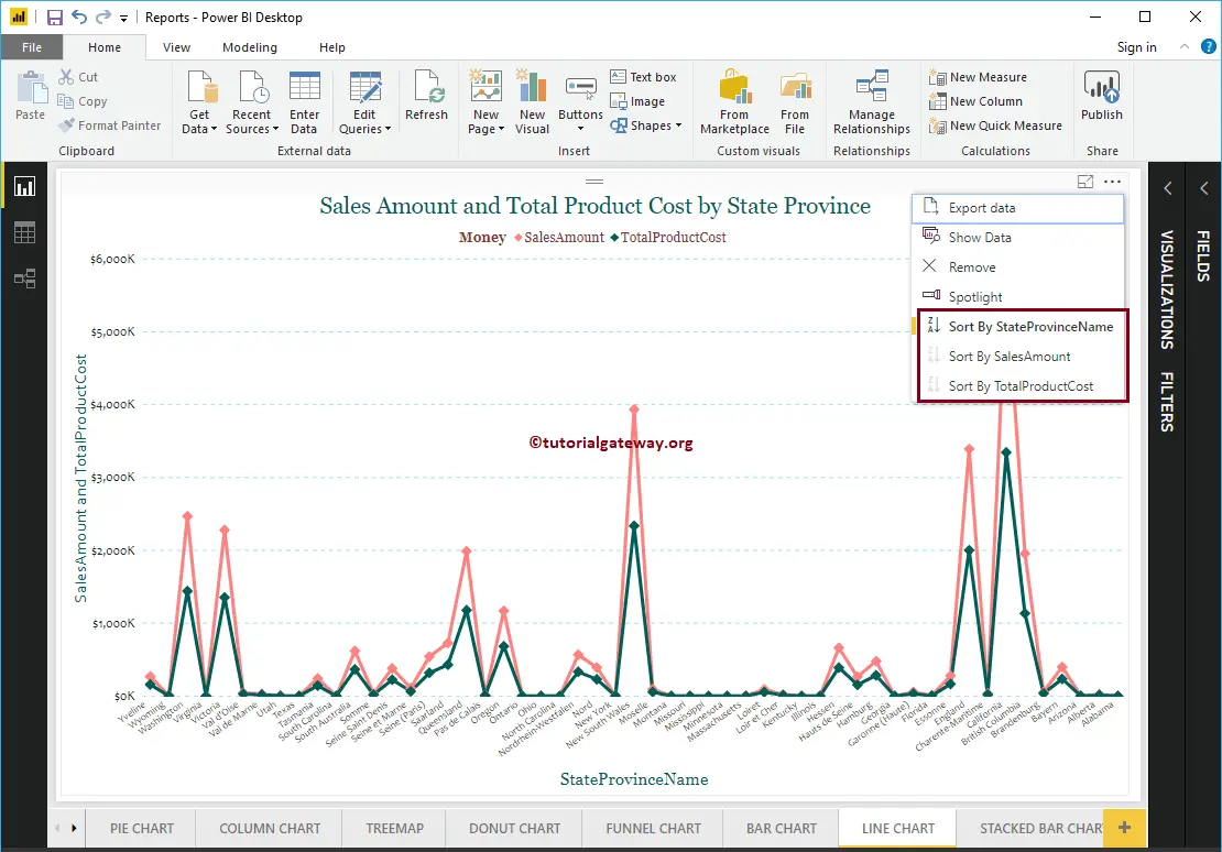
For example, if your chart has more than two fields, then you can sort by any of those three fields. From the below Line Chart, you can sort by State Province Name, Sales Amount, or Total Product Cost.