A Power BI Bar Chart or Horizontal Bar Chart is useful for data comparison or categorical data visually. For example, you can compare Sales by Color, Region, Product Group, etc. There are four types, and they are horizontal, Clustered, Stacked, and 100% Stacked Bar charts. Let me show you how to create a Bar Chart with an example.
For this Bar Chart demonstration, we use the SQL Data Source we created in our previous article. So, please refer to the Connect to SQL Server and the List of Charts articles to understand the Power BI Data Source.
Create a Bar chart in Power BI
Drag and drop the Measure (Sales) column within the blank page from the fields section to the X-axis under Visualization. Next, add any dimension (Country, segment, or category) to the Y-axis. Or select a clustered or stacked bar chart and add x and y-axis fields generated for you.
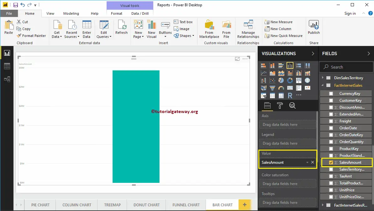
To create a Bar Chart, first, drag and drop the Sales Amount from the Fields section to the Canvas region. Then, it automatically creates a Column Chart. For more charts, visit Power BI charts.
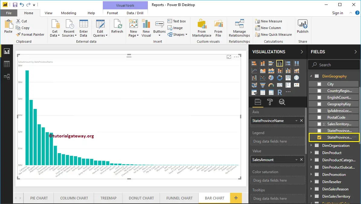
Next, let me add the State Province Name to the Axis section to create a column chart that shows the Sales Amount by State Province.
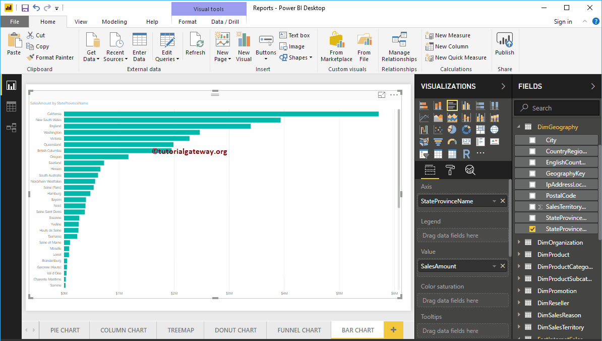
By clicking the Yellow box under the Visualization section, Power BI will convert the Column Chart into a Bar Chart.
Create a Bar Chart using Visualization
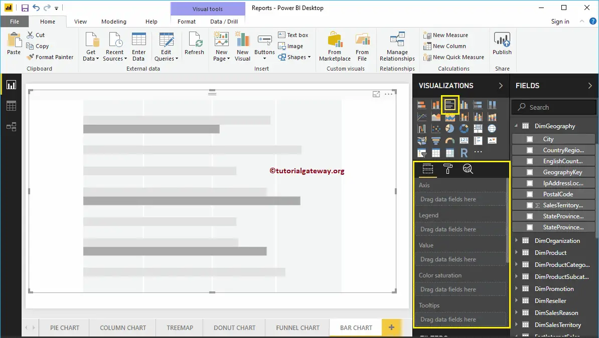
Dimension on the Y-axis and the Numeric Measure on the X-axis. will make the best bar chart. First, click on the Clustered under the Visualization section. It automatically creates a Bar Chart with dummy data.
In order to add data to the Power BI Bar Chart, we have to add the required fields:
- Axis: Please specify the Column that represents the Horizontal Bars.
- Values: Any Numeric value, such as sales amount, Total Sales, etc.
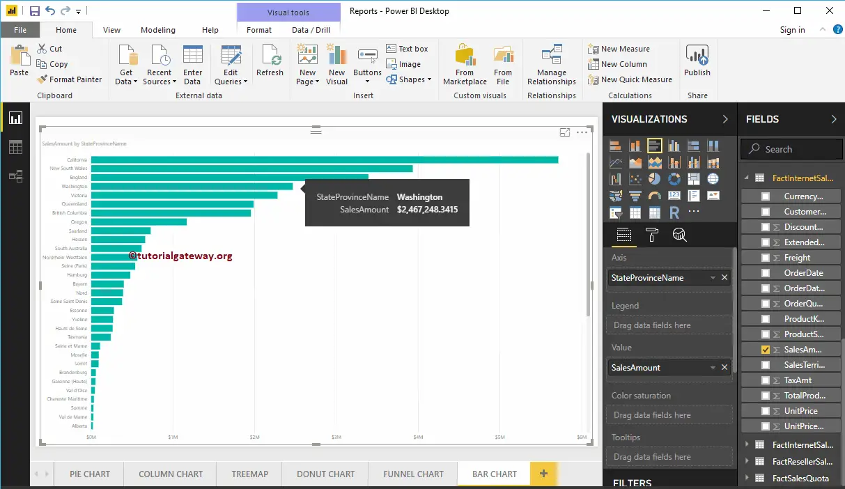
Let me drag the Sales Amount from the Fields section to the Values field. Next, add the State Province Name from the DimGeography table to the Axis section. You can do this by dragging State Province to the Axis section or simply checkmark the State Province column.
Now you can see a Bar Chart that represents Sales by State Province. Hover over any bar that shows the tooltip of the State Province Name and its Sales Amount.
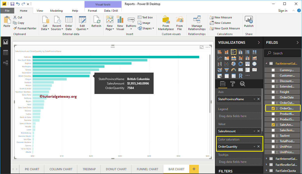
The Power BI Bar chart has one more property called Color Saturation. It adds colors to individual bars based on the Color Saturation Field value. So, for example, let me add Order Quantity to saturate the Color from Light to dark.
From the screenshot below, you can see that the Colors of the Bars have changed based on their order quantity.
How do you show a value in a bar chart in Power BI?
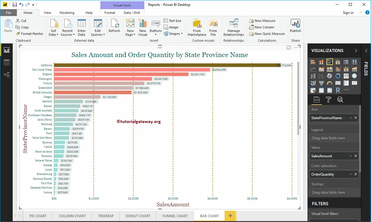
Under the Visualization section, go to Format your Visual Tab and toggle Data labels ON. Furthermore, you can format the font, color, background, and display units as thousands, millions, etc.
Let me do some quick formatting on this Bar Chart. I suggest you refer to the Format article to understand the steps involved in formatting the Title, Bar Colors, Data Color, Background Color, Axis fonts, and colors.
What is the difference between a column chart and a bar chart in Power BI?
A column and bar chart are very similar. The column chart has vertical rectangles where the x-axis contains the categories, and the y-axis is the measure value. The bar chart has horizontal bars where the x-axis is the measure value, and the y-axis contains the categories (dimensions) you are comparing.