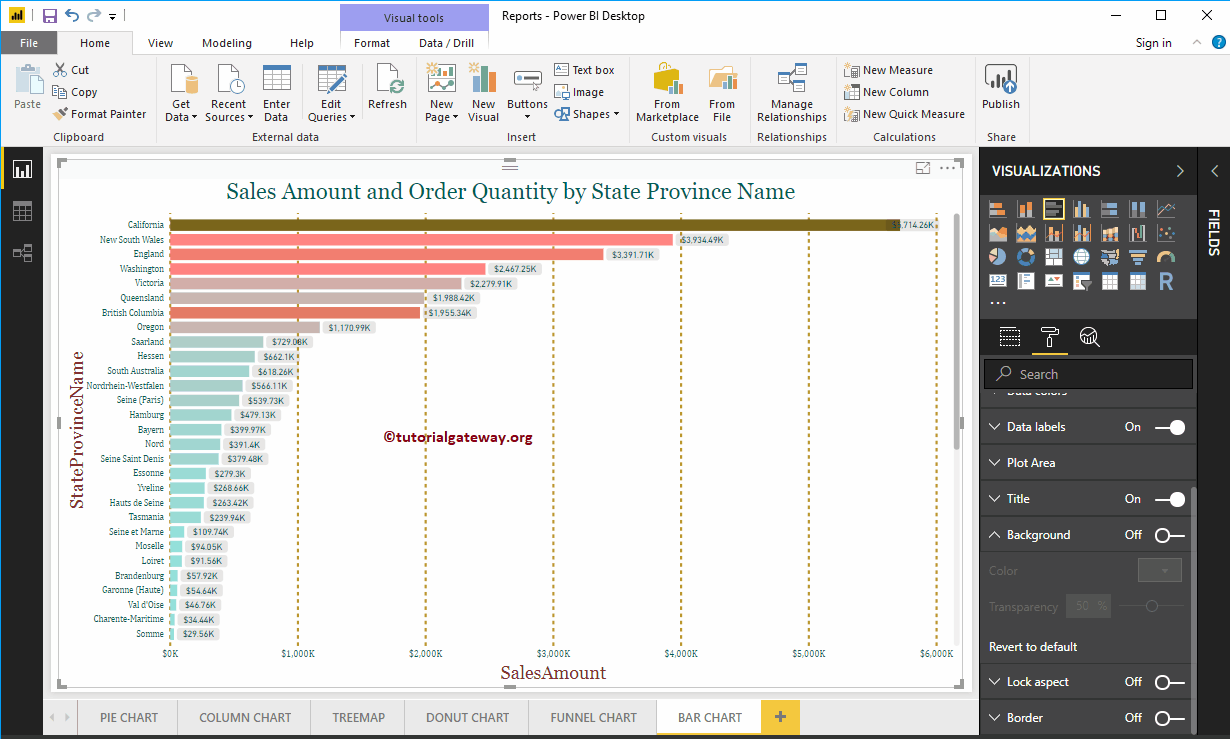
How to Format Bar Chart in Power BI with an example? Formatting the Bar Chart includes changing the Horizontal Bar Colors, Title text, Title position, Data labels, Axis Details, background Colors, etc.
To demonstrate these Bar Chart formatting options, we are going to use the Bar Chart that we created earlier. Please refer to the Bar Chart article to understand the steps involved in creating a Bar chart. For more charts in Power BI >> Click Here!
How to Format Bar Chart in Power BI
Please click on the Format button to see the list of formatting options that are available for this Bar Chart.
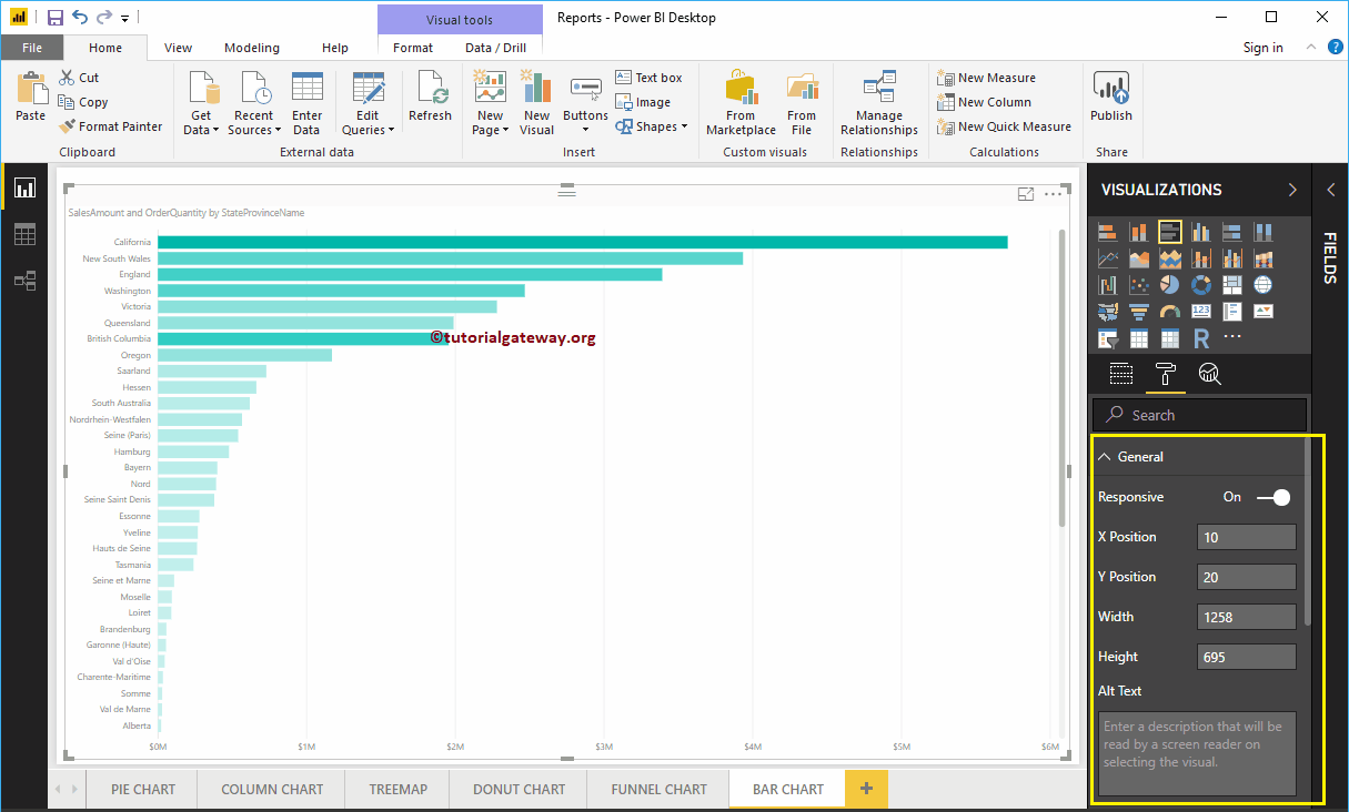
General Section
Use this General Section to Change the X, Y position, Width, and height of a Bar Chart
Format Y-Axis of a Power BI Bar Chart
The following is the list of options that are available for you to format the Vertical axis or Y-axis. You can see from the screenshot below, that we changed the Y-Axis label’s Color to Green, the Text Size to 12, and the Font style to Cambria. You can use the Minimum category width, Maximum Size, and Inner Padding options to change the horizontal bar widths.
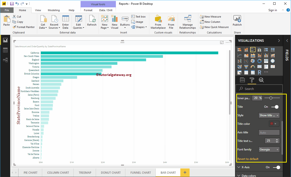
By default, the Y-Axis title is set to Off, but you can enable it by toggling Title under the Y-Axis section to On. Let me change the Title Color to Brick Red, the Title Text Size to 25, and the Font style to Georgia.
Format X-Axis of a Bar Chart in Power BI
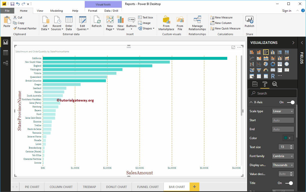
Following is the list of options that are available for you to format the Horizontal axis or X-axis. As you can see from the below screenshot, we changed the Color to Green, the Font style to Cambria, the Text Size to 13, and the Display Units to Thousands (default is Auto).
By default, the X-Axis title is set to Off, but you can enable it by toggling Title to On. Let me change the Title Color to Brick Red, the Font style to Georgia, and the Font Size to 25.
By toggling the Bar chart Gridlines option from On to Off, you can disable the Gridlines.
- Color: You can change the Gridlines color.
- Stroke Width: Use this to change the Gridlines width. Here, we changed the width from default 1 to 2 strokes.
- Line Style: Choose a line style such as Solid, dotted, or dashed.
From the below screenshot, you can see the changes that we made to X-Axis.
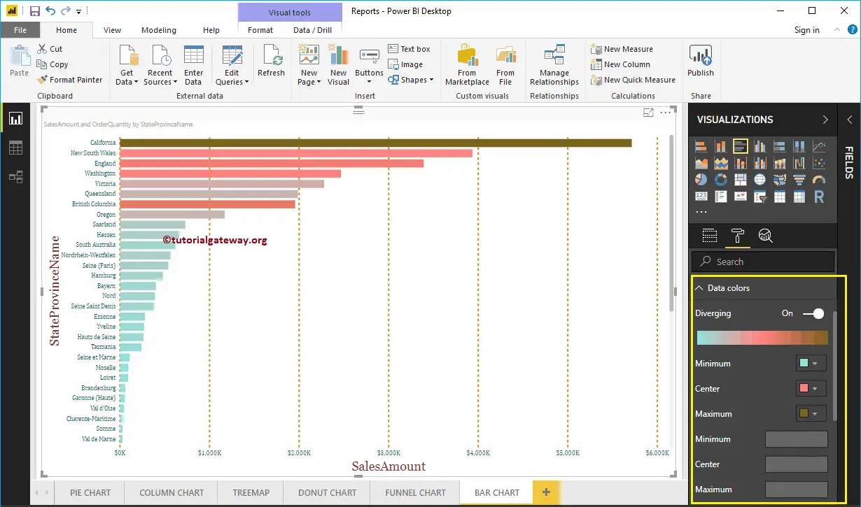
Format data Colors of a Bar Chart in Power BI
If you add any valid column to the Color Saturation field, then you can use this Diverging option to add colors to the Bar Chart. By default, it is set to Off, but you can enable those Diverging options by toggling Off to On.
If you haven’t added any Filed under the Color Saturation section, then the Diverging option under the Data Colors section is replaced with the Default Color option like below.
Let me add Minimum, Center, and Maximum color. Remember, you have an option to add the Minimum, Center, and Maximum values as well.
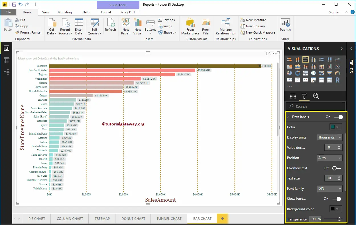
Enable Data Labels for the Bar Chart
Bar Chart Data Labels display information about each individual horizontal bar. In this case, it displays the Sales Amount of each bar. To enable or format Power BI bar chart data labels, please toggle the Data labels option to On.
Let me change the Color to Green, Display Units from Auto to Thousands, Font family to DIN, Text Size to 10, and Background color to Black with 90% transparency.
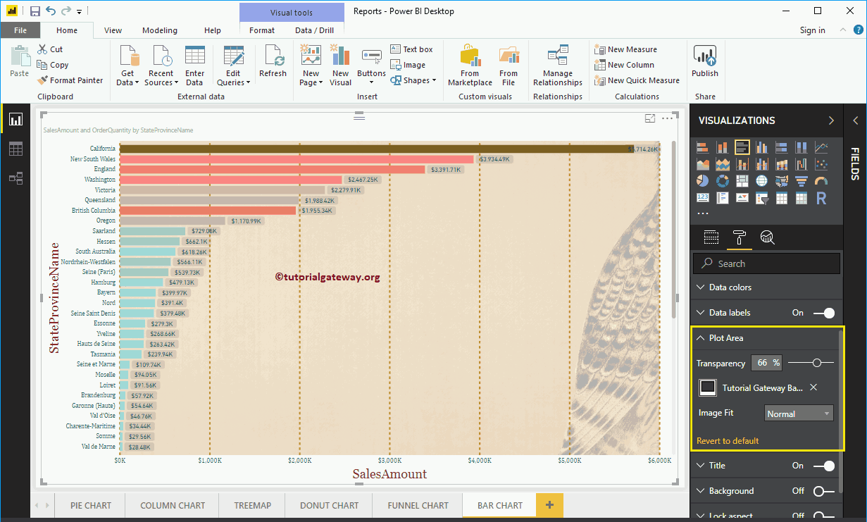
Format Bar Chart in Power BI Plot Area
You can add Images as the Background of a Bar Chart using this Plot Area section. For the demonstration purpose, we added one image as the Plot Area Background.
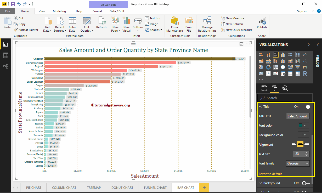
Format Bar Chart Title
By toggling the Title option from On to Off, you can disable the Bar Chart title.
As you can see from the screenshot below, we changed the Title Text to Sale Amount and Order Quantity by State province Name. We also changed the Font Color to Green, the Font Family to Georgia, the Font Size to 23, and the Title Alignment to center. If you want, you can add the background color to the title as well.
Format Background Color, and Border of a Bar Chart in Power BI
You can add the Background color to a Bar Chart by toggling the Background option to On. And, you can add Borders to a Bar Chart by toggling the Border option from Off to On.