A Power BI Matrix is similar to a table that contains rows and columns, and this article shows how to create it. However, the matrix shows the aggregated data instead of displaying the detailed rows. The aggregation of the numeric measure depends on the column and row headers.
If you add a hierarchy to column or row headers, you can drill up and down based on the levels. Let me show you how to create a Matrix with an example. A Power BI Matrix called the Cross tab helps display the relationships between two or more groups. The following list shows when to use a matrix
- To display the aggregated information in tabular format.
- To perform row and column grouping.
- To view row and column subtotals, totals, and grand totals.
- To enable drill down action across the Power BI Matrix crosstab report. Adding a Hierarchy to the rows section creates a drill down action for rows. Adding a hierarchy to columns enables the column-wise drill down action.
We will use the SQL Data Source we created in our previous article for this Matrix demonstration. So, please refer to the Connect to SQL Server and the List of Charts articles to understand the Power BI Data Source.
How to Create a Matrix in Power BI?
Although a Matrix looks like a table, there is a difference between them. A table displays the data in a two-dimensional format. So, it shows detailed information and duplicate records. Whereas a matrix displays the data in a layered or stepped layout. The important aspect is that the matrix automatically aggregates the measure (numeric) fields.
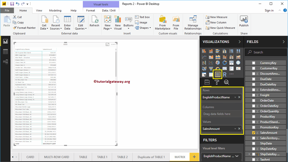
When you drag any dimension field to the Canvas, it automatically creates a table. Let me drag and drop the English Product Name from the Fields section to Canvas. And you can see the table. Next, drag one metric value (Sales Amount) to the Values section and click on the Matrix under the Visualization section.
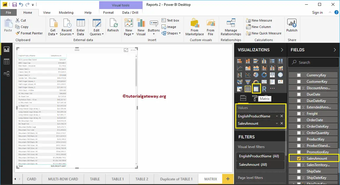
Clicking the button will automatically convert a Table into a Power BI Matrix. For example, the screenshot below shows the cross-tab representation of English Product names and Sales Amounts.
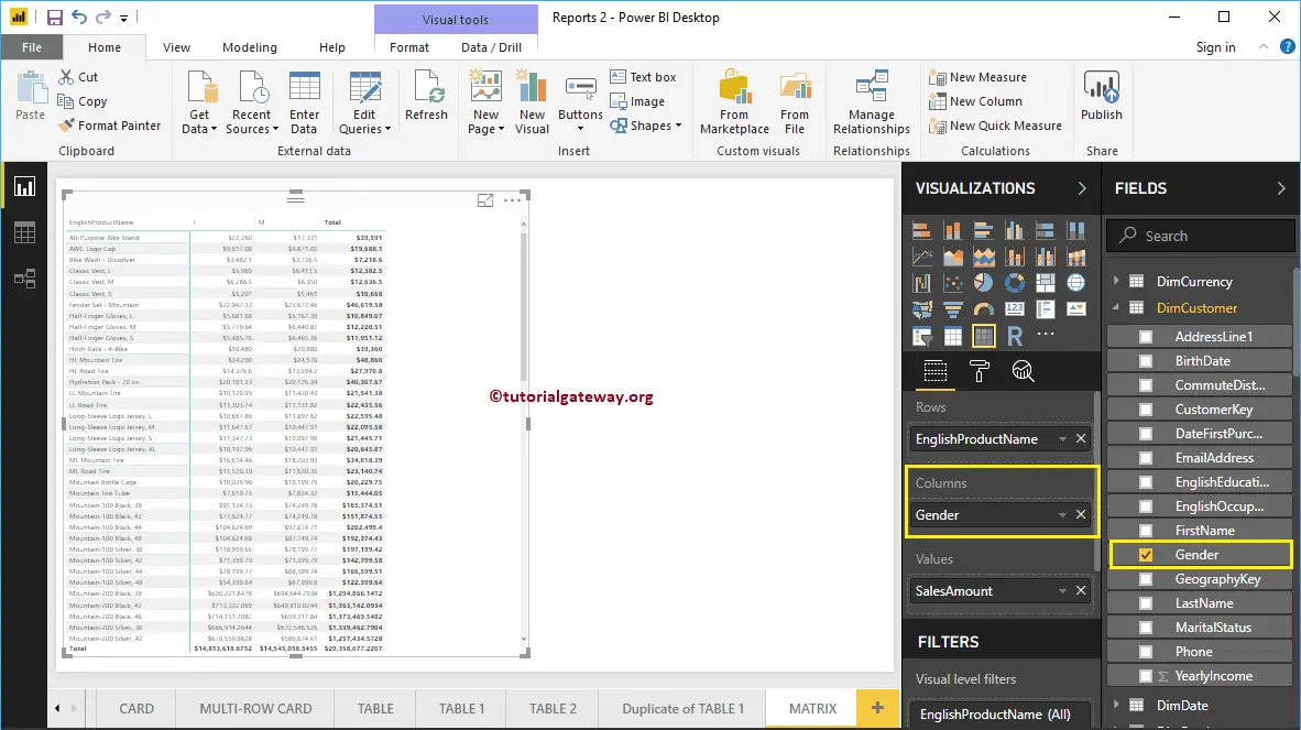
Let me add one more column group so you can understand the crosstab. As you can see, we added customer’s gender to the Column Groups.
Create a Power BI Matrix or cross-tab report using multiple columns
You can follow this step if you want to convert the existing chart into a Matrix. As you can see from the screenshot below, we created a column chart representing the Order Quantity by English Product Subcategory.
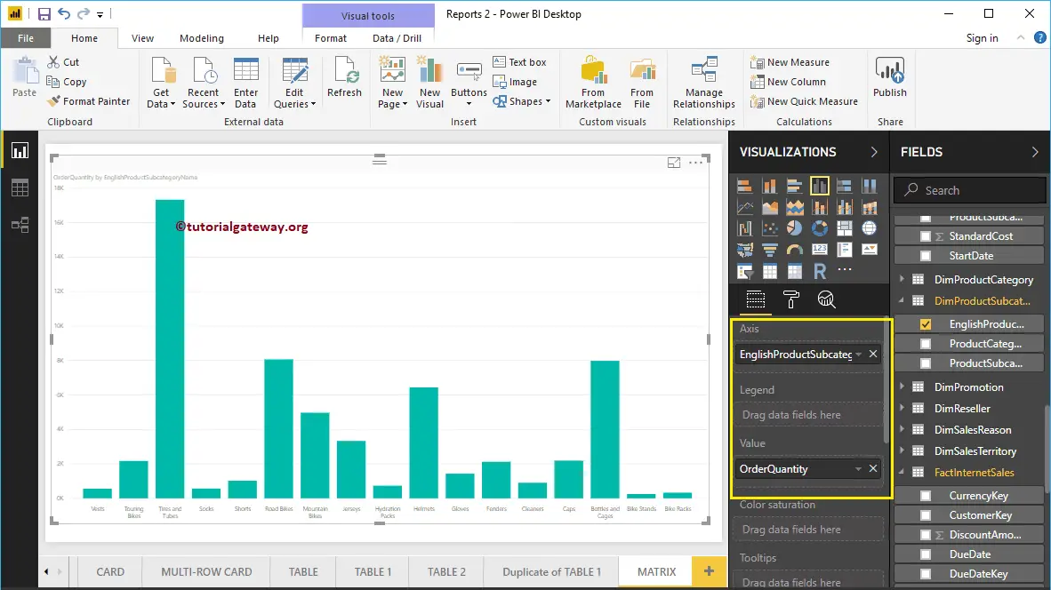
Click on the below-shown icon under the Visualization section to automatically convert the Column Chart into a cross tab. Let me add the Product Color to the Column Group
How do you show a matrix in Power BI? – Approach 3
Under the Visualization section, selecting the Matrix icon will generate a dummy Matrix. Next, add dimensions to both the Rows and Columns section and the Numeric measure to values. Apart from this, you can convert an existing table to a matrix.
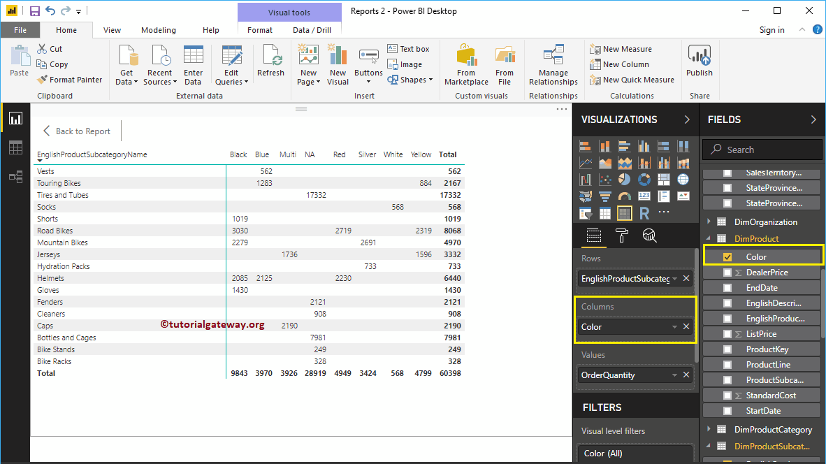
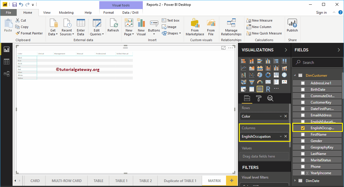
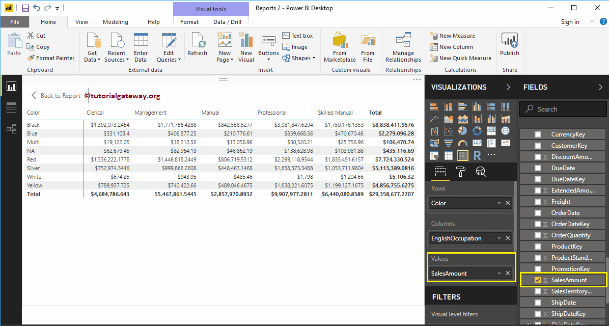
To create it, click on the Matrix in the Visualization section. It automatically creates a crosstab with dummy data. Next, let me add the product Color as the Row Group. Next, drag and drop the English Occupation into the Column Groups. Now, you can see the crosstab.
Next, let me drag the Sales Amount to the Values section. It automatically enables the Subtotals and grand totals.
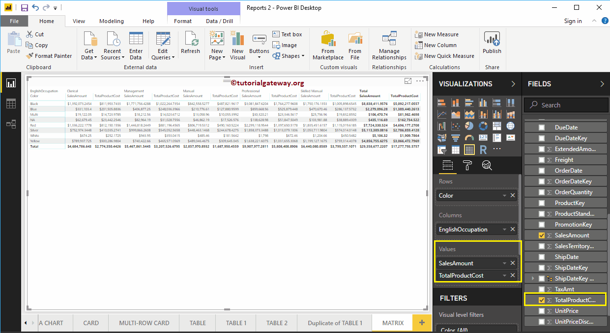
For this demonstration, we add one more metric field, i.e., Total Product Cost, to the Values section. Next, let me do some quick formatting to this Matrix. Please refer to the Format article to understand these settings.
Comments are closed.