Power BI Funnel Chart with a vast space at the top and a slim outlet at the bottom is useful for displaying the data in stages. They visually represent a complete process, highlighting the sequential data flow or the conversion rates. For example, we can use funnel charts to visualize the Product cost of each category in detail, sales pipelines, marketing campaigns at each stage, etc.
Each section of the Power BI Funnel Chart is represented by rectangle bars, and the width of each rectangle bar is proportional to the values (spending, production cost, orders, etc.). So that users can easily make comparisons and identify areas of improvement and bottlenecks (leaks).
This Power BI article will cover funnel charts, advanced formatting or customization options, and best practices for creating effective funnels. Creating a funnel chart is a straightforward process that involves importing data, preparing it, and selecting the appropriate visualization.
Create a Funnel Chart in Power BI
We will use the SQL Data Source we created in our previous article for this Funnel Chart demonstration. So, Please refer to the Connect to SQL Server and the List of Charts articles to understand the Power BI Data Source. If the imported data is not clean, perform any necessary transformations, such as aggregating data, deleting duplicates and nulls, applying required filters, etc.
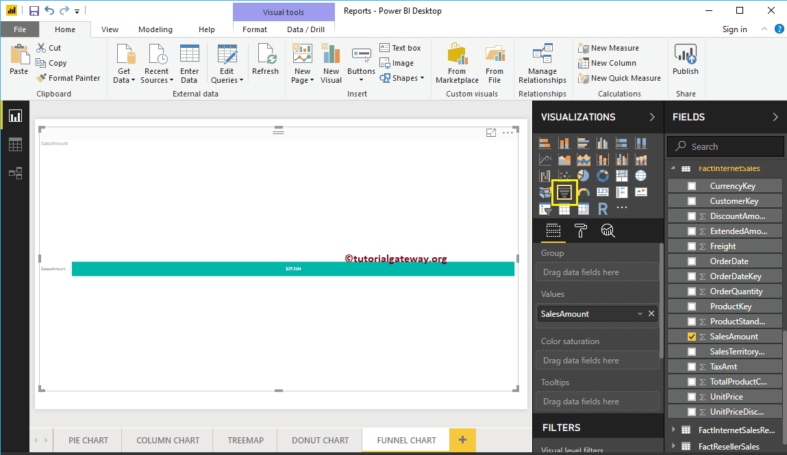
Once the data is ready, go to the Report view, and on the right-hand side pane, click on the selected one under the Visualization section. It automatically creates a Funnel Chart with dummy data, as shown in the screenshot below. See the dummy visual.
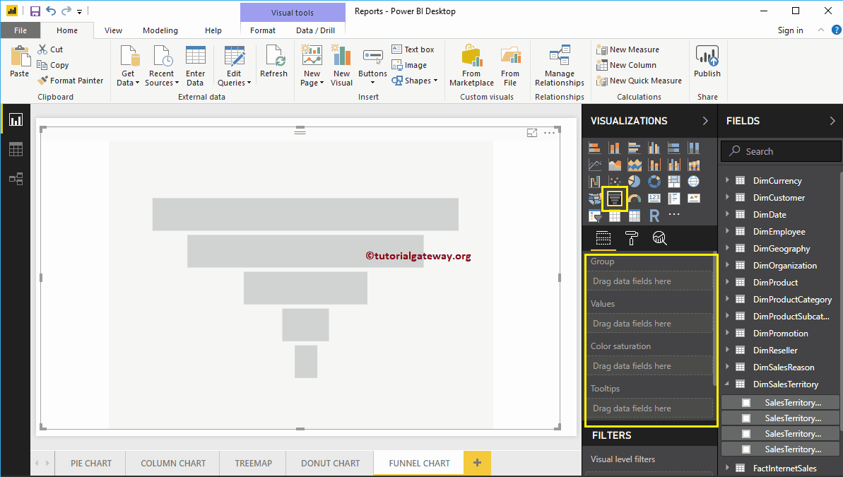
To add data to the Power BI Funnel Chart, we have to add the required fields:
- Group: Please specify the Column that displays the stages.
- Values: Any Numeric value, such as sales amount, Total Sales, Customer count, etc.
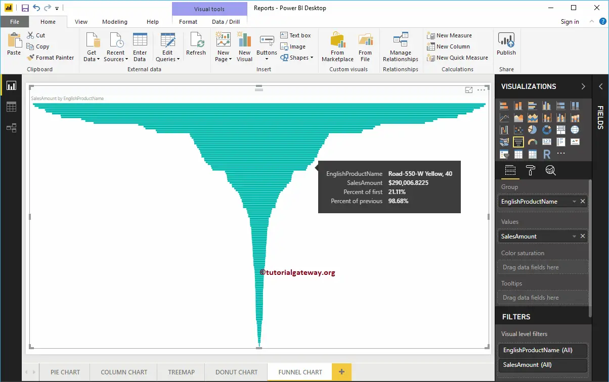
Let me drag and drop the Sales Amount from the Fields section to the Values field. Next, add the English Product Name from the DimProduct table to the group section. You can drag the Product Name to the Group section or checkmark the Product Name column.
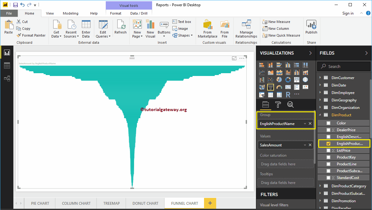
Now you can see the Power BI Funnel Chart for the Sales Amount of each product. Hover over any box that shows you the tooltip of the Product Name and its Sales Amount.
Like any other chart, Funnel Chart allows you to interact with them by applying filters, slicers, drill-up, drill-down, and drill-through functionalities. These are handy for analyzing the data in depth. For instance, you can use the filter to investigate the business at a specific funnel stage.
Create a Power BI Funnel Chart Approach 2
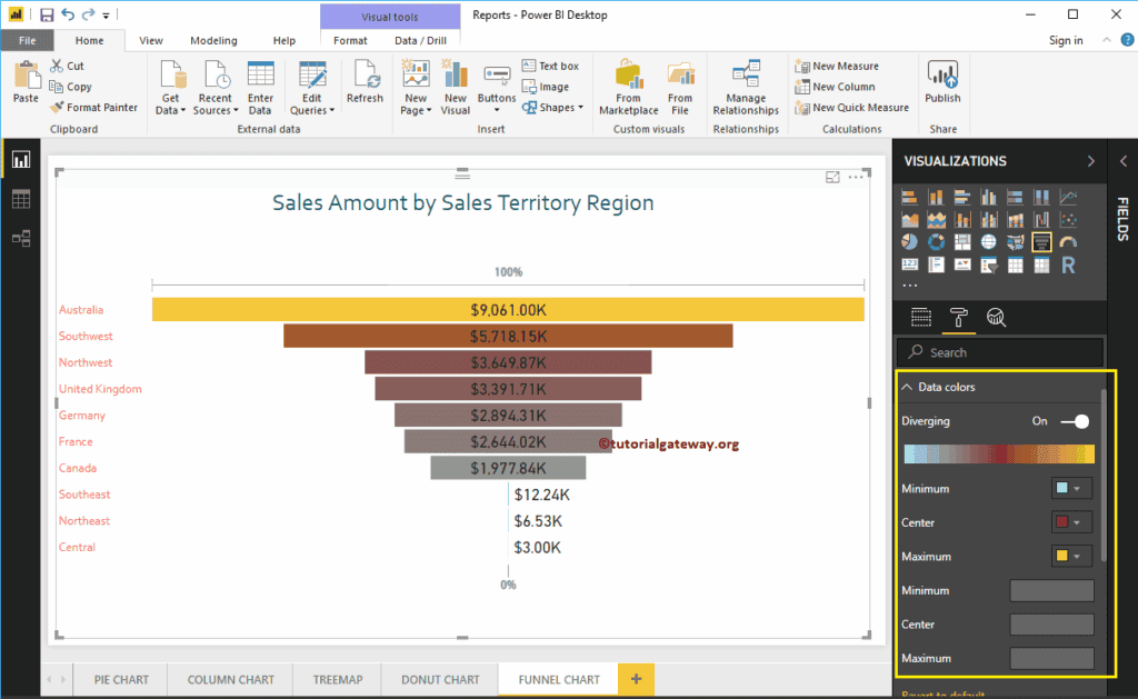
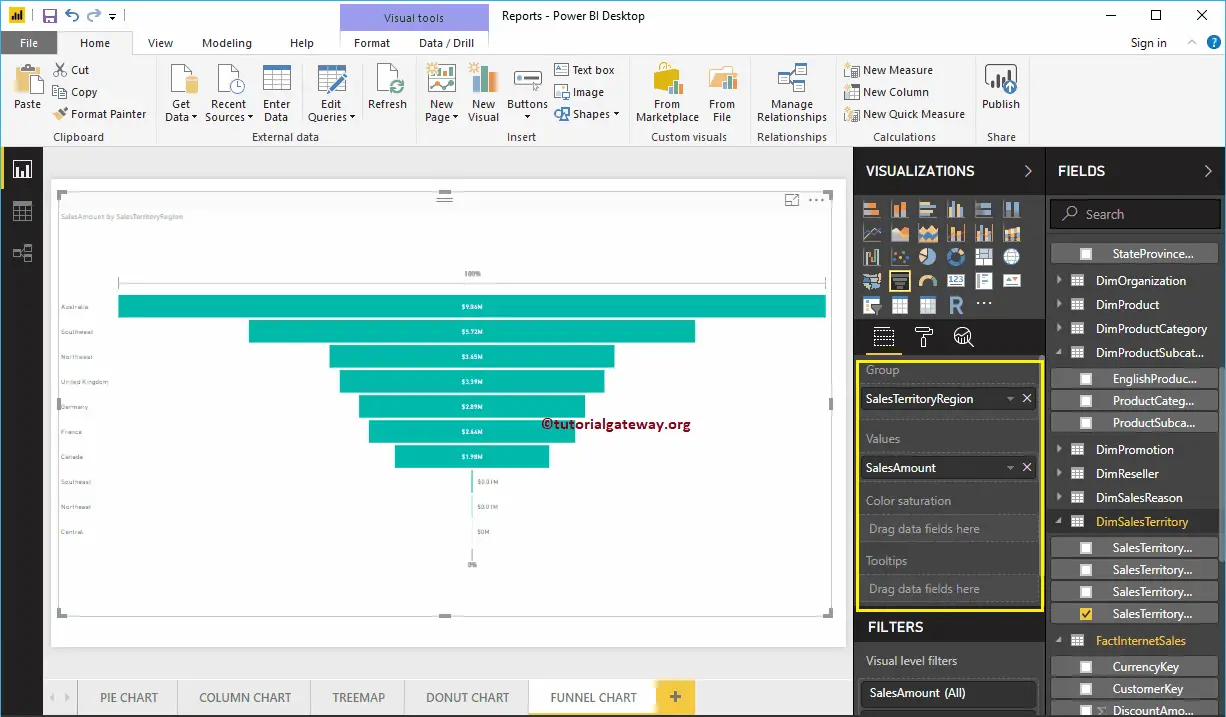
First, Drag and Drop the Sales Amount from the Fields section to Canvas. It automatically creates a Column graph. Clicking the marked one under the Visualization section automatically converts the Column Chart into a Funnel Chart, as we showed in the screenshot below.
Next, add the Sales Territory Region from DimSalesTerritory to the Group section. It means each box represents one region.
Let me do some quick formatting to the Funnel Chart.
I suggest you to refer the Format Funnel Chart article to understand the steps involved in formatting the Title font, Title alignment, Box colors, Data labels, and colors.