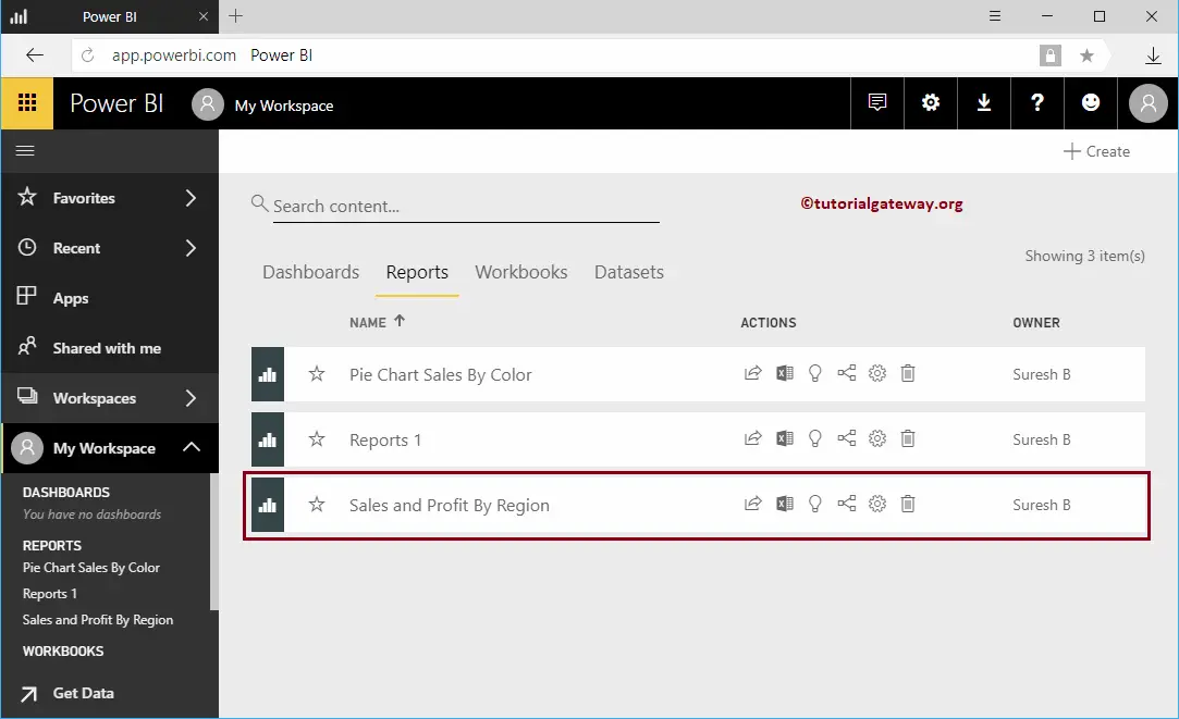
How to create a report in Power BI Workspace with a practical example? Before creating a report, let me show you the existing reports in my workspace.
To view them, please click on the Power BI My Workspace and then go to the Reports tab. As you can see from the screenshot below, there is currently only one report in my workspace.
How to create a Report in Power BI Workspace
You must use the + Create button in the top right corner to create a report inside your workspace. In order to create a new Power BI report, click the Create button and then select the Report option from the context menu. Please refer to the Create a Workspace and Dashboard articles to get the in-depth knowledge.
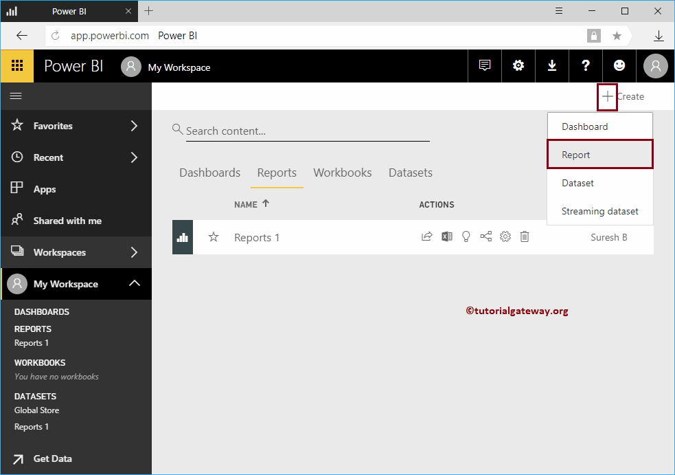
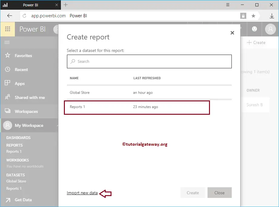
Selecting the Report option opens a new window called Create Report. Here, you must select the dataset you want to use for this report.
Use Import new data to import or create a new dataset. For now, we are selecting the Report 1 dataset.
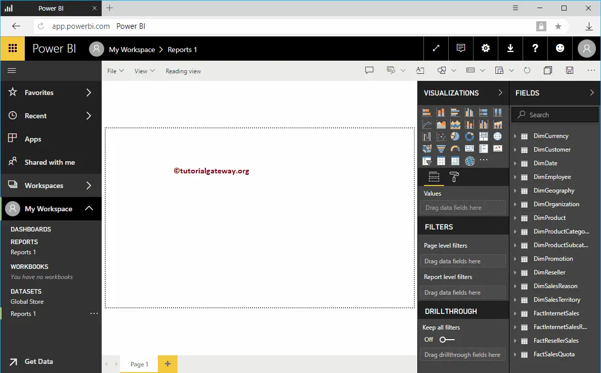
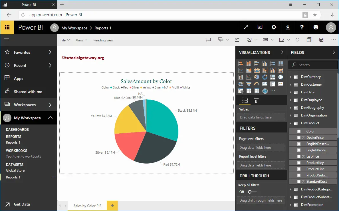
Clicking the Create button opens the following window. Here, you can create your own visuals.
For the Create a Report in Workspace demonstration purpose, we created a Pie Chart. Once you have finished creating a report, click on the Save button.
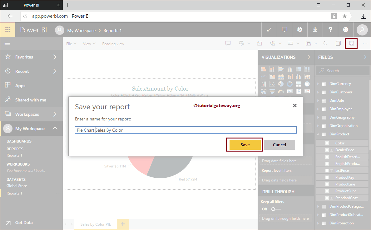
Clicking the Save button opens a new window called Save Your Report. Please provide the report name.
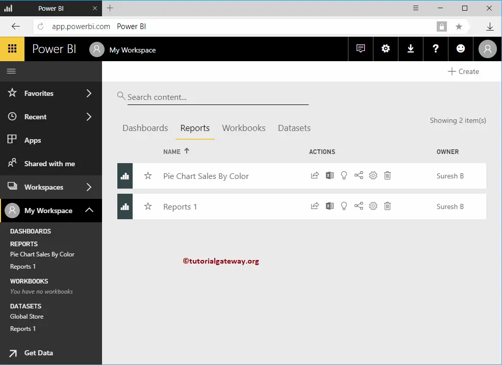
Now you can see the report that we created inside the Reports tab
How to create a Report using Excel Data in Power BI Workspace?
How to create a report using Excel Data in Workspace with a practical example? It is the Excel Workbook that we imported in our previous article.
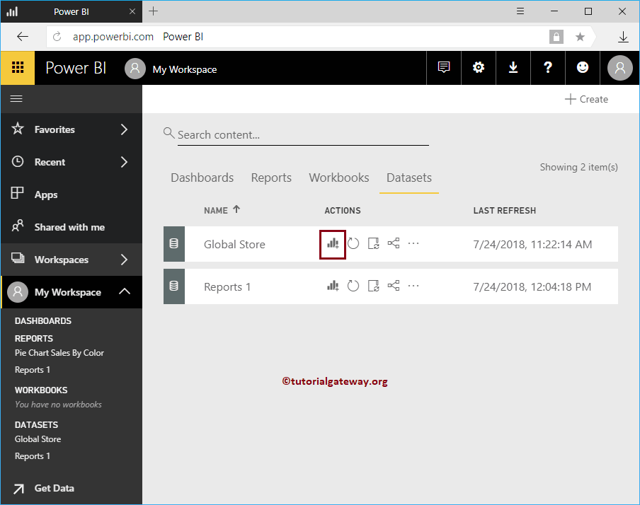
Before we start creating a Power BI report using the Excel file data, let me show you the dataset in my workspace. To view the same, please click on the Power BI My Workspace and then go to the Datasets tab.
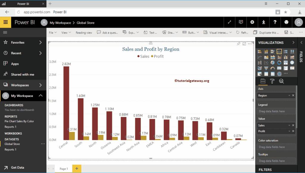
In this example, we use the Global Store Excel dataset, and I suggest you refer to the Upload Excel file article. Click on the Chart (or Visual) button beside the Excel Dataset
Please wait until the data is loaded. Clicking the Create chart button opens the above-mentioned empty window. Here, you can create your own visuals.
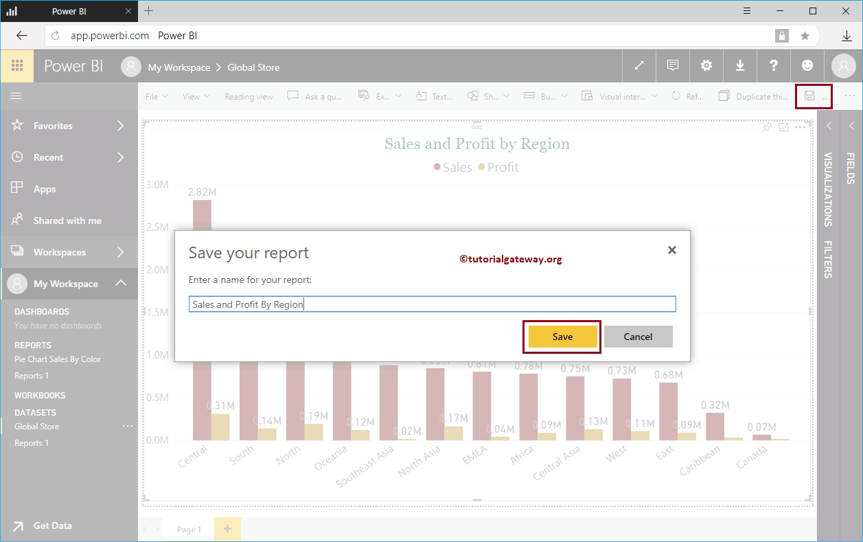
For the demonstration purpose, we created a Clustered Column Chart by adding Region to Axis and Sales and Profit to the Values section. Let me do some quick formatting to the Clustered Column Chart. Once you have finished creating a report, click on the Save button.
Clicking the Save button opens a Save Your Report window. Please provide the report name and hit the save button.
Within the Reports tab, you can see the report that we created in the Power BI workspace.