The Power BI Donut Chart is similar to the Pie Chart, which is useful for visualizing higher-level data. When comparing 2 to 4 segments or categories, use a donut chart. This article shows you how to create a Donut Chart with an example.
For this Donut Chart demonstration, we will use the SQL Data Source we created in our previous article. Please refer to the Connect to SQL Server and the List of Charts articles to understand the Power BI Data Source.
How to Create a Donut Chart in Power BI
When you click on the doughnut chart icon under the Visualization section, it automatically creates a Donut Chart with dummy data. In addition, adding Sales to Values and dimension field (category) to the legend will generate an actual donut chart.
To add data to the Power BI Donut Chart, we have to add the required fields:
- Legend: Drag and drop the column you want to display as the legend.
- Details: Drag and drop the Column on which you want to partition.
- Values: Any Numeric value such as orders, sales amount, Total Sales, Customer count, etc.
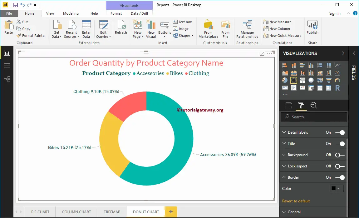
Let me drag and drop the Order Quantity from the Fields section to the Values field. Next, let me add the English Product Category Name from the DimProductCategory Table to the Axis section. You can do this by dragging Category to Axis or checkmarking the category column.
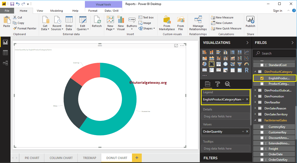
From the above screenshot, you can see the Power BI Donut Chart of Order Quantity that is Sliced by Product Category. If you use any category or segment hierarchy (more than one field) as the legend field, the desktop will automatically create a drill-down action on the Donut chart.
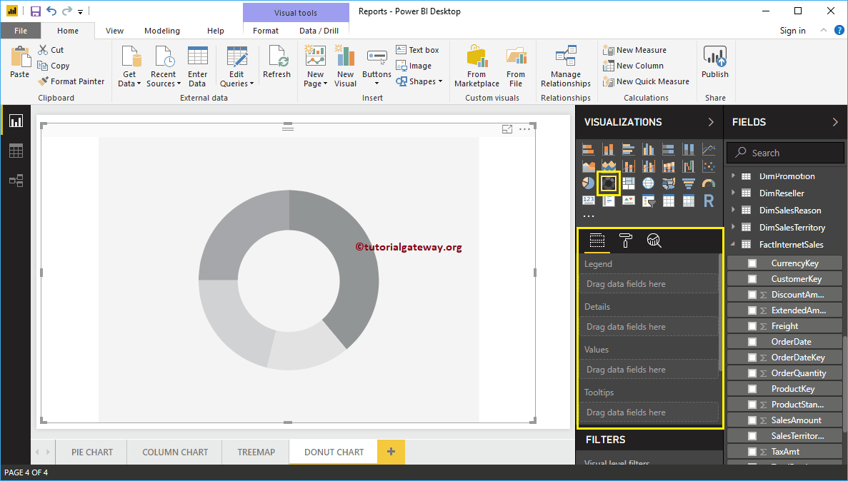
Create a Dount Chart using visualization
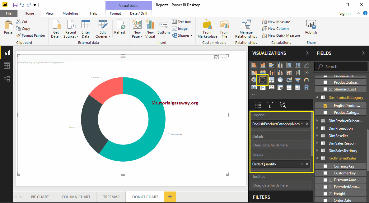
First, drag and drop the Order Quantity from the Fields section to Canvas. It automatically creates a Column. Next, add the English Product Category Name from the DimProductCategory Table to the Axis section. For this, drag and drop the Category to Axis or checkmark the category column.
By clicking the shown option under the Visualization section, automatically convert the Column into a Donut Chart.
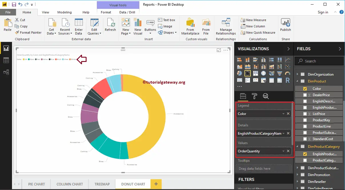
Further adding another field to the Details section, divide the Power BI Donut Chart.
Let me remove the product category name and do some quick formatting to it. I suggest you refer to the Format Donut Chart article to understand the steps involved in formatting the Title font, Title alignment, Data labels, Legend titles, Slice color, and background colors.
Comments are closed.