Power BI Treemap is used to display the data in Rectangle Boxes. You can define the rectangle box using any Dimension column and its size by Measure value. Treemaps use rectangular boxes with different colors to represent the hierarchal data. It means each row represents a rectangle, and the measure value defines its size. The bigger the size, the more sales; the smaller the size, the fewer sales.
The Treemap is very useful for displaying the largest data in a small region. For this Create a Treemap demonstration, we will use the SQL Data Source we created in our previous article.
How to Create a Power BI Treemap?
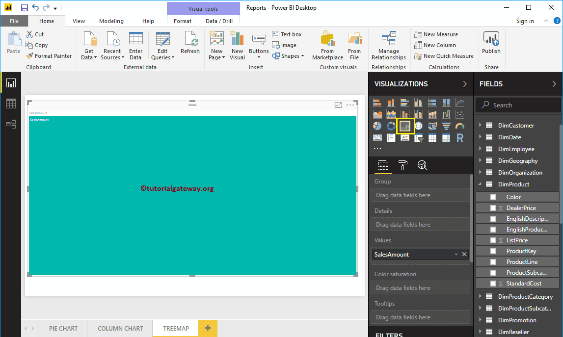
To create a tree map, first, drag and drop the Sales Amount from the Fields section to Canvas. Then, it automatically creates a Column Chart. Please refer to the Connect to SQL Server and Charts article to understand the Power BI Data Source.
By clicking the Treemap under the Visualization section, automatically convert the Column Chart into Treemap.
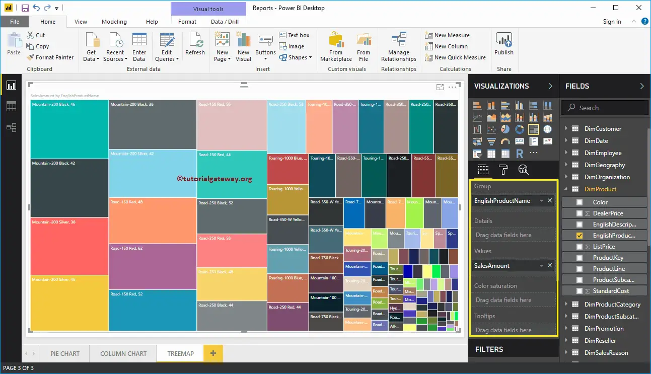
Next, let me add the English Product Name from the DimProduct Table to the Group section. It divides the rectangle boxes based on the Sales amount by each product.
Create a Power BI Treemap Approach 2
Click on the Treemap icon present under the Visualization section, and it will automatically generate the chart with dummy data.
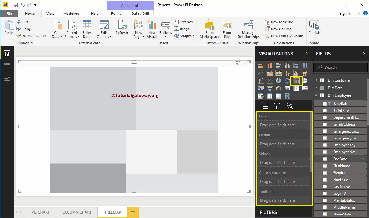
To add data to the Power BI TreeMap, we have to add the required fields:
- Group: Please specify the dimension Column that divides the Rectangle Boxes.
- Values: Any Numeric value, such as sales amount Measure, Total Sales, Customer count, etc.
- There is an option to add another dimension to the details to divide the rectangles further.
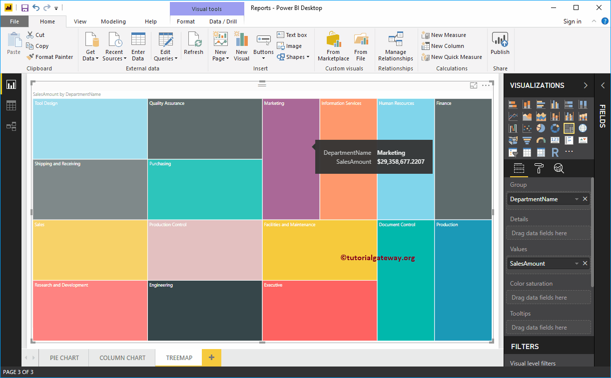
Let me drag and drop the Sales from the Fields section to the Values field. Next, add the Department Name from the DimEmployee table to the group section. You can do this by dragging the Department Name to the Group section or checking the Department Name column.
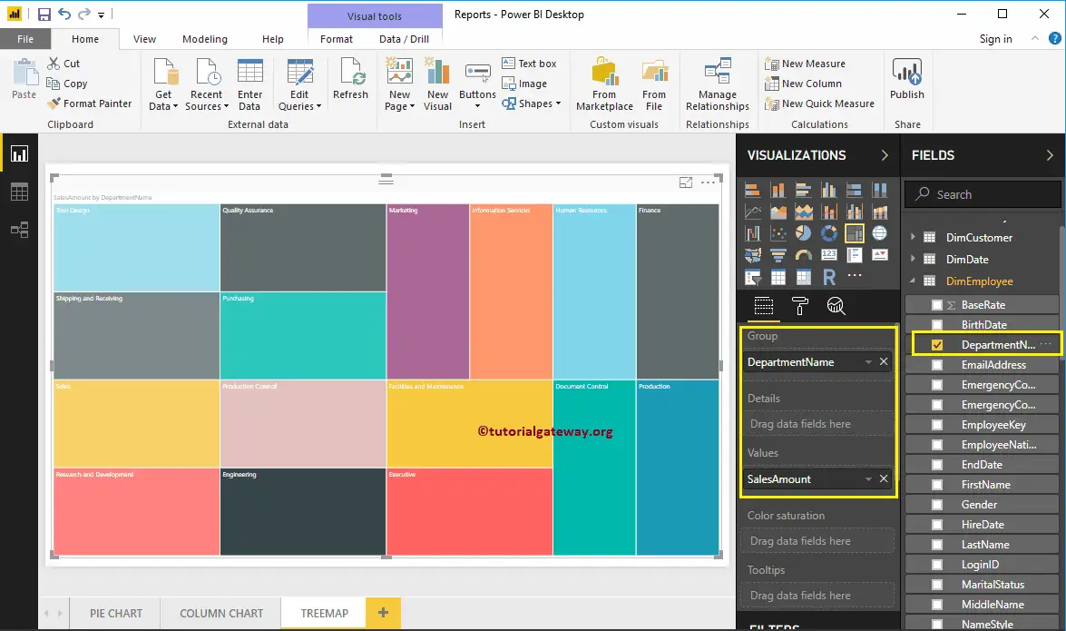
Now you can see the TreeMap of Sales Amount divided by Employees Department Name. Hover over any box that shows the tooltip of the Department Name and its Sales Amount.
Let me do some quick formatting to the Tree map. I suggest you refer to the Format Tree Map article to understand the steps involved in formatting the TreeMap Box Colors, Title font, Title alignment, Data labels, and colors.