Let me show you how to create a Card in Power BI with an example. A card is useful to display the aggregated information of a single measure number (or numeric metric value). However, you can change the aggregate function from default sum to Avg, min, etc.
The Power BI card is the best way to represent the overall numerical information of any measure. For example, if we want to track the total orders, total sales value, profit, orders, or total quotations we sent, we can use this Card visualization.
For this Card demo, we will use the SQL Data Source we created in our previous article. So, please refer to the Connect to SQL Server and the List of Charts articles to understand the Power BI Data Source.
How to Create a Card in Power BI
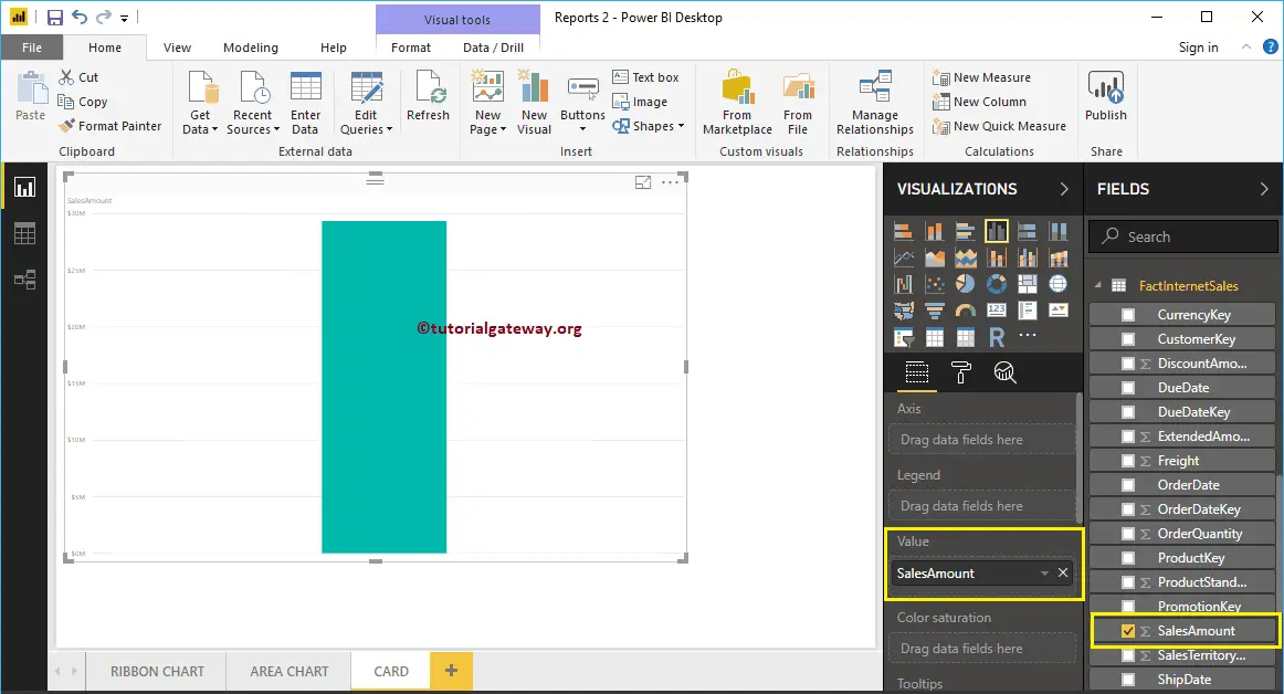
A card allows or accepts a single value, whereas a multi-row accepts multiple values. Please refer to the Multi-row example. First, drag and drop the Sales Amount from the Fields section to Canvas to automatically create a Column Chart.
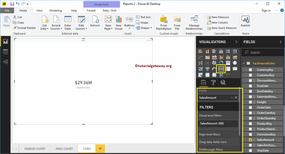
Click on the Card under the Visualization section. It automatically converts the Column Chart into a Card. From the screenshot below, you can see the card showing the total sales amount.
Create a Card in Power BI Approach 2
An advanced card was designed on top of the original one. It provides additional features such as conditional formatting, alignment, background image support, etc.
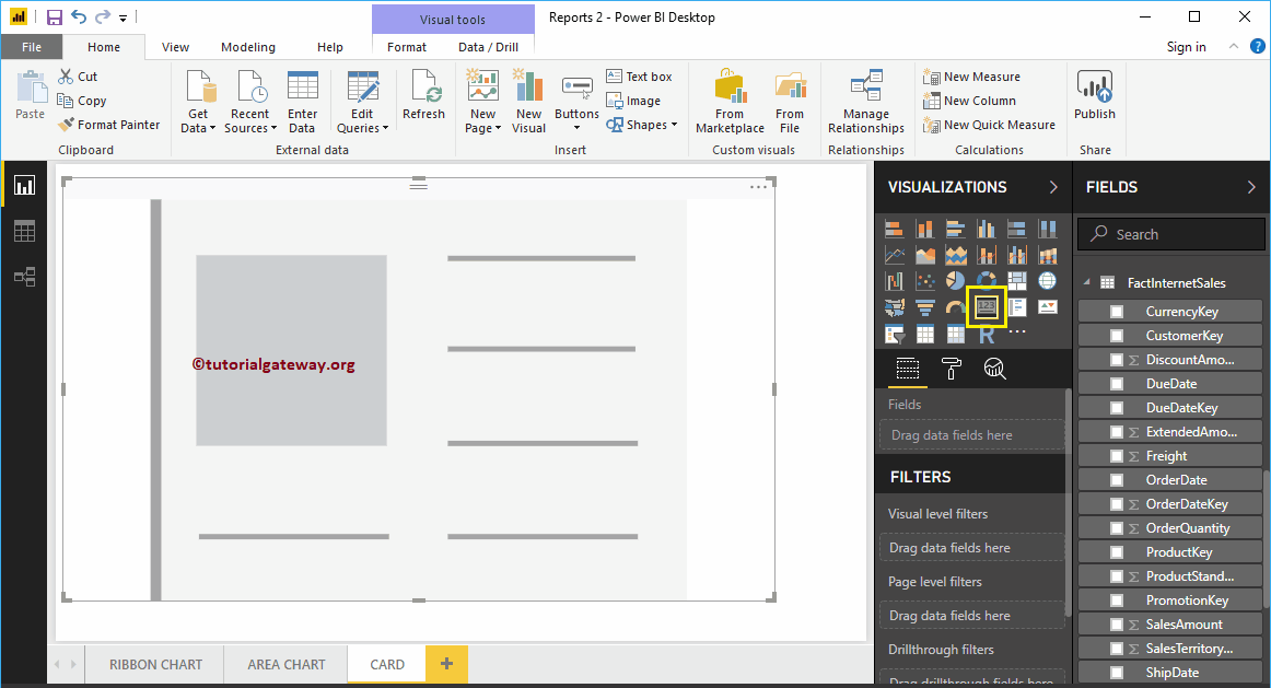
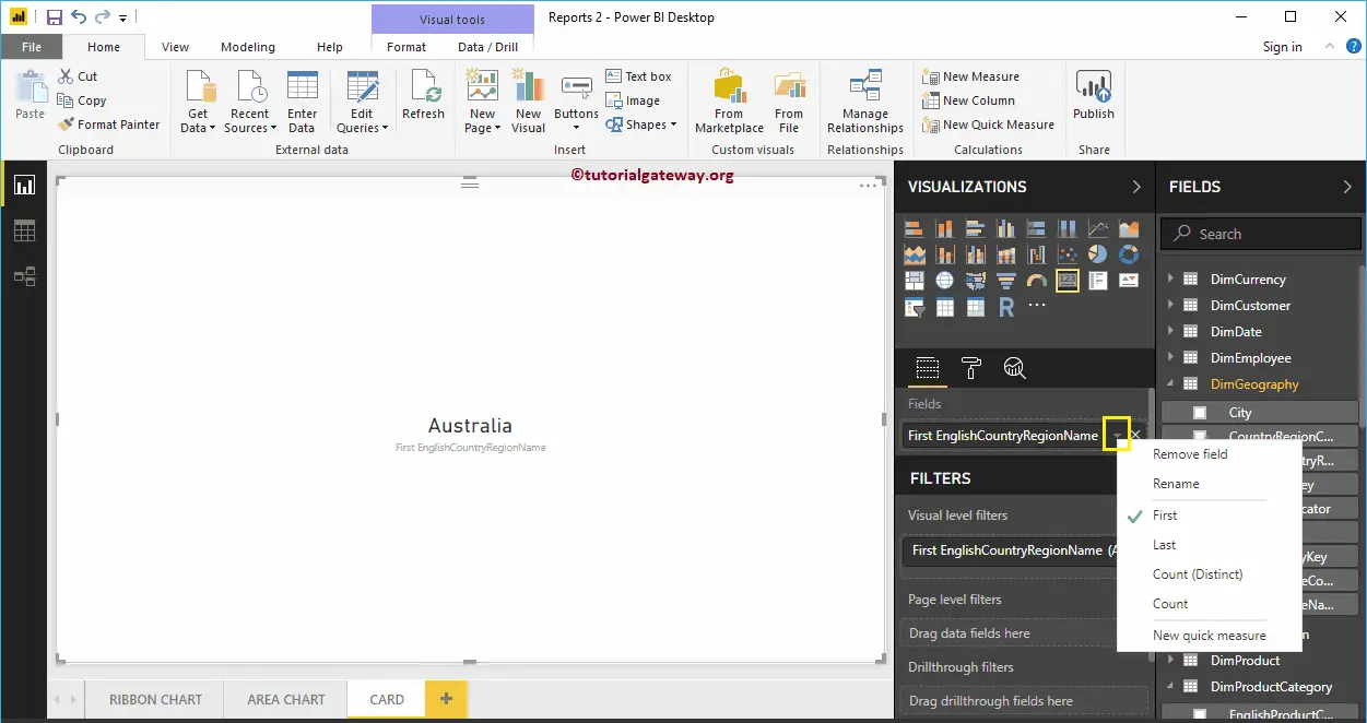
To create one, first click on the card present in the visualization section. It will create a Card with dummy data, as shown in the screenshot below.
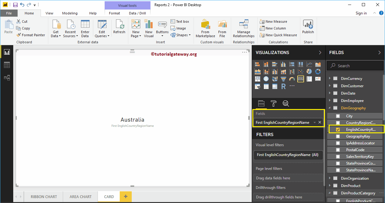
Let me drag the English Country Region Name (Dimension data) into the Fields section. As you can see, the card on the desktop shows the First Country Name as the value.
You can change the First function to any other Power BI-supported function to display in a Card.
Next, remove the Country Name and add the Sales Amount to the Fields section, as shown in the below screenshot.
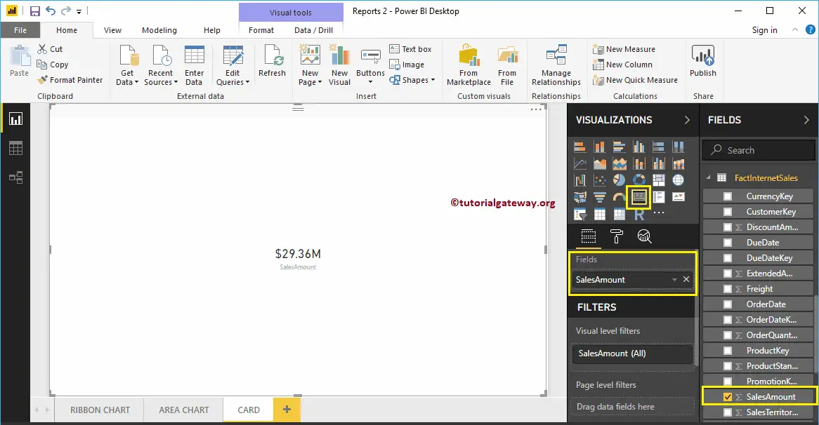
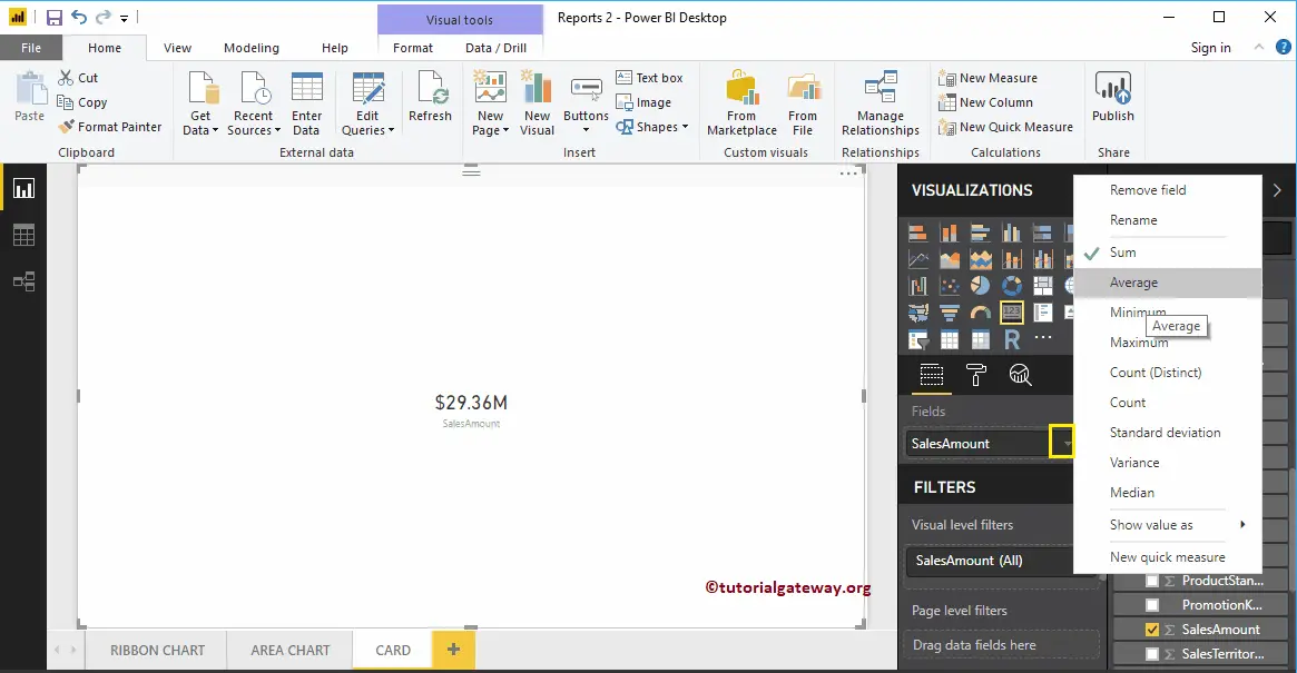
By default, it uses the default aggregated function called SUM. However, you can change this aggregate function as per your company’s requirement.
Let me do some quick formatting to this Card. I suggest you refer to the Format article to understand the available formatting options.
How do you add multiple values to a card?
It defaults to accept one measure value or dimension (text field). However, you can create a new column combining the multiple values using concatenation and add that one as a card. The second option would be adding multiple cards side by side.