The Power BI Ribbon Chart is useful to quickly identify which categorical data has the highest rank (large values). Let me show you how to create a Ribbon Chart with an example.
For this Ribbon Chart demonstration, we are going to use the SQL Data Source that we created in our previous article. So, please refer to the Connect to SQL Server article to understand the Power BI Data Source.
How to Create a Ribbon Chart in Power BI
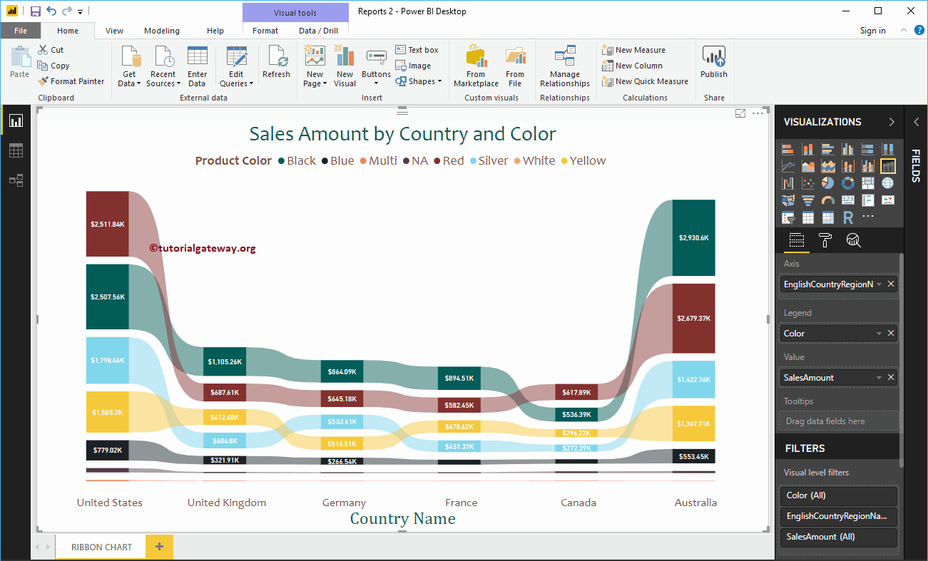
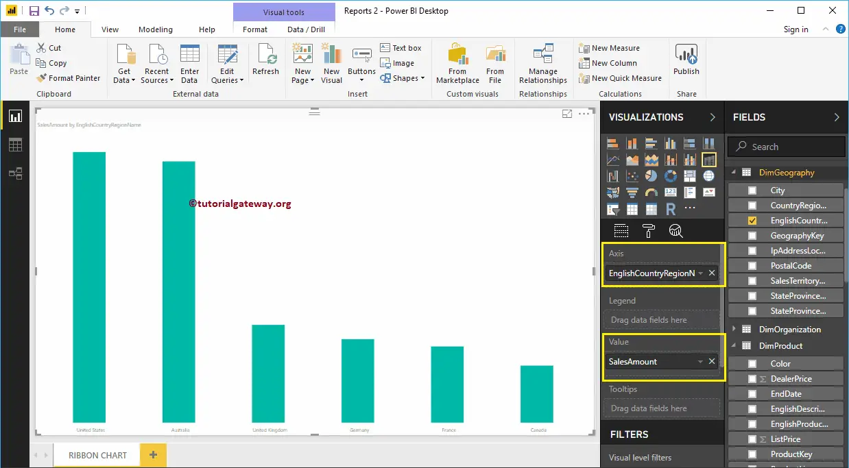
To create a Ribbon Chart, first Drag and Drop the Sales Amount from the Fields section to the Canvas region. It automatically creates a Column Chart. Next, let me add the English Country Region Name to the Axis section, as we showed in the below screenshot.
You can do this by dragging the Country Region Name to the Axis section or simply checkmark the Country column. It will automatically create a Column Chart for you. Next, add the Product Color from the DimProduct table to the Legend section.
By clicking the Power BI Ribbon Chart under the Visualization section, it will convert the. Clustered Column Chart into Ribbon Chart.
From the screenshot below, you can see the Ribbon Chart that shows the Sales by Country and Color.
Create a Ribbon Chart Approach 2
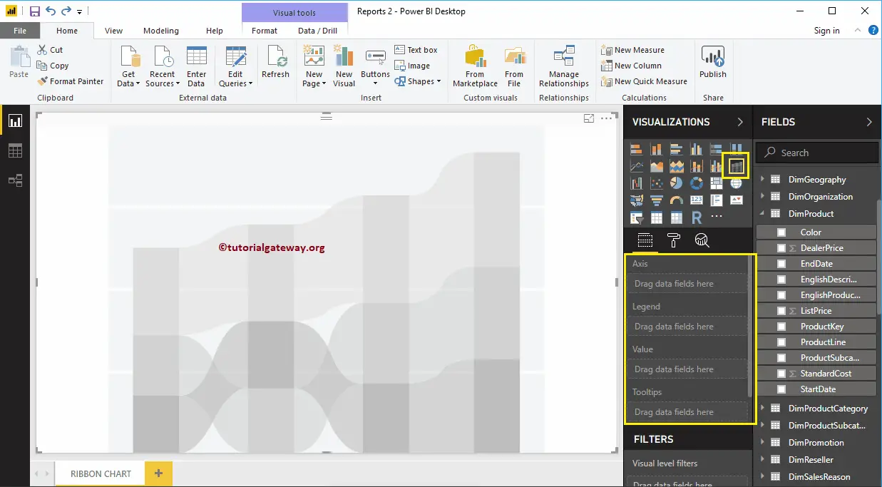
First, click on the Power BI Ribbon Chart under the Visualization section. It will create a Ribbon Chart with dummy data, as shown in the below screenshot.
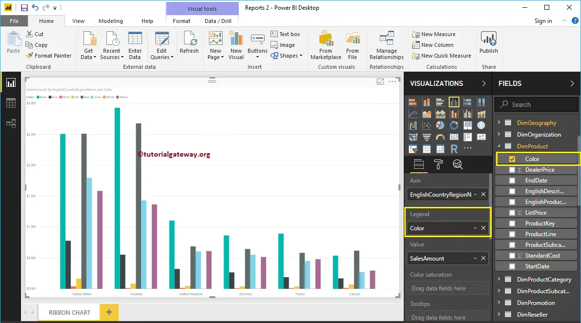
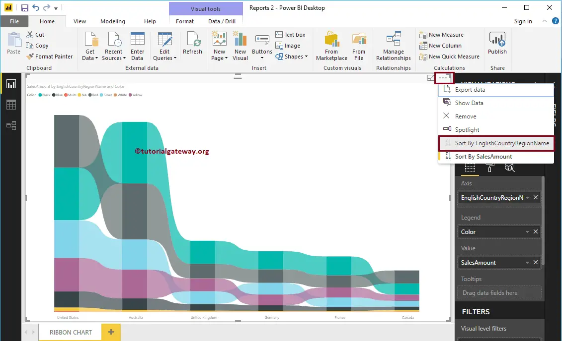
Let me drag the Sales Amount from the Fields section to the Values field and the English Country Region Name from Dim Geography to the Axis Field.
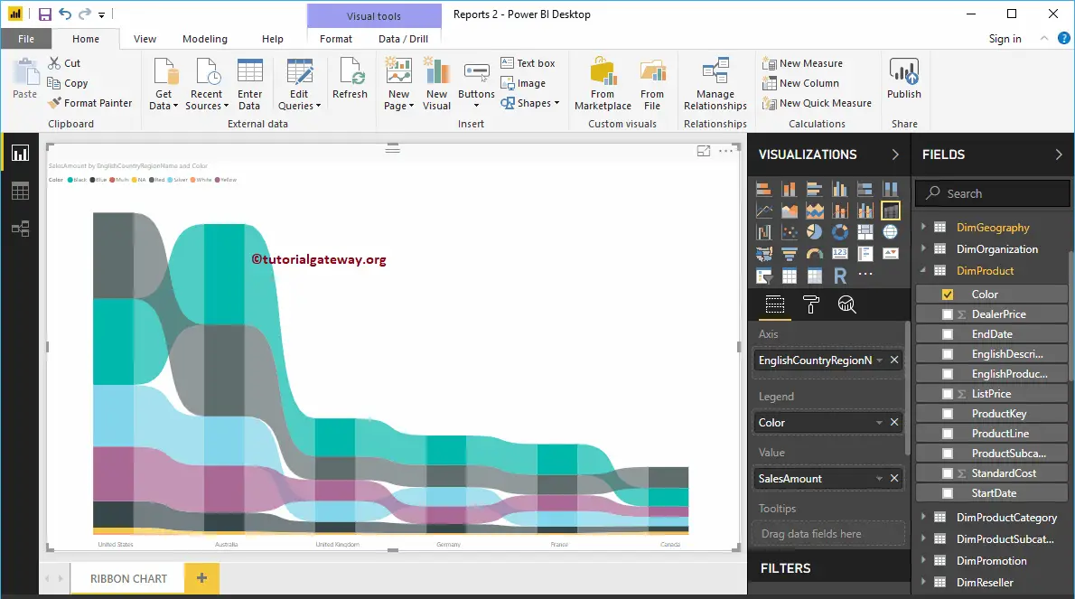
Next, add the Product Color to the ribbon chart’s Legend section. Let me sort the data by English Country Name (By default, it is sorted by Sales Amount). To do this, click on the … (3 dots) on the top right corner, and select the Sort By English Country Region Name option as we show below.
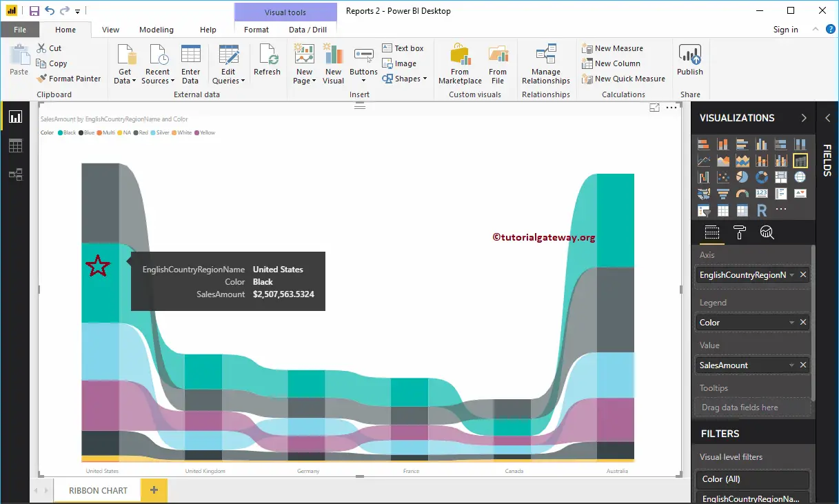
Now you can see the proper Power BI Ribbon Chart. Hovering over any bar shows the tooltip of the Country Name, Product Color, and Sales Amount.
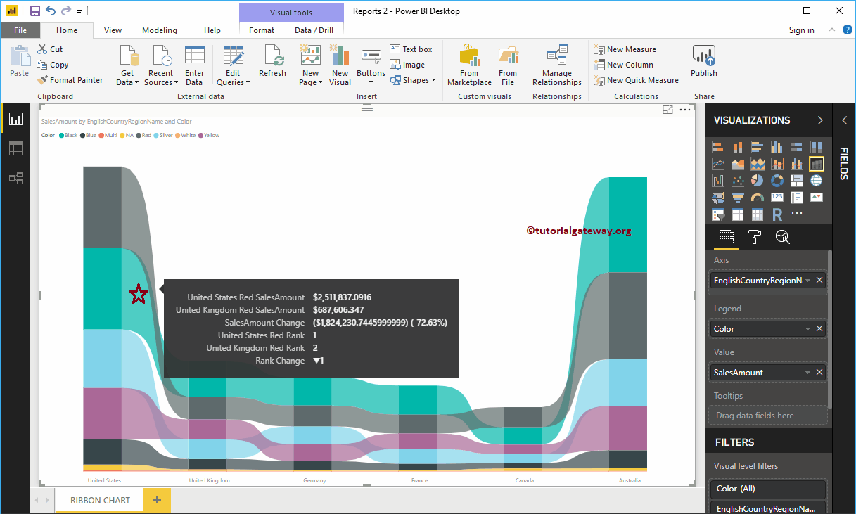
Hovering over any position in between the two bars will show you the Tool-tip of Previous Country Sales, Next Country Sales, Difference in percentage, and the Rank between those two countries in this case
Let me do some quick formatting to this newly created Ribbon Chart. I suggest you refer to the Format Ribbon Chart article to understand the steps involved in formatting these Ribbons, background colors, data labels, etc.