A Tableau bar Chart is handy for comparing the data visually using bar length. It will represent the data in the form of rectangular bars where each bar represents the text column (Dimension), and its length represents the Measure value (numeric column).
It means the largest rectangular bar has the highest value, and the smallest bar has the least sales. In a desktop, dragging a measure to Columns and a dimension to Rows will automatically generate a Bar Chart in Tableau.
By seeing this bar chart, one can understand which color product performs better than others. For example, we can use this to check the Sales by Color, sales by country, or profit by product category. This Tableau article shows you how to create a horizontal Bar Chart, a column chart, a stacked and categorical, and a side-by-side bar chart with examples. Remember, creating it on a desktop is very easy.
Create a Bar Chart in Tableau
The easiest way to create a bar chart is to double-click any Measure value (Numeric Column) you want to visualize, and Tableau automatically creates one for you. So, we start this section by creating this chart and later cover the customizations available to change the bar colors and size.
Please visit the How to add data Labels in the Reports and Charts article to understand the Tableau Data Source and Charts.
Tableau Horizontal Bar Chart
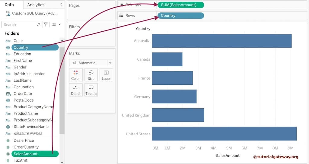
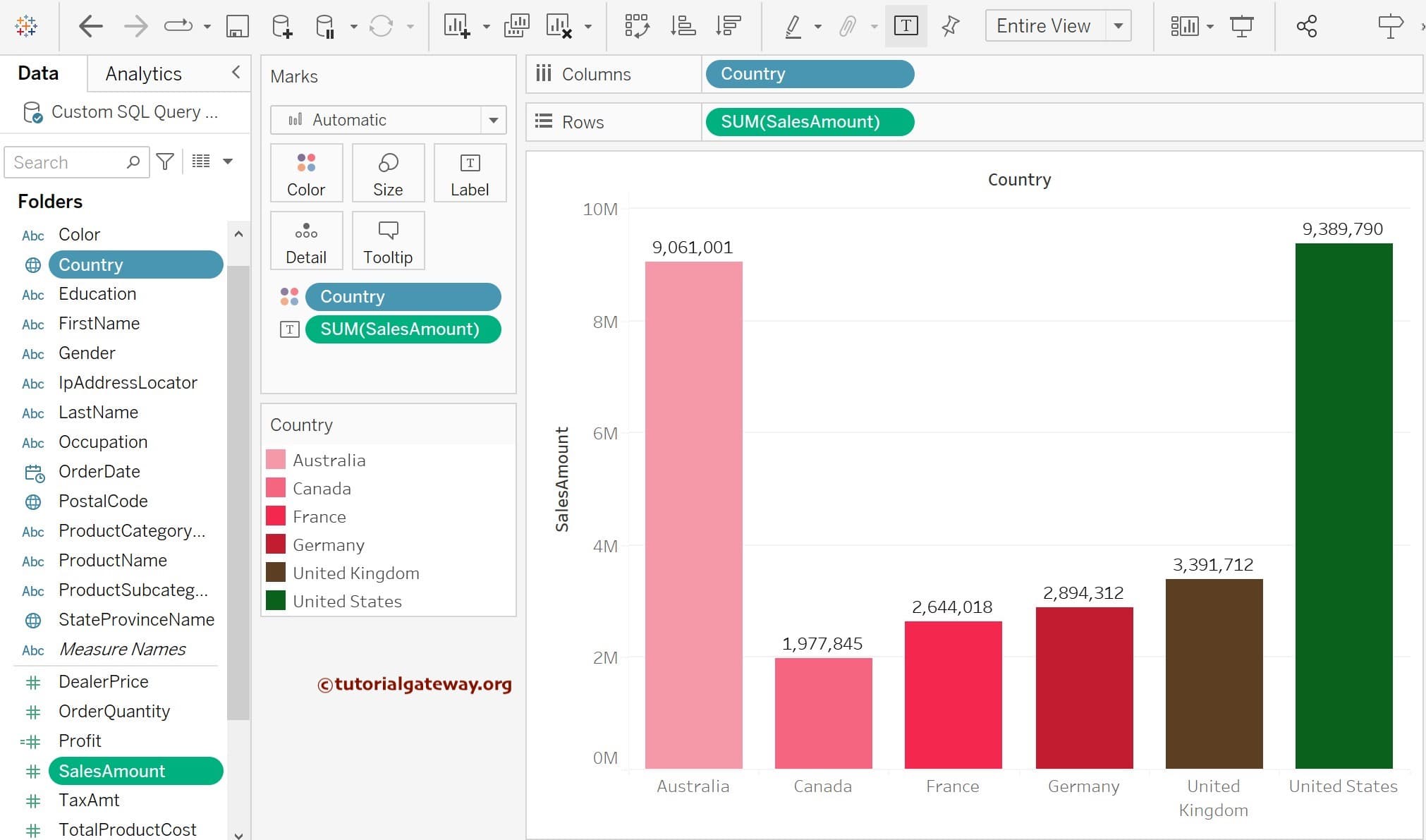
Dragging a Measure to the Rows shelf and a dimension to the Columns shelf will automatically create a horizontal bar. So, to create a Horizontal Bar chart, Drag and drop the Country Dimension to the Row Shelf and the Sales Amount to the Columns Shelf. Since the Sales Amount is a Measure value, it will aggregate to the default Sum.
The second approach using the Show Me window
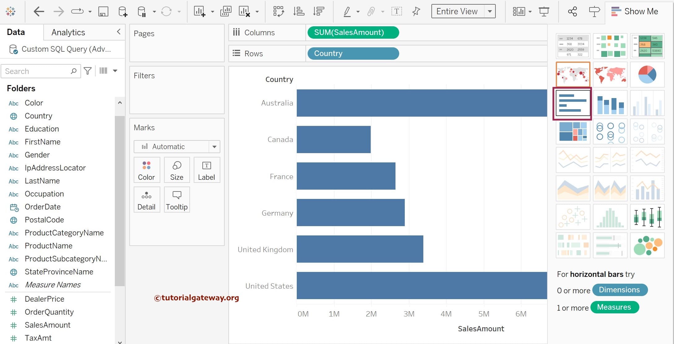
The bar chart is a predefined visual in the Tableau Show Me window, so you can use the Show Me window to create one for yourself. Please expand the Show Me window and hover over the marked one to check the required fields. If you look at the information, it says horizontal bars need 0 or more Dimensions and 1 or more Measures. So, use the control or command key, select Country and SalesAmount, and click the shown horizontal bars option from the Show Me window.
A new horizontal bar graph will display once you click that option from the Show Me window, as shown below. If you observe, it shows the Sales amounts on the X-axis and the Country names on the Y-axis.
The third approach of creating a Tableau Bar Chart
Apart from the above two famous options, there is another way of creating horizontal or vertical bar charts using the Marks shelf. When you select a Dimension and Measure, it makes a bar, but if you choose the Date or the desktop miss to create automatically, you can use the Marks shelf.
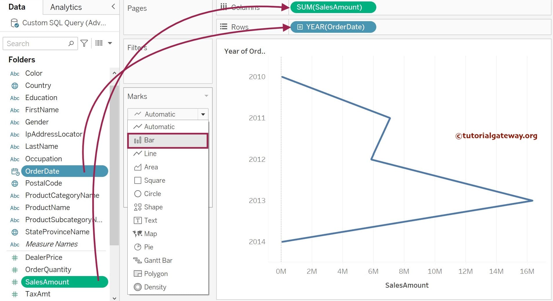
To demonstrate the same, we added the Sales Measure to the Columns shelf and the Order Date to the Rows shelf (by default, it chooses Year). As you can see from the below screenshot, it displays the Line chart because when the date field is added, Tableau automatically shows the Line chart. In that case, please change the Marks type from Automatic (default) to Bar.
Once you change it, the desktop will display the Horizontal Bar chart, as shown below.
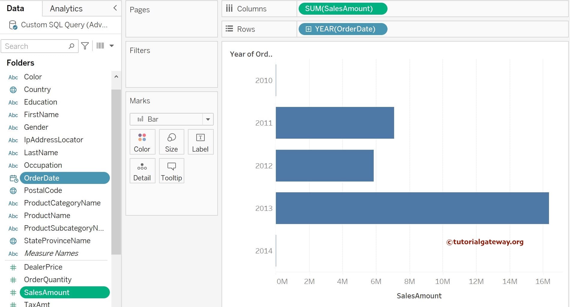
Tableau Vertical Bars or Column Chart
You can use all the approaches mentioned above to generate vertical bars. This example will explain the most commonly used technique, yet simple.
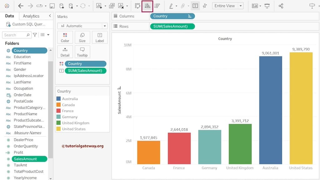
Dragging a Dimension to the Rows shelf and a Measure to the Columns shelf will automatically create a column chart. So, to make vertical Bars or column charts, drag and drop the Sales Amount to the Row Shelf and the Country Dimension to the Columns Shelf. From the screenshot below, you can see the Tableau Column Chart.

Swap Rows and Columns
Tableau allows us to convert the Horizontal Bar to the Vertical Column Chart and vice versa. To do this, please click the Swap Rows and Columns option (marked red) present in the Toolbar.
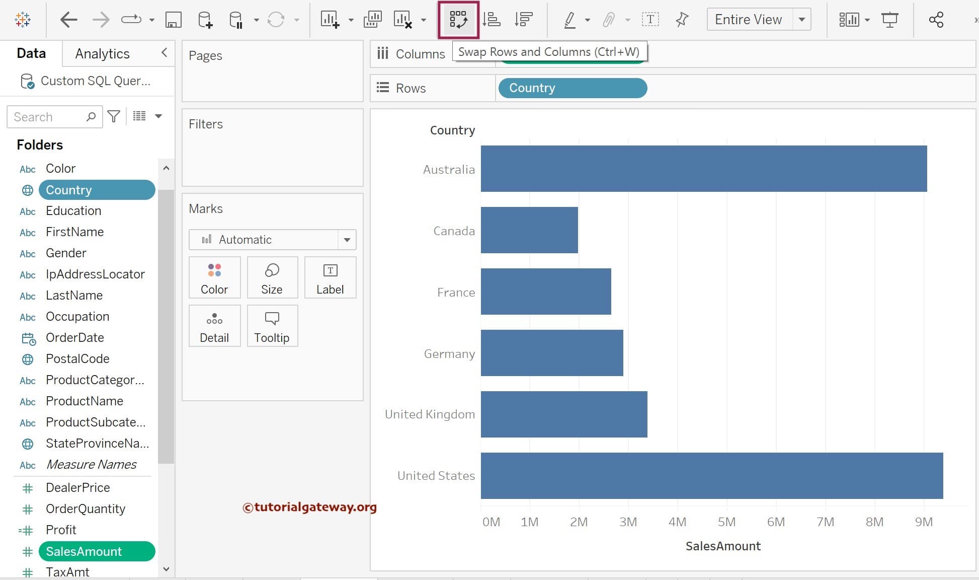
The above screenshot provides a perfect result to check which country has a larger or smaller bar, where large represents the highest sales and small means the least. Still, we cannot identify the exact amount of Sales for each country. Therefore, we must display the Data Labels to resolve these situations.
How to add Data labels to the Tableau Bar Chart?
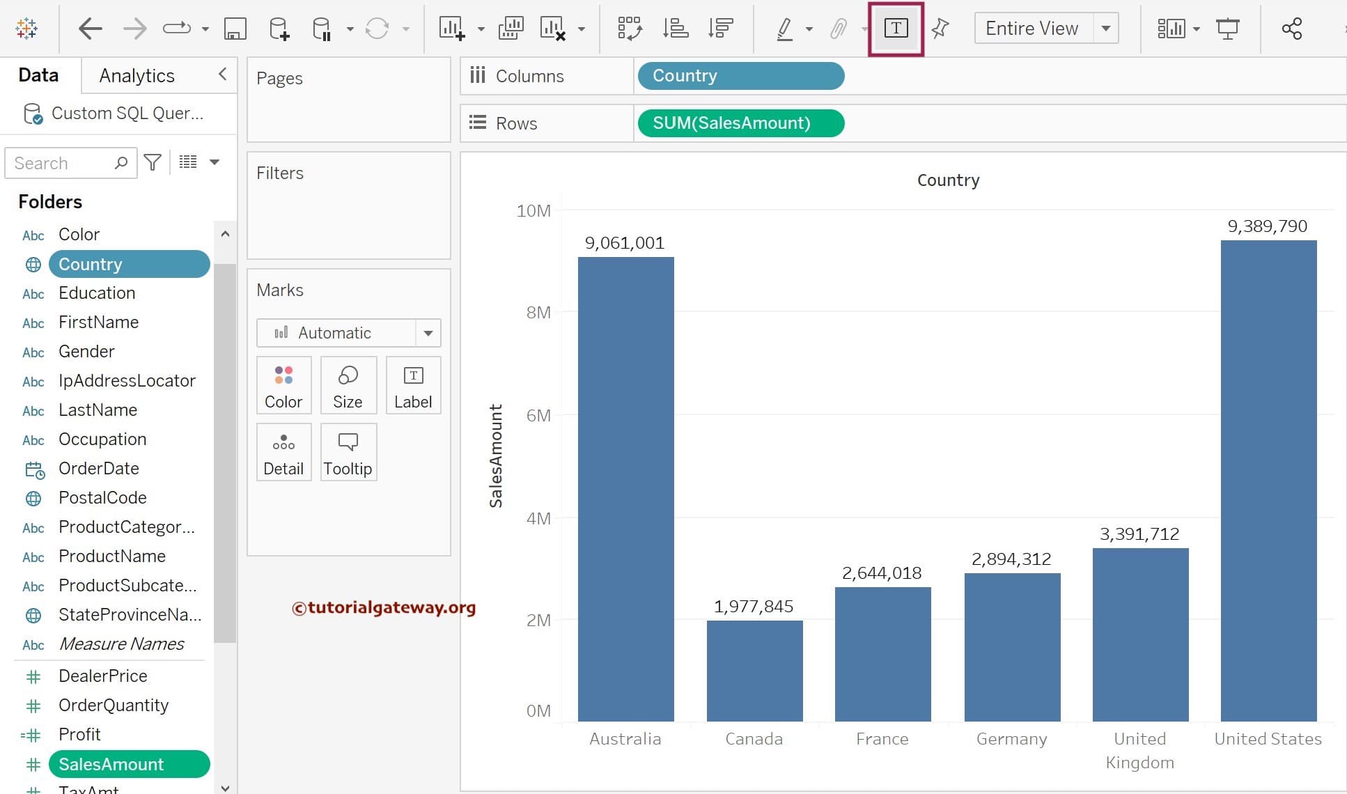
There are multiple ways to implement Data labels, and the first and easiest method is using the Toolbar. Please click the T button (marked red) to automatically add data labels to the bar chart using the Measure (Sales).
The above approach is the easiest, but you don’t have any control over what to display. For example, you must use the manual process to show other measures like Profit or anything else.
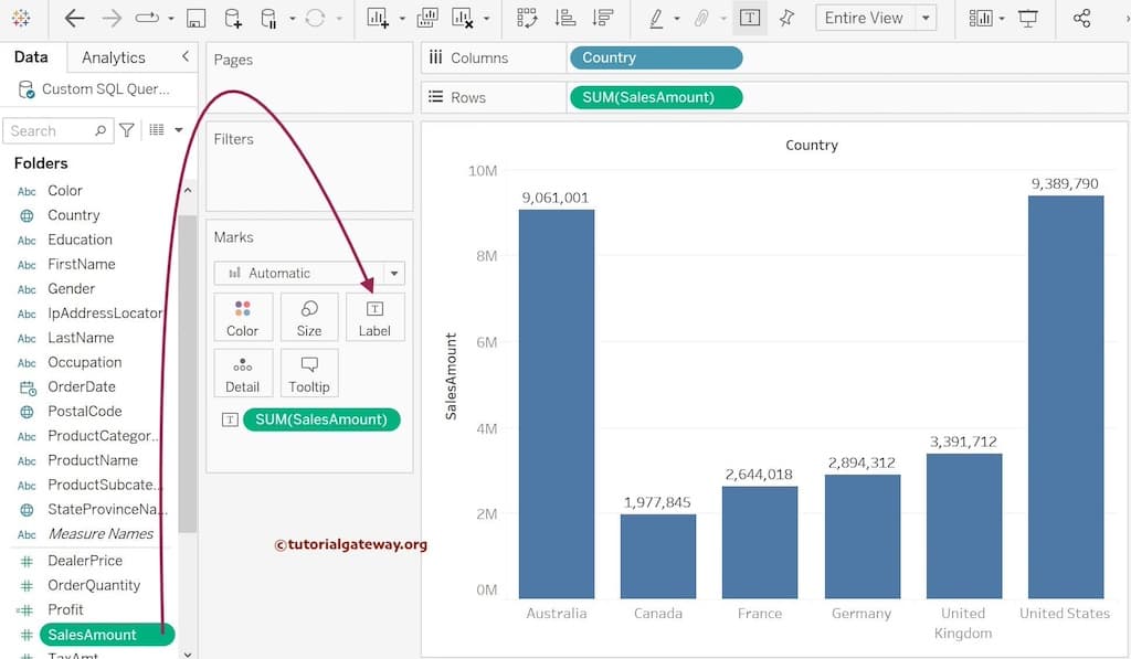
To add data labels manually in the Tableau Bar Chart, please drag and drop the data Label values from the Dimension or Measures Pane to the Label card on the Marks shelf. We want to display the Sales Amount as Data labels in this example. Drag and drop the Sales Amount from the Measures region to the Labels option. Once you do, you can see the Data Labels in the Bar chart Reports.
Stacked Bar Chart Example
Creating a Tableau stacked bar chart is more straightforward than any other Business Intelligence tool. These are very helpful to visualize multiple dimensions against a single measure.
In this example, we want to divide the country sales based on the product color. So, we are dragging the Product Color from the Dimension Region to the Color shelf in Marks Card. Once completed, you can see the Stacked Bar Chart. The Desktop allocates default colors for every product color. Still, from the Marks Region, you can edit the colors by selecting the Edit Colors.. option.
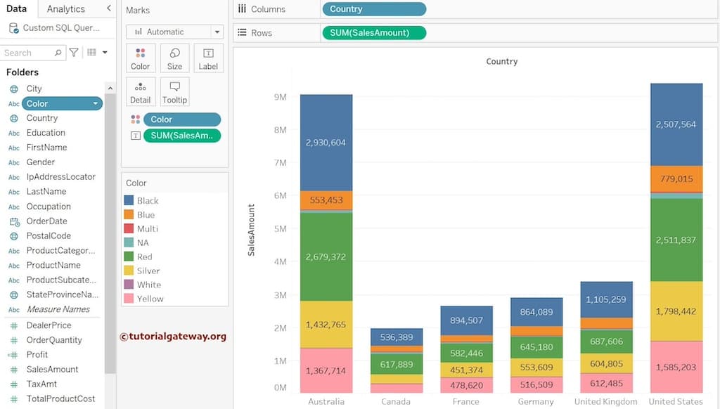
You may not notice a few colors as eight colors divide each country. So, let me replace the Product Color Dimenion with the Occupation column. From the screenshot below, you can see a better stacked bar chart.
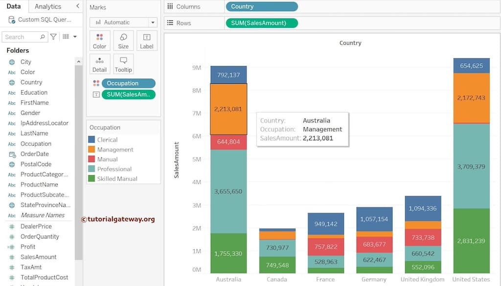
Categorical Stacked Bars: Adding an extra Dimension before the Tableau Measure value on the Rows shelf will divide the regular column or stacked bar chart into multiple categories. It is helpful to subdivide the measures for different regions, segments, categories, or years.
To demonstrate the same, we have added the Year(Order Date) column before the SUM(Sales Amount) on the Rows shelf. Remove the Occupation column from the colors shelf if you want the regular bar chart divided based on categories.
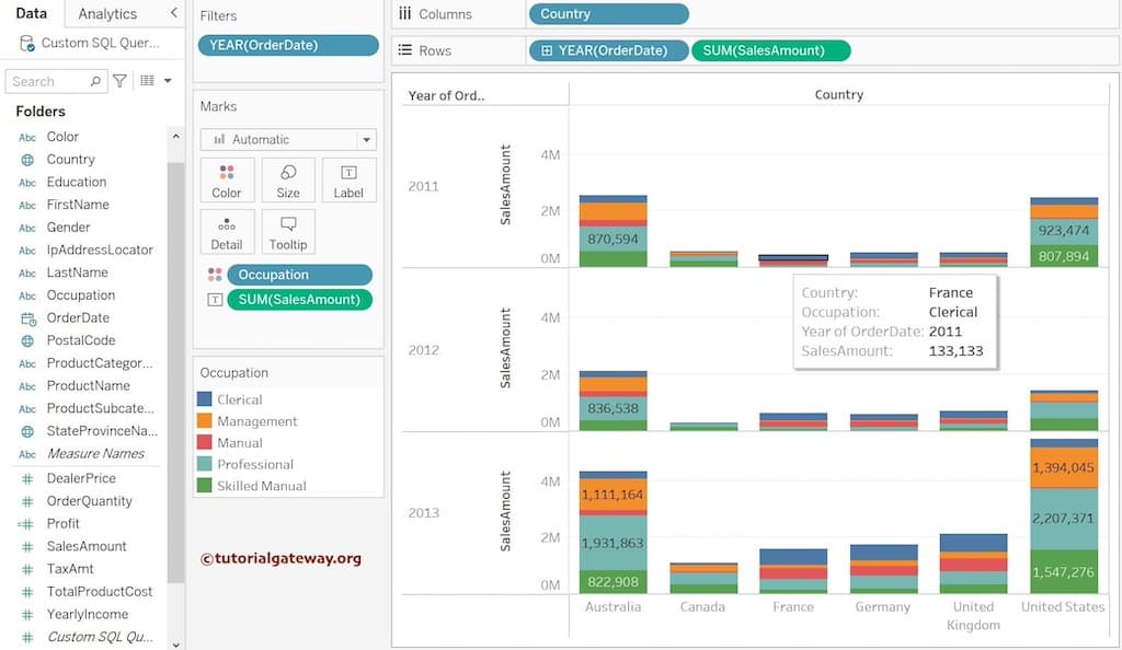
Tableau Side-by-Side Bar Chart
Adding an extra dimension besides the existing dimension value on the Columns or Rows shelf will create a Side-by-Side Bar Chart. This chart is helpful to view or divide two dimensions against a single measure or vice versa. We have already explained this in detail in the Side-by-Side Bar Chart, so please refer to the same.
In this example, we added Country and Color Dimensions to the Columns Shelf and SUM(Sales Amount)to the rows shelf. It will create a Side-by-Side Bar Chart. However, let me add the Sales Amount to the Label shelf to show the data labels and add Profit to the Color shelf to change the bar colors based on the profit.

Sorting Tableau Bar chart
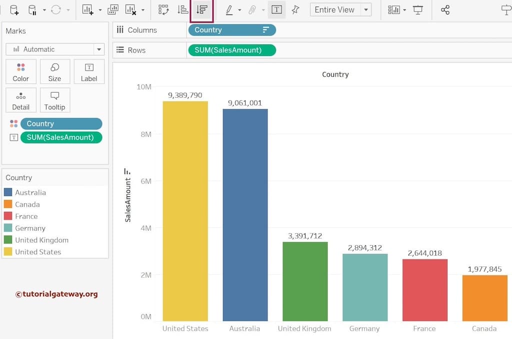
To sort the horizontal bar chart or vertical columns by length (Measure value), click the Sort icons in the Toolbar.
Please click the marked one (red box) to sort the Country by Sales Amount in ascending order. From the screenshot below, you can see the country names in ascending order based on the bar length or their respective sales.
Similarly, click the button in the red box to sort the Country names by Sales Amount in descending order.
Please refer to the following links to check the remaining bar charts.
How to Change the Tableau Bar Chart Size?
This section will show you how to change the Bar Chart sizes with an example. In general, all the rectangle bars will be displayed in the same size. However, we can use the size shelf to change them per our requirements.
For this example, we use the same country-wise sales report. We can use the Slider under the Size shelf to change the bar sizes. You can increase or decrease the widths of all rectangle columns.
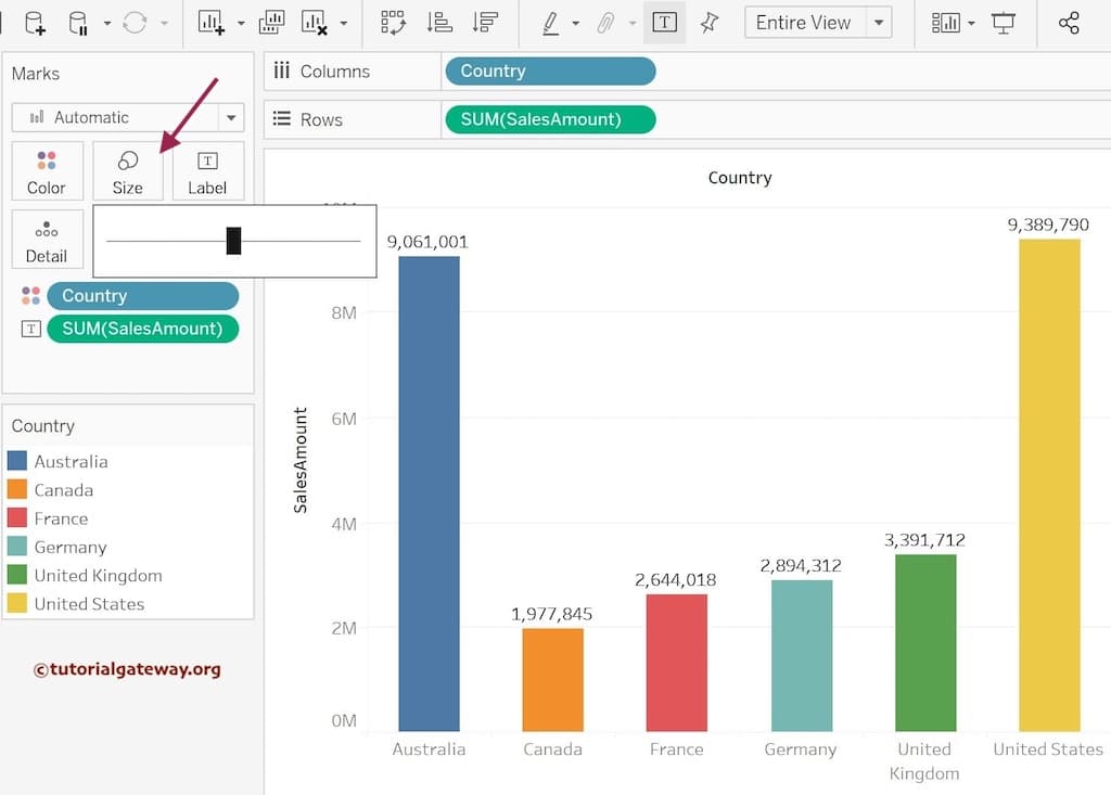
Whatever you perform above will reflect on all the rectangle bars (uniformity). What if you want different sizes based on the orders or profit?
You can achieve this change in the Tableau Bar Chart by adding a Measure value to the size shelf. Drag and drop the Profit measure field to the Size shelf. As you can see, the size or width of the vertical bars depends on the profit. By viewing the chart, one can understand which country simultaneously has the highest sales and profit.
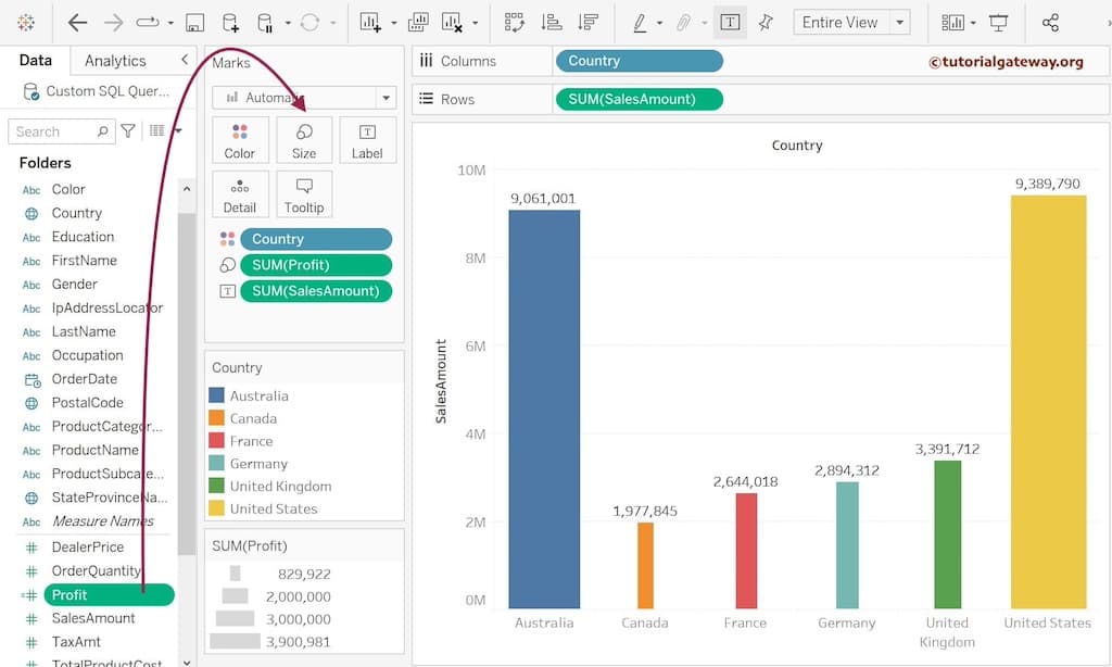
TIP: Replace the profit measure with the order quantity to show the bar widths based on the order quantity. Use the Swap Rows and Columns button to change this column chart to a horizontal bar chart with different rectangle widths or sizes.
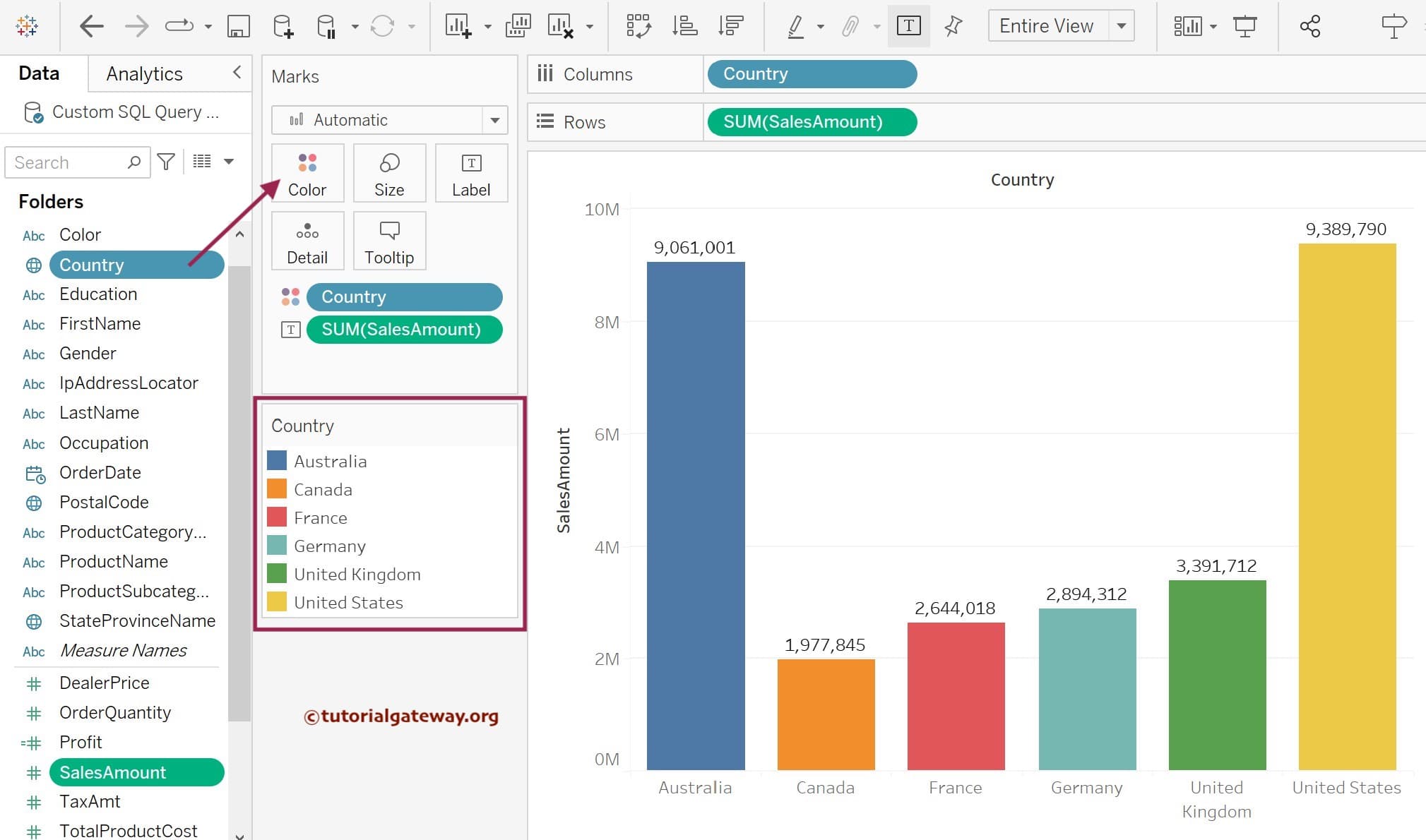
How to Change Tableau Bar Chart Colors?
This section will show you how to change the Bar Chart colors with an example. In general, all the rectangle bars will be displayed in blue color. However, we can use the color shelf to change the color to red, green, etc.
Drag and drop the Country column field from the Dimension region to the Color shelf to produce a unique color for Australia, Canada, France, Germany, the United Kingdom, and the United States.
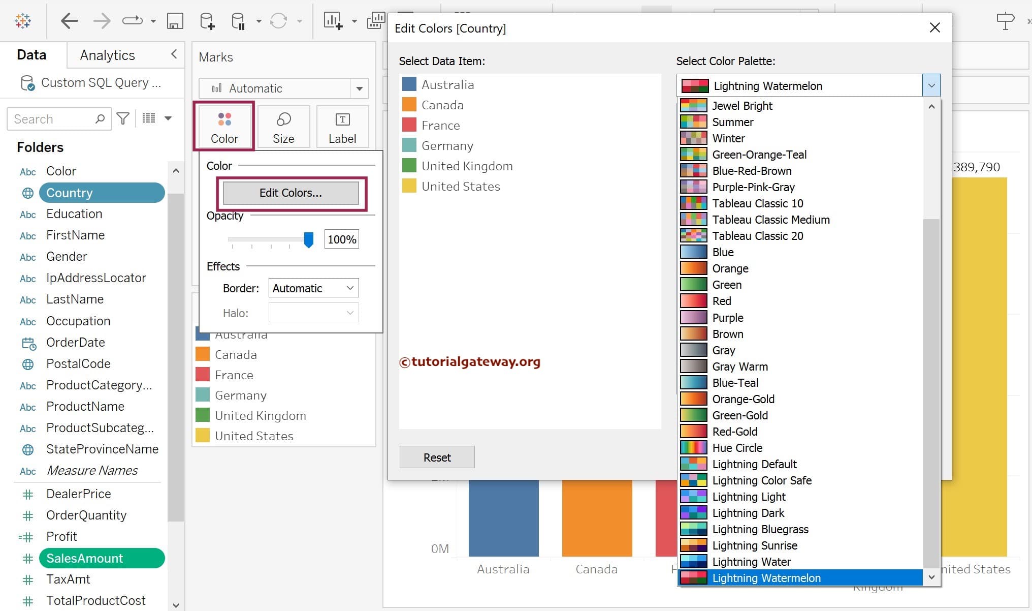
You don’t have to stick with these default bar colors because Tableau allows you to change the individual colors and the whole palette of a chart. To access them, please click the Color shelf and hit the Edit Colors button to change the palette. Use this window to select the Color Palette, or click the individual item and change its colors. Here, we have chosen the Lightning Watermelon.
Now, you can see the bar chart with different colors of the Lightning Watermelon theme.
The above approach displays colors based on the dimension field. Sometimes, you might need a measured value to compare which rectangle bar performs well—for instance, color thickness by Profit or the number of orders. Let me replace the Country Dimension on the Color shelf with Profit Measure to demonstrate the same. Next, click the Edit colors and select the palette. Here, we used the Red-Gree-Gold Diverging.

Now you can see the bar chart with colors depending on Profit Measure.

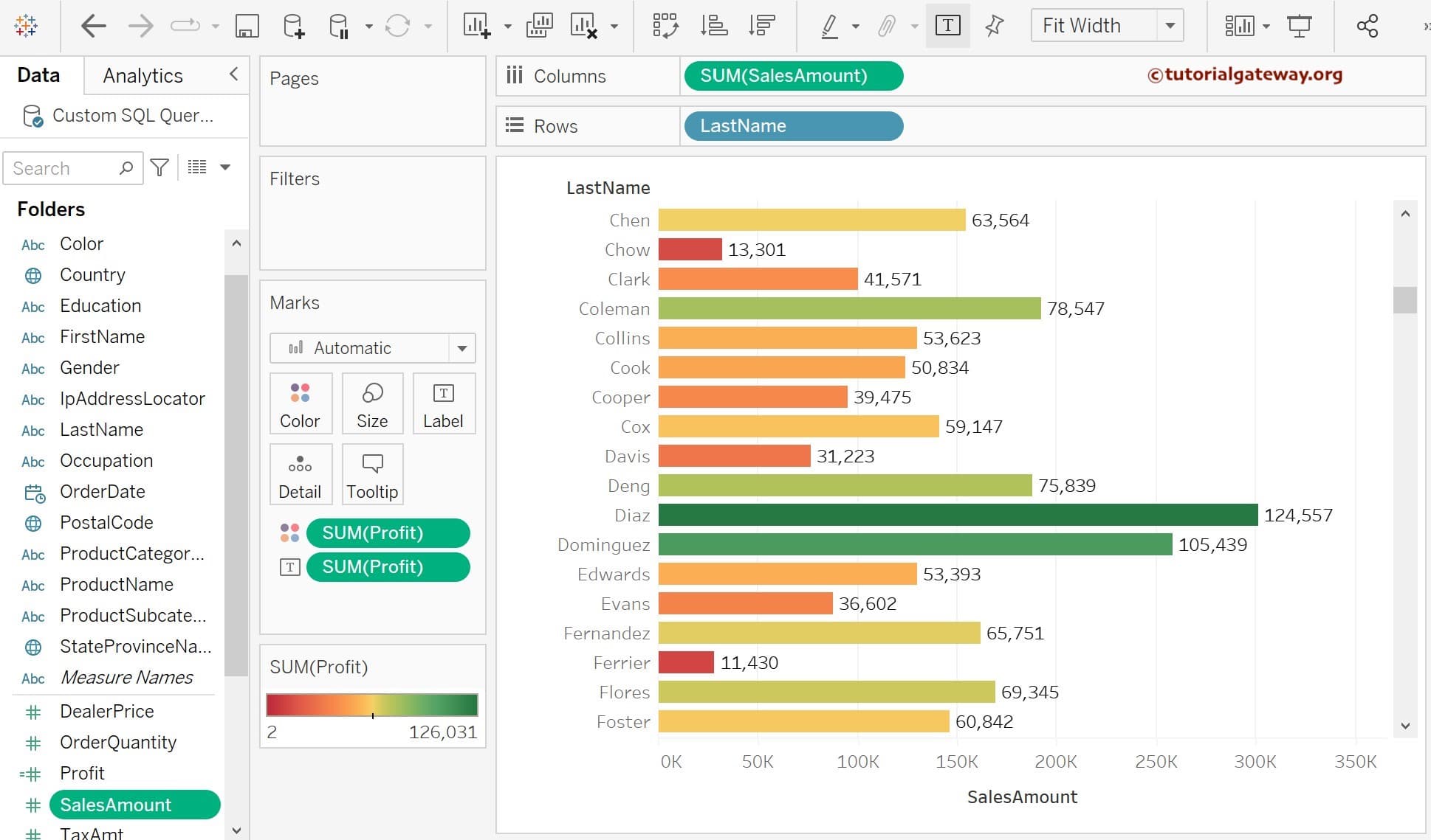
Since there are few rectangle bars, we can’t see more colors. So, we created a sales Tableau bar chart against the customer’s last name to demonstrate the color change. Next, add the Profit to both the Color and Label shelves.
Look at the below bar chart. We can quickly identify which customer generates the most Profit (valued customer).
Comments are closed.