This article shows you how to create a Tableau Side-by-Side Bar Chart with an example. The Side-by-Side Bar or column charts help see multiple measures against the dimension or multiple dimensions against a single measure. It means we need any three fields to generate this kind of graph.
How to Create a Tableau Side-by-Side Bar Chart?
First, we will try two dimensions against the measure. So, please select Color, English Country Region Name dimensions, and Sales Amount Measure and click the Side by Side Bars option in the Show Me window to create a chart.

By default, it generates the Side by Side Bar Chart and automatically adds Color dimension to the Color shelf to display unique colors.
- Tableau tutorial.
- For the data source, visit the Tableau Bar Chart.
- For more Charts, please refer to the Tableau Charts article.

Create Tableau Side-by-Side Bar Chart Manually
Drag and drop the English Country Region Name to Columns Shelf and Sales Amount to Rows Shelf to generate a bar chart. Next, drag the Color dimension to the Columns shelf.
It will automatically create a Side by Side Bar Chart. Here, we must manually add the dimension to the Color shelf to assign unique colors.

It will create the actual side-by-side bar chart that we have shown above. I suggest you refer to the second image on this page.
First, expand the Color section within the Marks shell to change the default colors of the rectangle bars. Next, click the Edit Colors button to change the palette. Here, we have chosen the Lightning Watermelon.

From the below screenshot, you can see the refreshing colors.

Let me remove the dimension from the Color shelf and add the profit Measure to show you the color based on the profit.

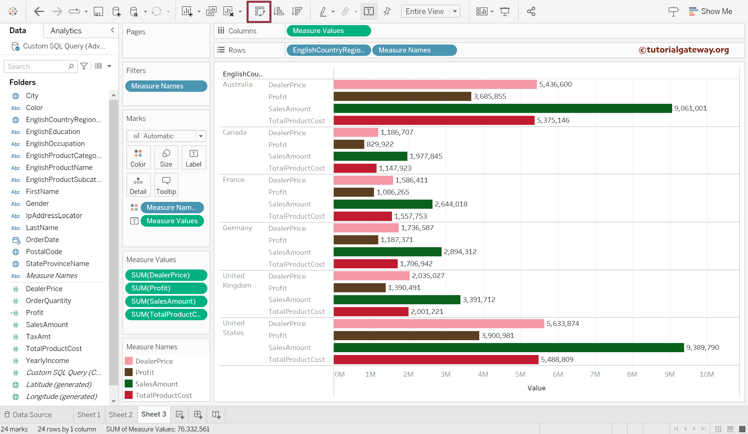
Tableau Side-by-Side Bar Chart With Multiple Measures
Select the English Country Region Name dimension and Sales Amount, TotalProduct Cost Measures, and click the Show Me window Side by Side Bars option.
Now, you can see the Side-by-side column chart of multiple charts against a single dimension.

Double-click the remaining (required) measures to add them to the chart. Click the T button or Control + select the Measure Values in the Rows shelf and add them to the Label Shelf.

Use the marked button to convert the chart to a side-by-side bar chart. Please refer to the Tableau Stacked Bar Chart and Tableau Highlight Table articles.