A Tableau Pie Chart is a graphical representation of data in the form of a round circle divided into different categories or pies. Each pie represents a category, and its size is directly proportional to the numerical data. Pie charts make it easy to represent high-level data in a more meaningful way.
The Pie Chart in Tableau is useful for displaying the Sales by region, Countrywide customers, Sales by Country, etc. These are also helpful in the dashboard design. For example, we can use the pie chart to display Country-wise sales and then the Action filters to drill further down.
This article shows how to create a Pie Chart with an example. We will use the Data Source we created in our previous example article for this.
How to Make a Pie Chart in Tableau?
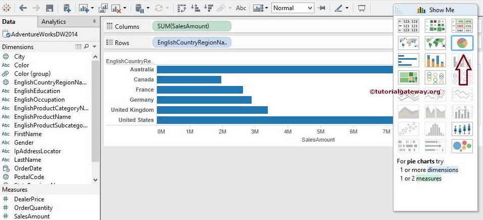
To create a Pie chart, first, drag the Sales Measures to the Columns shelf. Since it is a Measure value, the Sales Amount will aggregate to a Sum(default). Next, Drag and Drop the English Country Region Name from the Dimension Region to the Rows Card. Once you drag them, the following bar chart screenshot will display.
Please visit the Labels in Reports and Charts article to understand the DataSource and DataSet of this bar chart report from the SQL Server. Next, we must change the default Bar chart to the Tableau Pie Chart using the Show Me option. Please expand the Show Me window and select the pie chart button, as shown below.
Once you select it from the Show Me window, the Pie Chart plot will display different default colors. Please use the Size option in the Size Card to expand or shrink the Pie chart.
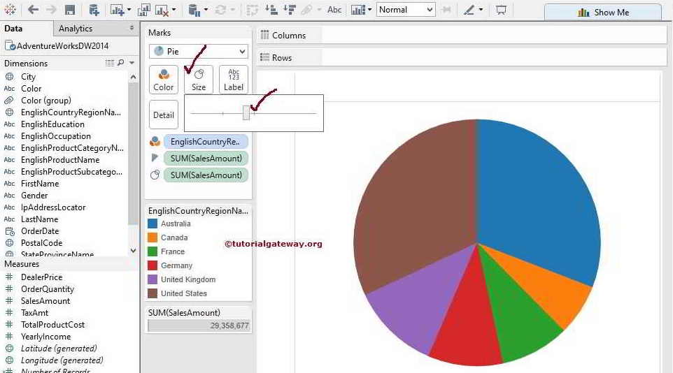
If you observe the above screenshot, it provides the perfect results. However, within the circle, we cannot identify the difference between the Sum of Sales measures in France and Germany. To resolve these situations, we have to display the Data Labels.
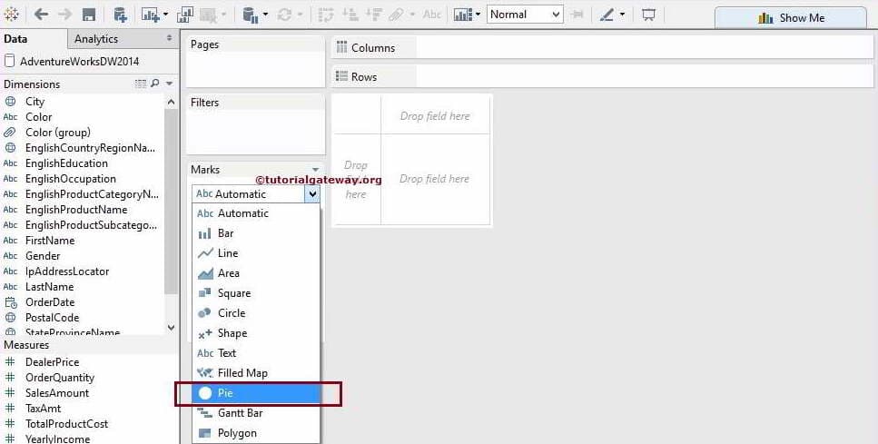
Create a Tableau Pie Chart using Marks Shelf
This method of creating a pie chart is very easy and straightforward. First, please select the Pie mark option from the drop-down list present in the Marks Card.
Next, drag and drop the Sales from the Measure Region to the Field region. Next, drag and drop the English Country Region Name from the Dimension Region to the Color option in the Marks Card. Once you drag them, the following screenshot will be displayed. I hope you understand how easy it is to design or build a Tableau Pie Chart.
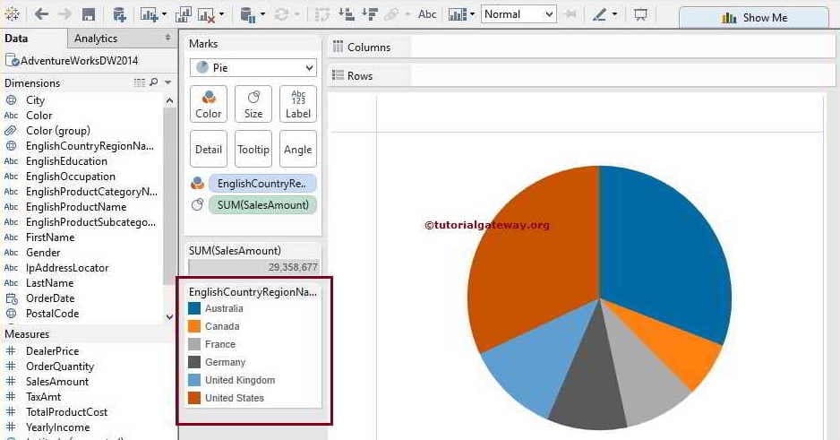
Remember, the Pie mark allows us to add Dimensions and Measures as the Data Labels. To demonstrate this, we just placed the total Sales Amount Measure and English Country Name on the labels Option present on the Marks card.

It is always advisable to use the Tableau Pie chart for High-level information. For instance, if you use the same for State-wise sales rather than Country-wise, you will end up with the following screenshot. If you look at the entire view carefully, we can’t even identify a few regions because the result is a rather small pie.

How to Format Tableau Pie Chart colors, labels, and sizes?
One of the most common questions raised by any developer is formatting Pie Charts. Because the Default colors or Default pallet may or may not be attractive to the end user.
Add Data Labels to the Tableau Pie Chart
Please select the English Country Region Name and Sales Amount and click the Pie Chart from the Show Me Window to create the chart.
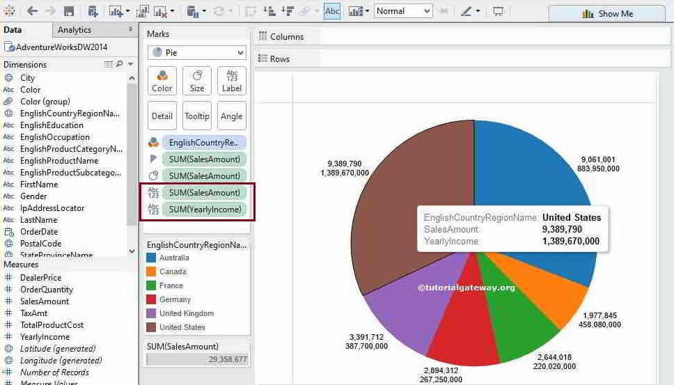
To add Pie chart labels, please drag and drop the text information or values from the Dimension or Measure Pane to the Label card on Mark’s shelf. In this example, we want to display the Sales Amount as Data labels, so drag and drop the Sales Amount from the Measures region to the Labels option. The other option is to click the T button that we marked below to display the data labels.

Tableau Pie Chart allows us to add Multiple Measure values as Data Labels. It can be handy when comparing the Total Sales against the Profits by Region. To do this, use the above technique to place the Yearly Income.
How to add Borders and Colors to a Tableau Pie Chart?
This section shows how to add borders and colors to a Pie chart. First, select the English Country Region Name and Sales Amount and click the Pie Chart from the Show Me Window. Next, drag and drop the English Country Region Name and Sales Amount to the label section and place the data labels inside the Pie chart.
Click the Color shelf to expand it. Next, expand the Border option under the Effects section. You can see the white lines between each slice once you change the Border option from the default Automatic (None) to White.

Let me change the border color to Black to show you the outer circle of the border.

How to Change the Slice Colors?
Apart from adding the border colors or lines, you can change the actual pie slice colors of the Tableau chart. The first option is to click the Colors Marks to open the small window and click the Edit Colors button to change the palette or individual slice colors.

Click the Apply button to see the real-time changes.

You can select or click the individual country name and choose the appropriate color. For now, let me choose the Classic 20, click the Apply button, and then click OK to finish formatting this Tableau Pie chart. And the final output of the Pie chart with borders is.

The section option to change the pie slice colors is to click the down arrow and select the Edit Colors.. option from the context menu, as shown below.
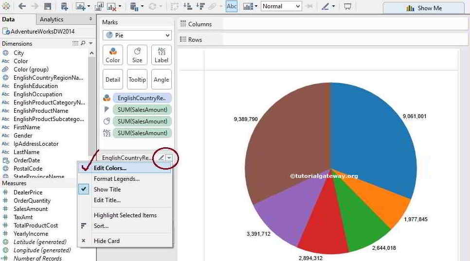
Once you choose the option, an Edit Colors window will open to select the Color Palette for the English Country region name. It is the same window that was shown before.
How to Display a List of Multiple Pie Charts in Tableau?
This section shows how to display or show the list of multiple Pie charts with an example. It helps display the pie chart for each section, country, product category, etc.
Drag and drop the English Country Region Name to the Rows shelf. Under the Marks shelf, change the Marks from Automatic to Pie option to display multiple pie charts.

Drag the Order Quantity measure to the Size shelf. As you can see, the size of each pie or circle depends upon the order.

Add the English Product Category Name to the Color shelf to convert the circle to a pie chart. You can now see the list of multiple pie charts on the Tableau desktop. Please click the T button or add the order quantity to the Label shelf to show the data labels.

TIP: Please refer to the Display Percentages, Sort Asc or Desc, Add Data Labels inside the Pie chart, and create using the Multiple Measures article.