Tableau Dual Axis chart is useful for comparing sales amount data with total product cost or comparing sales against profits, etc. This article will show you how to create a Dual Axis chart with an example.
For this dual axis report, we will use the Data Source we created in our previous article. So, please visit the Data Labels in Reports article to understand the Tableau Data Source.
Tableau Dual Axis Chart Example
To create a Dual Axis chart, first, drag and drop the Color Group (Created in the Grouping article) from the Dimension Region to the Column Shelf. Next, Drag and Drop the Sales Amount from the Measures Region to the Rows Shelf. Because it is a Measure value, the Sales Amount will aggregate to the default Sum. Once you drag them, the Bar Chart report will be generated.
In this Tableau dual axis combination charts example, we want to compare SalesAmount against Total Product Cost. So, drag and drop one more measure value, i.e., Total Product Cost from Measures Region to Rows Shelf. Since it is a Measure value, the Total Cost will aggregate to the default Sum.
Please assign Data Labels or data points to the Chart by clicking the Abc label button in the toolbar. Next, select the Total Product Cost in the secondary to create a Tableau Dual Axis chart. Next, right-click on it to open the context menu. From that, please select the option below.
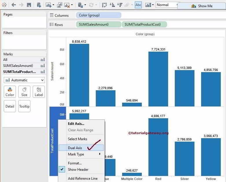
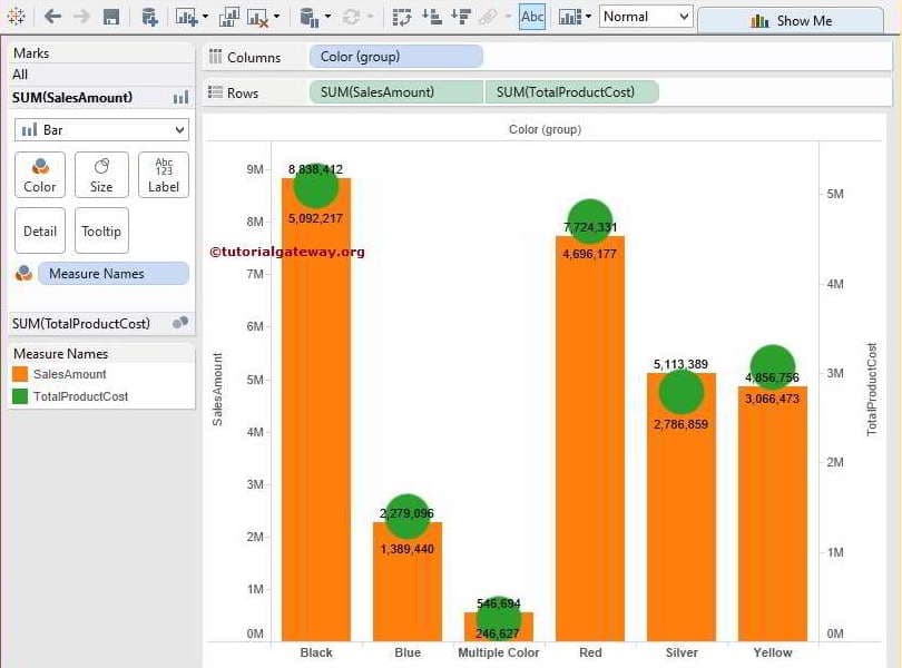
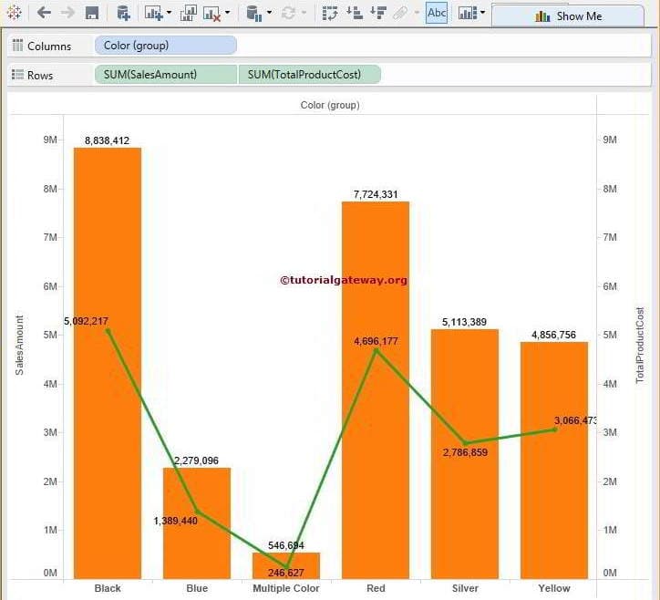
Once you choose the option, the following screenshot will be displayed. The screenshot below shows the Color Group horizontally and the Sales Amount and Total Product Cost vertically, which acts as the Dual Axis.
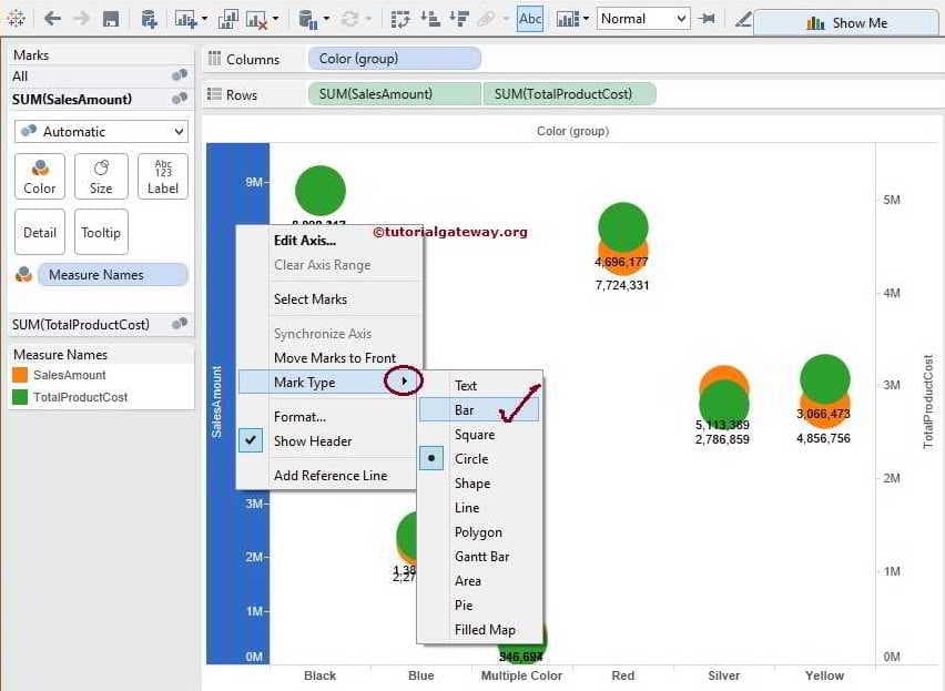
Let us change the Mark type from Automatic to more meaningful. We can do this in two ways. First, select the Sales Amount and right-click on it to open the context menu. From that, please select the Mark Type option and the Bar Chart for this Tableau Dual Axis demo.
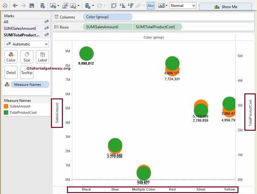
Once you choose the Bar Chart, it will display the Sales Amount Data.
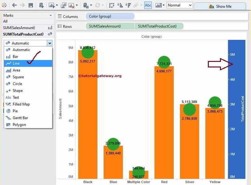
The second method of Dual Axis is to select the Total Prod Cost Yaxis and then select the Line type from the Marks card
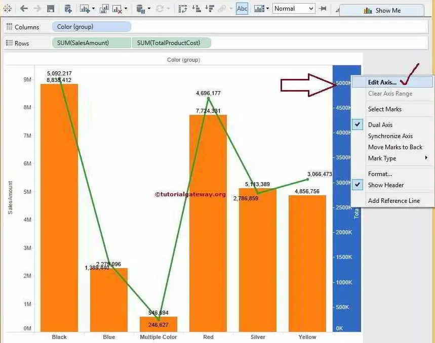
We successfully created a bar and line chart. However, you can observe that the Red Color Total Product Cost value of 4,696,177 is bigger than the Sales Amount value of 7,724,331. Because the Maximum value of the Sales Amount is 9 million, whereas the Total Product Cost is 5 million.
Synchronize Dual Axis
If you have no problem, leave it as it is. Otherwise, please select the Total Product Cost and Edit option to synchronize the dual axis in Tableau.
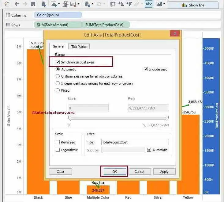
Once you choose the option, a new window will be opened to synchronize Axis since our aggregated Sales Amount and Total Product Cost values are the same. We can simply checkmark the Synchronize dual axis option.
Now, we got our Dual Axis Chart Synchronize final result.
Synchronize Tableau Dual Axis charts
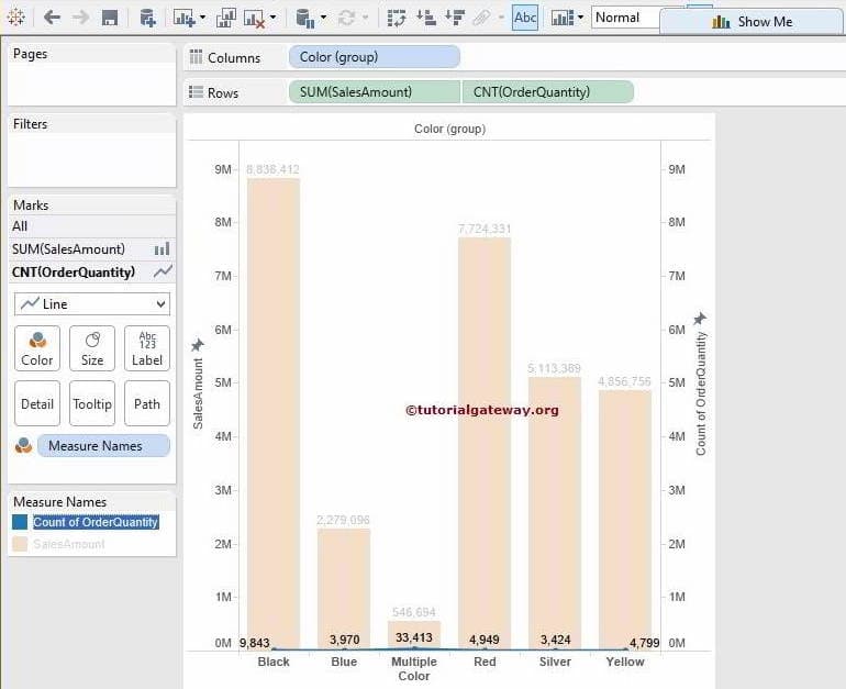
In this Synchronize Dual Axis chart example, we just replaced the Sum of Total Product Cost with the Count of Order Quantity.
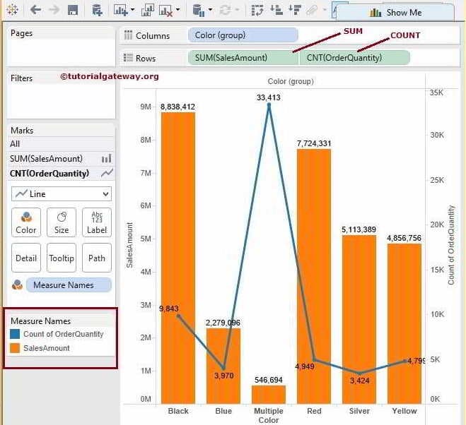
Since our aggregated Sales Amount and Order Quantity values are different, the Synchronize dual axes option is greyed out, as shown below. In these situations, we have to do it manually.
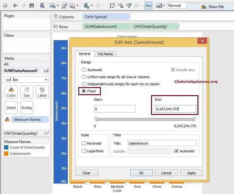
To synchronise the Tableau dual chart, select the Axis with the maximum value. Here, it is the Sales Amount with 9 million. Edit the option and select the Fixed option. Next, please copy the End value from the End text box.
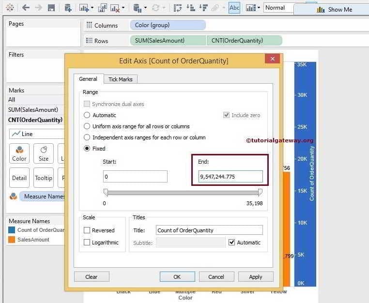
Next, change the option to fixed for Order Quantity. Then replace the End value with the SalesAmount End value (earlier copied End value).
The screenshot below shows that the values of Sales and Count of Order Quantity are the same. Here, the values of Order Quantity are too minimal to display. But you can see the blue line at the bottom. I hope you understood the creation of Dual Axis and synchronized the values.