The Tableau Stacked Bar Chart helps compare the data visually. This article will show you how to create it using the Sample – Superstore Data Source.
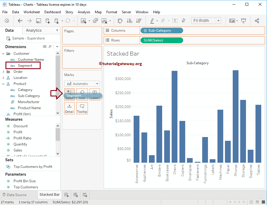
To demonstrate the Stacked Bar chart, first, drag and drop Sales from the Measures Region to the Rows Shelf to create it. Since it is a Measure value, Sales will aggregate to the default Sum. Once you drag them, Barplot will generate.
Create a Stacked Bar Chart in Tableau
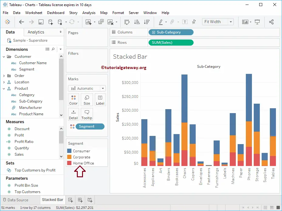
Next, Drag and Drop the Sub-category from the Dimension Region to the Column Shelf. Once you drag them, a proper Bar chart will generate, as shown below. In this example, we want to stack the Bar Chart by the Segments. So, we are dragging Segments from the Dimension region to the Color shelf in Marks Card.
Before this, please refer to the following links to check the remaining bar charts.
Once you drop the Segment field onto the Colors shelf, you can see the Stacked Bar Chart.
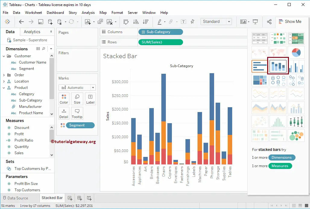
Create a Tableau Stacked Bar Chart using Show Me
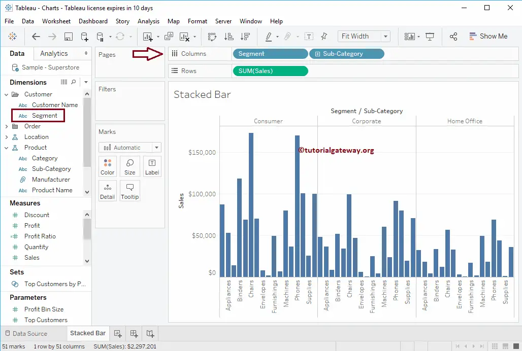
Let me remove the Segment field from the Color Shelf and place it right before the Sub-category in the Columns shelf.
We must change this to a Stacked Bar Chart using the Show Me option. Please expand the Show Me window and select the below-shown plot from the Show Me. Once you select it from the Show Me window, the Chart will display, as shown in the screenshot below.
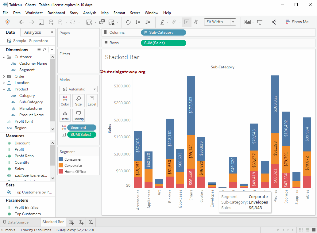
Add Data labels
To add data labels to the Tableau Stacked Bar chart, click the Show Mark Labels button in the Toolbar.
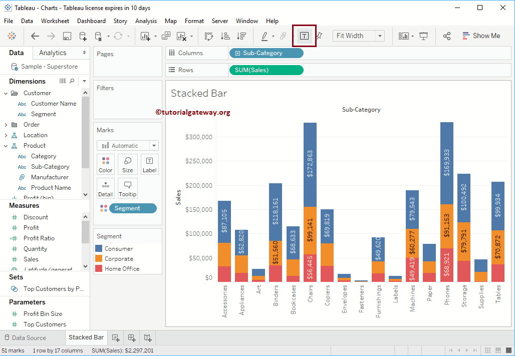
Or drag and drop the data Label value from the Dimension or Measures Pane to the Label shelf in Marks’s Card. In this example, we want to display the Sales as Data labels. So, drag and drop the Sales from the Measures region to the Labels shelf.
Selecting or highlighting any specific block will show you the information at that particular point.