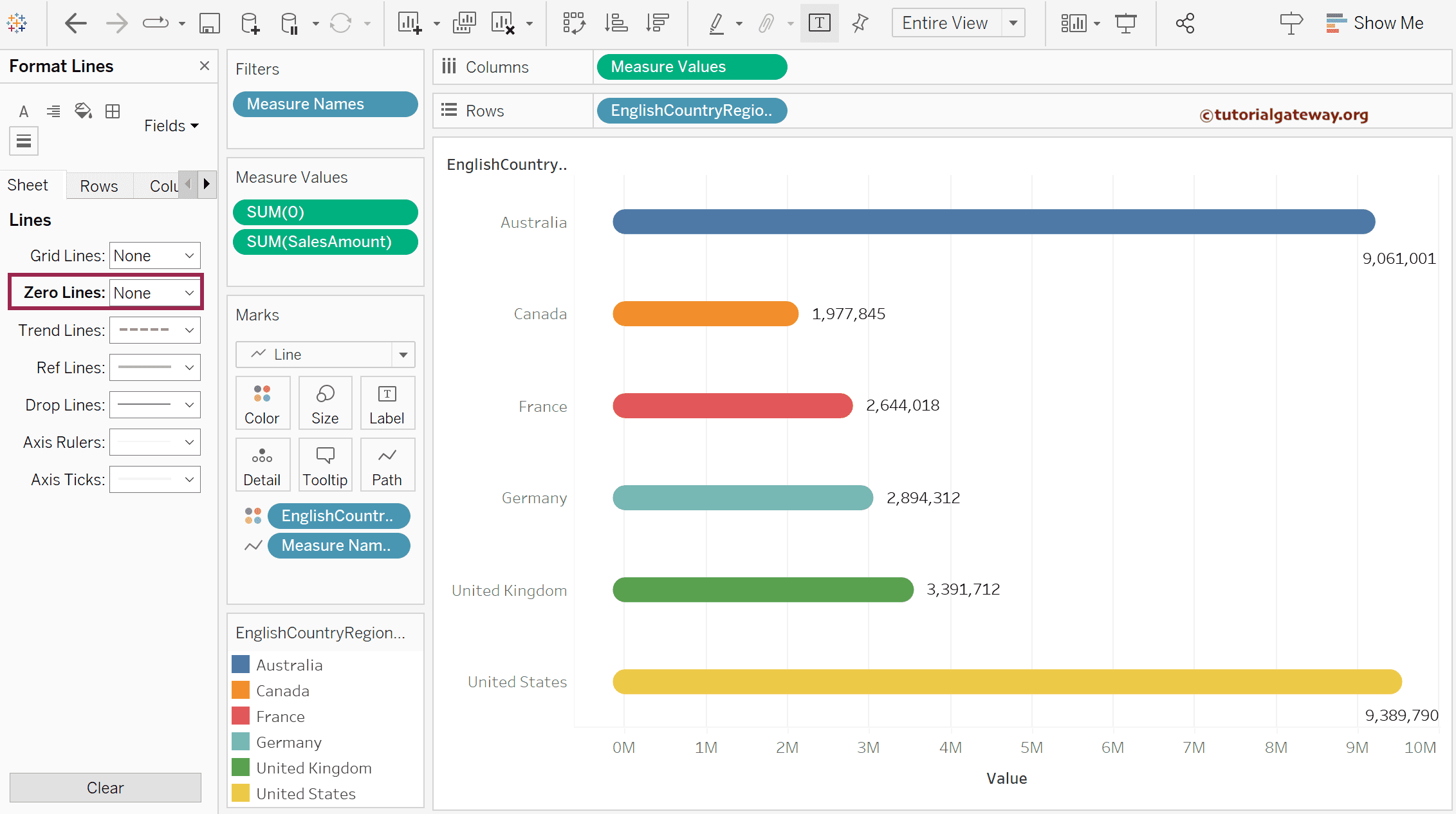
This article shows how to create a rounded edges bar chart in Tableau using the dual combination, calculated field, and line marks with an example.
Drag and drop the English Country Region Name to the Columns shelf. Then, the Sales amount to the Rows shelf to generate a bar chart.
How to create a rounded edges bar chart in Tableau?
Either use the down arrow to create a calculated field, or double-click the empty space beside the Sales in rows shelf and add 0 as value.

Drag the SUM(0) measure to the Sales Amount axis. Before this, please refer to the following links to check the remaining bar charts.

To create a rounded edges bar chart in Tableau, please change the Marks from default Automatic to Line type. From the below screenshot, you can see the lines with different angles. But first, drag the Measure names from the Column shelf to the Path shelf.

Now, you can see the straight vertical bars. Use the Size shelf to extend or increase the bar sizes.

Drag and drop the English Country Region Name to the Color shelf to add colors to the rounded edges bar chart.

You can use the below show button to convert the rounded edges vertical column chart to a horizontal bar chart.

Once you click the T button, the data labels will be added to the rounded edges bar chart. However, it adds the 0 axis value as well.

So, expand the Label shelf, change the Marks to Label option from All to Line Ends, and uncheck the Start of Line option label.

Use the format menu to remove their zero lines as well.
