The Tableau Grouped Bar Chart, also called side-by-side bars, is very useful for comparing data side by side visually. In this article, we will show you how to create a Grouped Bar Chart with an example.
For this Grouped Bar Chart demo, we will use the Sample – Superstore Data Source.
Grouped Bar Chart in Tableau Example
To create a Grouped Bar Chart, first, drag and drop Profit from Measures to Rows Shelf. Since it is a Measure value, Profit will aggregate to the default Sum. Once you drag them, the Bar Chart will be generated by Tableau. Next, Drag and Drop the Segment from the Dimension Region to the Column Shelf. Once you drag them, a proper Bar Chart will be generated.
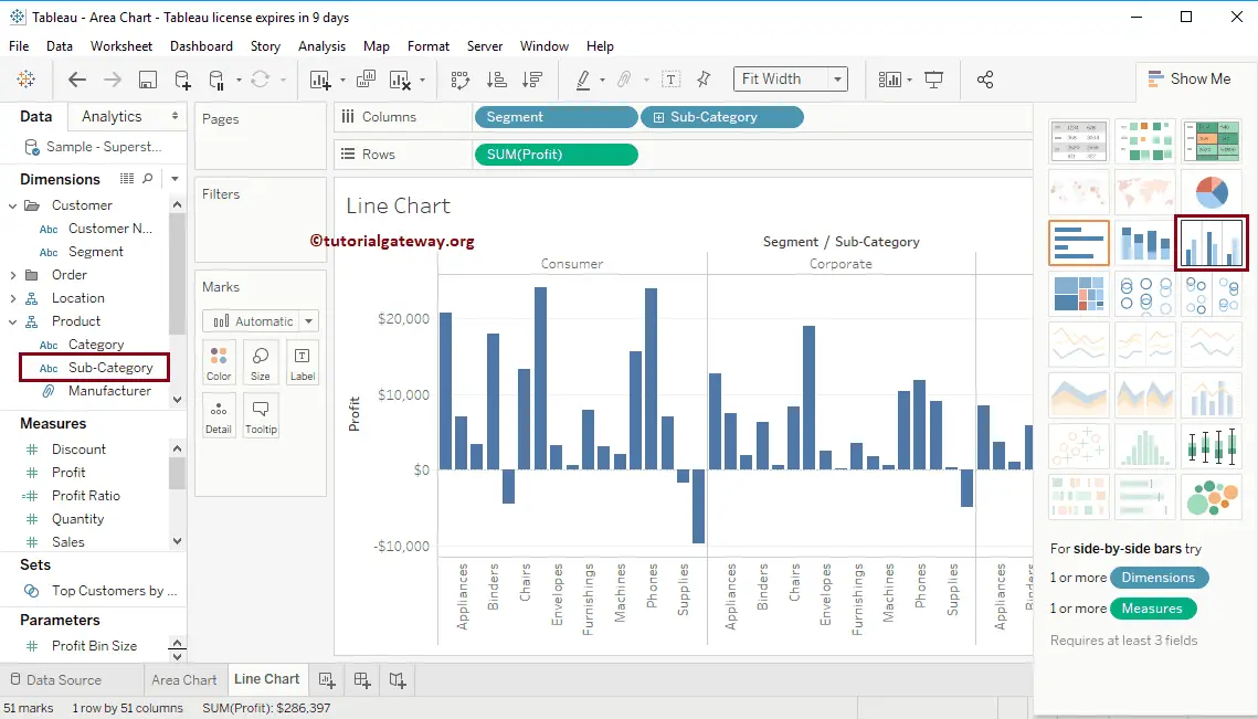
In this example, we want to group Sub-categories by Segments. So, we are dragging the Sub-category from the Dimension Region to the Columns Shelf. Now, you can see a grouped bar chart. Let me change this to a properly Grouped Bar chart.
To do so, please expand the Show Me window and select the Side-By-Side Bar Chart from it, and it creates a Grouped Bar Chart.
Before this, please refer to the following links to check the remaining bar charts.
- Gradient Bar Chart
- Progress Bar Chart
- Rounded Edges Bar Chart
- Side-by-Side Bar Chart
- Stacked Bar Chart
- List Of Charts
Once you choose the Side-by-side Bar Chart from the Show Me window, the Grouped Bar Chart will be displayed, as shown in the below screenshot.
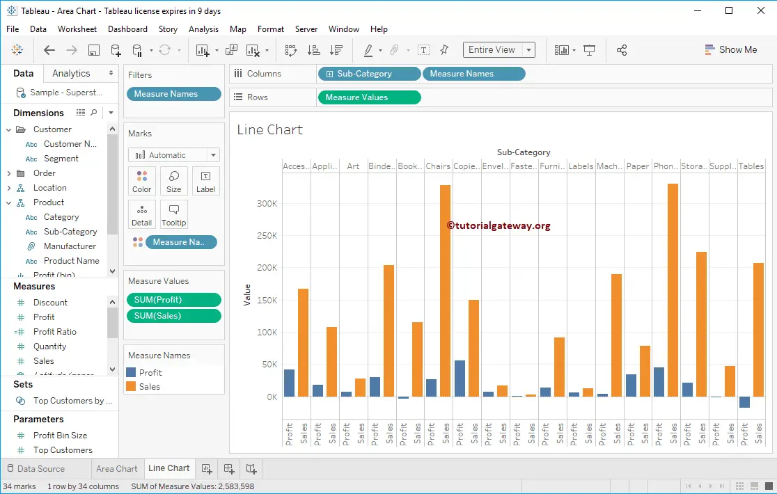
Create a Grouped Bar Chart in Tableau Example 2
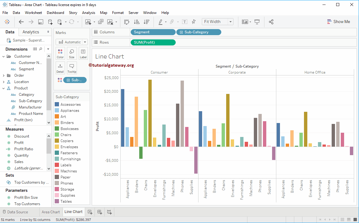
In this example, we want to compare Sales and profit using side-by-side bars. So, Drag and Drop the Sub-category from the Dimension Region to the Columns Shelf and Sales from the Measures Region to the Rows Shelf.
Next, drag and drop one more measure value, i.e., Profit from Measures Region to Rows Shelf. Since it is a Measure value, Profit is aggregated to the default Sum. To create a Grouped Bar Chart, please expand the Show Me window and select the Side-By-Side Bar Chart from it
Now you can see the grouped bar Chart comparing two measures
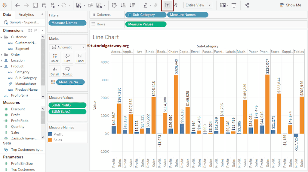
Add Data labels
To add data labels to the Grouped Bar chart in Tableau, please click on the Show Mark Labels button in the Toolbar.
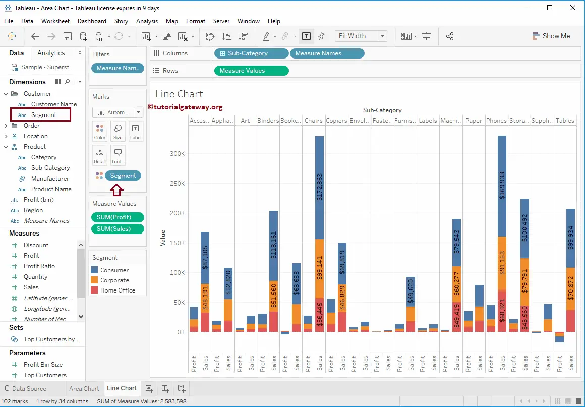
Grouped Stacked Bar Chart
You can convert the existing Grouped Bar Chart to a Stacked Group. Let me add Segments to the Colors shelf.