Maps are handy for visualizing geographical data, and in this article section, we show how to create them in Tableau with an example. For this demo, we will use the SQL Server Data Source.
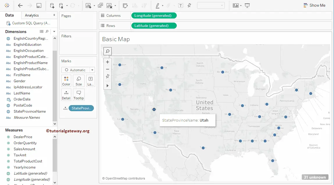
Double-clicking on any geographic field, such as city, postcode, country, or state, will automatically create a map in Tableau. In this example, we will double-click on the State Province Name dimension. The desktop added the Latitude value to the Row shelf, the Longitude value to the Column shelf, and the State province Name to the Details field in the Marks Shelf.
How to Create a Symbol Map in Tableau?
Drag and drop any geographic field, such as city, country, postcode, or state, on the details field, which will automatically create a map. Here, we will drag the State Province Name dimension to the Details field in Marks Shelf. Now you can see the auto-generated Tableau Map.
Refer to the Connecting to SQL Server, Charts, and SQL for this Desktop report.
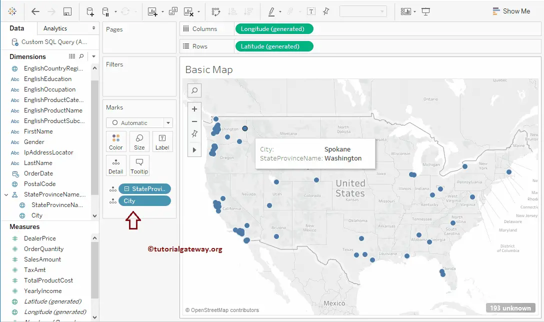
You can also add the geographical hierarchy to the details shelf. For example, we have added the state/province hierarchy (province Name, City) to the details card. Please refer to the following articles to enhance the map functionality and visibility.
- Google Maps
- Mapbox Maps as a Background Map
- WMS Server Map as a Background Map
- Map Options – To change the Background Layer and add the Data Layer
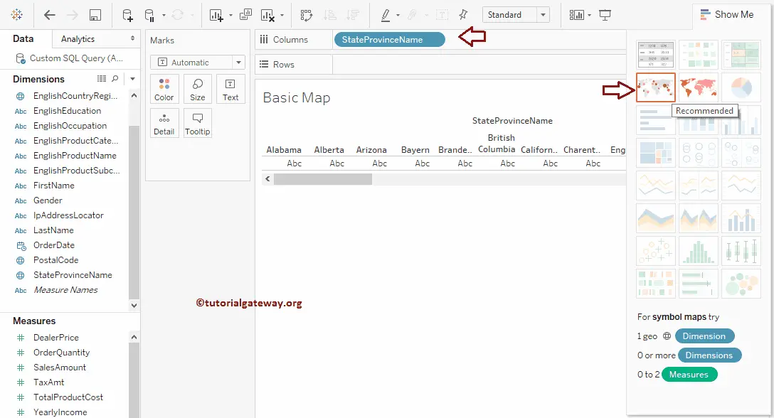
The third approach is to create a Symbol map in Tableau
Please drag and drop any Geographic field to the Column or Row shelf, and selecting the Map from the Show Me window will automatically create it for you. Let’s drag the State Province Name dimension to the Columns Shelf. Next, choose the dotted one present in the Show Me card.
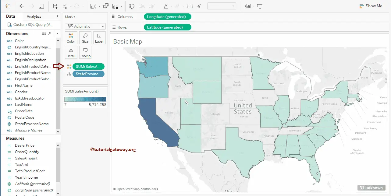
That will automatically create the United States data points that we have shown in the above two approaches. Please add Sales Amount Measure to the Colors field in the Marks Shelf. It will add color to each state on a Map based on the sales amount.
Create Basic Maps in Tableau
This section will show you how to create regular Maps with an example. For this Maps demo, we will use World Indicators data sources that come with the desktop.
There are multiple ways to create a basic Map in Tableau, and in this section, we will explain all of them. Drag and drop any Geographic field to the Row or Column shelf, and selecting the icon in the Show Me window will automatically create a Map. In this example, we will drag the Country dimension to the Columns Shelf.
Next, Drag and Drop the Total Population from the Measures Region to the Rows Shelf. Since it is a Measure value, the Total Population will aggregate to the default Sum. Let me change that Bar Chart into a World. To do so, please expand the Show Me window and select the marked option.

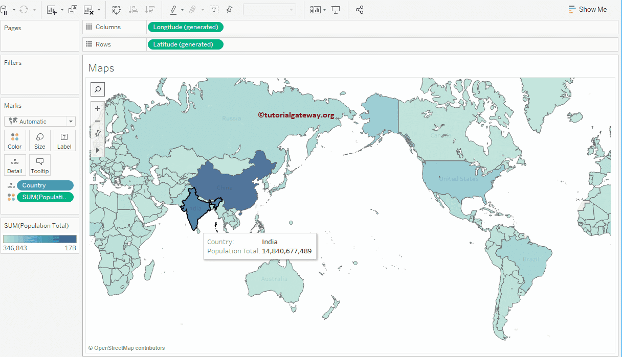
The Tableau Map will be displayed once you choose this from the Show Me window. From the screenshot below, you can see the Row and column Shelf filled with generated latitudes and Longitudes. The country will be added to the Detail Card, and the Total Population will be added to the Columns Card.
You can highlight any country to see that Country’s population
Creating Tableau Basic Maps Using the Show Me Window
Double-clicking on any geographic field such as Postcode, City, State, or Country will automatically create a Map. In this example, we will double-click on the Country dimension. From the screenshot below, you can see that the desktop has created a Symbol for you. Here, it added the Latitude to Row shelf, Longitude to Column shelf, and Country Name to Details Card in Marks Shelf.
The other option is to drag and drop any geographic field on the Details card, and Tableau Desktop will automatically create a map. In this example, we will drag the Country Name dimension to the Details card present on the Marks Shelf. Now, you can see the auto-generated symbol. Use either of the approaches mentioned below to convert the Symbol to a Map.
To convert the Symbols, you can either click on the marked one from the Show Me window or change the Marks type from Automatic to Map to convert Symbol to basic Map.

Either way, it will generate the below for you.

Let us add Population Total to the Colors card in Marks Shelf. It will add color to every country based on its Population and generate the map that we showed in the previous approach.
Add Data labels to Maps in Tableau
To add data labels to Maps, click the Show Mark Labels button in the Toolbar. Though it looks odd, you get the idea of adding data labels.

Change Colors of Maps
Until now, you saw the Tableau Maps with the default colors, but you can change the default colors. To do so, click the drop-down menu beside the SUM(Population Total) color legend or right-click on the Color bar. Both of them will open the context menu. From that, please select the Edit Colors… option. The other option is to click the Color shelf and click the Edit Colors button.
The following window will open once you choose the Edit Colors… option. Click the drop-down arrow under the Palette and select the color as per your specification. For now, we are choosing Gold-Purple Diverging. Remember, by clicking the Advanced button, you can specify the Start Point, End Point, and Center as well.

Now, you can see it with the Gold-Purple Diverging color schema.
