Tableau Line Chart is valuable for connecting individual dots. We can use the Tableau line charts to check sales trends, Forecast details, etc. Let us see how to create a Line Chart with an example.
For the Tableau Line Chart demo, we use the data source we built in our previous article. So, visit Data Labels in Reports article to know the Tableau Data Source.
Tableau Line Chart Example
To create a Tableau Line Chart, First, Drag and Drop the Year from Dimension Region to Column Shelf. Next, Drag and Drop the Sales Amount from the Measures Region to the Rows Shelf. Since it is a Measure value, the Sales Amount is aggregated to the default Sum. Once you drag them, the below report will generate.
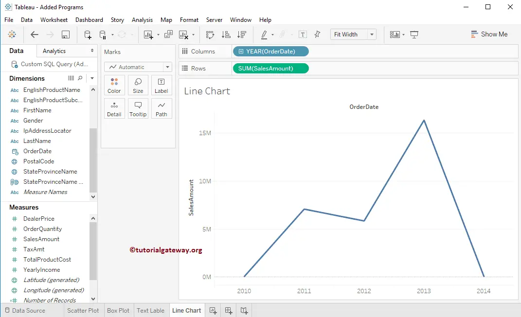
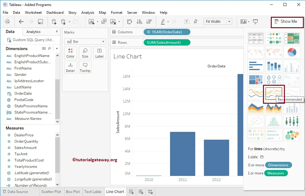
If that is not the case, please click the Show Me tab and select the shown Tableau Line Chart option.
Add Data Labels to the Tableau Line Chart
Drag and release the Sales Amount from the Measures Region to the Text field in the Marks Shelf.
Now you can see the Sales Amount at each point of the Chart.
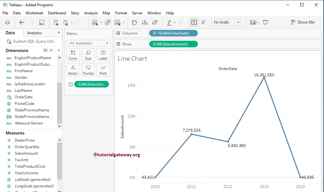
Tableau Line Chart using Multiple Measures
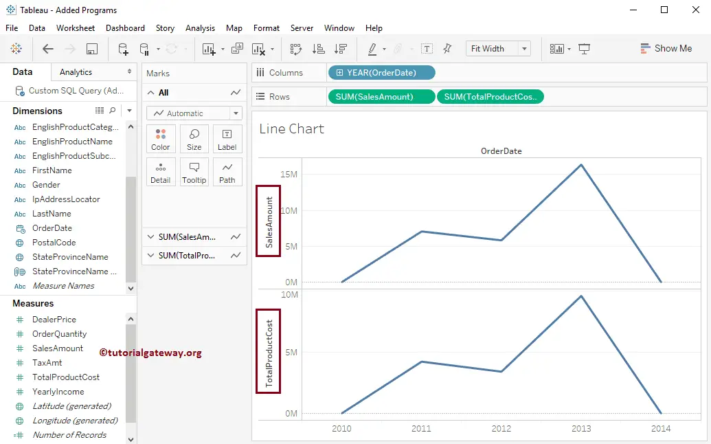
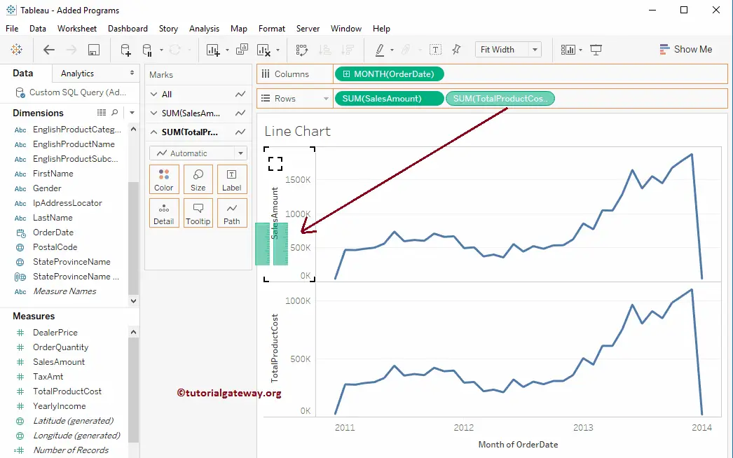
We can also create this using multiple measures. It can help us to compare the trend line of Sales and Profit. To create a Line Chart, First, Drag and Drop the Total product Sale from the Measures Region to the Rows Shelf. Since it is a Measure value, Total product Sales will aggregate to the default Sum. Once you drag them, another one will generate the product cost.
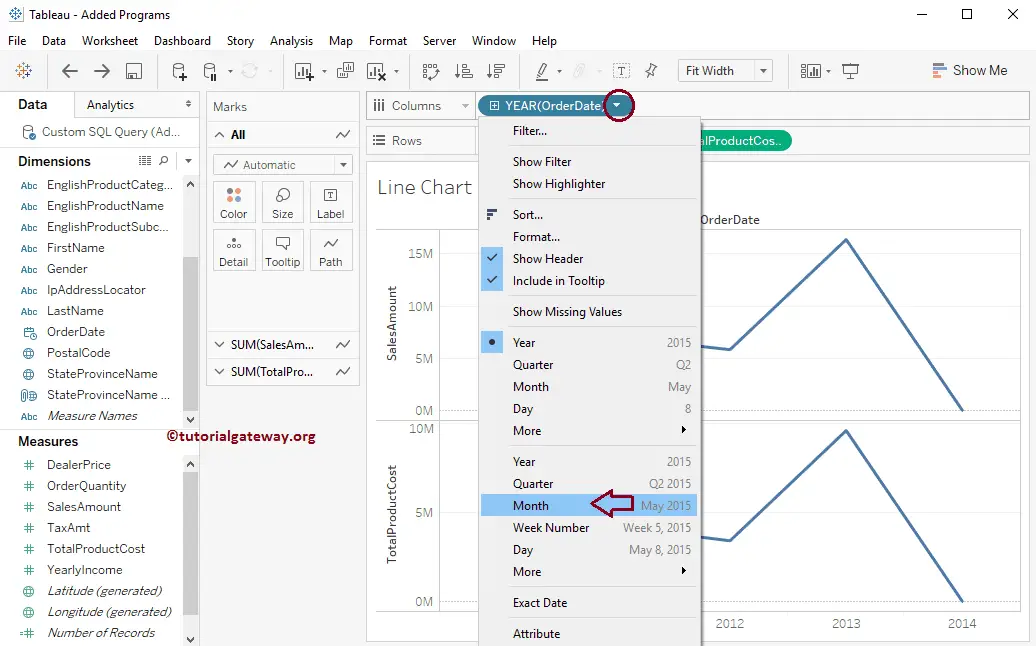
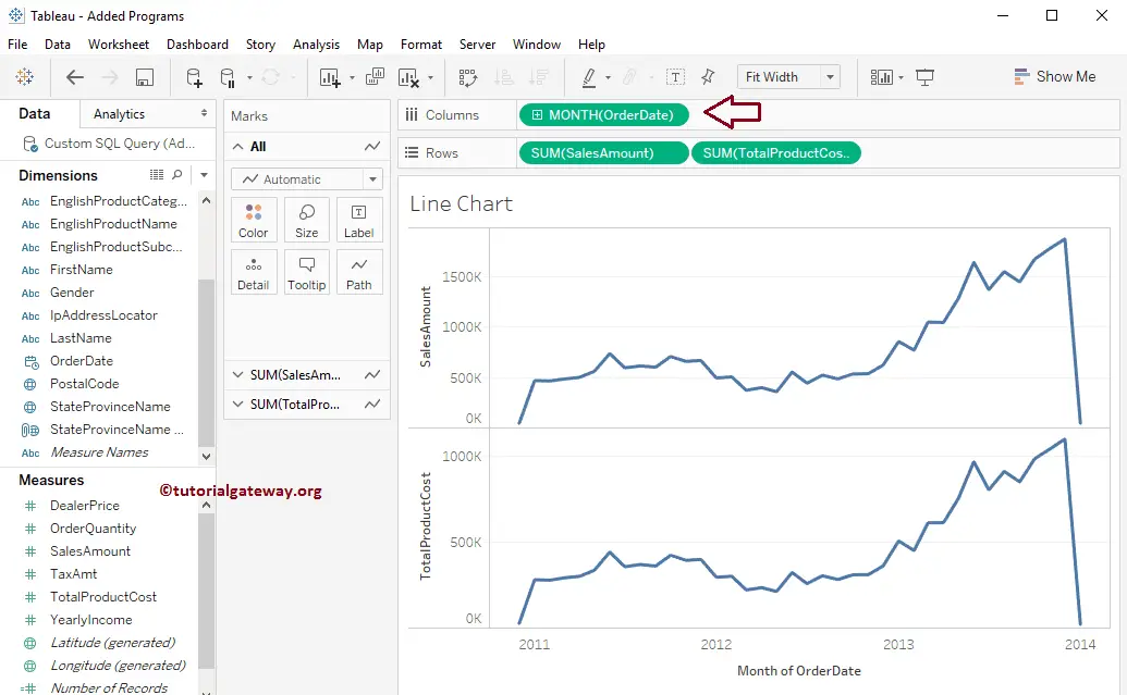
Let us change the value from Year to All months present in each year to see the detailed monthly sales (trend)
The detailed strip for each month in 2011, 2012, 2013, and 2014 is in the Tableau line chart.
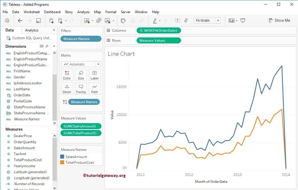
Create a Blended Axis Line plot
To create a Blended axis strip, drag and drop the Product Cost from the Row Shelf to the Sales Amount axis, as shown below.
The following screenshot shows you the Line Chart with the blended axis.
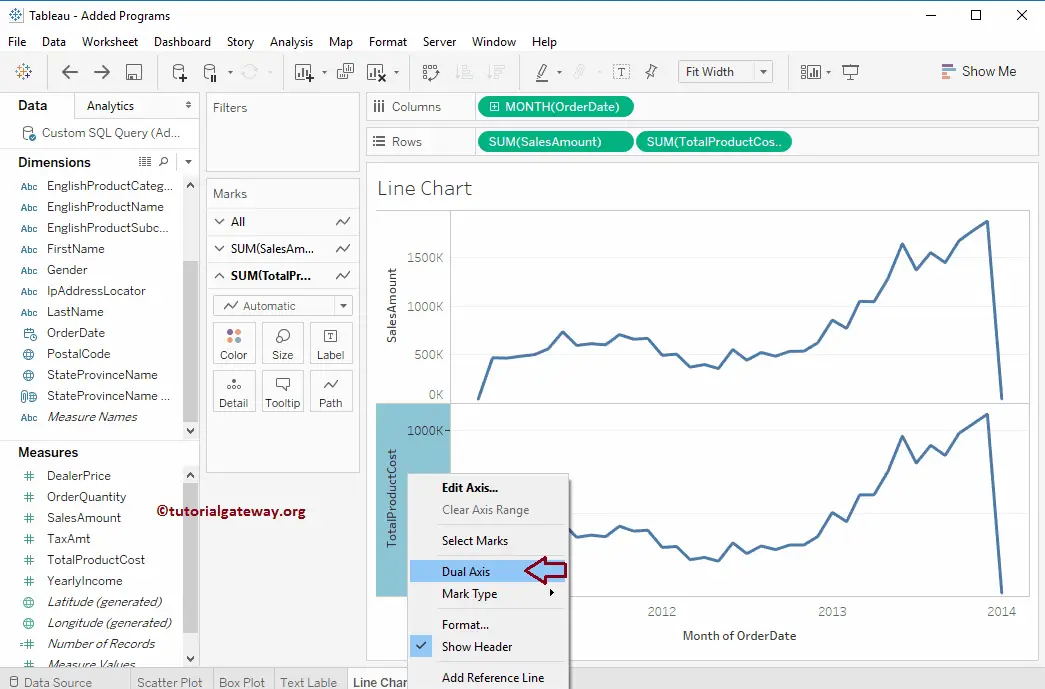
Create a Tableau Dual Axis Line Chart
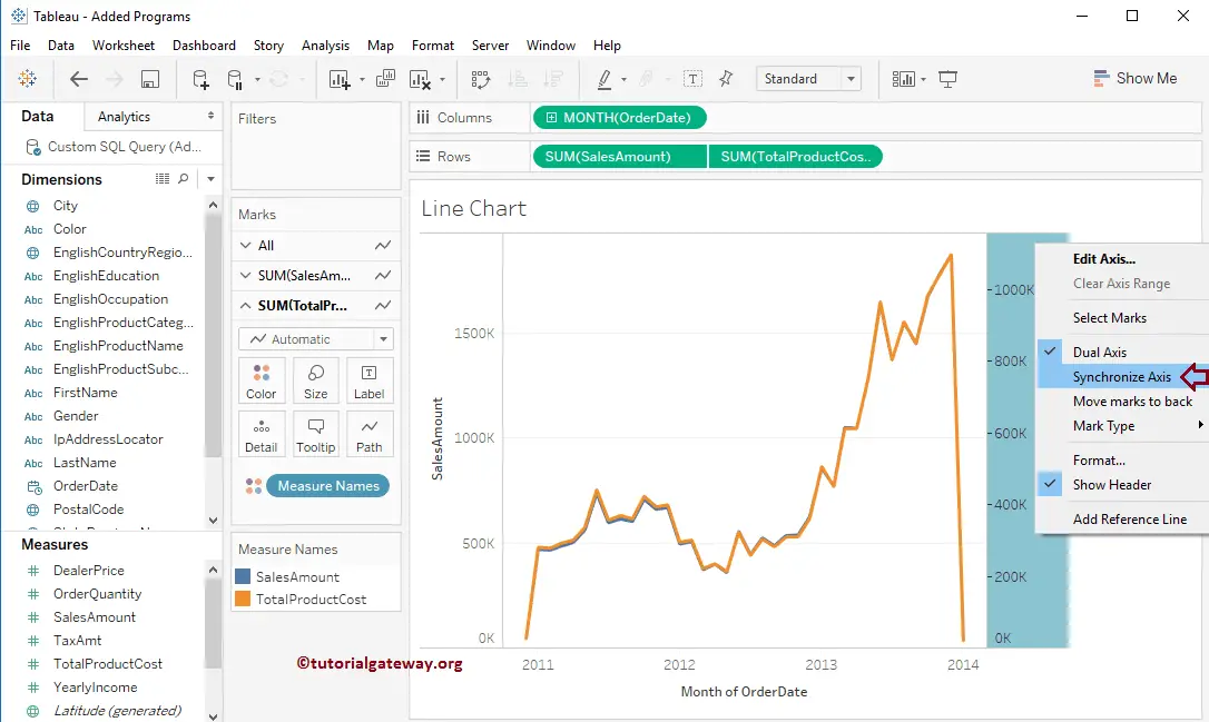
To create a Dual Axis strip, select the Total Product Cost Axis and right-click on it to open the contextual menu. From that, Please select the Dual Axis option as shown below.
Once you choose the Dual Axis option, the following Tableau line chart screenshot will be displayed. From the below image, you can observe that we have Years on the Horizontal Axis and Sales Amount and total Product Cost on the Vertical Axis (acting as a Dual Axis)
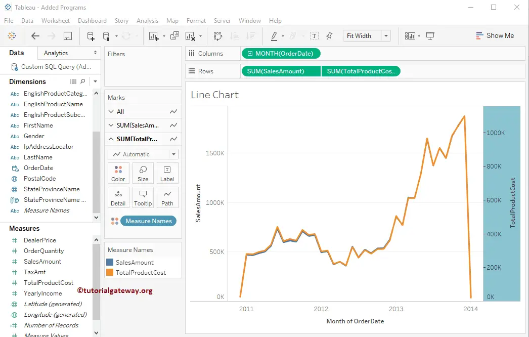
We successfully created the Dual Axes report. But from the screenshot below, we cannot see the Sales Amount curve because the Maximum Axis value of the Sales Amount is 1500K, whereas the Total Product Cost is 1000K. If you have no problem, Leave it as it is; otherwise, Please select the Total Product Cost and select the Synchronize Axis.. option from the context menu.
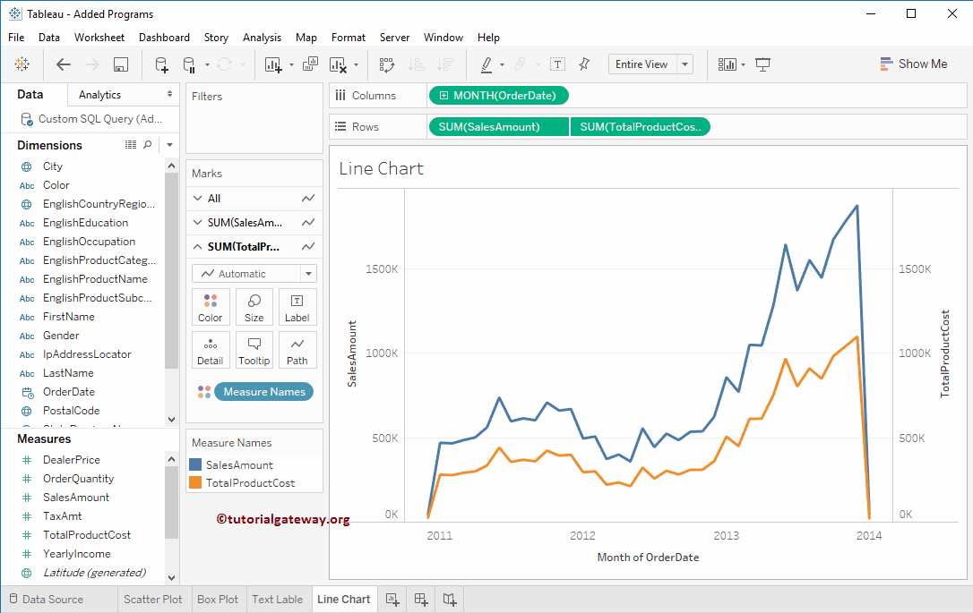
The below screenshot will show you the Tableau Line chart with Dual Axis.
How to Change Tableau Line Chart Color?
This section will show you how to change the Tableau Line Chart colors with an example. In general, the line chart is displayed in blue color. However, we can use the color shelf to change the lines to black, red, green, etc.
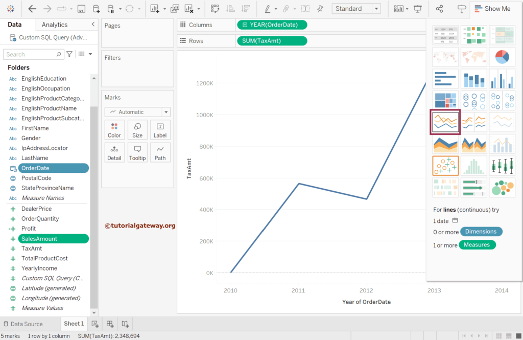
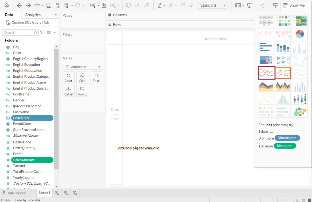
Select the Order Date (Date Field) and the Sales Amount (1 or more measures) and click on the continuous lines chart from the Show Me window to generate a line chart.
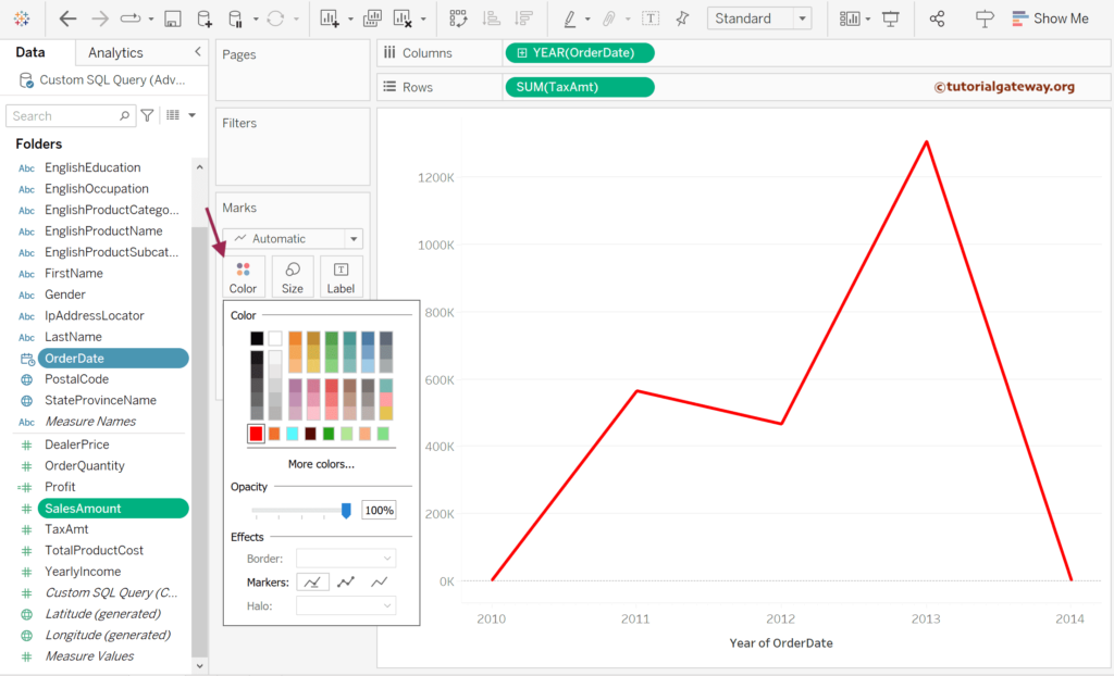
Under the marks shelf, click the Color section and choose your preferred color.
Using the above method, we can change the line color, but we need a different approach if it has to represent something or the color has to say some information.
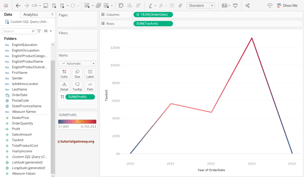
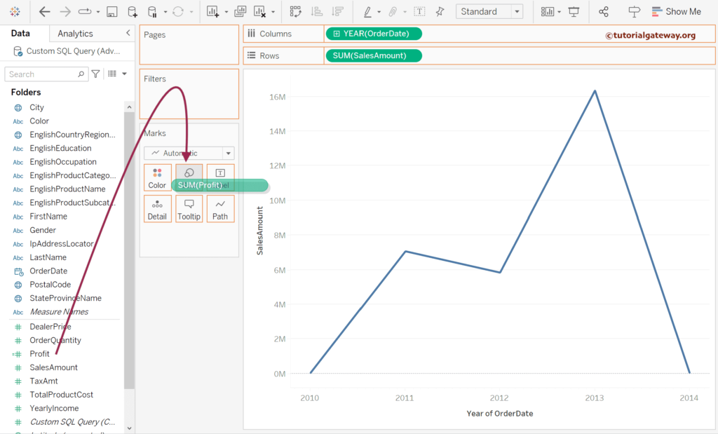
Drag and drop the Profit measure field to the Color shelf.
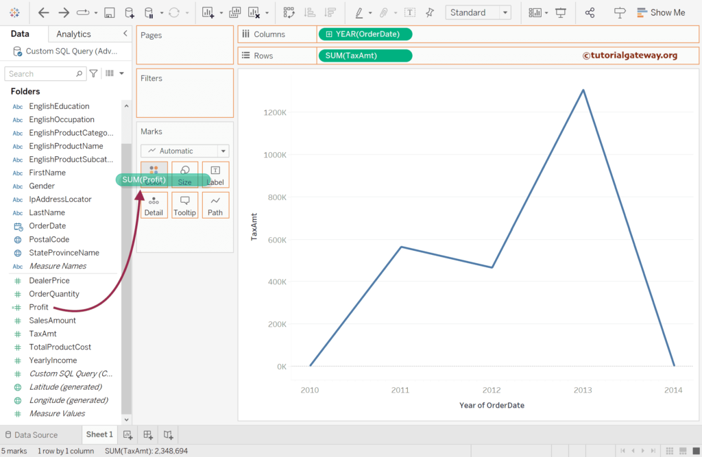
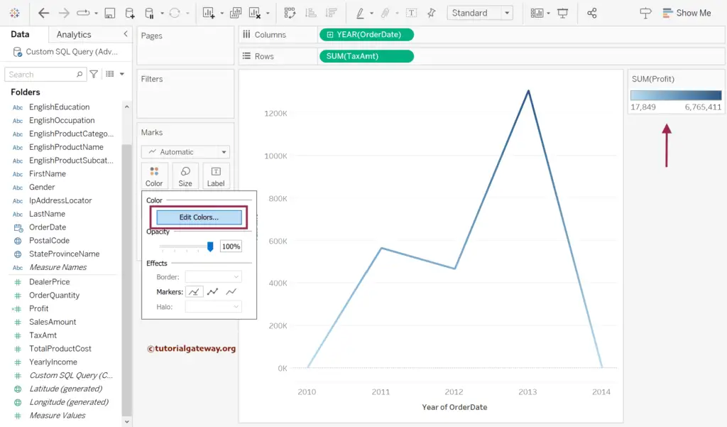
By default, it is given color to the line where thin (light color) represents less profit and darker more profit. Next, click the Edit Colors button to change the Color palette.
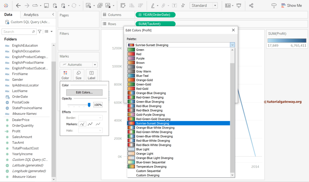
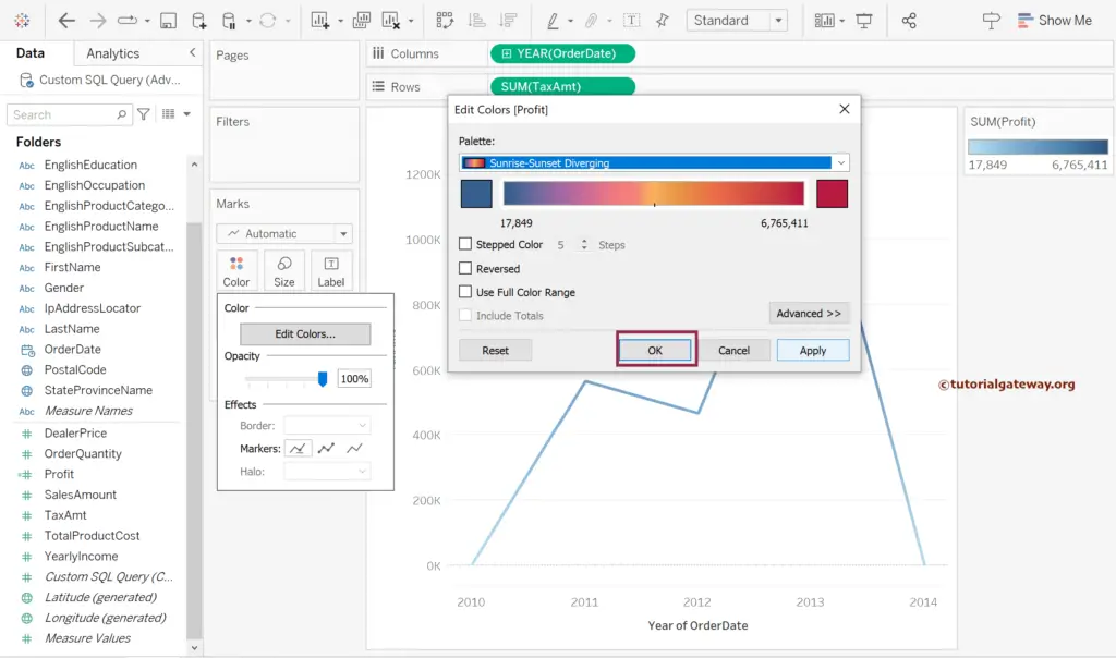
Here, we have chosen the Sunrise-Sunset Diverging palette.
Click OK to close the Edit window.
You can see the Tableau line chart with changed Sunrise-Sunset Diverging colors.
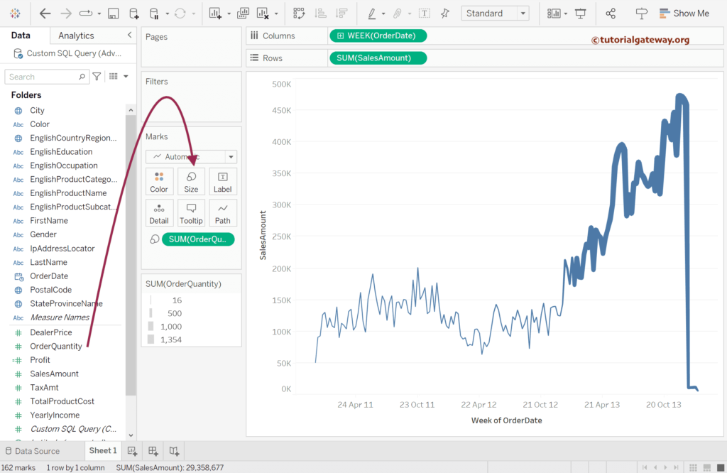
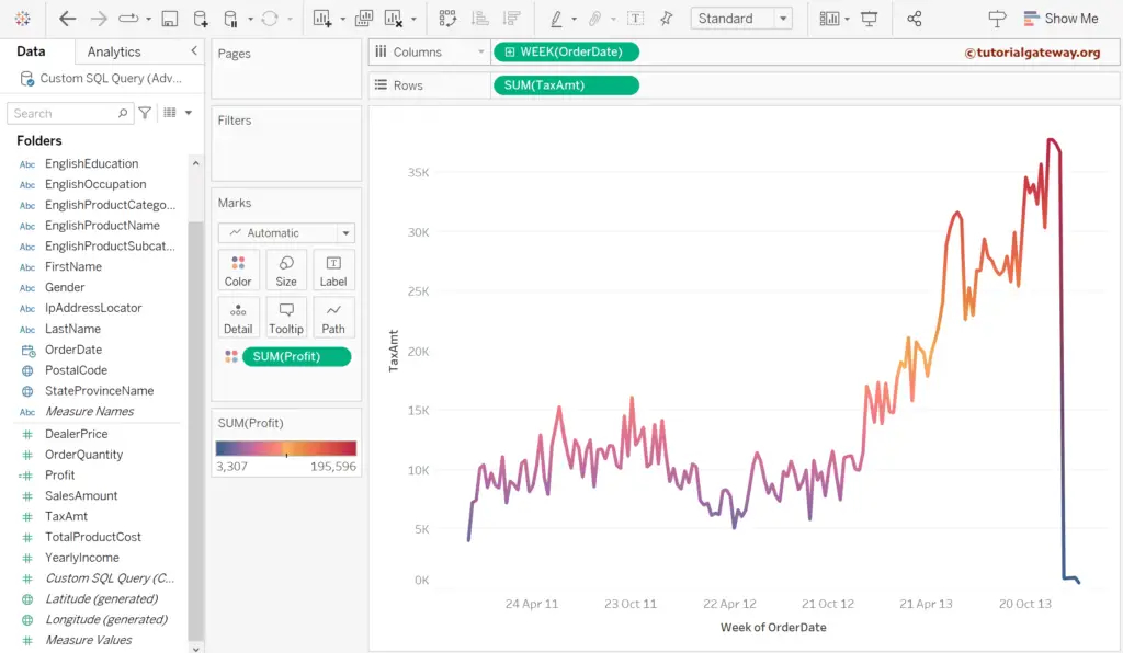
Let me expand or change the Order Date field from Year to Week to see the colors better.
How to Change the Size of a Tableau Line Chart?
In this section, we will show you how to change the size of a Tableau Line Chart with an example. In general, we can use the slider under the Size shelf to adjust the thickness of the line chart, but using a measure to control the size is more meaningful and informative.
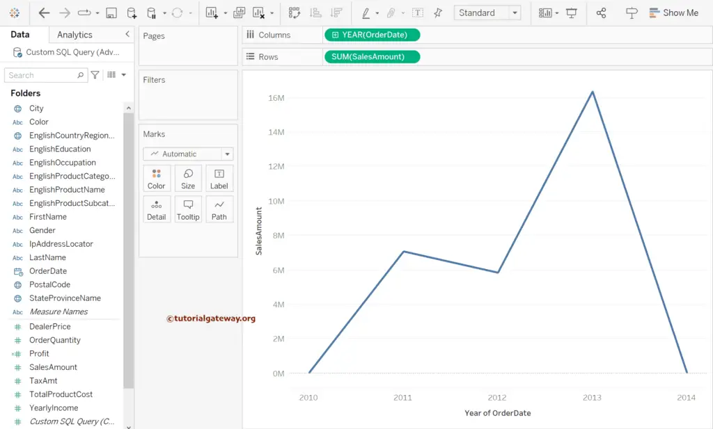
Select the Order Date and the Sales Amount and click on the Show Me window continuous lines chart to generate a line chart for you.
Now, you can see the line chart.
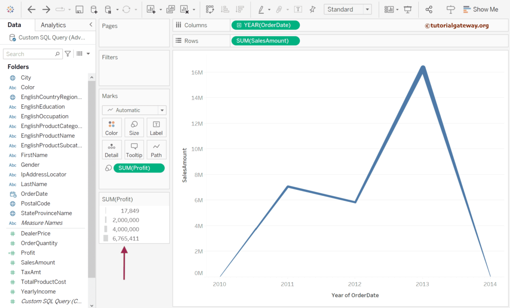
Drag and drop the Profit measure field to the Size shelf.
As you can see, the line’s thickness or size depends upon the profit. So it means the higher the profit, the thicker the line.
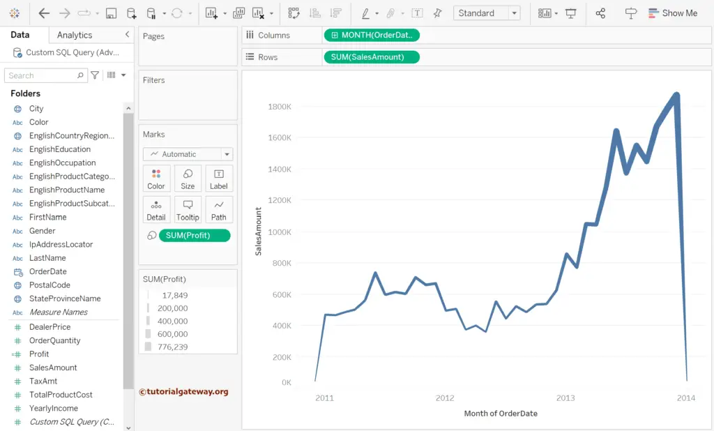
Let me show you the monthly sales to see the line size better.
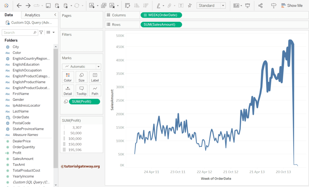
Under the Columns shelf, select Week using the down arrow.
Let me change or replace the profit measure with the order quantity to change the line size based on the product orders.