The Tableau Dual Lines Chart is useful for visually comparing the trend of multiple measures. In this article, we will show you how to create a Dual Lines Chart in Tableau with an example.
For this Tableau Dual Lines Chart demo, we will use the Data Source we created in our previous article. Please visit the Data Labels in Tableau Reports article in Tableau to understand the Data Source.
Dual Lines Chart in Tableau Example
To create the Tableau Dual Lines Chart, first, Drag and drop the Sales Amount from the Measures Region to the Rows Shelf. Because it is a Measure value, the Sales Amount is aggregated to the default Sum. Once you drag them, a Bar Chart will generate.
Next, Drag and Drop the Order Date from the Dimensions Region to the Columns Shelf. Once you drag the Order Date, a Line Chart will generate.
Let me change the Order date value from Year to All months present in each year to see the detailed monthly information (trend line). Now you can see the detailed Line chart for each month in 2014, 2015, 2016, 2017, and 2018
Create a Dual Lines Chart Approach 1
There are multiple ways to create a Dual Lines chart in Tableau. Drag and drop the Total product Cost from the Measures Region to a right-side axis.
This will automatically create a Dual Lines chart for you

Create a Dual Lines Chart in Tableau using Show Me
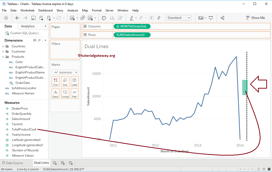
Let me undo the above step. Next, drag and drop the Total product Cost from the Measures Region to the Rows Shelf. Since it is a Measure value, the Total product Sale is aggregated to the default Sum. Once you drag them, another Line Chart will be generated for the Total product cost, as we showed below.
Let me change this to the Dual Lines chart. To do so, please expand the Show Me window and select the Dual Lines Chart from it.
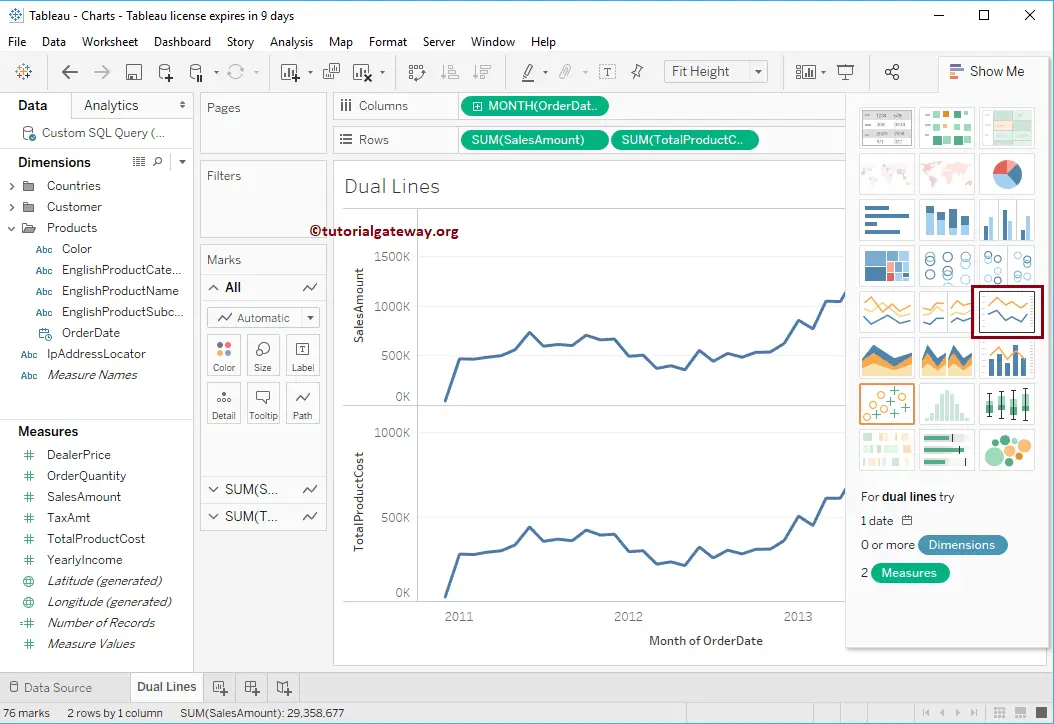
The Dual Lines Chart will be displayed once you choose the Dual Lines from the Show Me window. Though it looks good from the below screenshot, you can observe that the Maximum Axis values of the Sales Amount are 1500K, whereas the Total Product Cost is 1000K.
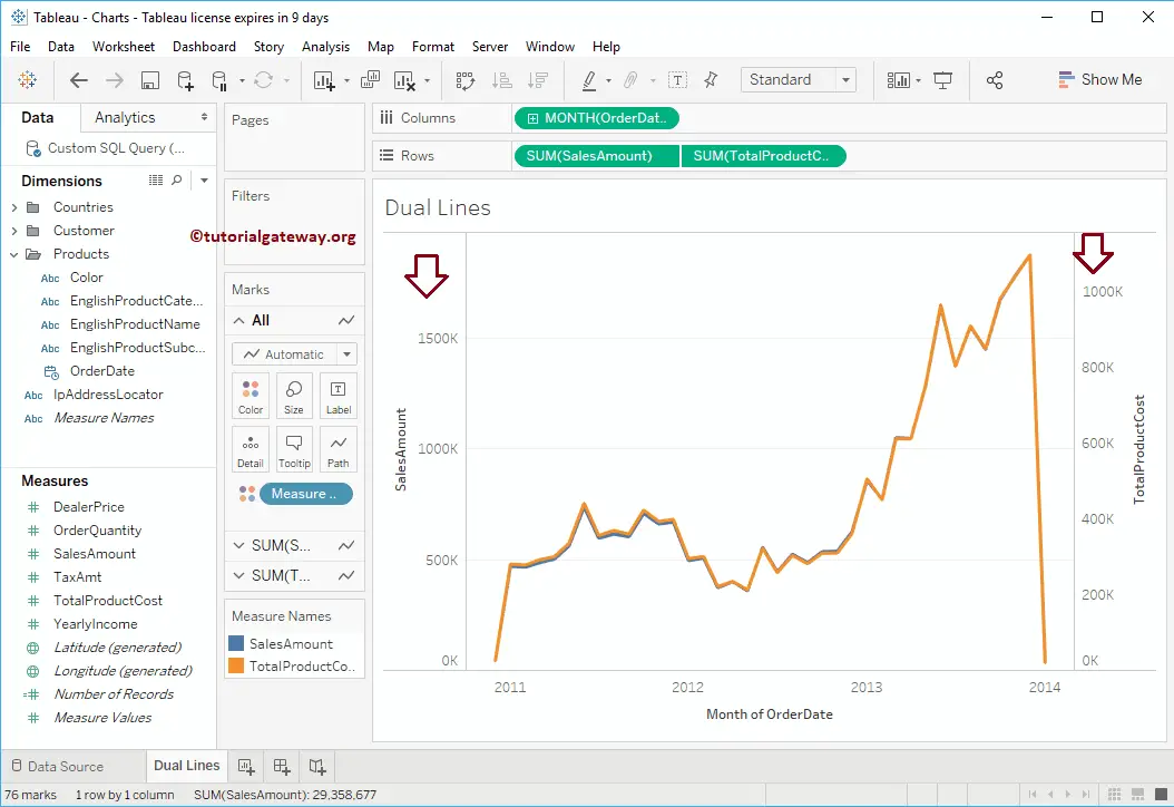
If you have no problem, leave it as it is; otherwise, please select the Total Product Cost and select the Synchronize Axis.. option from the context menu.
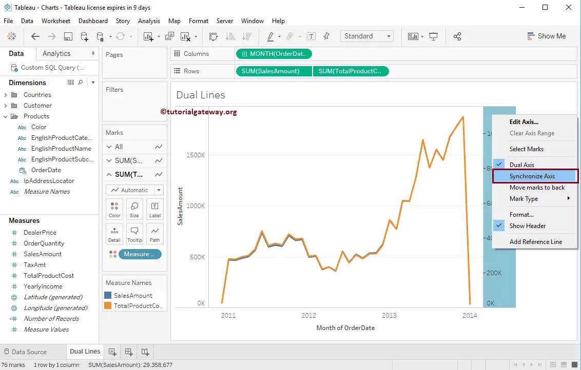
Now you can see the Dual Lines Chart with a synchronized Axis. It means the axis value of the Sales and product cost would be the same, and you can notice the same in the below image. You can also remove one axis.
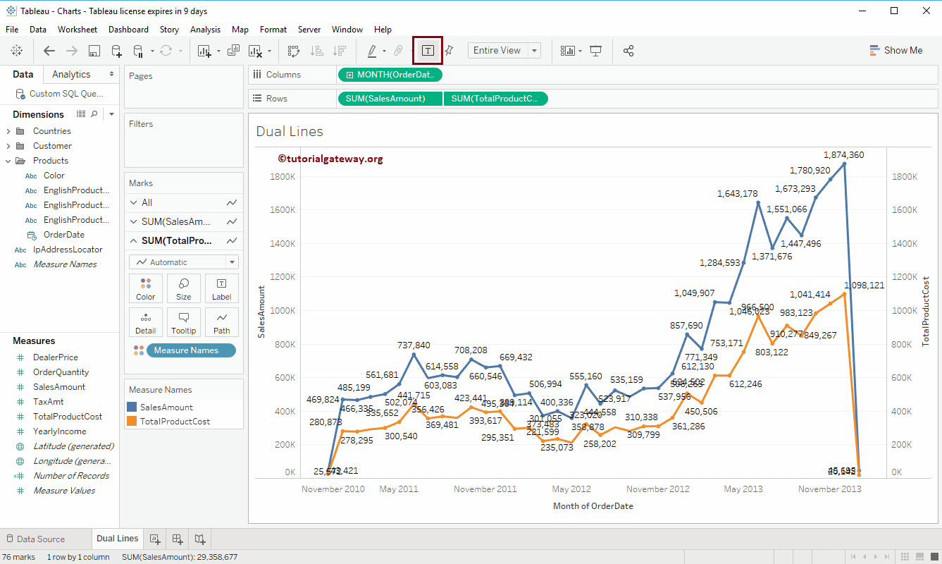
Add Data Labels to Dual Lines Chart
To add data labels to the Dual Lines chart, click the Show Mark Labels button in the Toolbar. Though it looks odd, you get the idea of adding data labels.
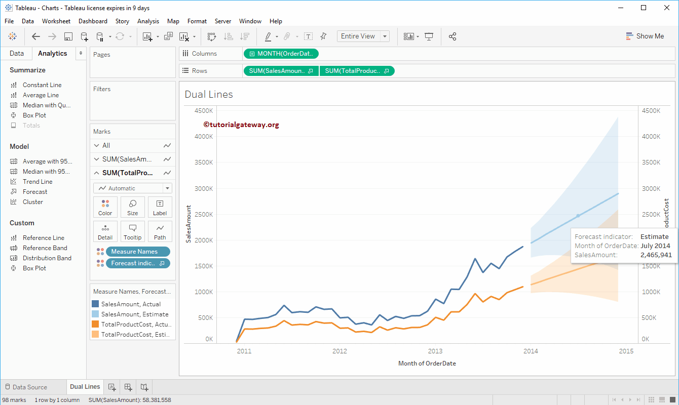
Add Forecast to Dual Lines Chart in Tableau
Drag and drop the Forecast from the Analytics tab to the Dual Lines chart.
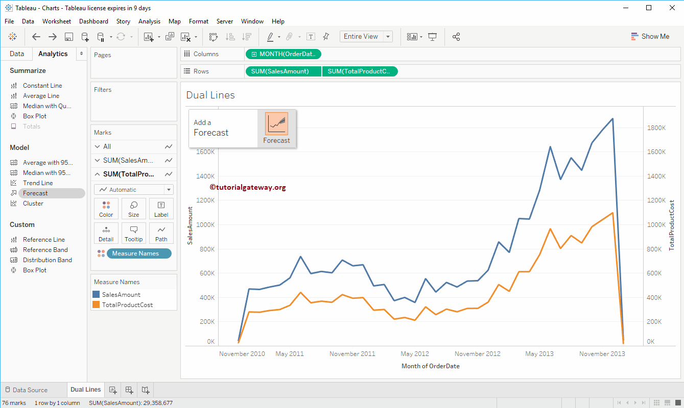
Now, you can see the forecast as well. Also, refer to the Change the Line Chart Color and Change the Size of Line sections in the Line Chart article to understand the options.