In this article, we show how to create a Pareto Chart in Tableau with an example. The Pareto Chart is handy to visually check whether our Data meets the rule (80 – 20 Percent or 80/20 rule). For example,
- Whether 80 percent of our Profits are coming from 20 percent of Customers or not
- Whether 80 percent of our sales are coming from 20 percent of Customers or not
- Check whether or not 80 percent of our profits come from 20 percent of our products.
- Or 80 percent of our sales are coming from 20 percent of Products.
In all the above scenarios, we can use this Pareto chart.
How to Create a Pareto Chart in Tableau?
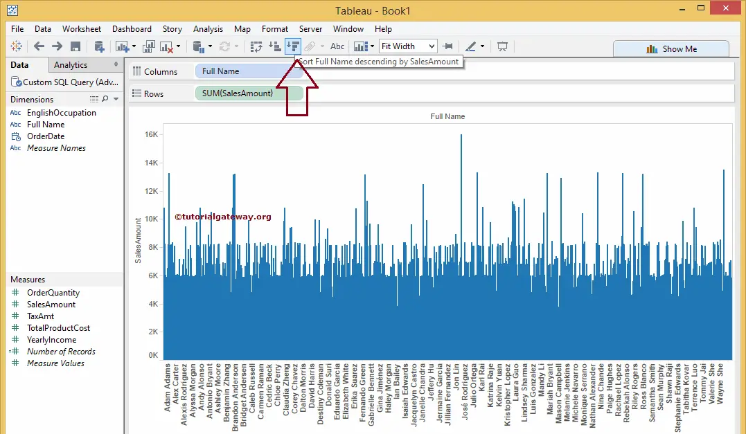
In this Pareto chart example, we will check whether or not 80 percent of our sales come from 20 percent of our Customers. First, drag and drop the Customer’s Full Name from the Dimension Region to the Columns Shelf and the Sales Amount Measures region to the Rows Shelf. By default, the desktop will generate the Bar plot.
Next, sort the generated barograph into Descending Order using the Sales Amount. Please visit the Bar Plot, Charts, and Connecting to SQL Server articles to understand the Tableau desktop configurations and SQL Query.
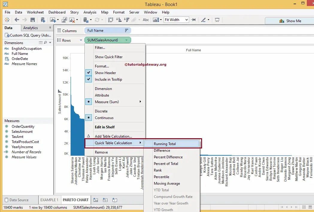
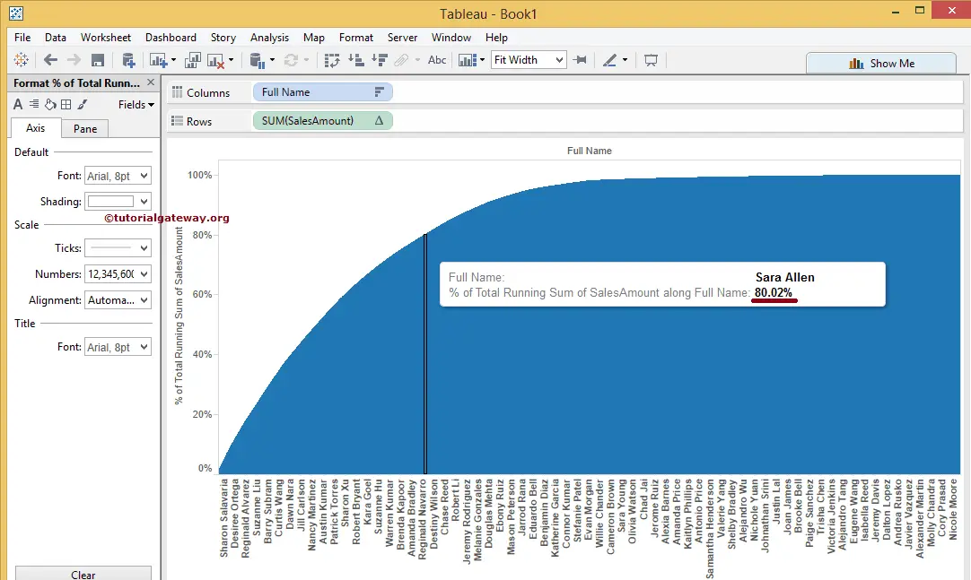
Next, click on the Sales Amount Measure from the Row Shelf, select the Quick Table Calculation option, and then select the Running Total to calculate the Running Total.
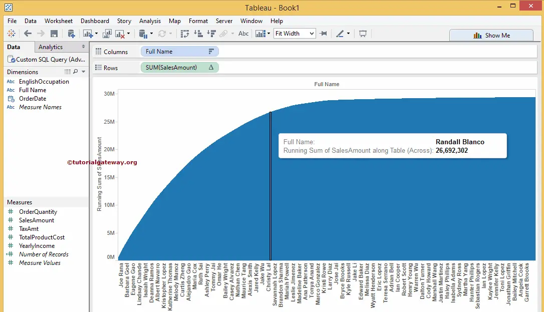
We have successfully created the Pareto Chart in Tableau. However, we cannot check whether 80 percent of our sales are coming from 20 percent of customers.
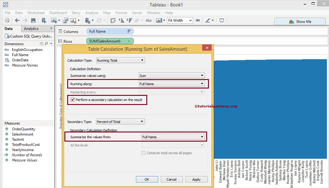
To achieve the same, we have to change the Pareto Chart Sales Amount Axis from the Running Sum to the Percentage of the Total. To do this, please click on the down arrow beside the Sales Amount measure. Then, select the Edit Table Calculation option.
The following Tableau Pareto chart window will open once you choose the Edit Table Calculation option.
- Please change the Running Along option from Table Across to Customer Full Name field. It calculates the running total based on the customer name rather than a table.
- Please checkmark the Perform Secondary Calculation on the result option and select the secondary calculation Type as Percent of Total.
- Don’t forget to change the Summarize the values option from Table Across to the Customer Full Name field.
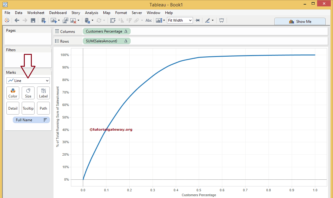
Now, we can identify 80 percent of sales, but again, we must compare this with 20 percent of our customers. We must change the axis names from customer names to percentages for this. To do this, let us create one calculated field of the Tableau Pareto chart.
Right-click on the empty space present in the Measures Region. Now, please select the Create Calculated Field option from the Context menu.
Once you choose the Create Calculated Field option, a new window will open to write a Custom Expression. For this Tableau Pareto chart example, we need the customers’ percentages. So please add the following expression.
Calculated Field Name: Customers Percentage
Expression: INDEX() / SIZE()
Now, drag and drop the newly created calculated field (Customers Percentage) from the Measures region to the Columns Shelf. Next, remove the existing Customer names from the Columns Shelf and place them in the Level of Details field in the Marks Shelf.
To create a Tableau Pareto chart, please change the Marks type from Automatic to Line type. To do this, please expand the drop-down list and change the Automatic to Line.
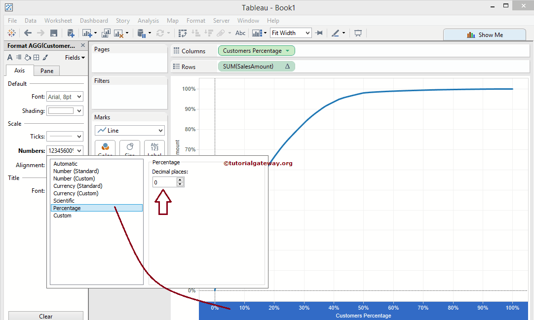
Let us format the Axis labels to the percentage. Right-click on the Customer name Axis and select the Format option.
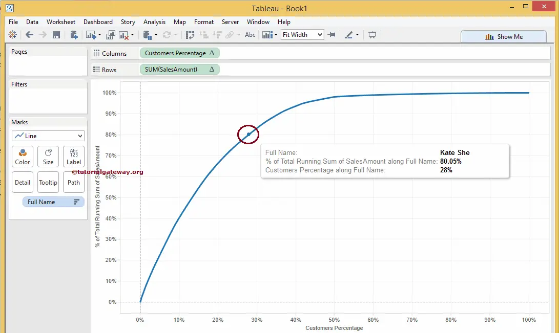
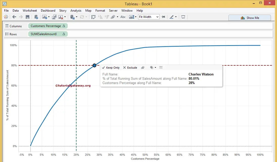
We have done all the work to check whether 80 percent of sales come from 20 percent of our customers. The below Pareto Chart screenshot shows that it’s not 20 percent but 28 percent of our customers.
Add Reference Lines to Tableau Pareto Chart
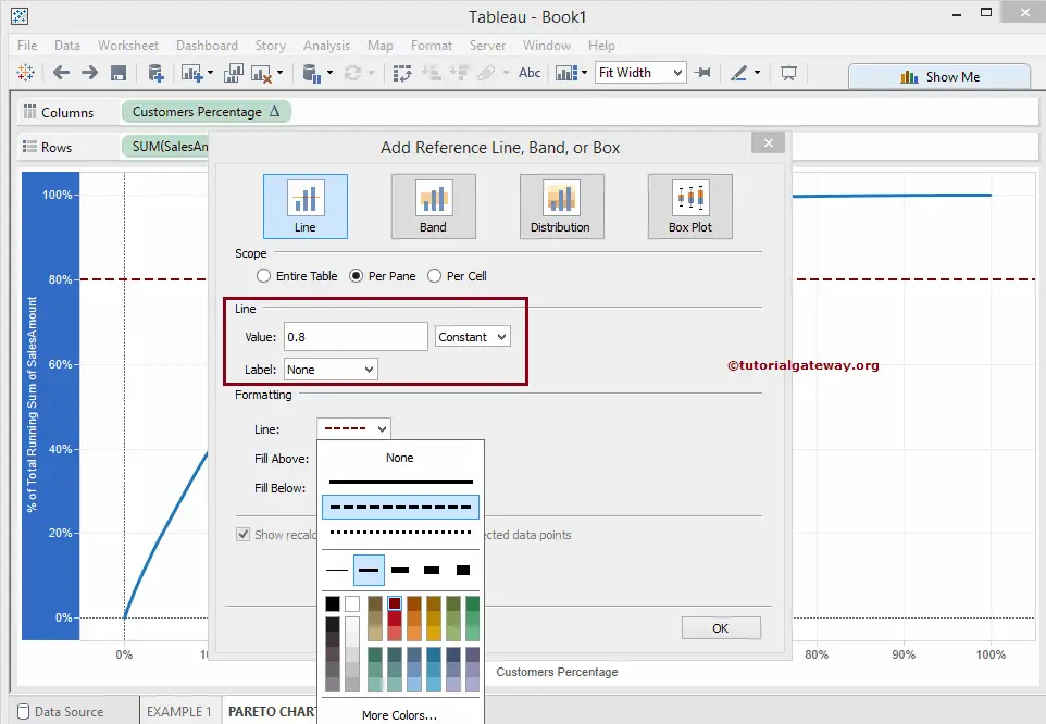
If you want to add a reference Line to the Pareto chart, follow this section. In this example, we are adding reference lines for 80 percent. Right-click on the Sales Amount Axis, select the Add Reference Line option and change the value to a constant 0.8 (which is technically 80 percent).
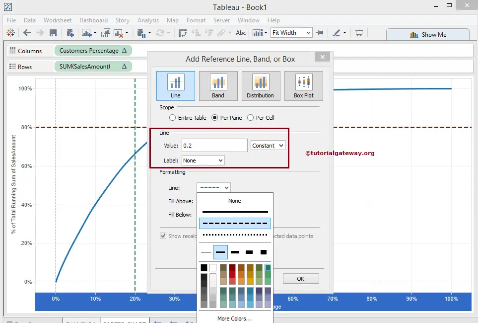
If you want to add a reference Line for 20 percent of the Pareto chart, click on the Customer name-axis. Select the Add Reference Line option and change the value to a constant 0.2 (which is technically 20 percent)
We successfully created a Tableau Pareto Chart with reference lines.
Comments are closed.