This article explains the process of disaggregating the data in Tableau with a practical example. By default, the numerical data (measures) will aggregate to SUM to show the grouped data. However, there are some situations where we must compare data on a row-level basis. We must disaggregate the data in such cases by unchecking the Aggregate Measures option.
We used the Sample Superstore Excel sheet to demonstrate this Tableau data disaggregate example. Please visit the Excel Source article to understand the Data Source.
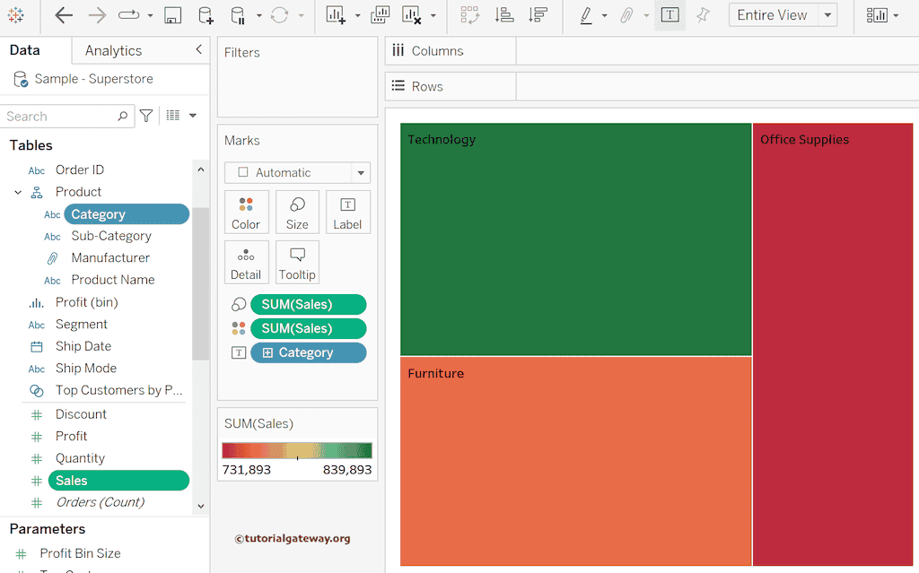
Drag and drop the Category dimension to the Text shelf and the Sales Measure to the Size shelf will automatically create a Treemap. Next, Sales Measure to the Color shelf to add distinct colors to each category. Please use the Show Me window if the marks shelf doesn’t detect the tree map. For the remaining charts in Tableau, please click here.
When you drag any Measure field to the report, by default, the data will be aggregated using the default SUM function, and our job is to disaggregate it. For instance, if you click the down arrow beside the SUM(Sales) on the marks shelf, you can see the Sum function. Sum(Sales) -> Measure (Sum) -> Sum.
How to Disaggregate the Data in Tableau?
Data aggregation helps design the reports and understand the data at a higher level. It groups the data using the default aggregation function so that you can create a Pie, Bar chart, Treemap, etc. However, there are some situations where we need to disaggregate the data to perform row-level comparisons.
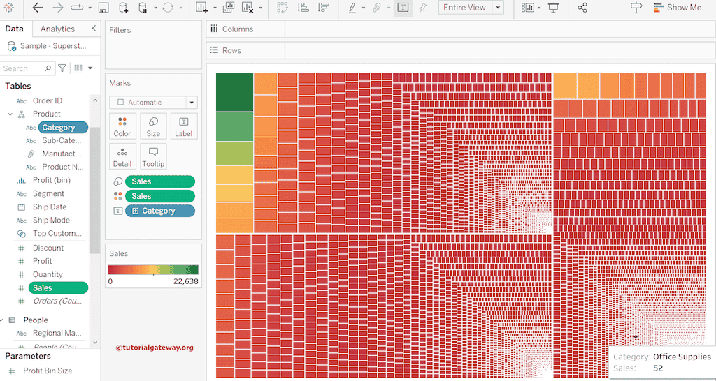
Tableau allows you to disaggregate the data, considering each record as a separate entity. To do so, go to the Analysis Menu and uncheck the Aggregate Measures option.

As you can see, it automatically disaggregates the aggregated data and compares Data on a Row-Level basis. If you observe the Marks shelf, you can see the Sales instead of SUM(Sales) on both the Color and Size shelves.
Let me change the Mark type to Circle and replace the Sales in the Color shelf with Category dimension. It creates a bubble chart where each bubble is a separate entry.
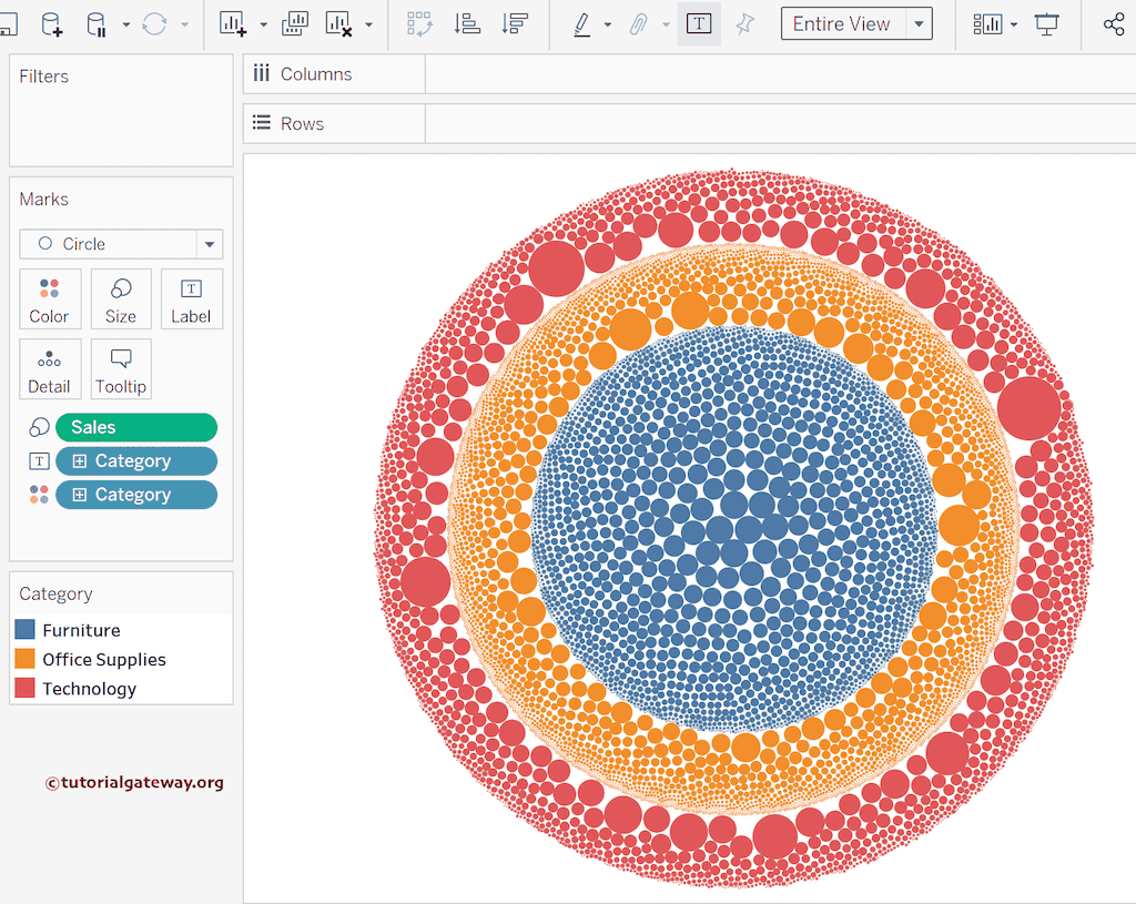
You can add the Product Name to see the detailed Disaggregated data in the bubble chart.
