A Tableau Bubble Chart is used to display the data in circles. We can define each bubble using any of our Dimension members and size by Measure value.
Bubble chart plays a significant role in creating Maps. For instance, we can use them on top of the Map to display the Sales by Postal code, etc. In this article, we will show how to create this using a Custom SQL Query. So, visit the Connecting to Server article.
SELECT Geo.EnglishCountryRegionName, Geo.StateProvinceName, Geo.City,
       Prod.EnglishProductName, Prod.Color,  Fact.OrderQuantity,  Fact.TotalProductCost,
       Fact.SalesAmount, Fact.TaxAmt, Fact.[Freight]
FROM DimProduct AS Prod
INNER JOIN FactInternetSales AS Fact ON Prod.ProductKey = Fact.ProductKey
INNER JOIN DimSalesTerritory AS Terry ON Terry.[SalesTerritoryKey] = Fact.[SalesTerritoryKey]
INNER JOIN DimGeography AS Geo ON Geo.[SalesTerritoryKey] = Terry.[SalesTerritoryKey]
Create a Tableau Bubble Chart
In this example, we will create a Bubble Chart for the State dimension against the Sales Amount size. First, Drag and Drop the State Dimension from the Dimension Region to the Text or Label Field in the Marks Shelf.
Next, Drag and Drop the Sales Amount from the Measures Region to the Size Field. By default, the Desktop displays a TreeMap. From the below Tableau screenshot, you can see the available State names in the Treemap report. For more Charts >> Click Here.
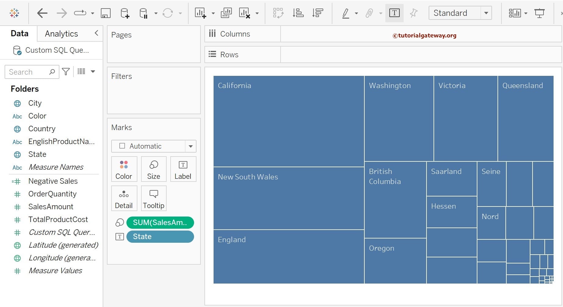
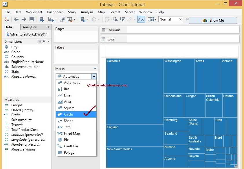
To change the Default TreeMap to Bubble Chart in Tableau, we have to change the default Automatic option in the Marks Shelf. Please expand the drop-down list and change the Automatic to Circle.
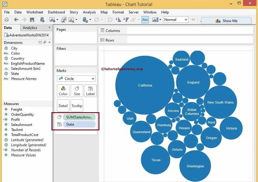
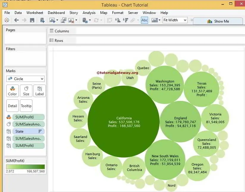
Once you change, the Bubble Chart will be displayed with State Name as the Text field and Sum of Sales Amount as the circle size. From the below screenshot, you can see that the Size of California State is bigger than the remaining states because the Sales Amount is higher than in the other states.
Showing Values Inside Bubbles
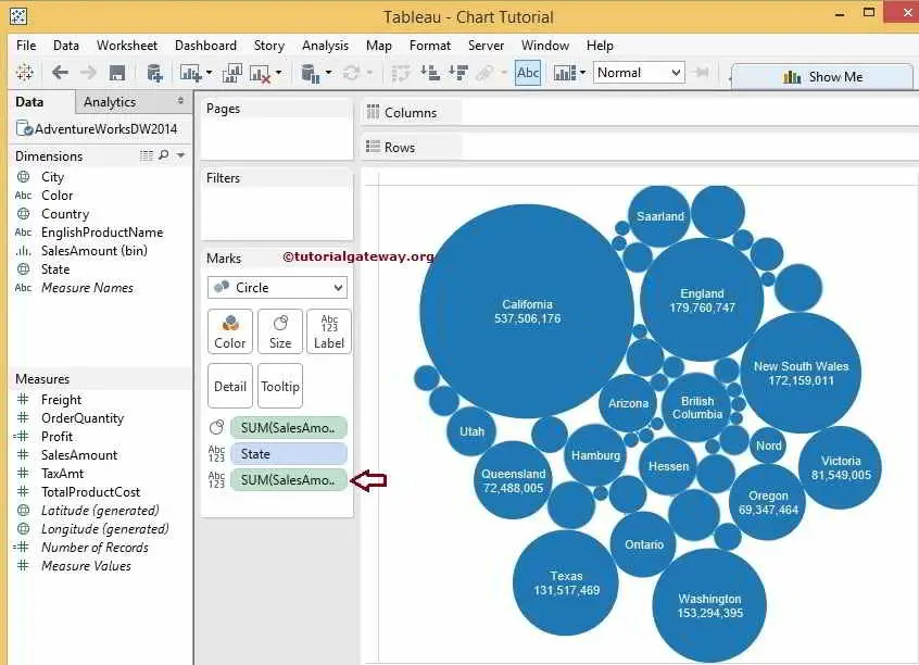
Let us add the Sales Amount to the Text field as well. By this, we can see the State name and the Sales Amount. To do this, please drag the Sales Amount from the Measures region to the Text field present in the Marks Shelf.
Changing Bubble Colors
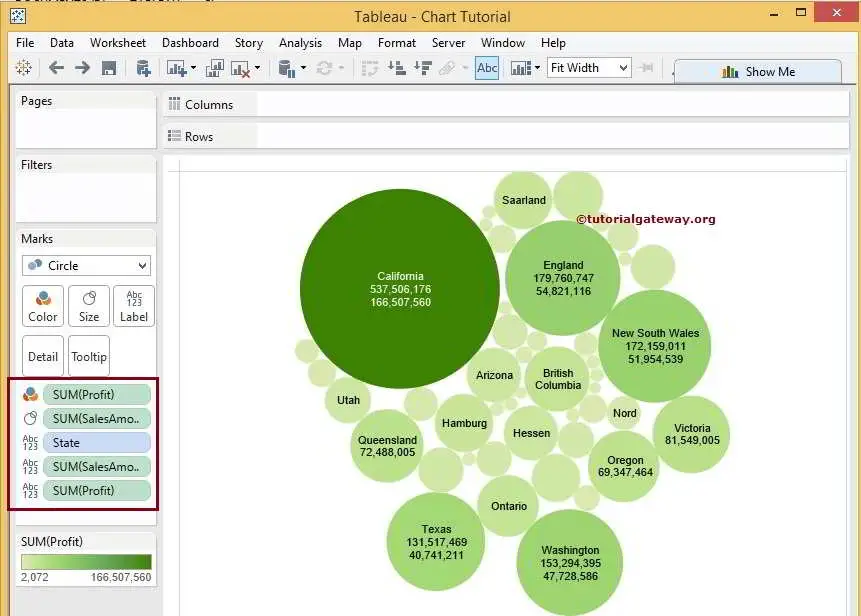
Let us add color to our Tableau Bubble Chart. We can do it by dragging the calculated field Profit to the Colors field in Marks Shelf.
Once you have done this, the following Bubble Chart screenshot will be displayed. The State name with the Maximum number of Sales is filled in Dark Green, and the Least Sales Amount is in light green.
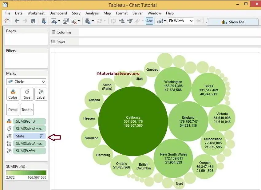
Sort Tableau Bubble Chart
A bubble chart also allows us to sort the circles. So please click on the Sort by descending order button present in the toolbar.
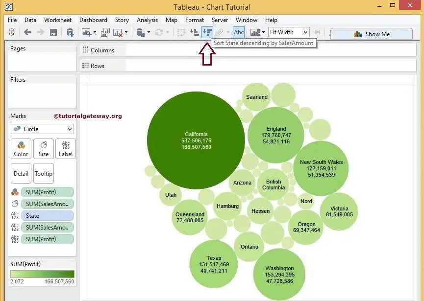
You can see that our report is formatted in descending order
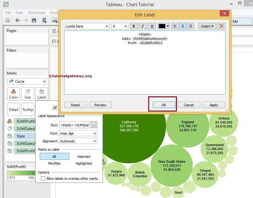
Format Bubble Text
To format the Tableau bubble chart Data Labels, please click on the Text field inside the Marks Shelf. After you click on it, the following window will be displayed. We are doing basic formatting for now, so click on the … button beside the text.
Here, we added extra text, Sales, Profit beside the < SUM(SalesAmount) > and < SUM(Profit) > and also changed the font style to Lucida Sans.
See the Formatted Text inside the Bubble Chart.
Creating a Tableau Bubble Chart: Second approach
This method of creating a Bubble chart is very easy and straightforward. Please press and hold the control key, select the Dimension (s) and Measure(s) from the respective region, and select the below-shown chart from the Show Me window.
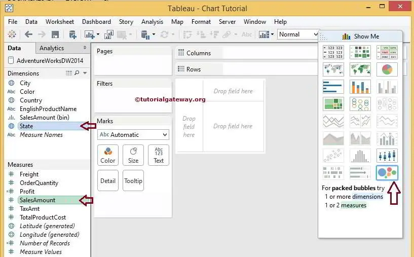
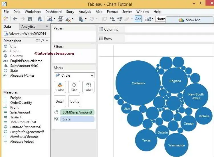
Once you do, the desktop will create it for you.
Comments are closed.