In this article, we will show how to create a Circle Views in Tableau chart with an example. For this, we will use the Data Source we created in our previous article.
Please visit the Data Labels in Reports article to understand the Data Source.
Create Circle Views in Tableau Example
To create a Circle Views Chart, first, drag and drop the Sales Amount from the Measures Region to the Rows Shelf. Since it is a Measure value, the Sales Amount is aggregated to the default Sum.
Once you drag them, the Bar Chart will generate with the sum of the sales amount. For more Charts, Click Here. Next, Drag and Drop Color from the Dimensions Region to the Columns Shelf. Once you drag the Color dimension, a proper bar graph will generate, as shown below.
Create Circle Views in Tableau Chart Approach 1
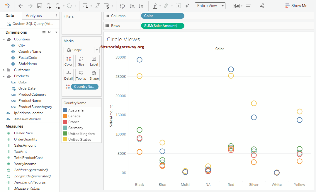
There are multiple ways to create a Circle Views chart. First, please change the Bar graph to this. To do so, please expand the Show Me window and select the Circle Views Chart from it.
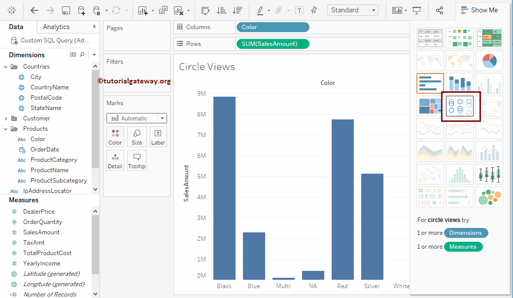
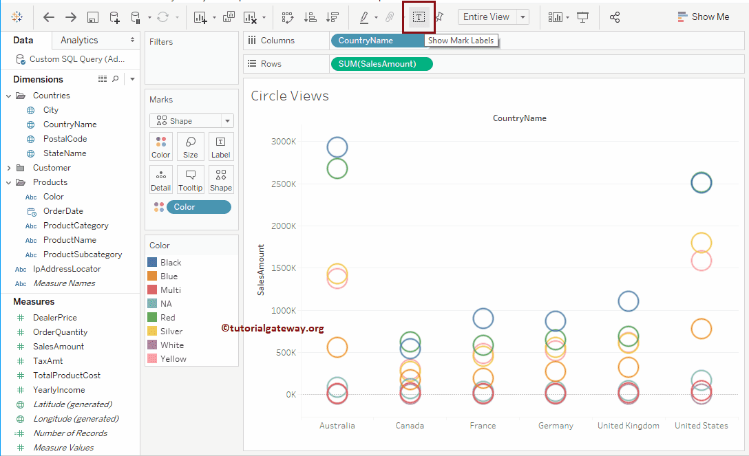
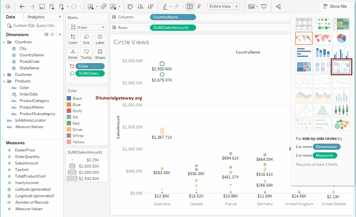
Once you choose this from the Show Me window, the Circle Views Chart will be displayed, as shown in the screenshot below.
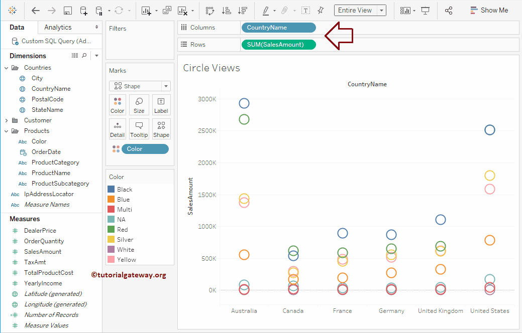
Let me add the Country Name to the Column Shelf. Now you can see the proper one.
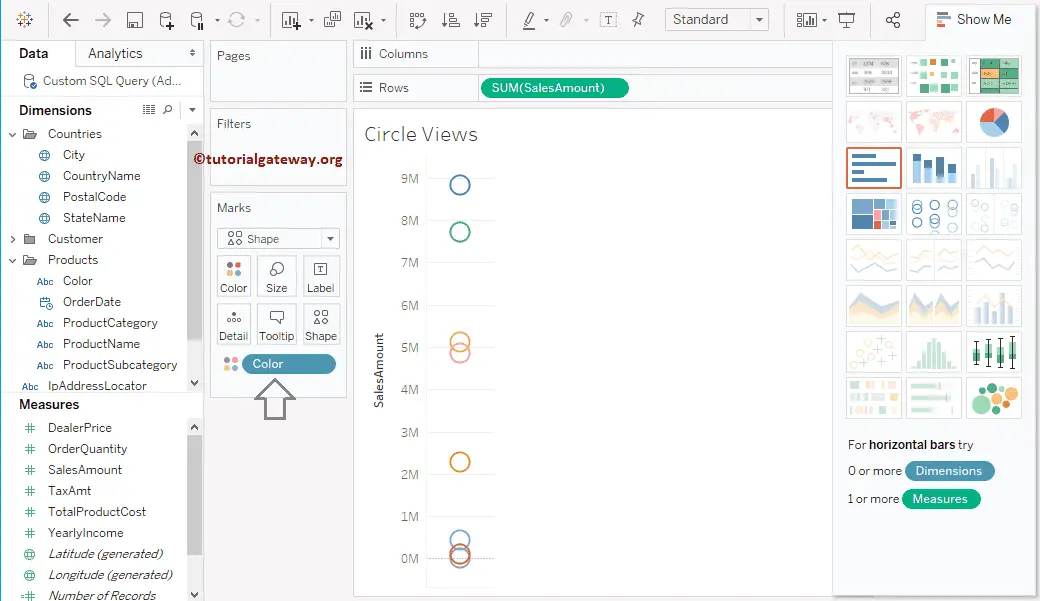
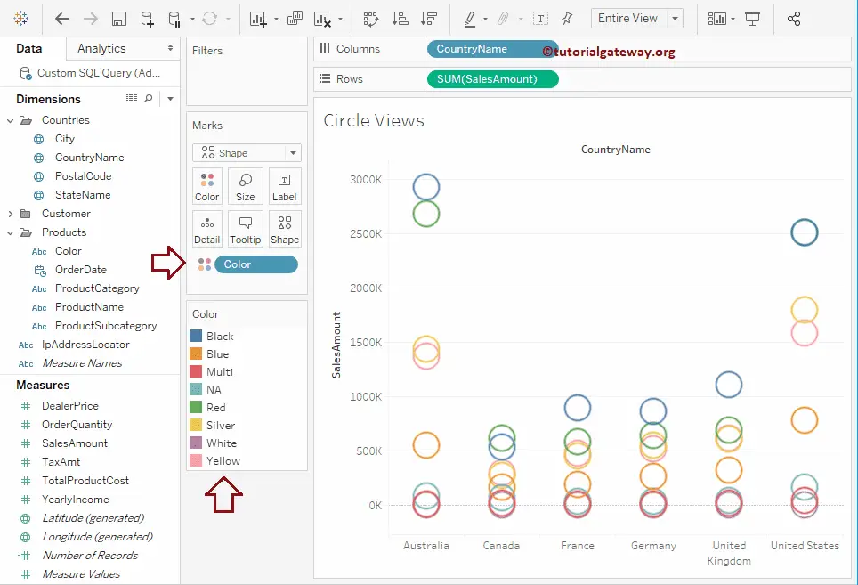
Create Tableau Circle Views chart using Marks Shelf
Drag and Drop the SalesAmount from the Measures Region to the Rows Shelf and Color from the Dimensions Region to the Columns Shelf.
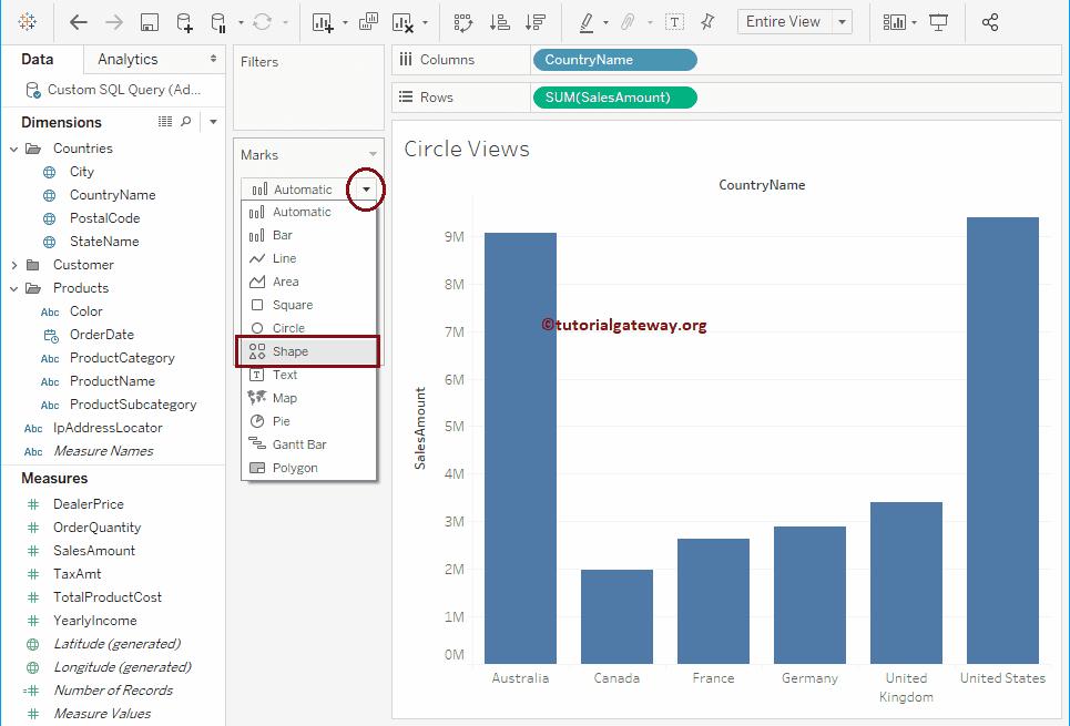
Please change the marked field from Automatic (Bar) to Shape within the Marks Shelf.
And this will create the chart for you. Please drag and drop Color from the Dimensions Region to the Color field in the Marks card, as shown below.
Create Circle Views in Tableau chart using Show Me
First, Drag and Drop the SalesAmount from the Measures Region to the Rows Shelf. Next, drag and drop the Color and Country Name fields from Dimensions Region to Columns Shelf.
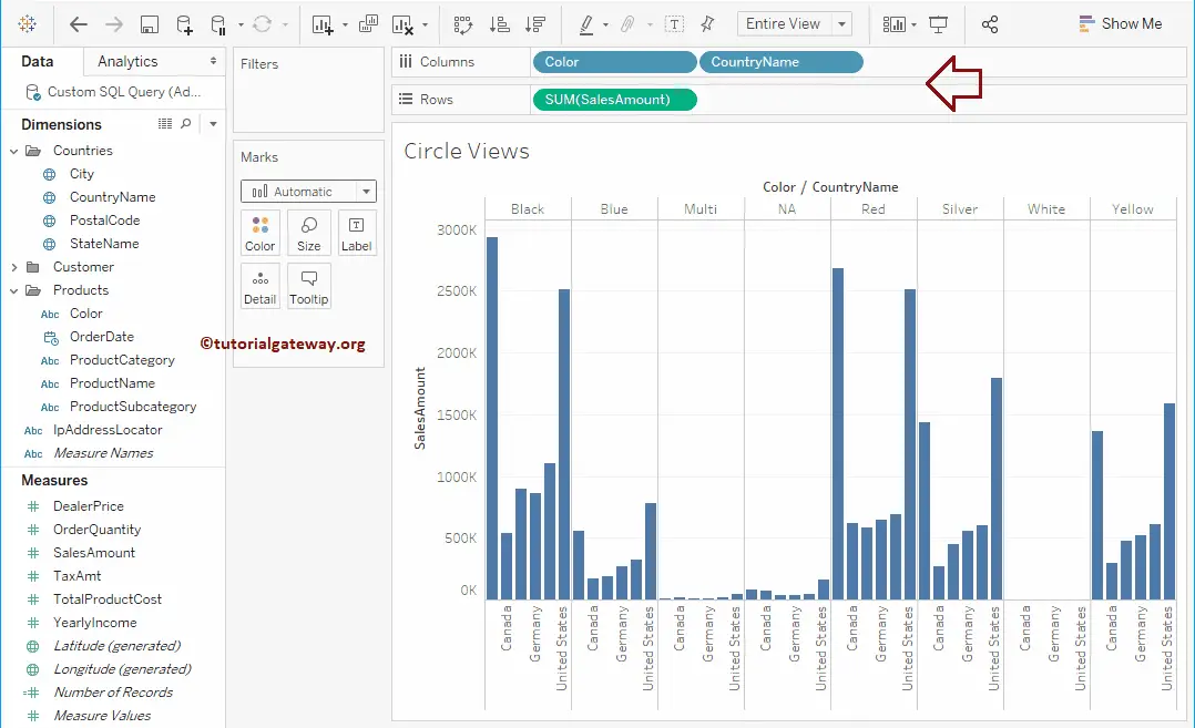
You must use the Circle View option in the Show Me window.
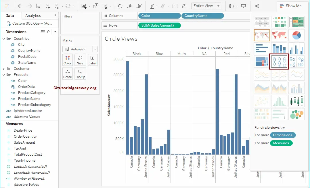
and that will create a Circle Views chart for you
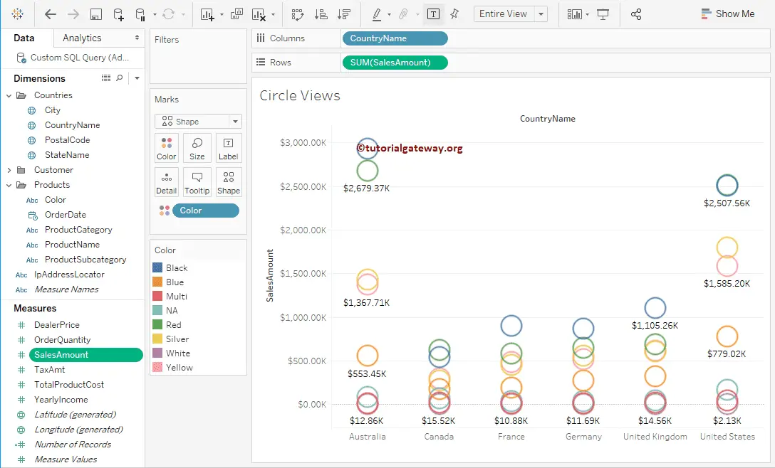
Add Data labels to Circle Views in Tableau
To add data labels to the Circle Views chart, click on the Show Mark Labels button in the Toolbar. Or you can drag and drop the Sales Amount from the Measures Region to the Label field in the Marks Shelf.
Now you can see the Sales Amount at each point.
Change the Size of a round
In this example, we will show you how to change the size of a round. For this, drag and drop the Sales Amount from the Measures Region to the Size field in the Marks Shelf.
Once you complete it, you can see the rounds of different sizes, as shown below. Here, sizes purely depend upon the Sum of the Sales Amount.
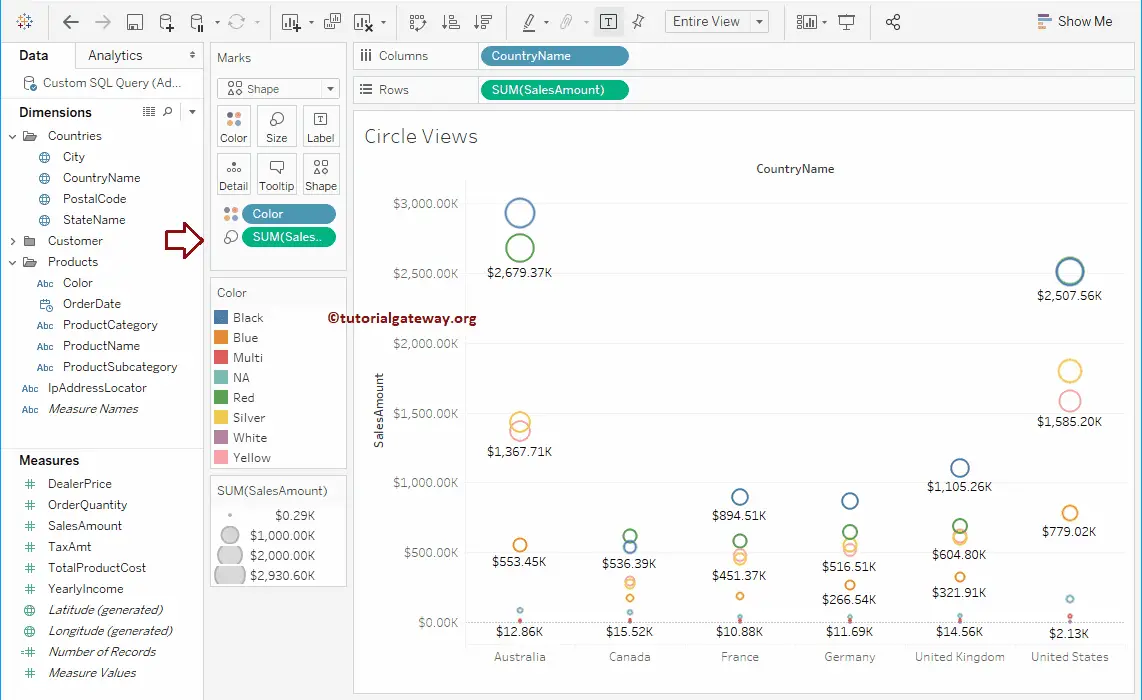
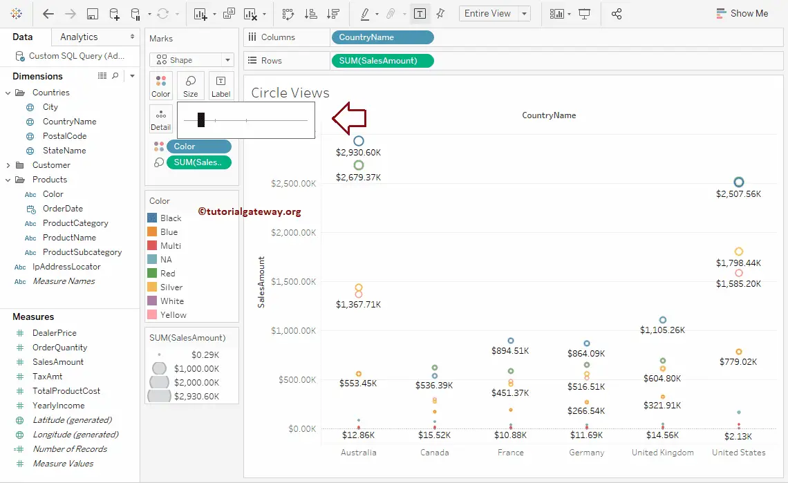
You can click on the Size field and use the slider to alter the round size.
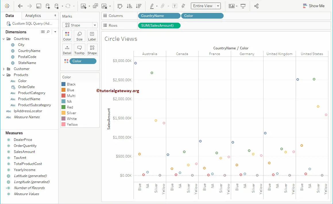
Create Side By Side Circle Views chart in Tableau
Let me change this to the Side-by-Side Circle View Chart. To do so, please expand the Show Me window and select the Side-By-Side option from it.
Please refer to the Side-by-Side Circles Chart article to understand more about the side by side circles.
Once you choose the Side-by-side Circle Views from the Show Me window, Side-by-side it will be displayed as shown in the below screenshot.
Let me format this report that we specified in the above examples.
