This article shows how to create a Tableau side-by-side circles chart with an example. It helps to compare multiple dimensions against measures or vice-versa.
Please use the control button to select the English Country Region Name, Color, and Sales Amount and click the side-by-side circles from the Show Me Window.
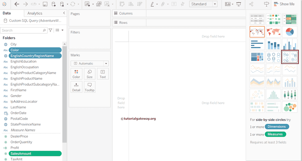
The desktop will automatically generate the side-by-side circles that we will show in the next section. Please refer to the third image on this page because the generated report will be the same.
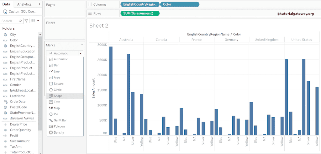
Tableau side-by-side circles chart without using Show Me
Drag and drop the English Country Region Name and Color to the Columns Shelf. Next, Sales Amount to the Rows shelf and change the Marks from Automatic to Shape.
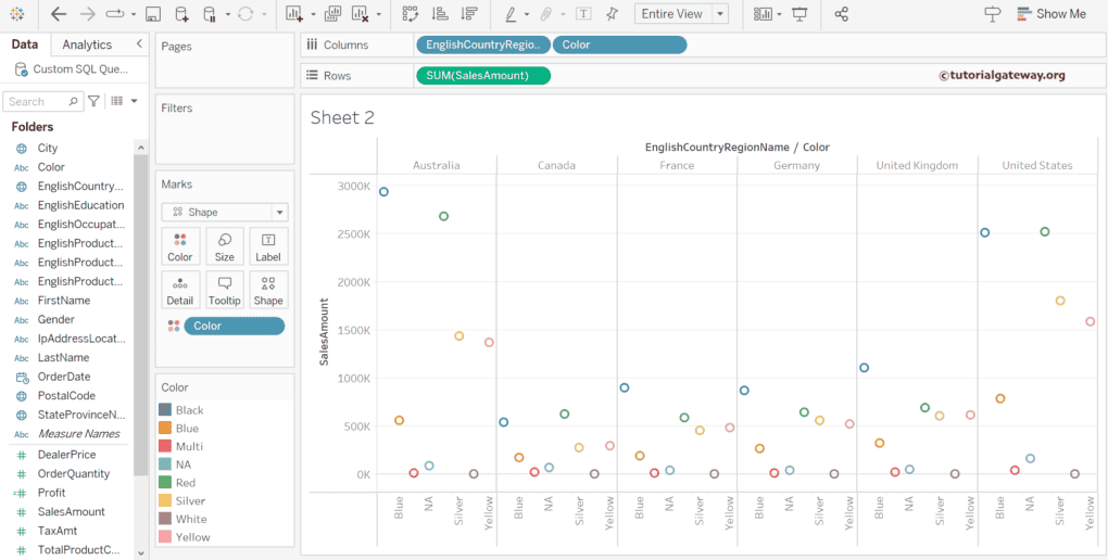
Add a Color field to the Color shelf. Now, you can see the actual side-by-side circles chart.
Use the Shape shelf to change the shape from a circle to a star or any other one.
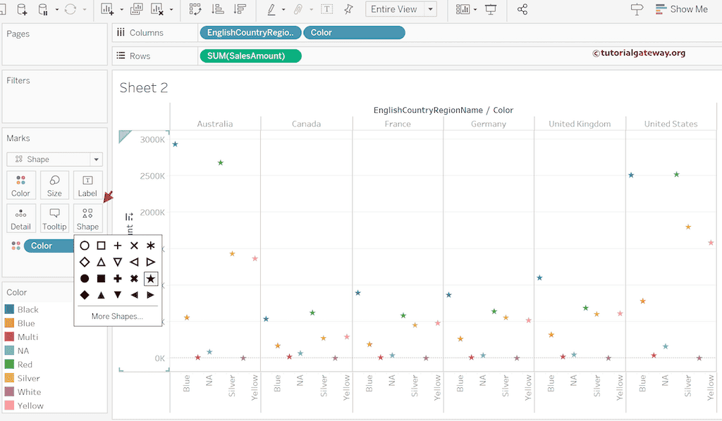
The Size shelf helps to increase or decrease the size of the marks or stars.
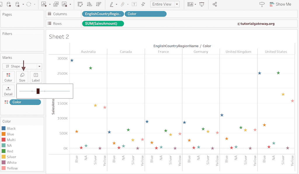
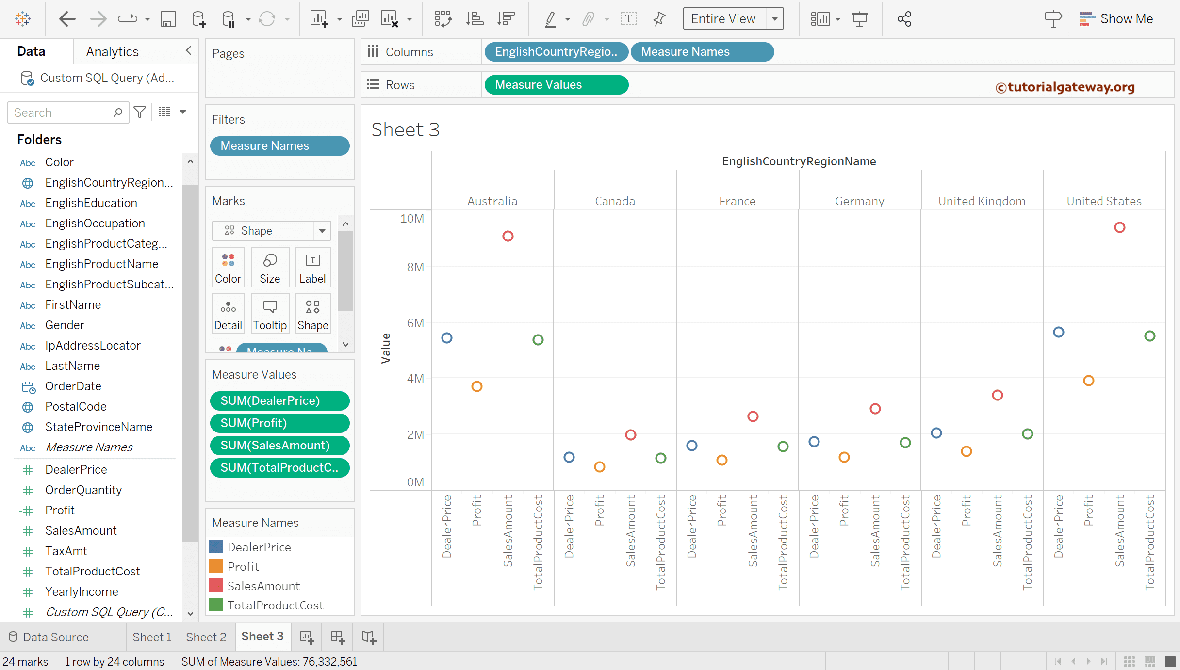
Tableau side-by-side circles using Multiple Measures
Use the control button to select multiple measures and the country dimension and click the side-by-side circle option.
The final output of the side-by-side circles is.