Tableau Waterfall Chart is a form of data visualization that helps to visualize the Running sum or total of any measure against the Dimension. The Waterfall chart is a type of Gantt bar that is very useful for comparing Measures over a time period.
For instance, use this Waterfall Chart to visualize the Profits (Positive or Negative) of a Month or year to increase or decrease our Production (Decision Making), shown as stacked bars. The height of each bar corresponds to the total value of that time period (month or year), while the color indicates whether its value is positive or negative.
Create a Tableau Waterfall Chart
To create a Waterfall chart, drag and drop the Product Subcategory Name from the Dimension Region to the Columns Shelf and Order Quantity (Count) from the Measures region to the Rows Shelf of the new sheet. By default, it generates the Bar chart.
As we all know, the Tableau Waterfall chart is the modern name of the Running total graph. So, we have to add the running total to the below-specified graph. Please click on the Order Quantity from the Row Shelf. Next, select the Quick Table Calculation option and choose the Running Total.
Please visit the Connecting to Server, Bar Graph, Charts, and SQL articles to understand the Tableau configurations, data source, and dimension members.
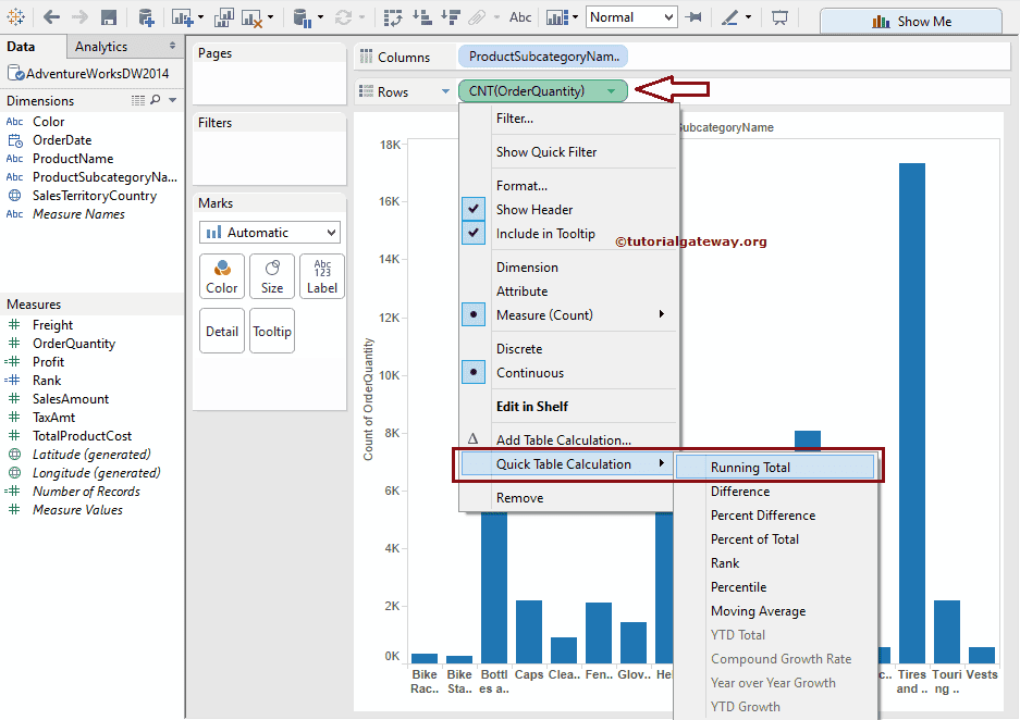
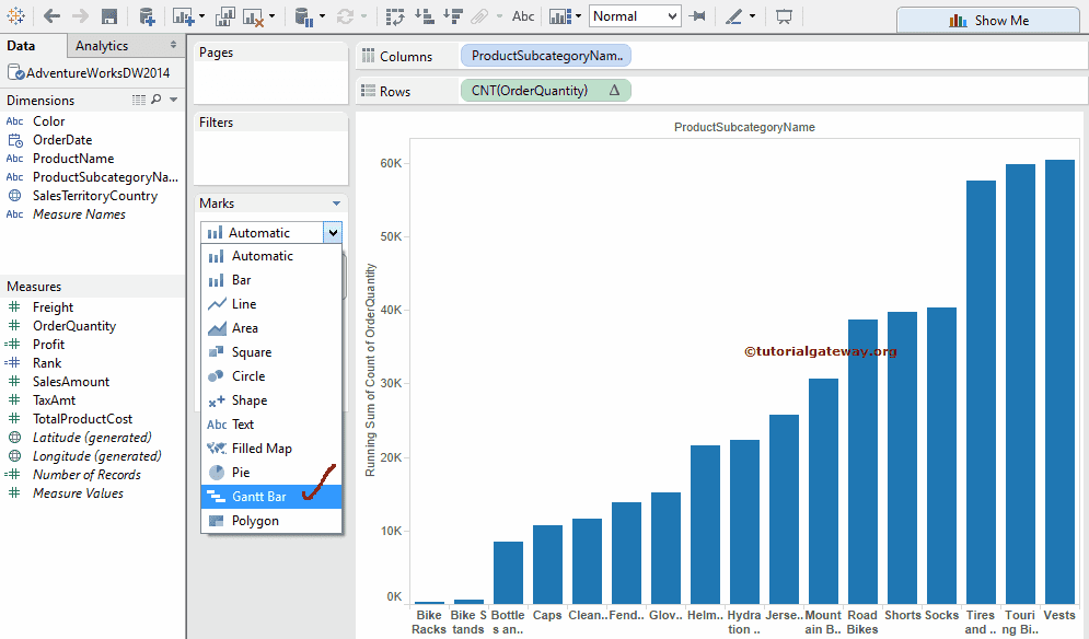
Once you select the Running Total, the following screenshot will be displayed in ascending order. Please change the Mark type from Automatic to Gantt Bar to create a Tableau waterfall chart. To do this, please select the Mark Type option for the Order Quantity and select the Gantt Bar for cumulative effect.
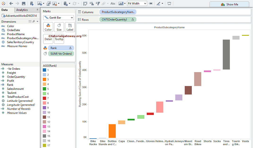
As you see, we are closer to the result. Next, we have to specify the size of each cell in the Gantt bar. So, add one more calculated field. Select the Create Calculated Field option from the Analysis Menu.
Once you select the Create Calculated Field option, a new window will be opened to write or edit table calculations. For the following example, we need negative values of order Quantity. So, write the following expression as the table calculations. For more Charts >> Click Here.
Calculated Field Name: -Ve Orders
Expression: -([OrderQuantity])
Next, drag and drop the newly created calculated field (Negative orders) from the Measures region to the Size field present in the Marks card. As you see our Waterfall Chart. The negative value of order quantity sizes Gantt Bar cells.

Add Colors and Row Grand Totals to the Tableau Waterfall Chart
Let us add some colors to this. We now use the Rank (Calculated Field) we created in the Bump Graph article to color this report. Drag the Rank from the Measures region to the Color Field present in the Marks card.
NOTE: You can use Profits Measure or KPI trends and Goals On the color shelf to visualize them in the Waterfall Chart.
By default, the Rank field will rank using Table Across. So, please change the quick table calculation from Table Across to Count of Order Quantity and Sort the order by descending.

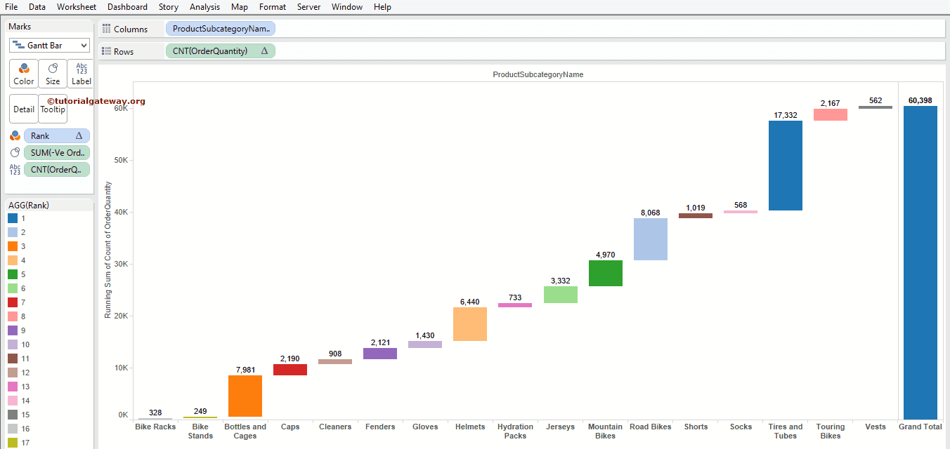
We successfully created a Tableau Waterfall Chart.
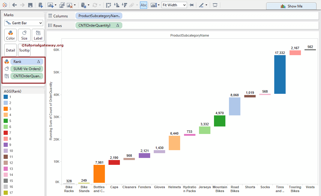
We forgot to add the Grand Total to complete this. To add the Grand Total, go to the Analysis Menu. Next, select the Totals option and the Show Row Grand Totals option. Please refer to the Add Totals article.
The final preview of the Waterfall chart.
Comments are closed.