In this article, we will show you how to create a Tableau Lollipop Chart with an example. For this lollipop chart demo, we will write the Custom Query against the SQL Server Data Source.
Please visit the Connecting to SQL Server and Charts article to understand the Tableau configurations. The custom SQL query we are going to use for this report is:
SELECT ProdSubCat.EnglishProductSubcategoryName, Tery.[SalesTerritoryCountry],
       Prod.EnglishProductName,  Prod.Color, Fact.OrderQuantity, Fact.TotalProductCost,
       Fact.SalesAmount, Fact.TaxAmt, Fact.OrderDate
FROM DimProductSubcategory AS ProdSubCat
INNER JOINDimProduct AS Prod ON ProdSubCat.ProductSubcategoryKey = Prod.ProductSubcategoryKey
INNER JOIN FactInternetSales AS Fact ON Prod.ProductKey = Fact.ProductKey
INNER JOIN [DimSalesTerritory] AS Tery ON Tery.[SalesTerritoryKey] = Fact.[SalesTerritoryKey]
How to Create a Tableau Lollipop Chart
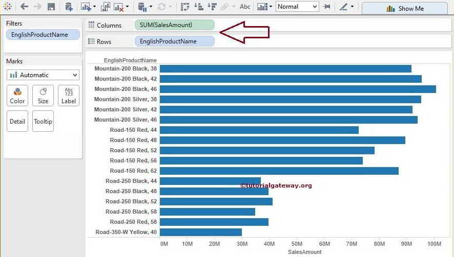
In this example, we are going to create a Lollipop Chart. First, drag and drop the English Product Name from the Dimension Region to the Rows Shelf and the Sales Amount from the Measures region to the Columns Shelf, as shown below. By default, it will generate the Bar graph.
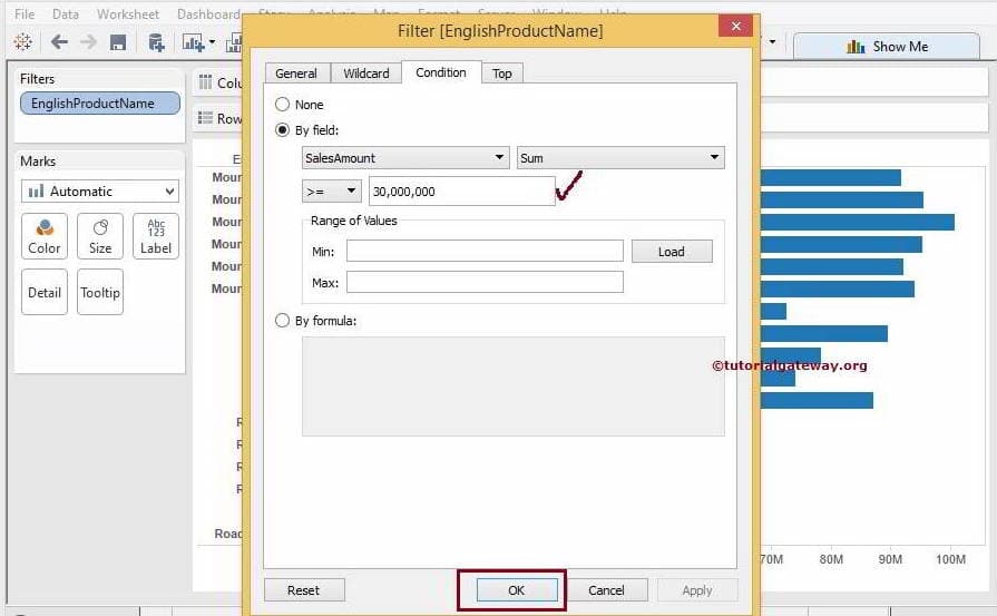
From the screenshot below, we used the filters to restrict the number of rows returned by the Bar Graph. So, our report will display the products whose sales amount is greater than or equal to 30,000,000.
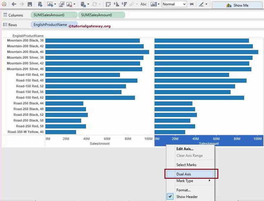
Next, for this Tableau Lollipop Chart, drag and drop the Sales Amount from the Measures region to the Columns Shelf, as shown below.
Using the Dual Axis concept, please merge measures in the column shelf. To do this, select the Sales Amount and right-click on it to open the context menu. From that, please select the Dual Axis option.
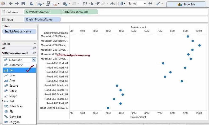
Once you complete it, let us change the Mark type from Automatic to more meaningful for the Lollipop Chart. First, please select the Mark Type option of a Sales Amount axis and select the Bar graph for now.
Next, please change the Size of the Bar plot using the Size field present on the Mark shelf.
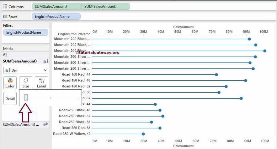
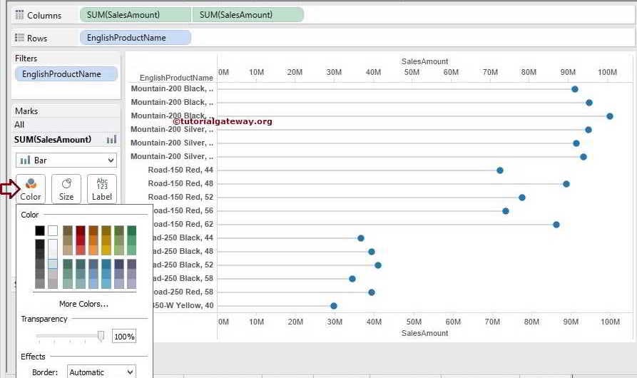
Then, please change the Color of the Bar graph using the Color field in the Mark shelf as shown below.
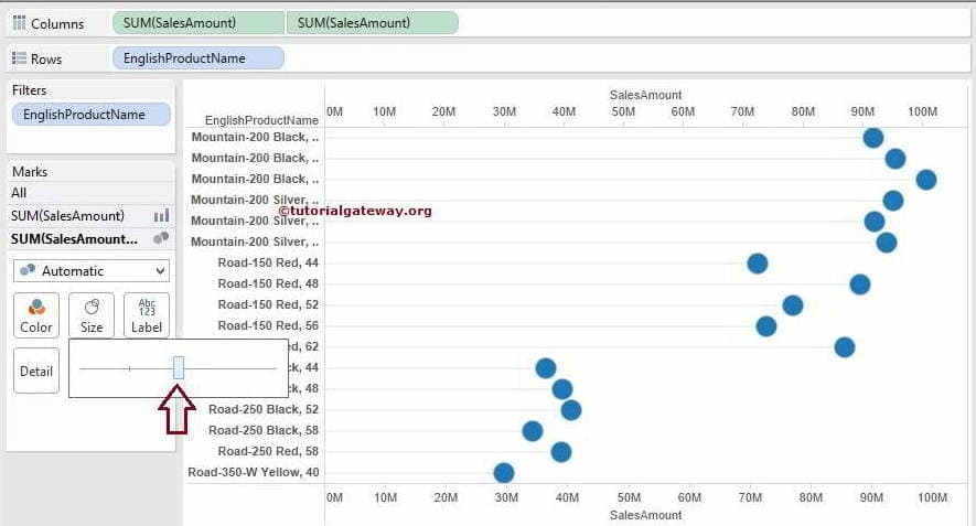
Now, we are increasing the Tableau lollipop chart circle size by using the Size field present in the Mark shelf.
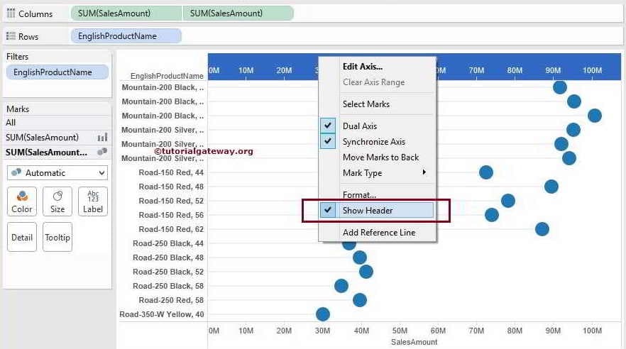
If you are uncomfortable seeing both Axes, please select one of the axes and uncheck the Show Header option as shown below.
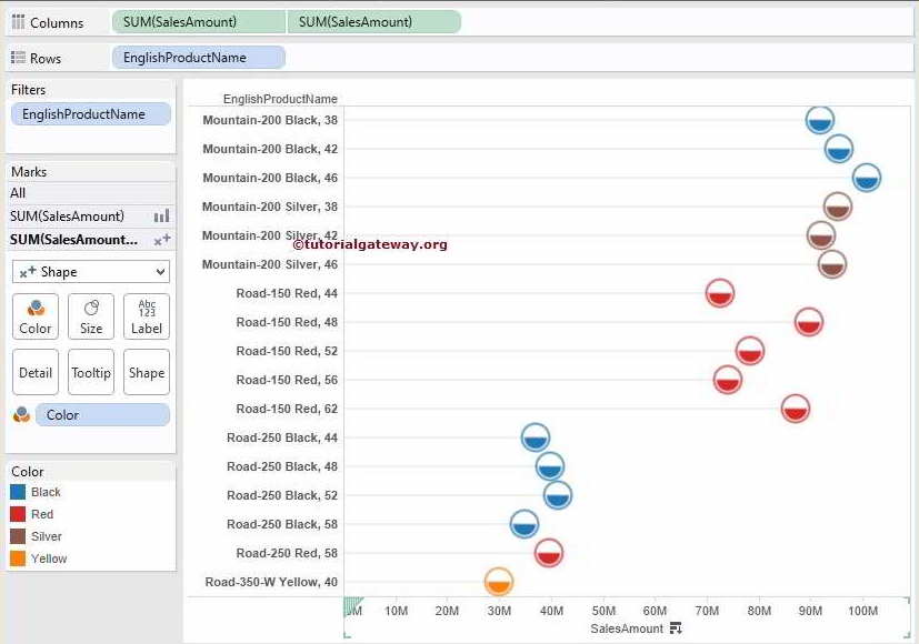
To make our report more colorful, we added the Color dimension to the Lollipop Chart Color field in Marks Shelf.
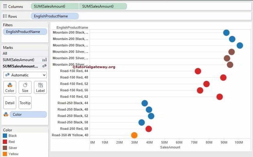
The above screenshot shows that we successfully created the lollipop chart.
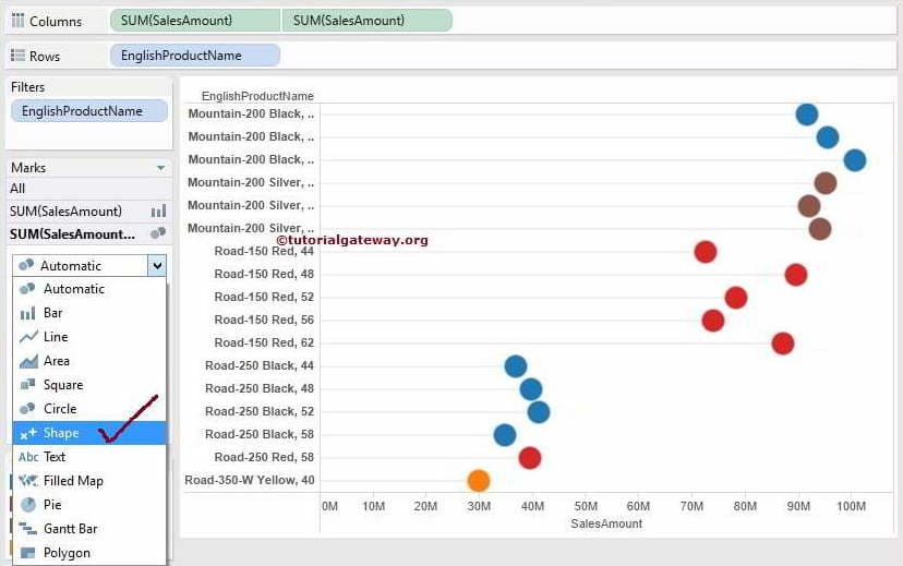
Format Tableau Lollipop Chart
To change the Lollipop chart circle, we have to change the Mark type from Automatic to Shape, as shown below.
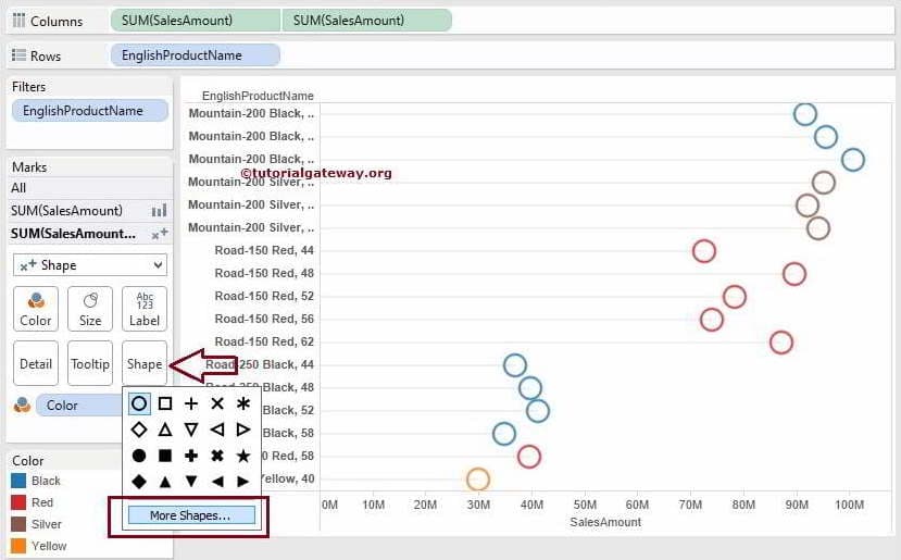
Next, click on the Shape field and select the shape from the drop-down list. If you want more shapes for you to project, please click on the Tableau lollipop chart More Shapes option.
Once you click on the More Shapes option, an Edit Shape window will open. Here, we are selecting the Ratings palette. Next, we selected the below-shown shape for this example.
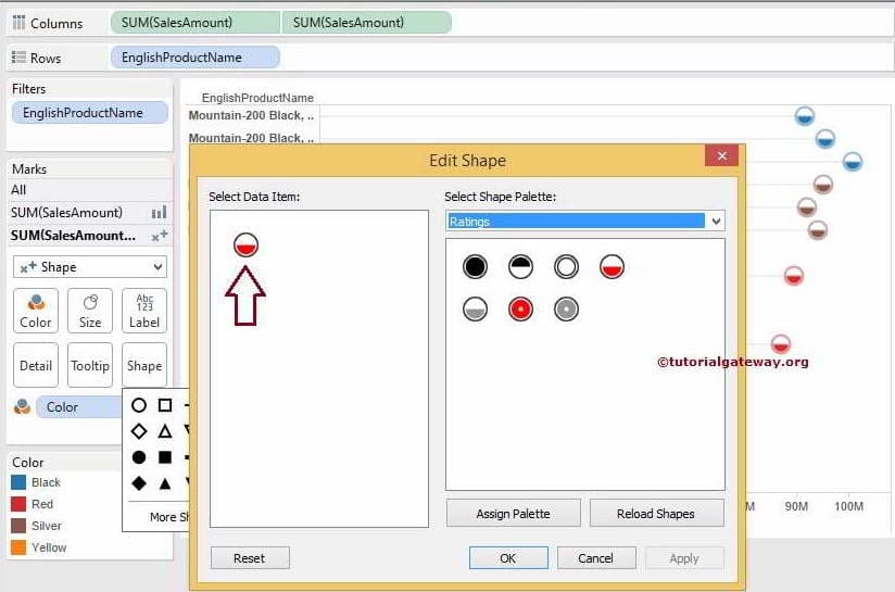
Click OK to finish assigning the selected shape to our Lollipop Chart. Let us see our final report preview.
Comments are closed.