The Python matplotlib histogram looks similar to the pyplot bar chart. However, the data will be equally distributed into bins. Each bin represents data intervals, and the histogram compares the frequency of numeric data against the bins.
In Python, you can use the Matplotlib library to plot histograms with the help of the pyplot hist function. The hist syntax to draw a histogram is
matplotlib.pyplot.pie(x, bins)
In the above pyplot histogram syntax, x represents the numeric data that you want to use in the Y-Axis, and bins will use in the X-Axis.
Simple matplotlib Histogram Example
In this example, we were generating a random array and assigning it to x. Next, we are drawing a histogram using the pyplot hist function. Notice that we haven’t used the bins argument.
import matplotlib.pyplot as plt
import numpy as np

x = np.random.randn(1000)
print(x)

plt.hist(x)

plt.show()

Since we are using the random array, the above image or screenshot might not be the same for you.
The first step in the plot is creating equal width bins using the lower and upper range of values. However, in the above Python example, we haven’t used this argument, so the hist function will automatically create and use default bins.
Here, we used this argument number explicitly by assigning 20 to it. It means the below code will draw hist of random numbers, and the data will be equally distributed into 20 bins.
x = np.random.randn(1000)
print(x)

plt.hist(x, bins = 20)

plt.show()
It is another example of a pyplot histogram with random numbers of bin size 50.
x = np.random.normal(0, 1, 1000)
print(x)

plt.hist(x, bins = 50)

plt.show()

Python matplotlib Histogram using CSV File
In this example, we are using the CSV file to plot a hist. As you can see from the below code, we are using the Orders quantity as the Y-Axis values.
import numpy as np
import pandas as pd
from matplotlib import pyplot as plt

df = pd.read_excel('/Users/suresh/Downloads/Global_Superstore.xls')

data = df['Quantity']
bins=np.arange(min(data), max(data) + 1, 1)

print(df['Quantity'].count())
plt.hist(df['Quantity'], bins)

plt.show()
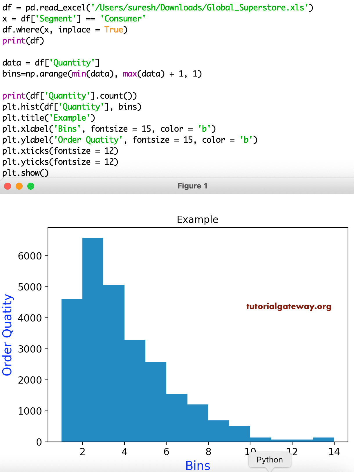
pyplot histogram titles
This example shows how to add the title, X-Axis, and Y-Axis labels. In this example, we are also formatting the font size and color of the X and Y labels, X, and Y ticks. If you notice the below code, we are using the data whose Segment is equal to Consumer.
df = pd.read_excel('/Users/suresh/Downloads/Global_Superstore.xls')

x = df['Segment'] == 'Consumer'
df.where(x, inplace = True)
print(df)

data = df['Quantity']
bins=np.arange(min(data), max(data) + 1, 1)

print(df['Quantity'].count())
plt.hist(df['Quantity'], bins)

plt.title('Example')
plt.xlabel('Bins', fontsize = 15, color = 'b')
plt.ylabel('Order Quatity', fontsize = 15, color = 'b')
plt.xticks(fontsize = 12)
plt.yticks(fontsize = 12)

plt.show()
Multiple Python matplotlib pyplot histograms
In this example, we are trying to plot multiple histograms.
df = pd.read_excel('/Users/suresh/Downloads/Global_Superstore.xls')

dat = df['Quantity']
bins = np.arange(min(dat), max(dat) + 1, 1)

x = df.loc[df['Segment'] == 'Consumer']
y = df.loc[df['Segment'] == 'Corporate']
z = df.loc[df['Segment'] == 'Home Office']

plt.hist(x['Quantity'], bins)
plt.hist(y['Quantity'], bins)
plt.hist(z['Quantity'], bins)

plt.show()

Controlling pyplot hist bin size
It is the same pyplot Histogram example that we have shown above. However, this time, we changed the range of the bins to a static value of 5. It means the whole quantity of data is distributed into five bins.
import numpy as np
import pandas as pd
from matplotlib import pyplot as plt

df = pd.read_excel('/Users/suresh/Downloads/Global_Superstore.xls')

data = df['Quantity']
bn = 5

x = df.loc[df.Segment == 'Consumer', 'Quantity']
y = df.loc[df.Segment == 'Corporate', 'Quantity']
z = df.loc[df.Segment == 'Home Office', 'Quantity']

plt.hist(x,bn)
plt.hist(y, bn)
plt.hist(z, bn)

plt.show()

As you can notice, there is a difference between both of them. It is because of their change in the bin.
Python matplotlib pyplot Histogram legend
While working with multiple values, it is necessary to identify which one belongs to which category. Otherwise, users will get confused. To solve these issues, you must enable the legend using the pyplot legend function. Next, use the labels argument of the hist function to add labels to each one.
import numpy as np
import pandas as pd
from matplotlib import pyplot as plt

df = pd.read_excel('/Users/suresh/Downloads/Global_Superstore.xls')

dat = df['Quantity']
bs = np.arange(min(dat), max(dat) + 1, 1)

x = df.loc[df['Segment'] == 'Consumer']
y = df.loc[df['Segment'] == 'Corporate']
z = df.loc[df['Segment'] == 'Home Office']

plt.hist(x['Quantity'], bs, label = 'Consumer')
plt.hist(y['Quantity'], bs, label = 'Corporate')
plt.hist(z['Quantity'], bs, label = 'Home Office')

plt.legend()
plt.show()
Format histogram Colors
Whether it is one or more, it will automatically assign the default colors to the histogram. However, you can use the color argument of the pyplot hist function to alter the histogram color. In this example, we are assigning maroon to the first, blue to the second, and green to the third one.
df = pd.read_excel('/Users/suresh/Downloads/Global_Superstore.xls')

da = df['Quantity']
bs = np.arange(min(da), max(da) + 1, 1)

x = df.loc[df['Segment'] == 'Consumer']
y = df.loc[df['Segment'] == 'Corporate']
z = df.loc[df['Segment'] == 'Home Office']

plt.hist(x['Quantity'], bs, label = 'Consumer', color = 'maroon')
plt.hist(y['Quantity'], bs, label = 'Corporate', color = 'blue')
plt.hist(z['Quantity'], bs, label = 'Home Office', color = 'green')

plt.legend()
plt.show()

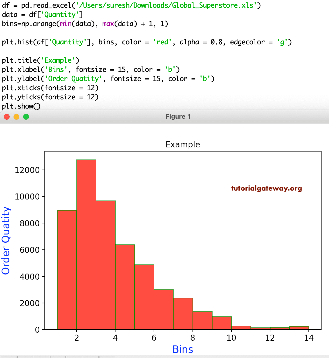
Similarly, you can alter the bin edges colors and opacity using alpha and edgecolor argument.
df = pd.read_excel('/Users/suresh/Downloads/Global_Superstore.xls')
da = df['Quantity']
bins=np.arange(min(da), max(da) + 1, 1)

plt.hist(df['Quantity'], bins, color = 'red', alpha = 0.8, edgecolor = 'g')

plt.title('Example')
plt.xlabel('Bins', fontsize = 15, color = 'b')
plt.ylabel('Order Quatity', fontsize = 15, color = 'b')
plt.xticks(fontsize = 12)
plt.yticks(fontsize = 12)
plt.show()
Python matplotlib Horizontal Histogram
The pyplot hist function has an orientation argument with two options, and they are horizontal and vertical (default). If you use this orientation argument as the horizontal, then the hist will be drawn horizontally.
import pandas as pd
from matplotlib import pyplot as plt

df = pd.read_excel('/Users/suresh/Downloads/Global_Superstore.xls')

data = df['Quantity']
bins=np.arange(min(data), max(data) + 1, 1)

plt.hist(df['Quantity'], bins, color = 'red',
         alpha = 0.8, orientation = 'horizontal')

plt.title('Horizontal Example')
plt.show()

histtype
The Python matplotlib pyplot histogram has a histtype argument, which is useful to change the type from one type to another. There are four types of hists available, and they are
- bar: This is the traditional bar-type. If you use multiple data along with histtype as a bar, then those values are arranged side by side.
- barstacked: When you use the multiple data, those values stacked on top of each other.
- step: Hist without filling the bars. Something like a line chart or Waterfall chart.
- stepfilled: Same as above, but the empty space filled with the default color.
df = pd.read_excel('/Users/suresh/Downloads/Global_Superstore.xls')

data = df['Quantity']
bins=np.arange(min(data), max(data) + 1, 1)

fix, (ax1, ax2, ax3) = plt.subplots(1, 3, figsize = (8, 4))

x = df.loc[df['Segment'] == 'Consumer']
y = df.loc[df['Segment'] == 'Corporate']
z = df.loc[df['Segment'] == 'Home Office']

ax1.hist(x['Quantity'], bins, histtype = 'bar', color = 'red', alpha = 0.8, edgecolor = 'g')
ax2.hist(y['Quantity'], bins, color = 'blue', histtype = 'step')
ax3.hist(z['Quantity'], bins, color = 'green',histtype = 'stepfilled')

plt.show()

The log argument value accepts a boolean value, and its default is False. If you set this True, then the axis will be set on a log scale. Apart from log, there is one more argument called cumulative, which helps display the cumulative histogram.
df = pd.read_excel('/Users/suresh/Downloads/Global_Superstore.xls')

data = df['Quantity']
bins=np.arange(min(data), max(data) + 1, 1)

plt.hist(df['Quantity'], bins, color = 'red', alpha = 0.8,
         cumulative = True, log = True)

plt.title('Horizontal Example')

plt.show()

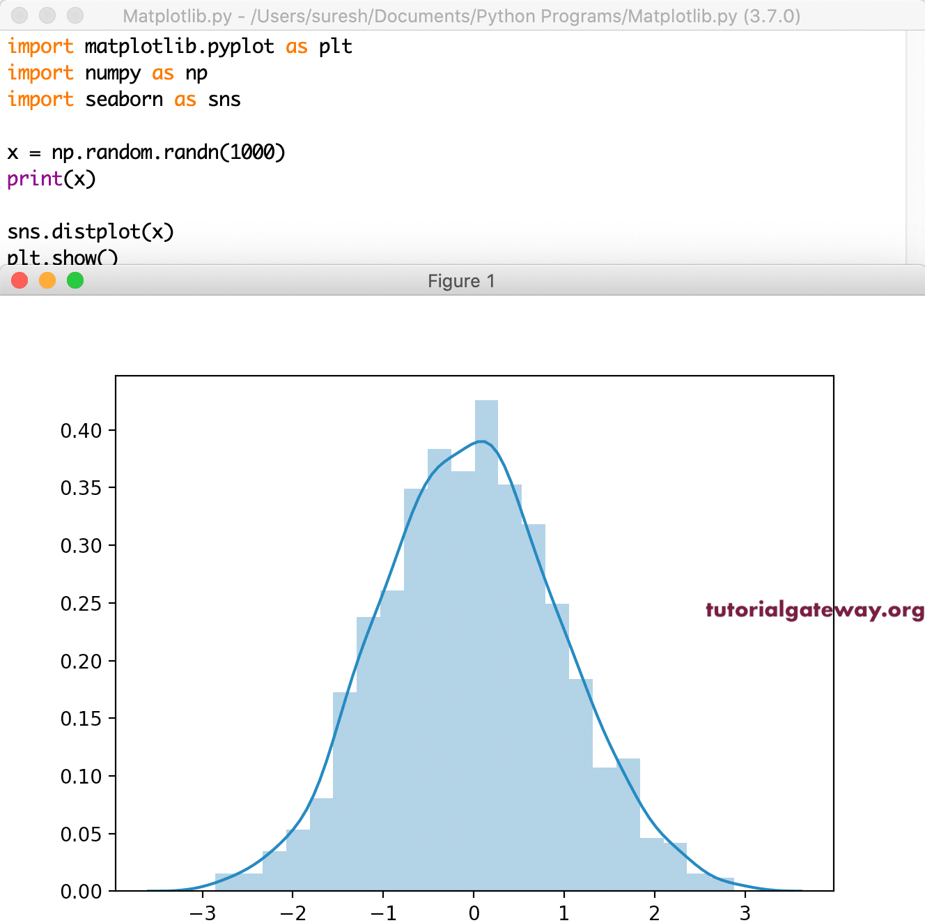
seaborn Histogram
We have a seaborn module, which helps to draw a histogram along with a density curve. It is very simple and straightforward.
import matplotlib.pyplot as plt
import seaborn as sns

x = np.random.randn(1000)
print(x)

sns.distplot(x)

plt.show()
Python matplotlib pyplot 2D Histogram
The pyplot has a hist2d function to draw a two dimensional or 2D histogram. And to draw matplotlib 2D hist, you need two numerical arrays or array-like values.
x = np.random.randn(100)
print(x)

y = 2 * np.random.randn(100)
print(y)

plt.hist2d(x, y)

plt.show()

In this, we were using two subplots and changed the size.
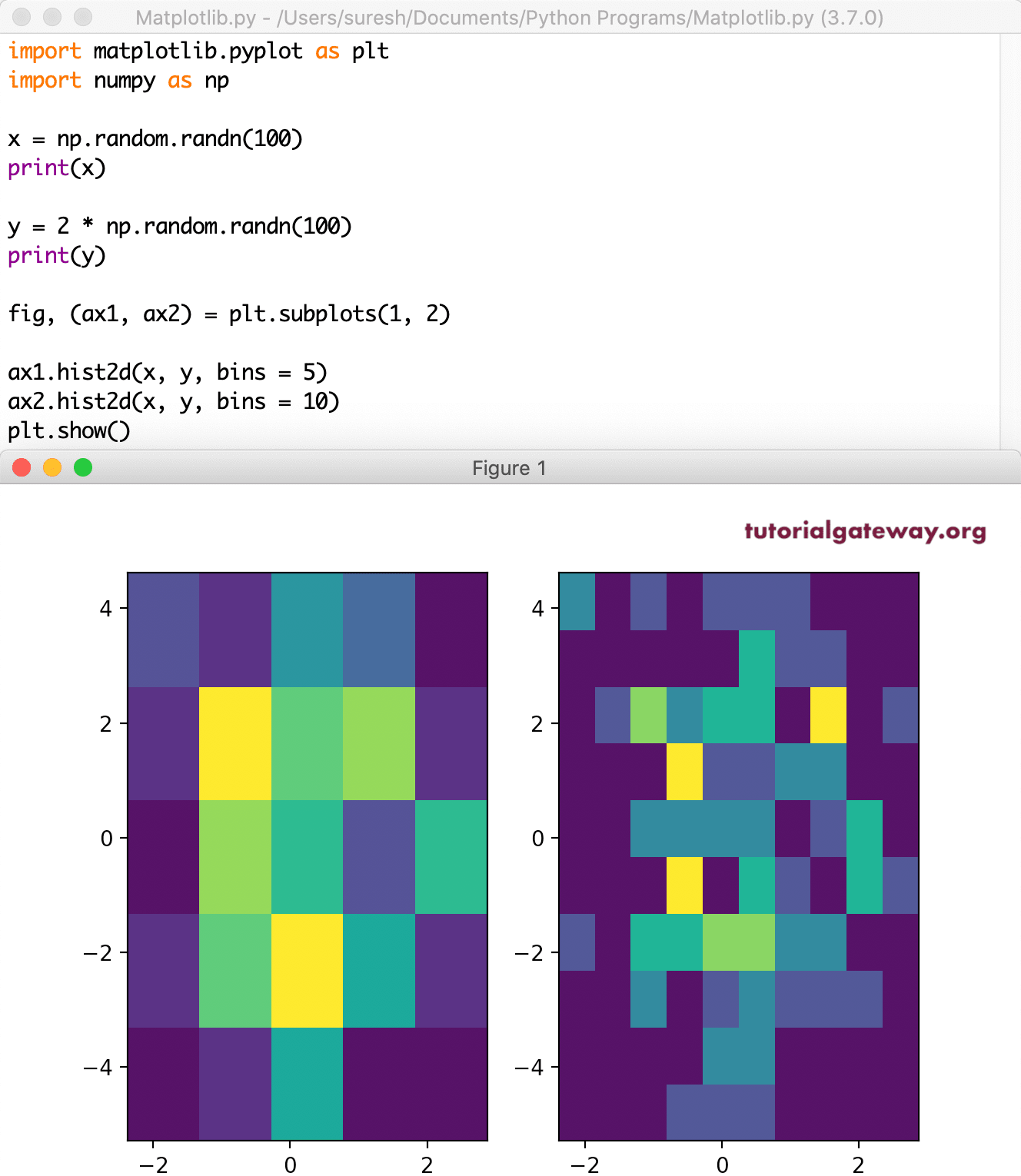
x = np.random.randn(100)
print(x)

y = 2 * np.random.randn(100)
print(y)

fig, (ax1, ax2) = plt.subplots(1, 2)

ax1.hist2d(x, y, bins = 5)

ax2.hist2d(x, y, bins = 10)
plt.show()
It is another one of the 2D histogram.
x = np.random.randn(10000)
print(x)

y = 2 * np.random.randn(10000)
print(y)

fig, (ax1, ax2) = plt.subplots(1, 2)

ax1.hist2d(x, y, bins = (10, 10))

ax2.hist2d(x, y, bins = (200, 200))
plt.show()

Let me change the colors of a histogram using the cmap argument.
x = np.random.randn(10000)
print(x)

y = 2 * np.random.randn(10000)
print(y)

fig, (ax1, ax2) = plt.subplots(1, 2)

ax1.hist2d(x, y, bins = (10, 10), cmap = 'cubehelix')

ax2.hist2d(x, y, bins = (200, 200), cmap = 'rainbow')
plt.show()

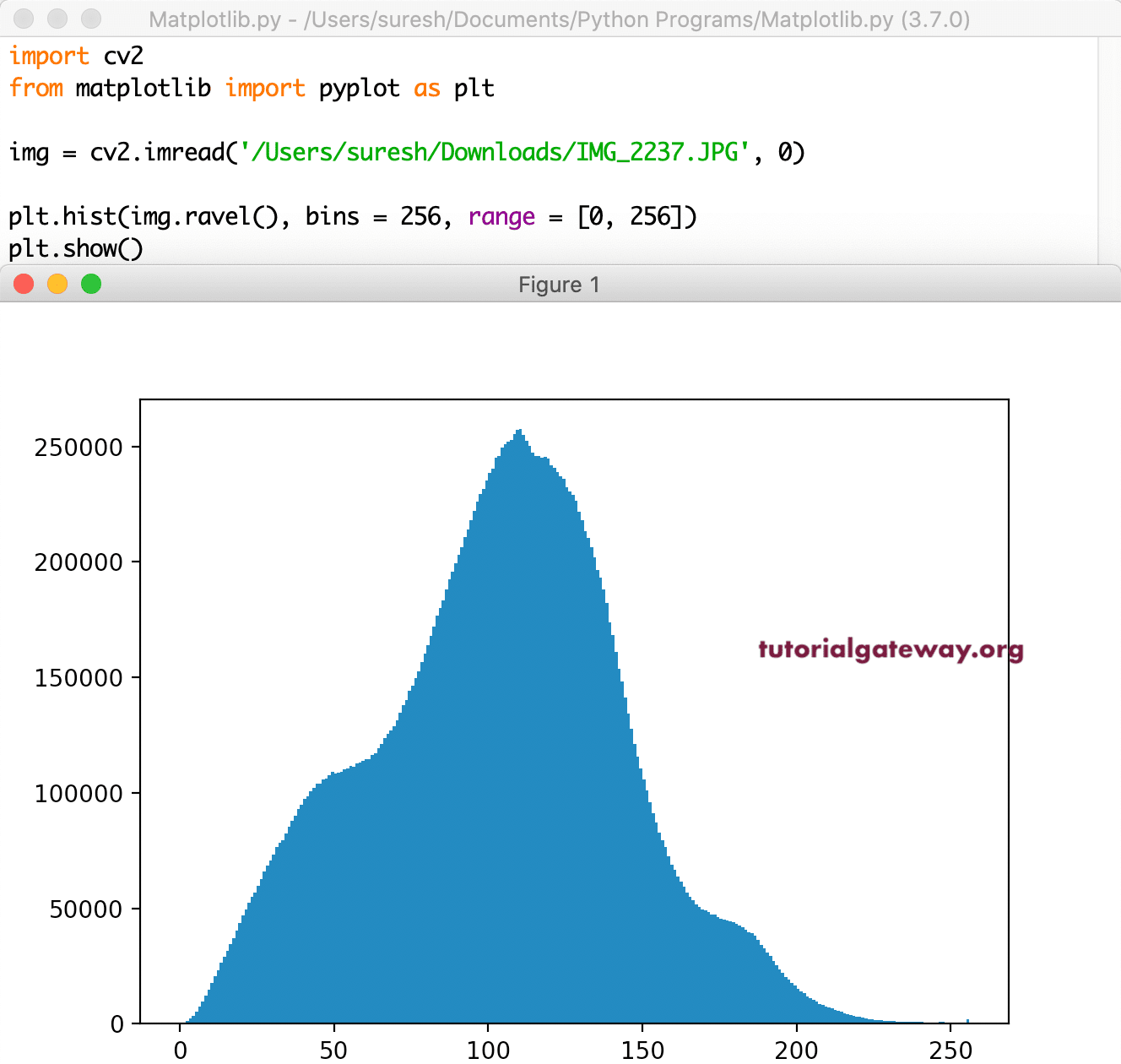
Histograms of an Image
Apart from the above-specified ones, you can use histograms to analyze the colors in an image. In this section, we show the RGB colors In an image.
import cv2
from matplotlib import pyplot as plt

img = cv2.imread('/Users/suresh/Downloads/IMG_2065.JPG', 0)

plt.hist(img.ravel(), bins = 256, range = [0, 256])
plt.show()