A highlight table in Tableau visualizes the data in a crosstab format filled with colors. It allows the user to add any Measure value to highlight the individual cell data within a table. The colors in the Highlight table naturally draw attention to particular values because of their dark or light shade. For example, you have a Product, year in the crosstab report, and Sales to decide the color. In that case, the cell with the thickest color has the highest sales, and the lightest color cell has the most negligible sales.
Tableau Highlight tables quickly identify highs and lows or other interesting points in your data. You can use them to identify the key dimensions, years, and measures to compare and analyze. You have to be careful with the measure on the Color shelf because it will decide or act as the condition to highlight the table.
Highlight Table helps you to compare the categorical data using colors. This article will show you how to create a Highlight Table with an example. For the demo, we use the World Indicators Data Source.
How to Create a Tableau Highlight Table?
Highlight tables consist of one or more dimensions on rows and column shelves and one measure on the color shelf. You can manually create a Highlight Table using the Show Me Window. We start this section with a manual approach and later show you the other approach.
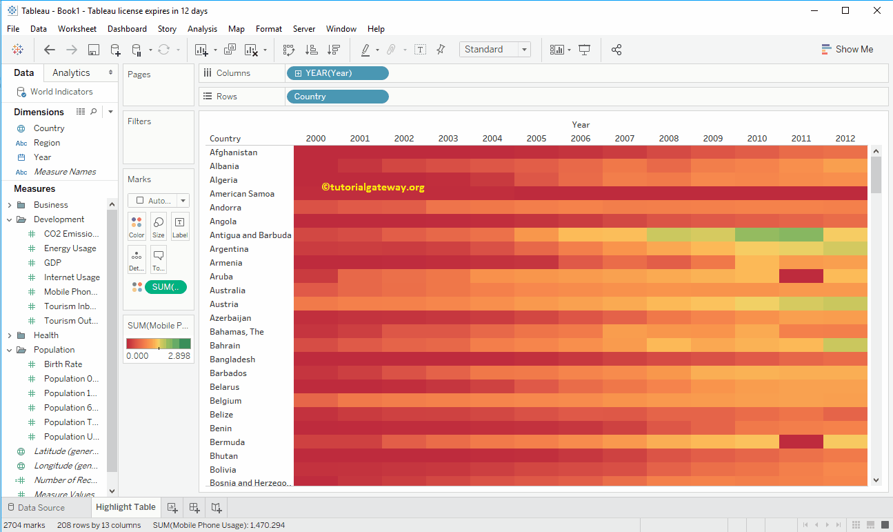
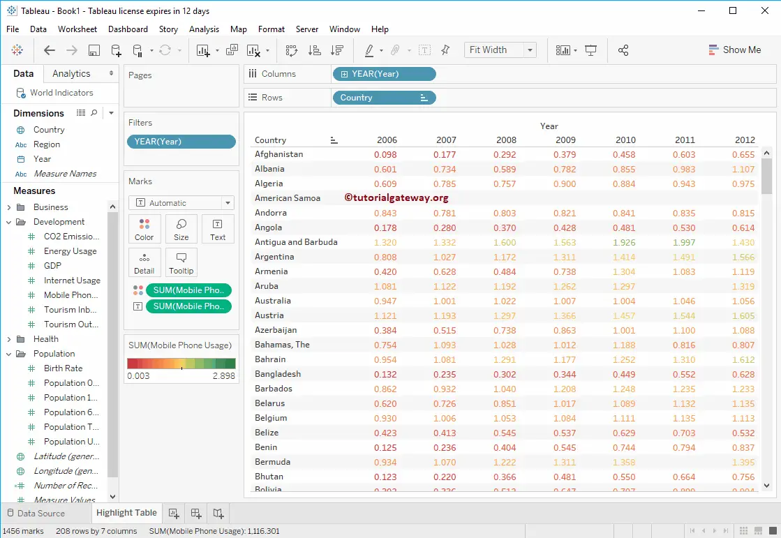
To manually create a Tableau Highlight Table, drag and drop the Country field from the Dimension Region to the Rows Shelf. Once you drag them, a Text Label will generate, as shown below.
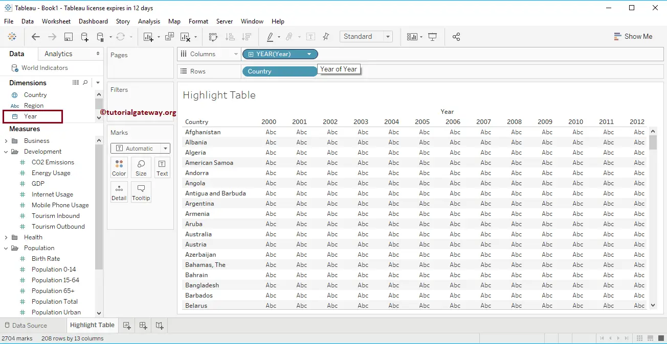
Next, Drag and Drop the Year from the Dimensions Region to the Tableau Columns Shelf. Refer to Text Label and Charts.
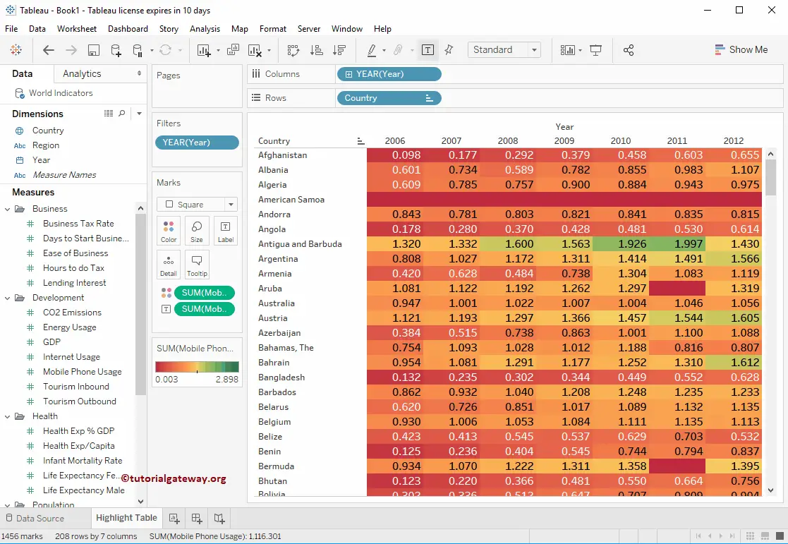
Next, drag and drop the Mobile Phone Usage field from the Measures Region to the Color field in the Marks Shelf. From the below screenshot, you can see the Highlight table. Let me change the Color adjustment field position.
Change the Colors of a Highlight Table in Tableau
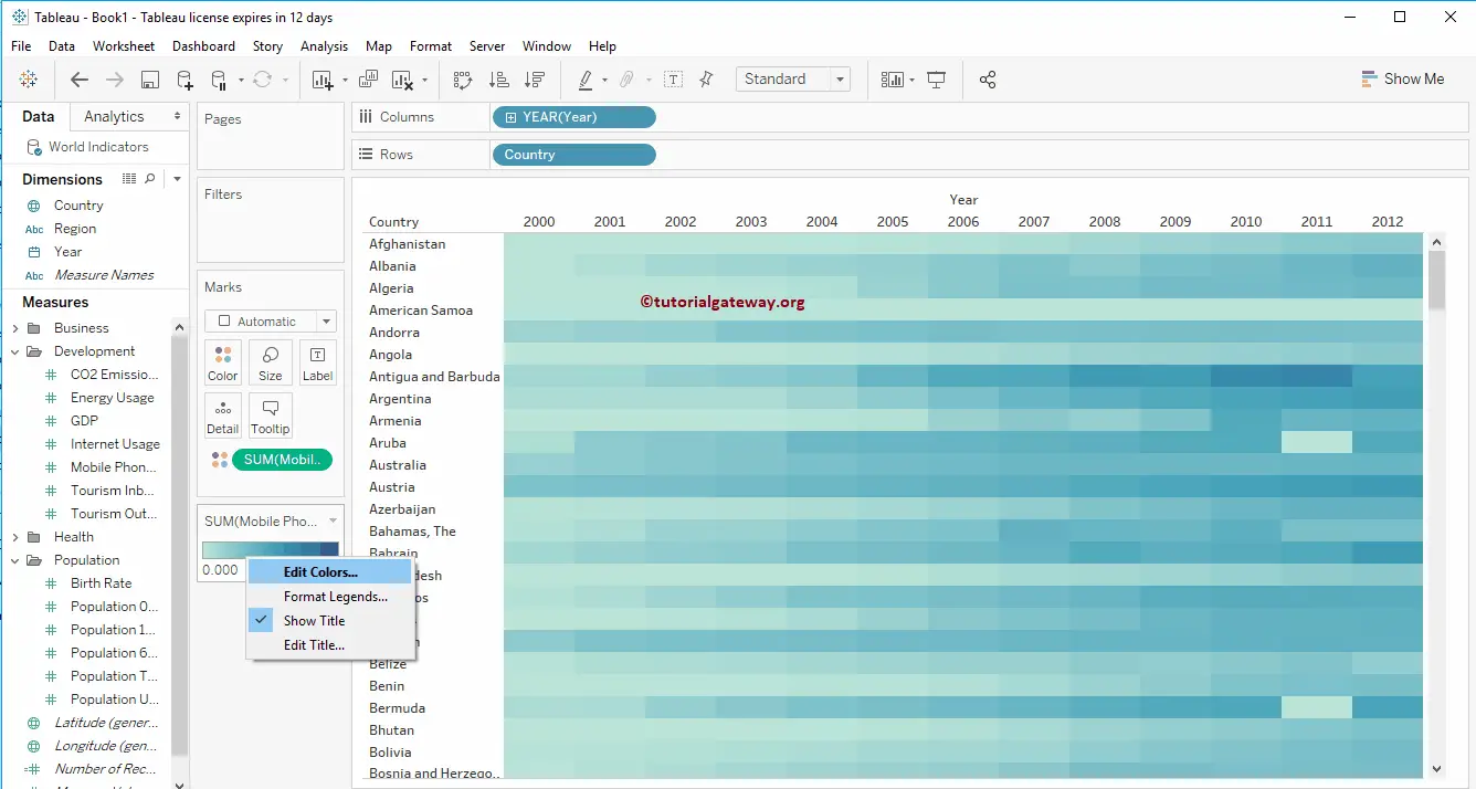
The screenshot below shows the Highlight table with default colors. However, you have the option to change the default colors.
To do so, click the drop-down menu beside the SUM(Mobile Phone Users) color legend or right-click on the Color bar. Both of them will open the context menu shown below. From that, please select the Edit Colors… option.
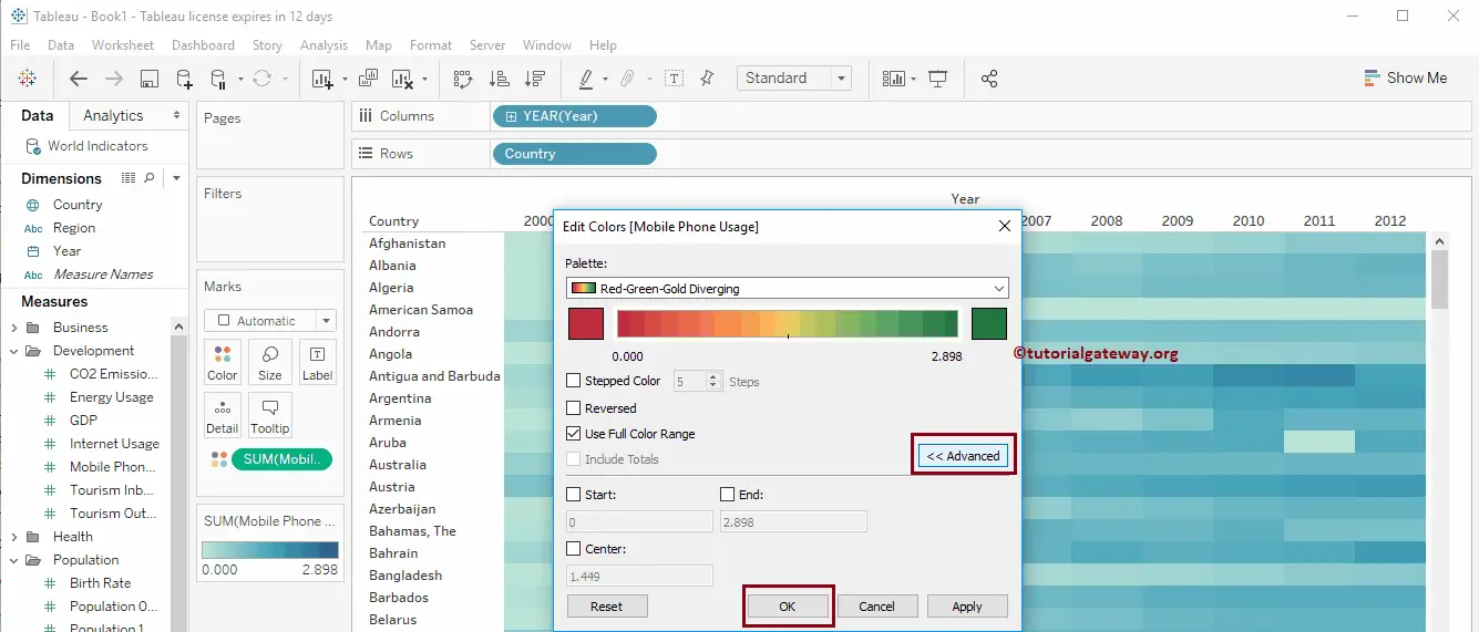
Selecting the Edit option opens the following window. By default, it selects the Automatic pallet as the color schema with blue colors.
Click the drop-down arrow under the Palette and select the color as per your requirement. For now, we are choosing Red-Green-Gold Diverging. You can also specify the Start Point, End Point, and Center by clicking the Advanced button.
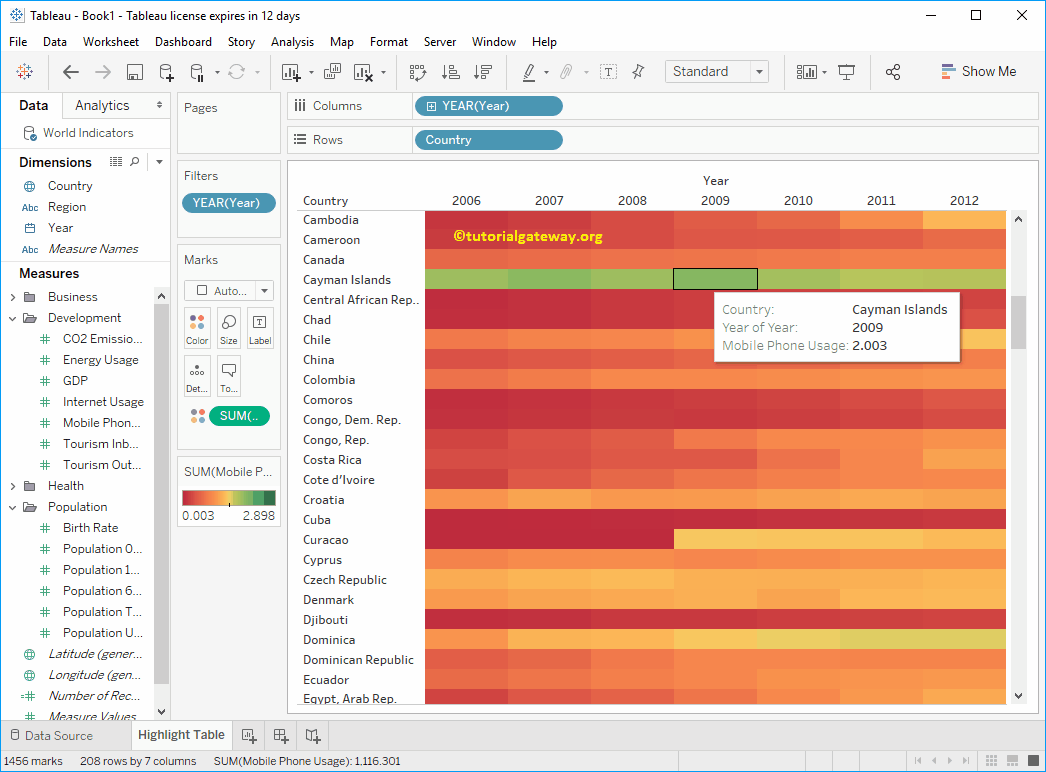
Now you can see the Tableau Highlight table with different color combinations. However, it looks good to exclude the years from 2000 to 2005 because we don’t have much data to display over that period.
We applied a filter on the year filed. Please refer to the filter concept to understand this. Highlighting any block will show you the information at that particular point.
How to Change the Tableau Highlight Table Block Size?
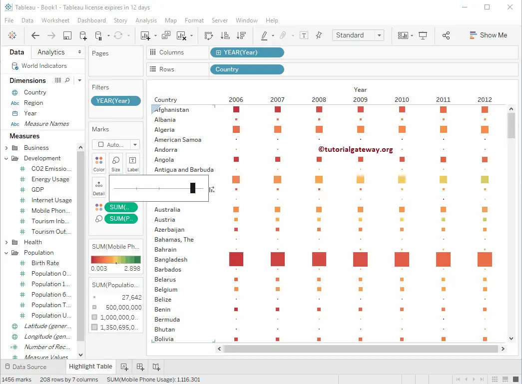
We can adjust the size instead of filling the Highlight table complete block with colors. To do so, drag the Total Population from the Measures Region to the Size field in a Marks Shelf. As you can see, the size of each block is displayed based on the population.
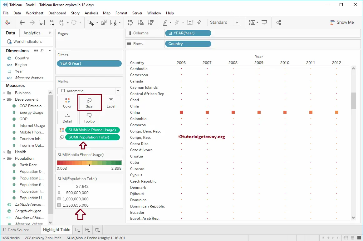
Let me increase the Size. Selecting any specific block will show you the information at that particular point.
Placing the Mobile Phone Usage Measure in the Text label will convert this one into a Normal Table along with the colors.
Create a Tableau Highlight Table using Show Me
Before we show you the steps, let me show you the difference between Regular and Highlight Tables.
- Regular tables display numeric data in a plain tabular (text) format. On the other hand, highlight tables fill each cell with colors to draw attention to particular data.
- Using Regular tables, you have to look at each row to identify the low and high-performing products. With highlight tables, anything dark is the highest performing, and light color is the lowest performing product. So you can identify them in a fraction of a second.
The Show Me window shows you the available charts you can make using the Measures and Dimension fields. Let me select the Highlight Table.
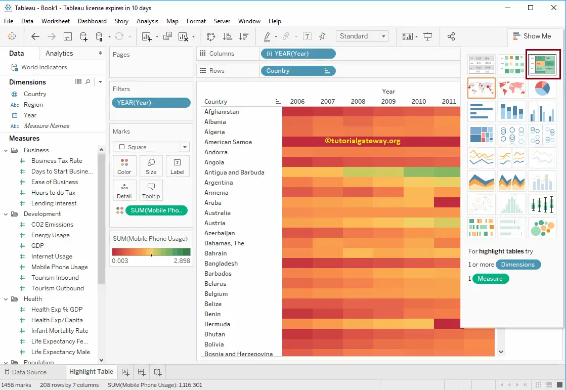
Now you can see the Highlight Table created by Show Me.