Power BI provides a range of customization or format options to help you enrich the appearance of your funnel charts. This section dwells deeper into all the available options. The desktop allows you to format various aspects of the funnel chart, including changing the Funnel Chart Title, Box Colors, Title position, fonts, Title position, borders, data labels, and background Colors.
We will use the Funnel Chart we created earlier to demonstrate these Power BI formatting options. Please click the Format button in the Visualizations pane to see the formatting options available for this Funnel Chart.
We use simple colors and basic options to explain every section in detail. However, I suggest experimenting with different font styles and colors to highlight important categories. Let’s explore some key ways to customize your funnel charts. For more List of Charts articles, visit the link.
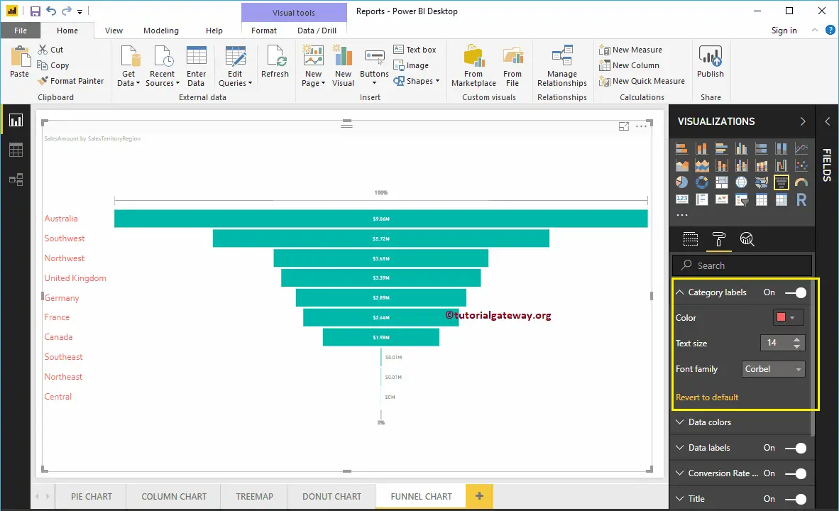
Format Power BI Funnel Chart Category labels
Category labels display the information about each box (Here, Sales Territory Region Names). You can use this section to format those labels. From the screenshot below, you can see that we changed the color of the label to Brick red, the Text Size to 14, and the Font family to Corbel.
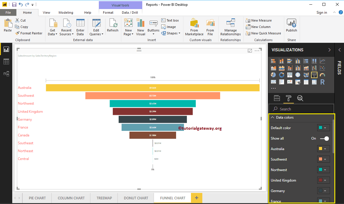
Change Power BI Funnel Chart Data Colors
By default, all the Funnel Chart Boxes display in a single default color. You can use this Data Colors section to change the Box Colors. First, toggle Show all options from Off to On.
It allows you to pick the specific color for each box. For demonstration purposes, we changed the Colors of all the existing boxes. And you can see the result.
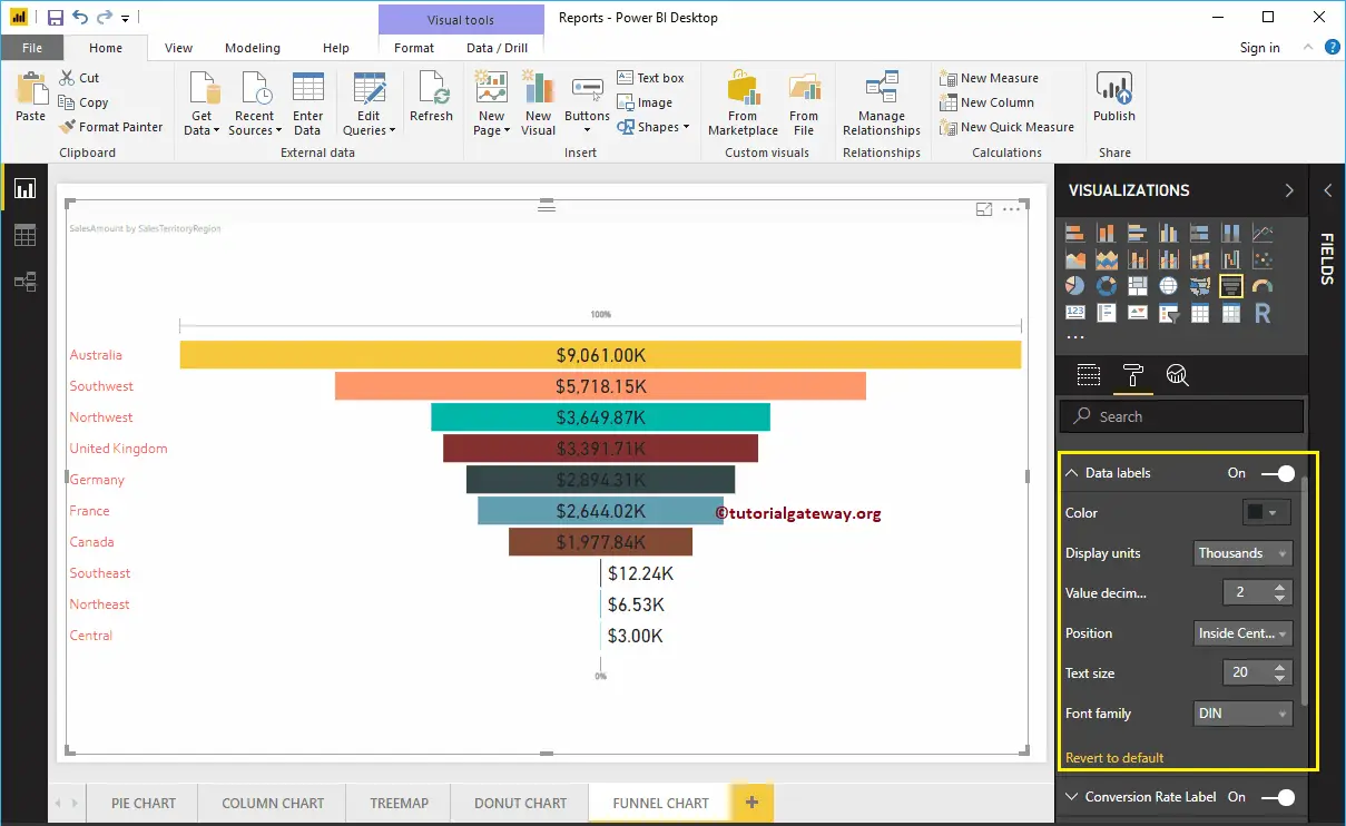
Format Data Labels of a Funnel Chart in Power BI
Data Labels display the Metric information (Sales Amount of each bar) about the bar.
As you can see from the screenshot below, we changed the Data labels Color to Dark Gray and Display Units from Auto to Thousands. We also changed the Label Position to the Inside Center, the Text Size to 20, and the Font family to DIN.
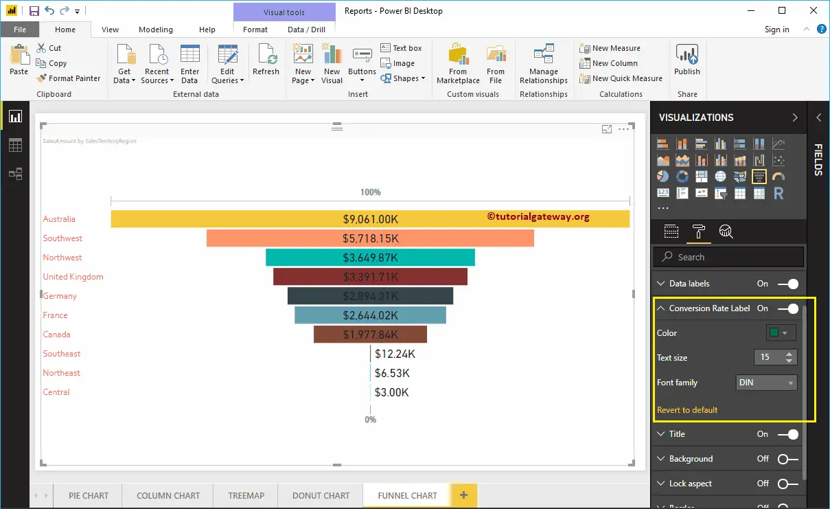
Format Funnel Chart Conversion Rate Labels
Please select the Conversion rate Label and toggle the option from Off to On. It displays 100% on the Top and 0% at the bottom of the Funnel Chart.
As you can see from the screenshot below, we changed the Color to Green, the Font style to DIN, and the Font Size to 15. In general, you can just disable this feature.
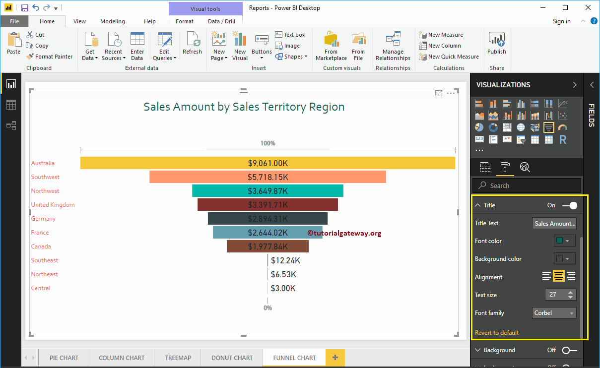
Format Power BI Funnel Chart Title
By toggling the Title option from On to Off, you can disable the title of a Funnel Chart.
As you can see from the screenshot below, we changed the Title Text to Sale Amount by Sales Territory Region. We also changed the Font Color to Green, the Font style to Corbel, the Font Size to 27, and the Title Alignment to center. You can add the background color to the title if you want.
Add Background Color to Power BI Funnel Chart
You can add the Background color to the Funnel Chart by toggling the Background option to On. We are enabling this feature and adding a background color for demonstration purposes. Here, you can change the Transparency percentage as well.
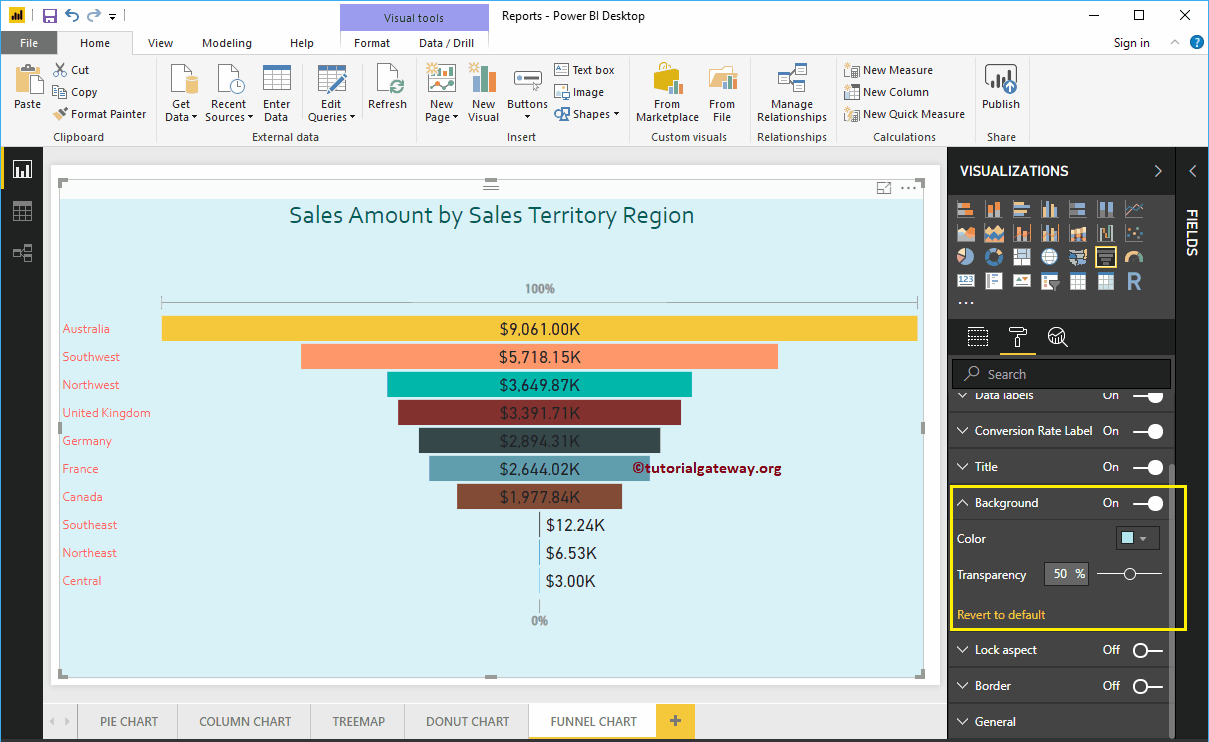
Let me remove the background color by clicking the Revert to default option.
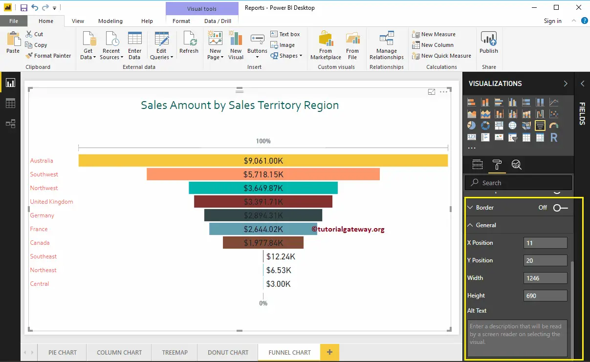
Add Border to Funnel Chart
You can add Borders to the Funnel Chart by toggling the Border option from Off to On. For the demonstration purpose, we enabled Borders and added Black color as the Border color.
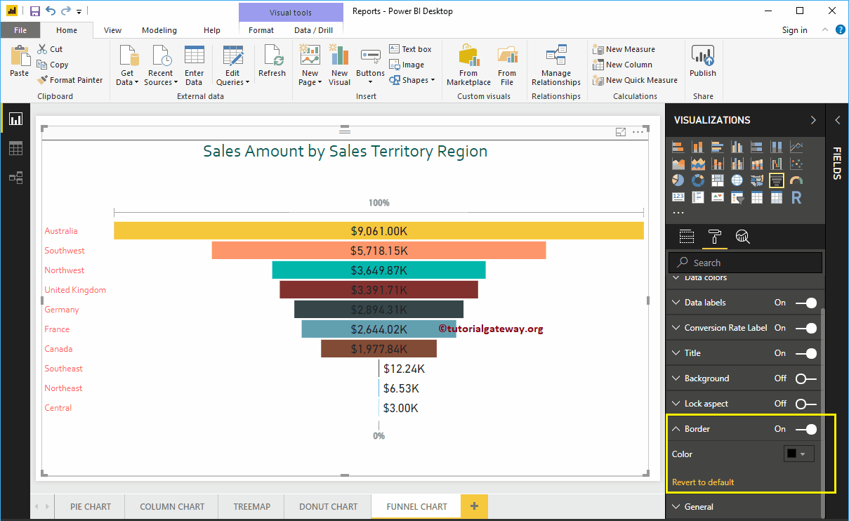
Use the General Section to Change the X and Y position, Width, and height of a Funnel Chart.
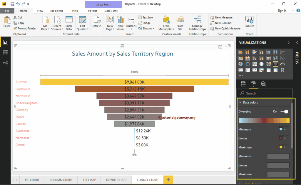
Format Funnel Chart in Power BI: Diverging option
If you add any valid column to the Color Saturation field, you can use this Diverging option to add colors to the Funnel Chart Boxes. We are adding the Sales Amount to Color Saturation to demonstrate the same.
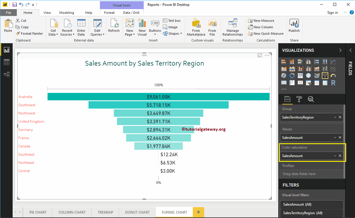
You can see that the Default Color option under the Data Colors section was replaced with the Diverging option. Let me add the Minimum, Center, and Maximum colors. Remember, you also have the option to add the Minimum, Center, and Maximum values.