In this Tableau article, we will show you how to use the calculated fields to create KPI or key performance Indicators and display the KPI in a donut chart.
To demonstrate the Tableau KPI Donut Chart, we used the Sample Superstore Excel sheet. Please visit the Excel Source article to understand the Data Source.
First, we must create a few calculated Fields, precisely four, for writing expressions. So, go to the Analysis Menu or click the down arrow (marked red) and select the Create Calculated Field.. option.
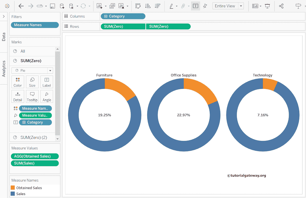
Tableau KPI Donut Chart
The expression below creates a zero calculated field that returns 0, and it is helpful to create a donut chart with the dual axis.
0
The second calculated field, i.e., Sales Target, will set the Goal or maximum expected sale.
900000
The third calculated field, i.e., Obtained Sales, is what we achieved. Let’s subtract the actual sales from the target to get the same.
[Sales Target] - SUM([Sales])
The fourth calculated field, i.e., Total Sales Percentage, is to display the percentages inside the Tableau KPI donut chart.
[Obtained Sales] / SUM([Sales])
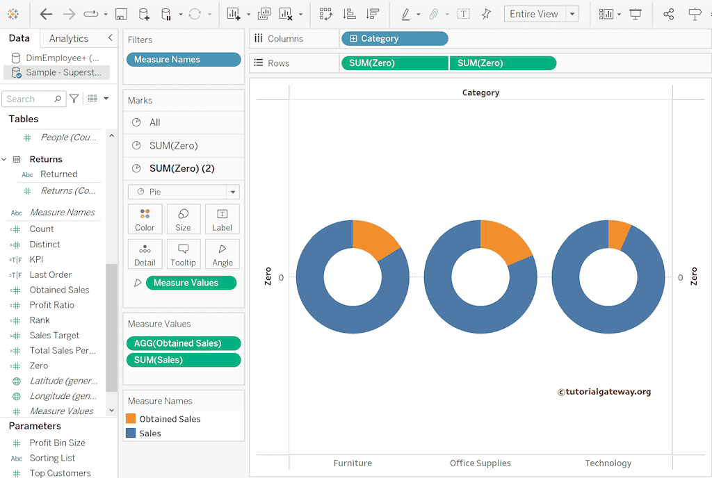
Drag and drop the Category dimension to the Columns shelf. By default, it will create a Pie chart. If not, change the Marks type from Automatic to Pie.
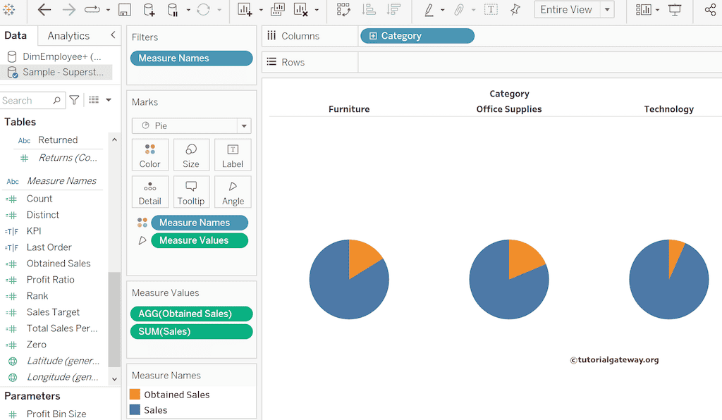
To create a Pie chart, we need a measure on the angle shelf and dimension on the color shelf. So, drag and drop the Measure Values to the Angle Shelf and remove the unwanted Measure Values from them. It means keeping the Obtained Sales calculated field and the Sales measure.
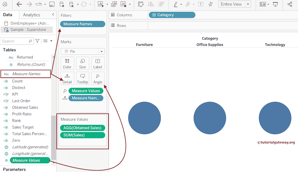
Next, Drag Measure Names from the Details Shelf to the Color Shelf to see the pie chart.
To convert the Pie chart to a donut chart, add a zero calculated field to the Rows shelf multiple times, which creates a multi-axis. Please right-click the secondary axis and choose the Dual Axis option from the menu. For the remaining charts in Tableau, please click here.
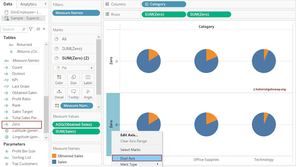
Remove Measure Names from the Color Shelf and Measure Values from Angle within the Marks shelf of the SUM(Zero)(2). Next, change the Color to White to show the Tableau KPI Donut Chart.
Right-click on each Zero Axis and uncheck the Show Header option. Next, remove the Measure Values and drag and drop the Total Sales Percentage to the SUM(Zero)(2) Label shelf. Use the Format Menu to change the Default number to a percentage.
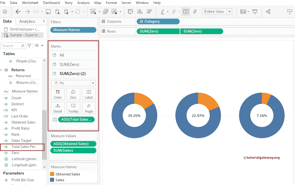
Add the Category to SUM(Zero) Label Shelf and set the Alignment to Top to see the final KPI donut chart.