Tableau Bullet Graph is similar to a bar chart, which is useful to compare One Measure over others and visualize the result. For instance, comparing the Sales this year with last year, etc. The Desktop allows us to create a Bullet Graph in multiple ways.
This article will show you how to create a Bullet Graph or chart manually or using the Show Me window. For this demo, we use the SQL Adventure Works dw.
Create Tableau Bullet Chart
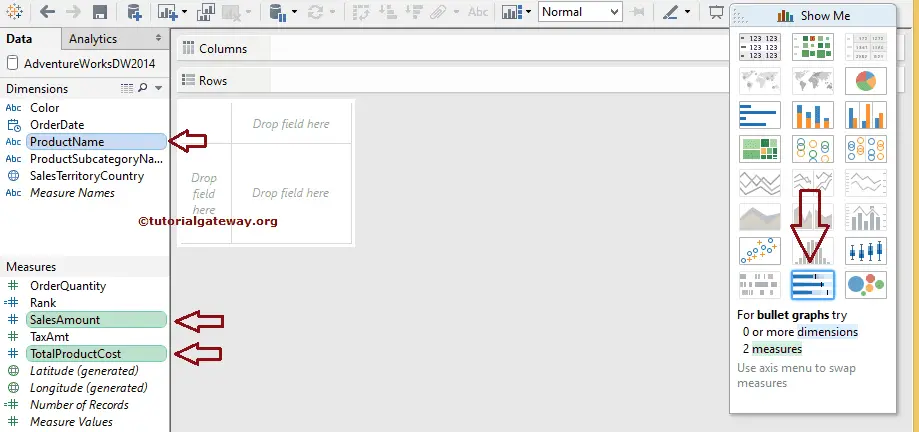
Creating a bullet graph or chart is very easy and straightforward. Please press and hold the control key, select the Dimension (s) and Measure(s) from the respective region, and select the option from the Show Me window.
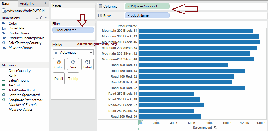
For this Tableau Bullet Graph example, we select the Product Name Dimension, Sales Amount, Total Product Cost Measures, and the shown option.
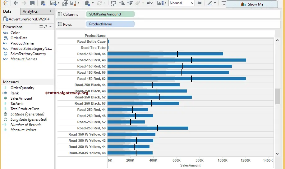
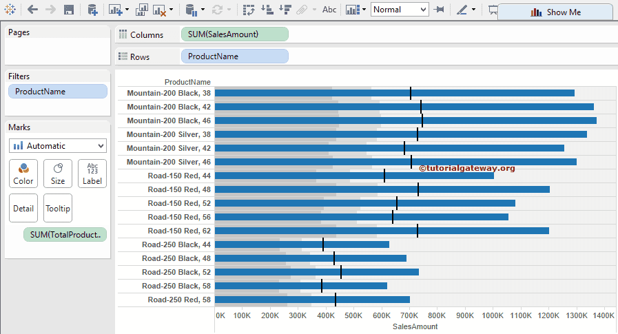
Once you complete it, the desktop will create a bullet chart or graph for you. Let us do some formatting to Tableau to filter the underperforming products. For more Charts >> Click Here.
We applied a filter on the Product Name Dimension with the following condition. It means the Tableau Bullet Graph will display the products whose Sales Amount is Greater Than or Equal to 500,000
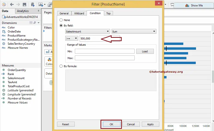
Click OK to close the Filters window and see our newly created one.
Create a Tableau Bullet Chart or Graph Manually
This approach of creating a bullet chart is not the direct way. However, you can control the reference lines and distributions. It is beneficial to analyze data in real time.
First, drag and drop the English Product Name from the Dimension Region to the Rows Shelf and the Sales Amount from the Measures region to the Columns Shelf. By default, the desktop generates the Bar plot. We also applied the filter mentioned above on the Product name.
Next, drag and drop the Total Product Cost from the Measures region to the Level of Details marks present in the Marks Shelf.
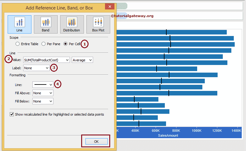
To convert this Bar chart into a Bullet Graph in Tableau, we must add Reference Lines and Distributions. To do this, right-click the Sales Amount Axis and select the Reference Line option.
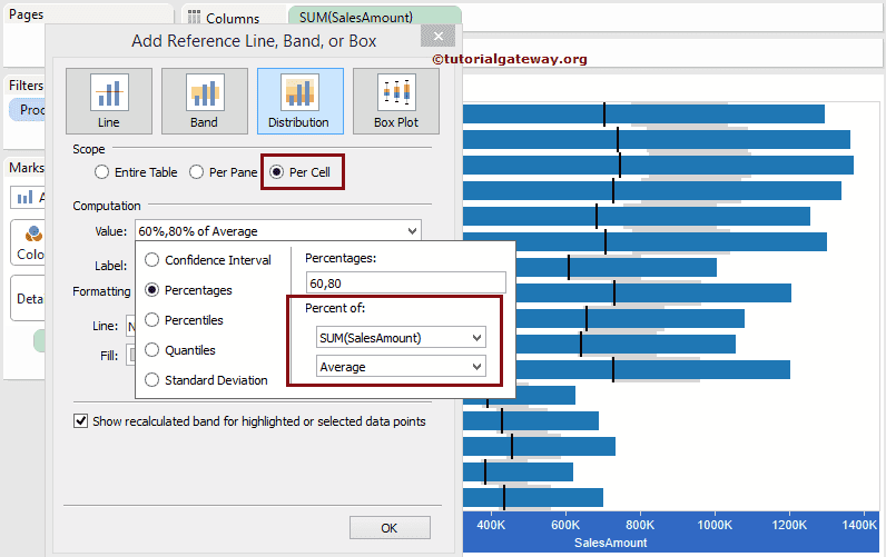
Once you choose the option, a new window called Add Reference Line, band, or Box will open for the bullet graph. By default, the Scope will be Per Pane, so please change it to Per Cell and change the value from Sales Amount to Total Product Cost. Next, fill the Area Below the reference Lines.
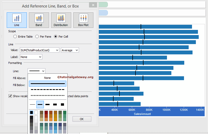
We made the following changes to this reference Line options to build a bullet graph in Tableau.
- Scope: Please change the default Per Pane option to per cell. You can use the default Per Pane option to add a straight or static reference line.
- Value: By default, the Measure value inside the Row or Column shelf will be selected, but you can change it as required. Here, we replace the Sum of the Sales Amount with the Sum of the Total Product Cost. Aggregate Value: Please select the aggregate function from the drop-down list.
- Label: If you want to display the label, select the label value; otherwise, select None.
- Line: Please specify the Line Width, Style, and color.
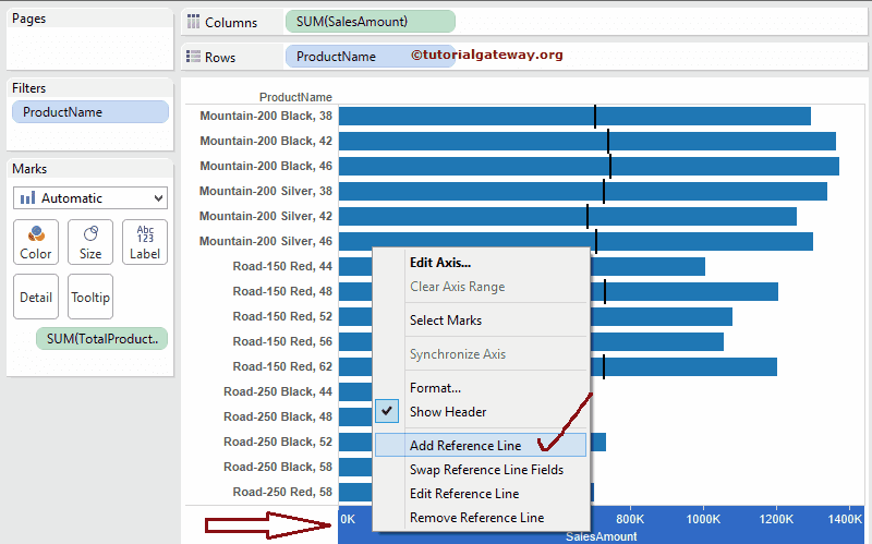
As you can see, we are closer to the bullet graph. Let us add one more reference line to show the Distributions because we need two reference lines to show the comparison point.
To add a second reference line, please right-click on the Sales Amount Axis and select the below shown first Reference Line option.
Go to the Tableau bullet graph Distributions tab to edit the reference line and see the default configuration settings. By default, the Scope will be Per Pane for the bullet graph.
So please change it to per cell and shift the Computation value from the Sales amount to the Total Product Cost. Select the aggregate function from the drop-down list if you want to change the aggregated value.
The changes we made to this Tableau bullet graph or chart reference Distributions
- Scope: Please change the default Per Pane option to per cell.
- Value: Here, we replace the Sales Amount Sum with the Total Product Cost Sum. Aggregate Value: Please select the aggregate function from the drop-down list
- Label: If you want to display the label, select the label value; otherwise, select None
- Line: Please specify the Line Width, Style, and color. Here, we are choosing the None option.
- Fill: Specify the pattern and color for the distributions.
- By selecting the fields, please specify whether you want to fill the distributions above and below the Bar Chart.
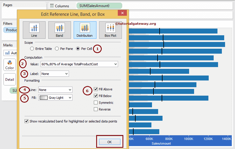
Click OK to finish configuring the Distributions. We got our final Bullet graph or chart. To see the Distributions clearly, let us reduce the Bar Chart Size using the Size shelf slider in the Marks Shelf. We successfully created a Tableau Bullet Graph.
