Tableau Box and Whisker plot or boxplot help to show the distribution of values along the axis. In the Box and Whisker plot, the Box represents the middle data, i.e., the values between the first quartile, second quartile (median), and third quartile. The Whiskers, called lines, display all points between the lowest first quartile value and the highest upper quartile value.
A Tableau Box and Whisker Plot, is useful for graphically visualizing the numeric data grouped by specific data. Let us see how to create a boxplot with an example.
How to Create a Tableau Box Plot
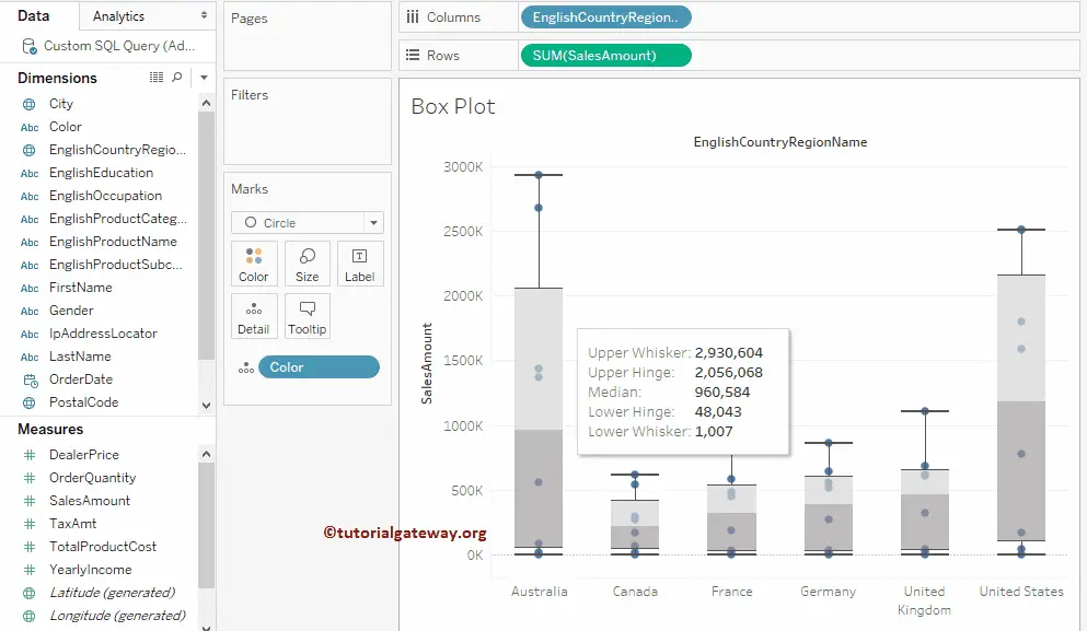
In this example, we are going to create a boxplot. First, drag and drop the Sales Amount from the Measures Region to the Rows Shelf and Color from the Dimensions region to the Details field in the Marks Shelf.
The intelligence automatically creates the Bar Chart, but we want to create a Box plot. So, please select the below-shown option from the Show Me window. For more Charts >> Click Here.
From the below screenshot, you can see the Box plot.

Let me drag the English Country Region Name from Dimensions to Columns Shelf. It will be created for each country. You can hover over the mouse on the box plot to see the Median, Upper Quartile, Lower Quartile, and Whisker values.
Change the Colors of a Tableau Box Plot
We will show you how to change the colors of the rectangles. We have two different approaches to creating this.
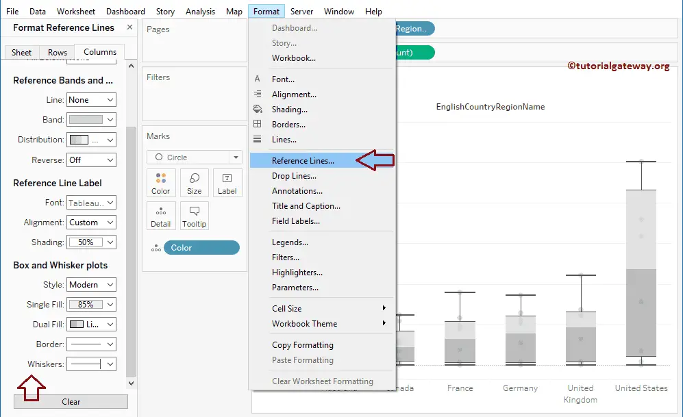
First Approach: Go to the Format menu and select the References Lines… This will open the Format Reference Lines tab. Use that tab to change the appearance completely.
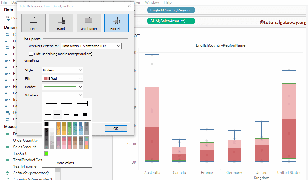
Second Approach: Please right-click on the rectangle and select the Edit.. option from the context menu.
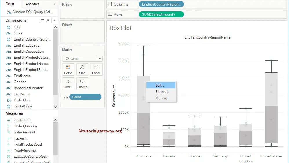
Once you select the Edit.. option, a new window called Edit Reference Line or Band will open to style the box plot. Let me change the Fill color to the Red pallet. Next, we are changing the box plot Border width and color.
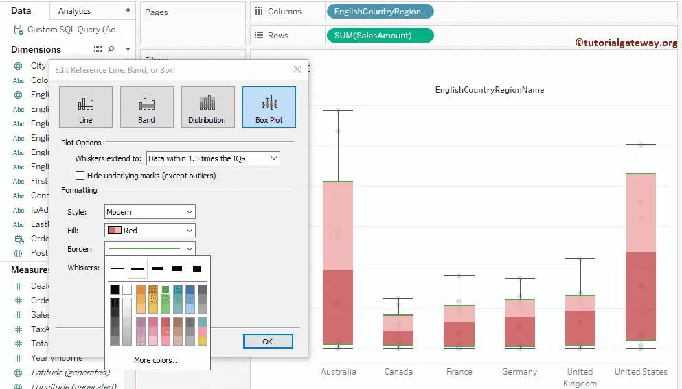
Lastly, we are changing the Whiskers width and color.
Change the Colors of the Dots
This Tableau box and whisker plot example explains how to add color to the dots. For this, drag and drop the English Country Name from the Dimensions Region to the Color field in the Marks Shelf, as shown below. It means each country has its own color.

Change the Size of a dot
In this example, we will show you how to change the size of the dots. For this, drag the Order Quantity from the Measures Region to the Size field in the Marks Shelf.

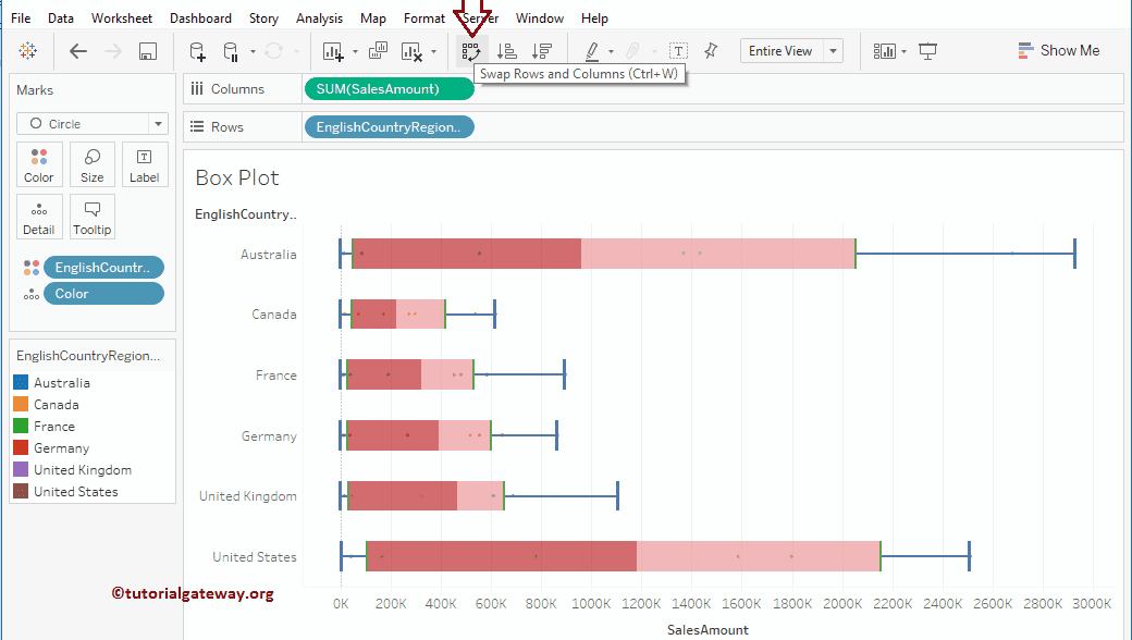
Horizontal Box and Whisker plot
Change the default vertical into a horizontal boxplot by swapping rows and columns.
Create Categorical Box Plots in Tableau
Here, we show how to create a boxplot for each color within a region. For this, drop the Color from the Dimensions Region to the Columns Shelf.
By default, the box plot displays compressed horizontal lines (or dots). Because it is difficult to draw for aggregated data, let’s remove the aggregated measure by unchecking the Aggregate Measures available in the Analysis Menu.

Now, you can see the box plot for each color present in a region.
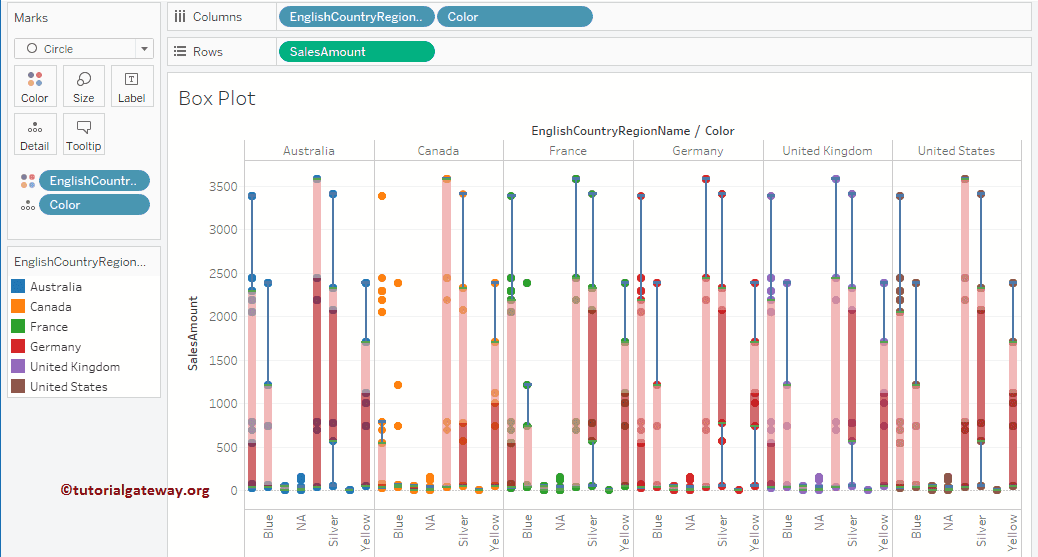
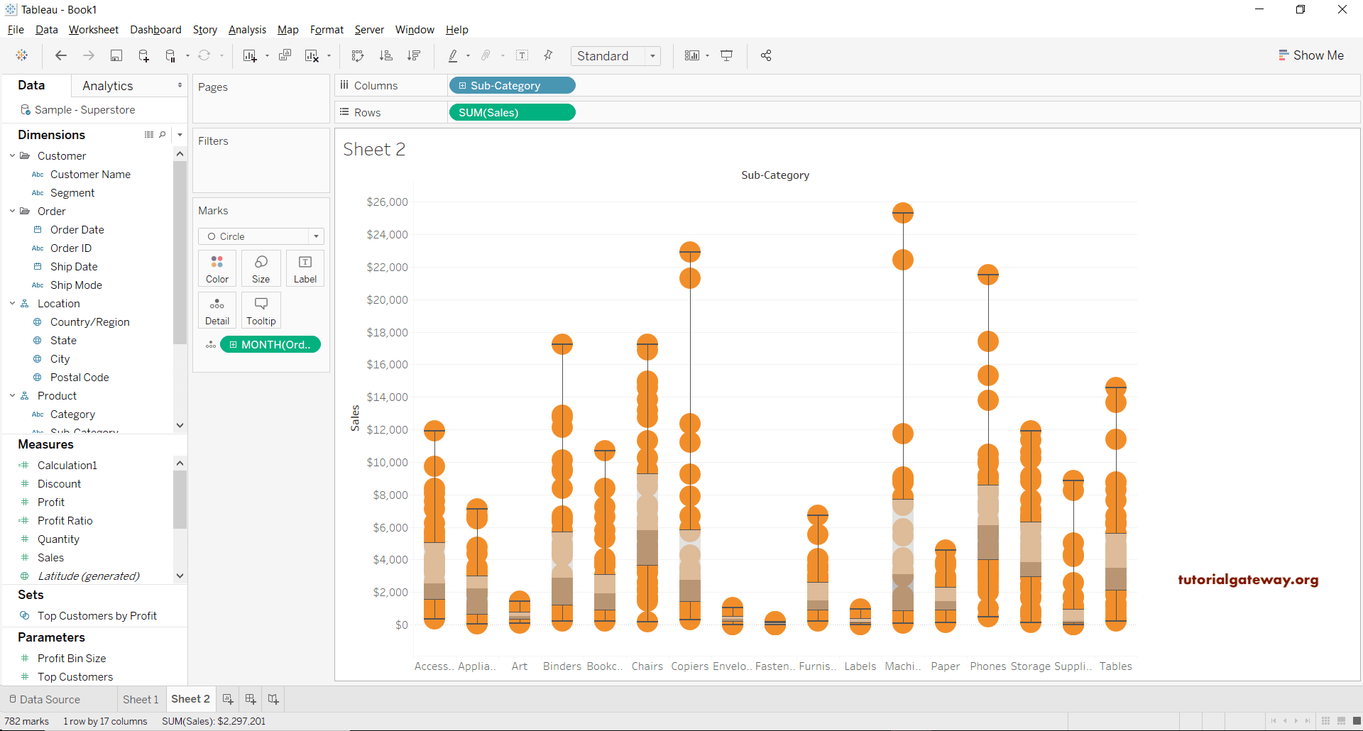
Tableau Box and Whisker Plot of Circles
This section uses the superstore Excel file to build the Box and Whisker plot. Drag and drop the Sub-Category dimension to the columns shelf and drop the Sales measure into the row shelf. By default, the Aggregated sum was assigned, and based on the data, it displays the bar chart.
Next, drag the Order Data from the Order section to the Details section. Here, you have to select the MONTH. Let me convert the bar chart to a Box and Whisker plot. To do so, please select Circle from the Marks section.

As you can see, we are a step closer to the actual boxplot. Right-click on the Sales Y-axis and select the Add Reference Line option in Tableau to add reference lines.

It opens the Add Reference Line, Band window. Please select the Box plot tab, leave the default settings, and click OK. Use the formatting section to format the fill color, borderline size, or whisker lines.

Now, you can see the Tableau Box and Whisker plot.