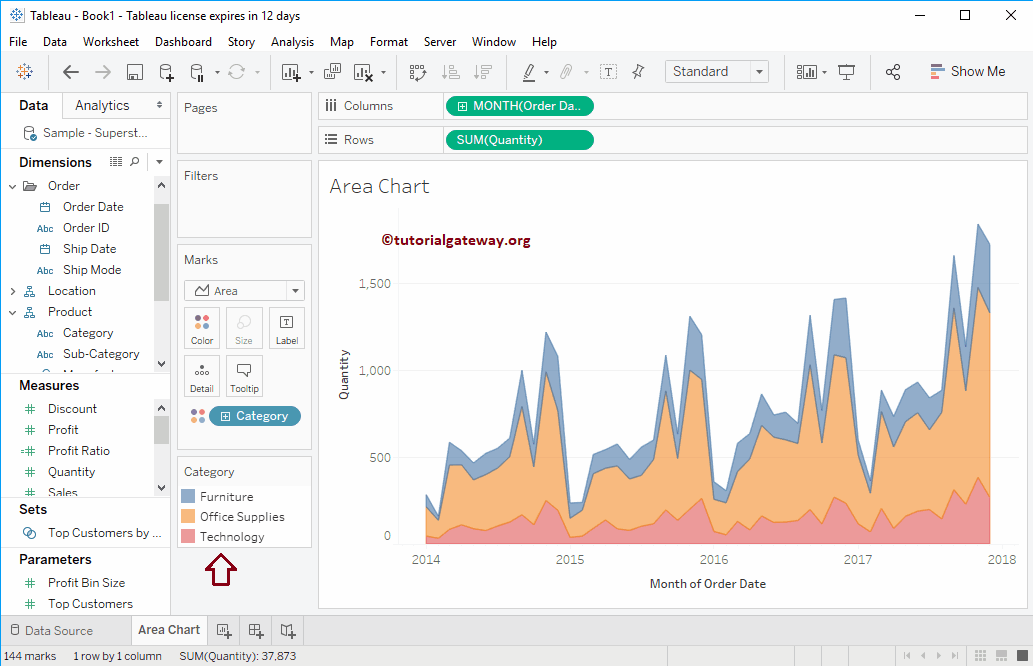
A Tableau Area Chart is a Line Chart where the space or place between the Axis and the Lines fill with color(s). In this article, we will show you how to create an Area Chart with an example. For this demonstration, we will use the Sample – Superstore Data Source.
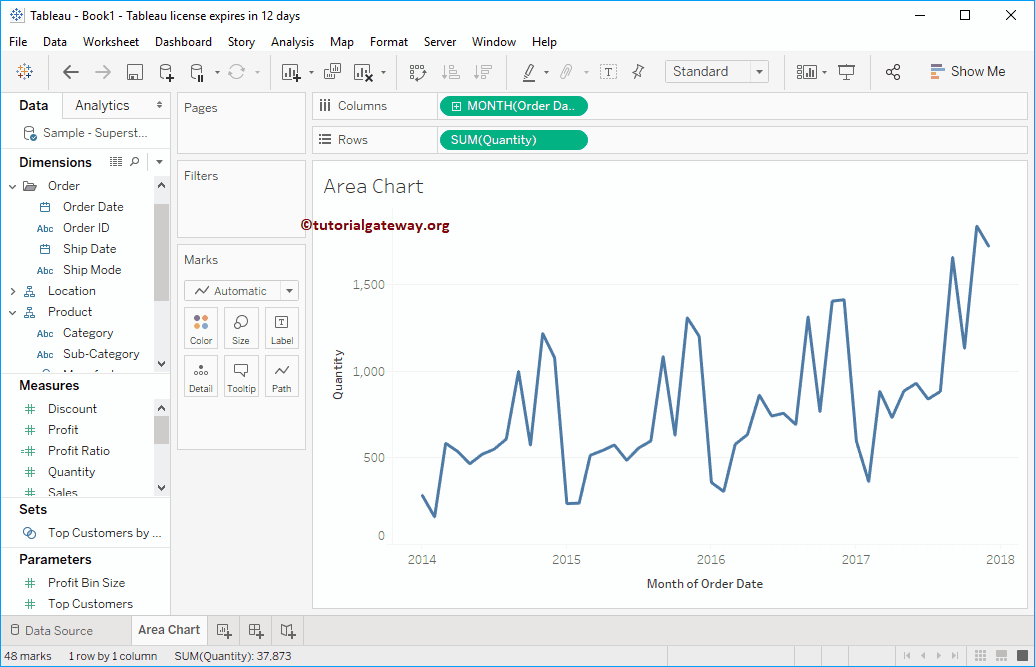
To create the Area Chart first, drag and drop Quantity from the Measures Region to the Rows Shelf. Since it is a Measure value, Quantity will aggregate to the default Sum. Once you drag them, a Bar Chart will generate.
Tableau Area Chart Example
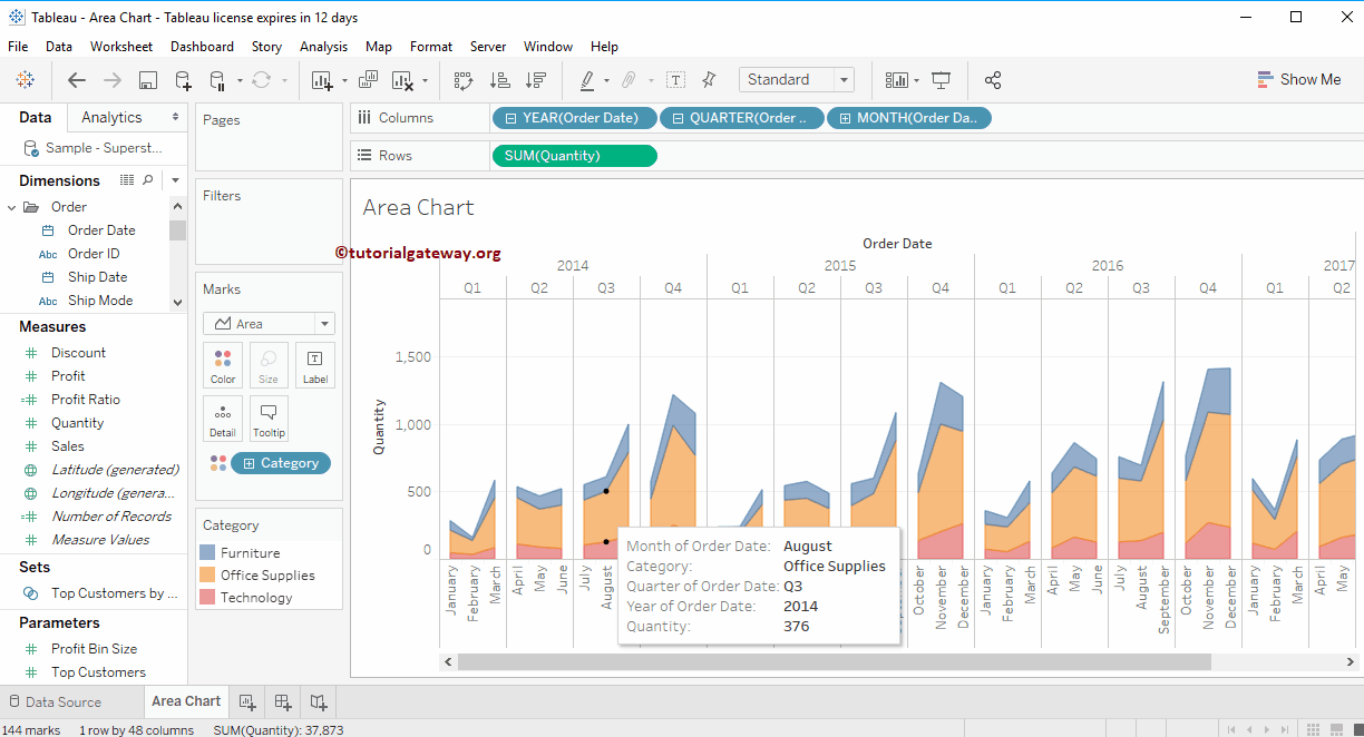
Next, Drag and Drop the Year from the Dimension Region to the Tableau Column Shelf. Once you drag them, a Line graph will generate. Please refer to the Discrete for the remaining option. For more Charts >> Click Here. Let’s change the value from Year to All months present each year to see the detailed monthly information (trend) in the Area Chart.
Now, you see the Tableau detailed Line chart for each month of 2014, 2015, 2016, 2017, and 2018, but we need an Area chart.
Let me compare the Trends for each Category. To do so, drag and drop the Category from the Dimension Region to the Colors field present in the Marks Shelf.
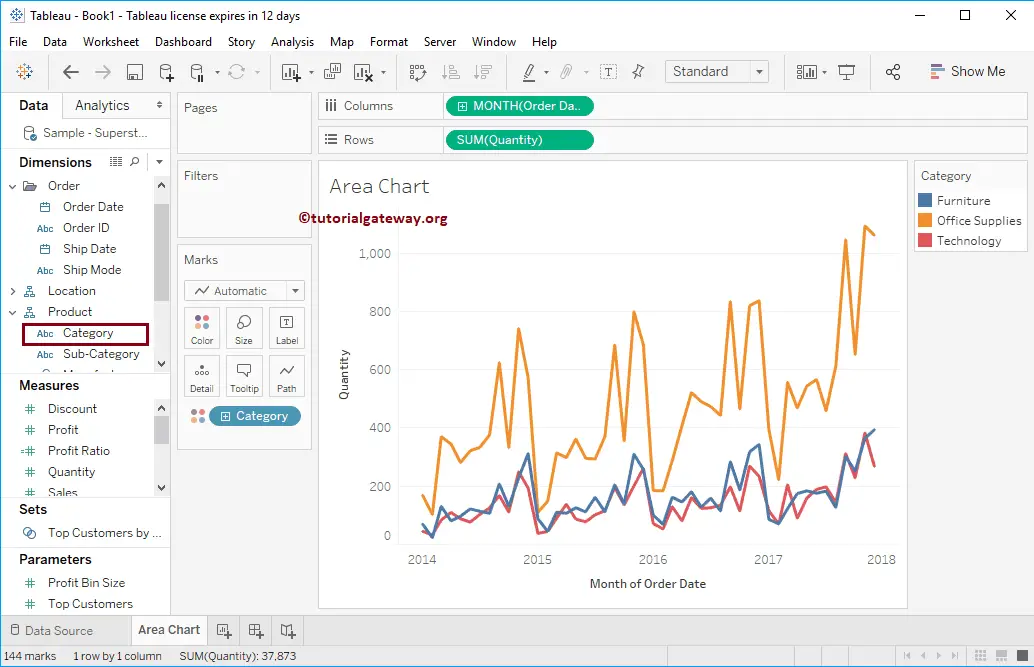
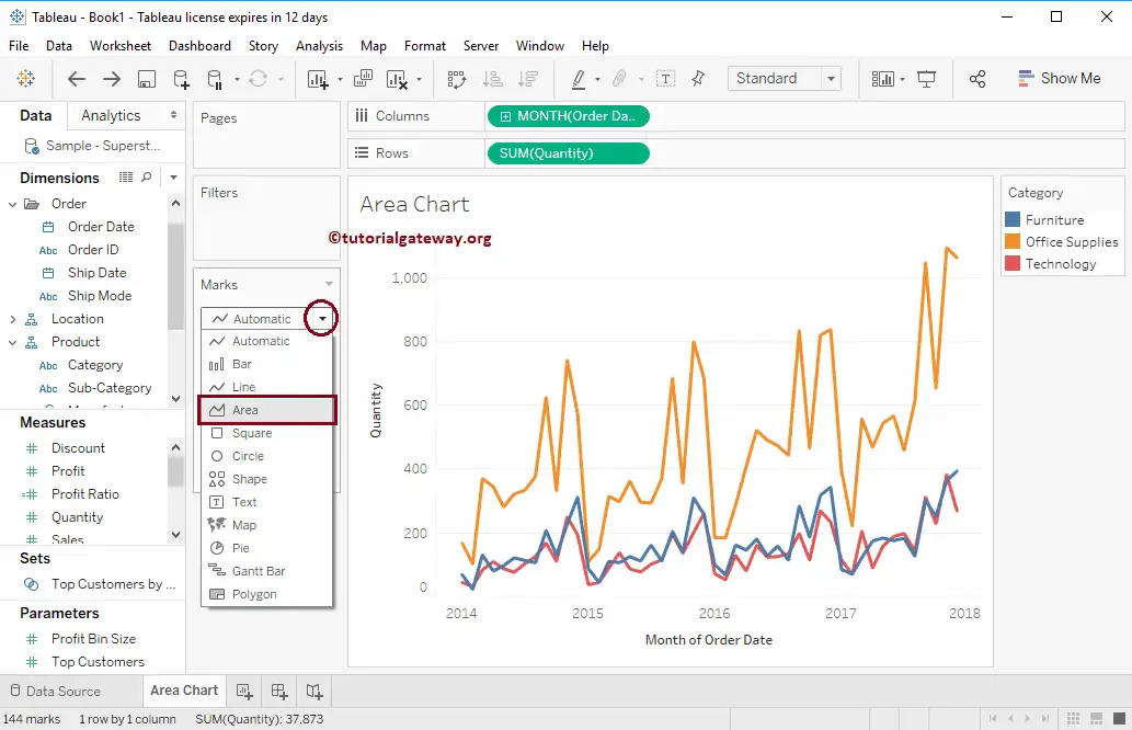
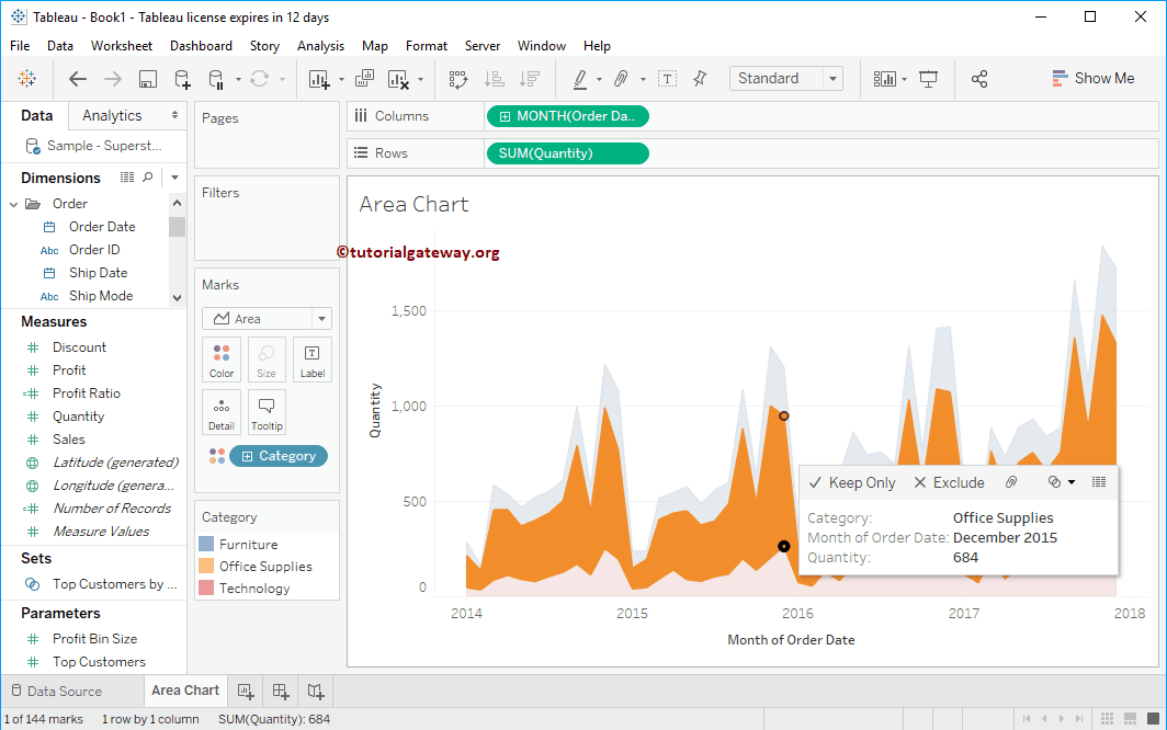
Now you can see the Trend for each category. To convert the Line, please change the Mark type from Automatic to Area. Or, Select the Area Chart from the Show Me window.
Let me change the Category’s position. Now you can see the Area Graph.
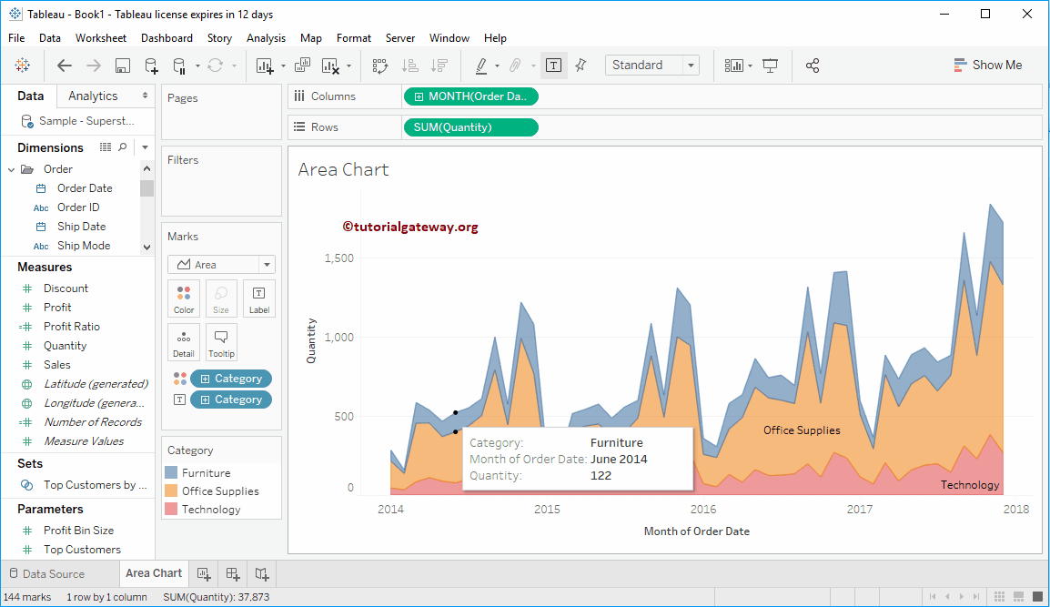
Add Labels to the Tableau Area Chart
Drag and drop the Category from the Dimension Region to the Text or Label field in the Marks Shelf. As you can see, the category’s Names are on the Area graph.
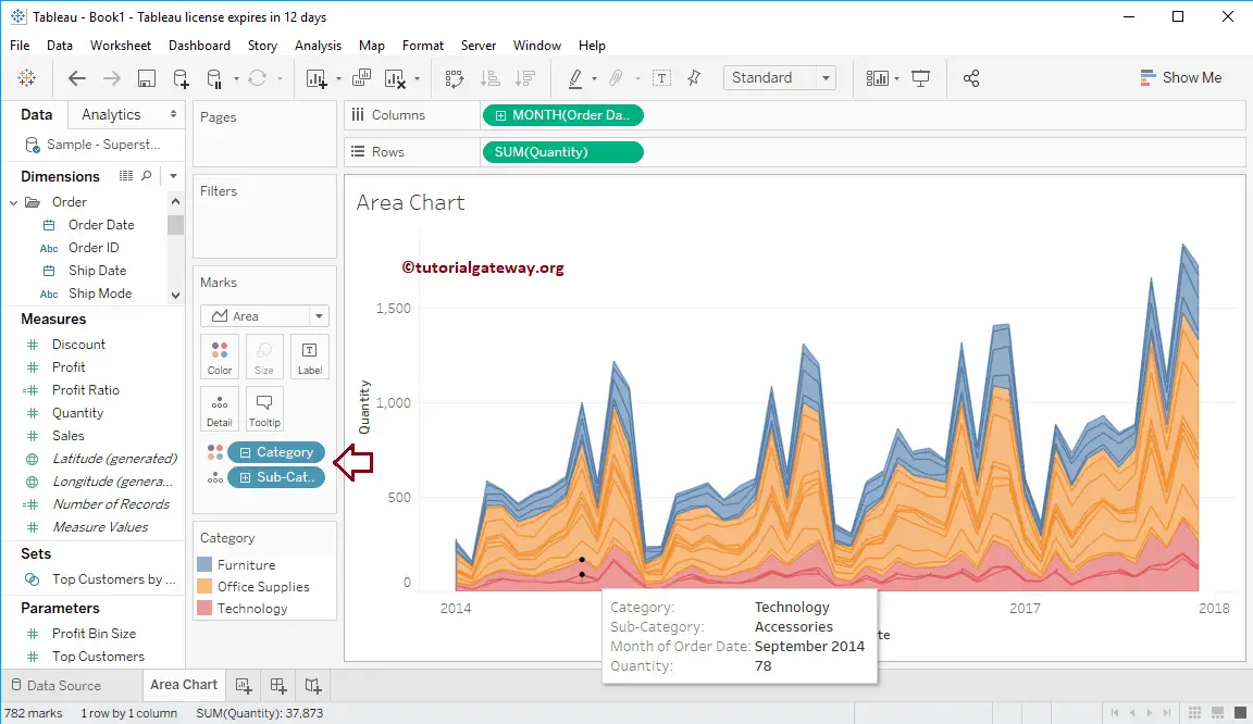
Detailed Chart
Let me expand the Category to show the Area Chart for every Sub-category
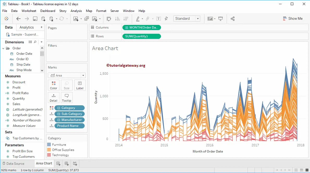
We further divided the Area chart based on the Product Name, and to do so, we added another dimension to the details shelf.
Selecting any specific area will show you the tooltip with information at that particular point.
Discrete Area Chart using Show Me Window
Show Me has one more option called Discrete Area Chart in Tableau. Let me select the same from Show Me
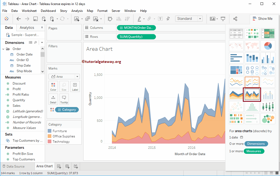
Now, you can see the Discrete Area Chart for each category.