The Python matplotlib pyplot pie chart displays the series of data in slices or wedges, and each slice is the size of an item. In order to draw the chart in this programming language, you have to use the pyplot pie function. The syntax of this pie function is
matplotlib.pyplot.pie(x, labels = None)
Apart from the above, there are many pyplot arguments that you can use to style the pie chart. This chapter covers most of those Python matplotlib pyplot pie function arguments with a practical chart example.
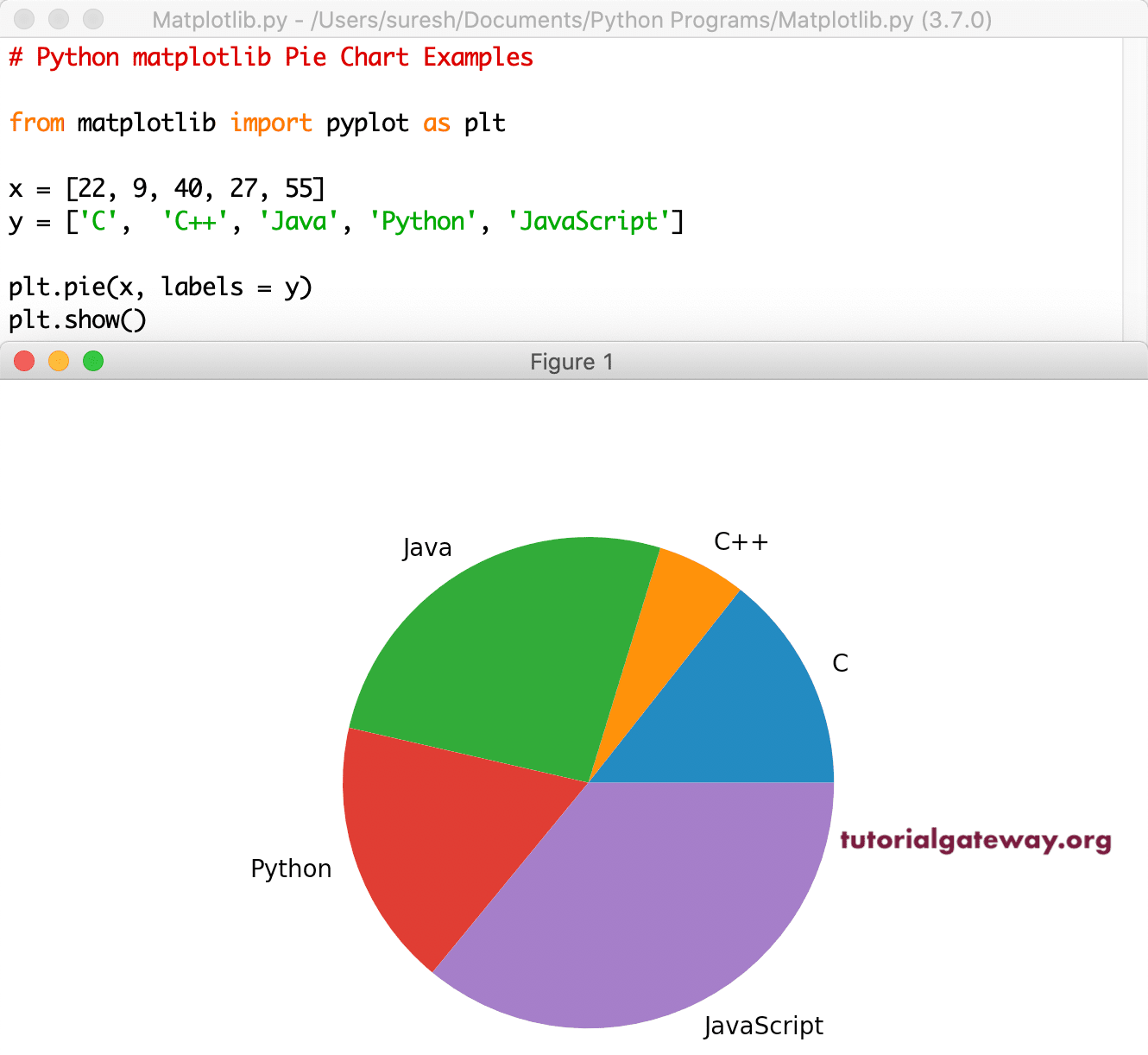
Python matplotlib Pie Chart Example
In this pyplot Pie Chart example, we declared X and Y lists, where X represents a few programming languages, and y represents some random values. Next, we used the pie function to draw a chart.
from matplotlib import pyplot as plt

x = [22, 9, 40, 27, 55]
y = ['C', 'C++', 'Java', 'Python', 'JavaScript']

plt.pie(x, labels = y)
plt.show()

It is an example of a pyplot pie chart using a CSV file. Here, we use the global sales data and draw the chart representing the Sales by Order Priority.
import pandas as pd
from matplotlib import pyplot as plt

df = pd.read_excel('/Users/suresh/Downloads/Global_Superstore.xls')

sales_data = df.groupby('Order Priority')[['Sales']].sum()
print(sales_data)

plt.pie(sales_data['Sales'], labels = sales_data.index)

plt.show()
Add Title or Name to Pie Plot
The pyplot has a title method, which helps to assign a title or heading for the pie chart. Here, we assigned a new title to this and formatted that title font style, color, and weight.
df = pd.read_excel('/Users/suresh/Downloads/Global_Superstore.xls')

sales_data = df.groupby('Order Priority')[['Sales']].sum()

plt.pie(sales_data['Sales'], labels = sales_data.index)

plt.title("Sales Percentage by Order Priority",
     color = 'blue', fontweight = 'bold', fontsize = '20')

plt.show()

Change Python matplotlib pyplot Pie Chart colors
By default, the pie function uses the active colors in a current cycle to plot a chart. However, you can use the Python colors argument to assign your own colors to each wedge. For instance, we assign cyan, green, yellow, and maroon colors to those four pies.
df = pd.read_excel('/Users/suresh/Downloads/Global_Superstore.xls')

sales_data = df.groupby('Order Priority')[['Sales']].sum()
print(sales_data)

colors_list = ['cyan', 'green', 'yellow', 'Maroon']

plt.pie(sales_data['Sales'], labels = sales_data.index, colors = colors_list)

plt.show()

Python matplotlib pyplot Pie Chart Percentage
The autopct argument shows the percentage of each slice in a pie chart. Here, you can use the string format to vary the display of percentage values. For example, %1.2f%% returns value 25.34%, and .1f% returns 25.3%.
df = pd.read_excel('/Users/suresh/Downloads/Global_Superstore.xls')

sales_data = df.groupby('Order Priority')[['Sales']].sum()

colors_list = ['cyan', 'yellowgreen', 'orange', 'Maroon']

plt.pie(sales_data['Sales'], labels = sales_data.index,
    autopct = '%1.1f%%', colors = colors_list)

plt.show()
pyplot Pie Chart Slice out
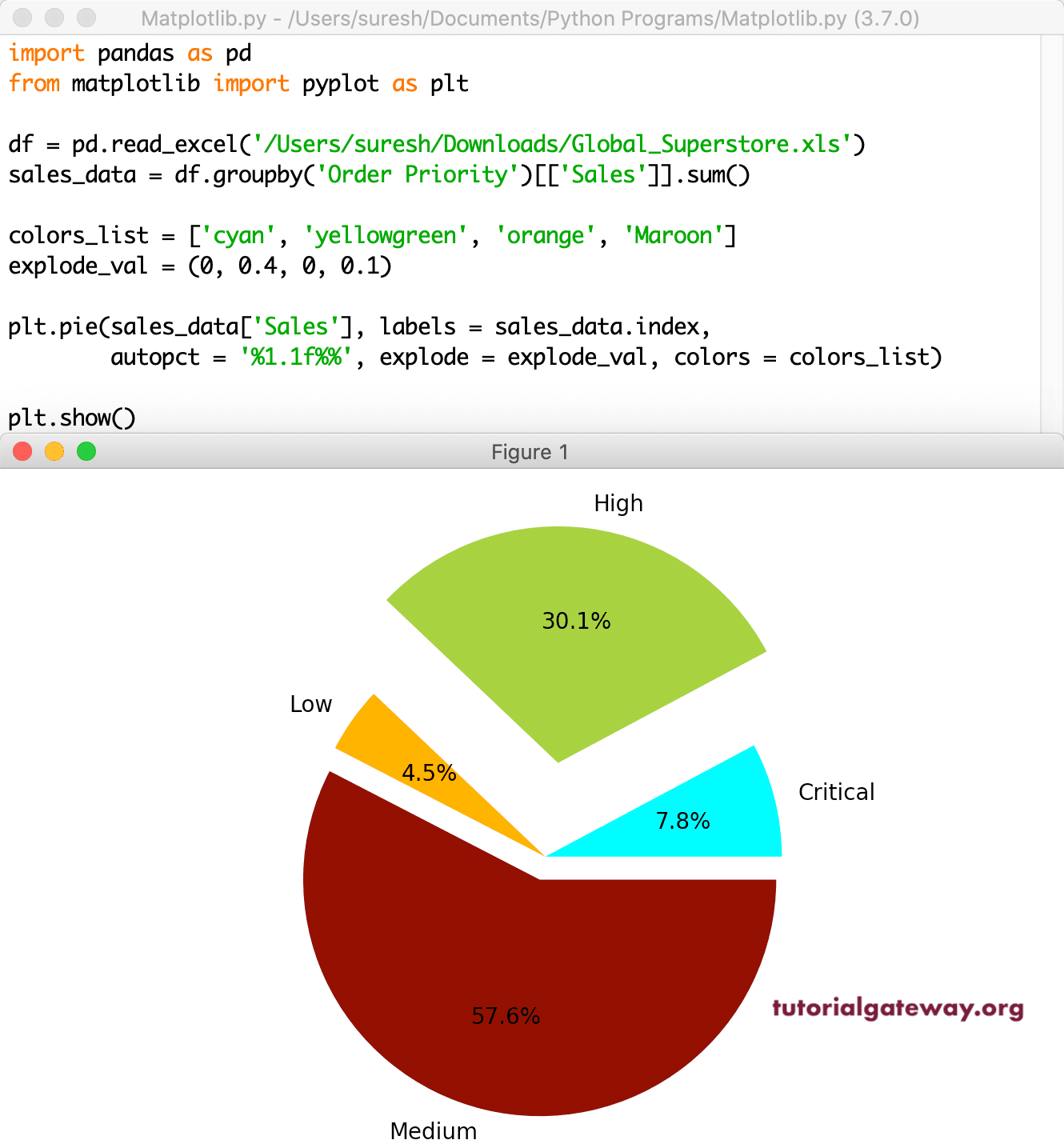
The explode argument in pyplot decides which part should explode (separate and move a distance from the center). This argument accepts a tuple of numeric values, and each non-zero value represents the distance of that slice from the center. In this example, we exploded medium priority from the center.
df = pd.read_excel('/Users/suresh/Downloads/Global_Superstore.xls')

sales_data = df.groupby('Order Priority')[['Sales']].sum()

colors_list = ['cyan', 'yellowgreen', 'orange', 'Maroon']

explode_val = (0, 0, 0, 0.1)

plt.pie(sales_data['Sales'], labels = sales_data.index,
    autopct = '%1.1f%%', explode = explode_val, colors = colors_list)

plt.show()

It is another example of a pyplot Pie Chart exploding. Here, we are exploding multiple wedges or slices. It might look odd, but you get the point.
df = pd.read_excel('/Users/suresh/Downloads/Global_Superstore.xls')

sales_data = df.groupby('Order Priority')[['Sales']].sum()

colors_list = ['cyan', 'yellowgreen', 'orange', 'Maroon']

explode_val = (0, 0.4, 0, 0.1)

plt.pie(sales_data['Sales'], labels = sales_data.index,
    autopct = '%1.1f%%', explode = explode_val, colors = colors_list)

plt.show()

Rotating Python matplotlib pyplot pie chart
The startangle argument in this function allows choosing the chart starting position. It means you can rotate it based on the angle of degrees you provided. In this example, we are using 90 degrees so that the chart start position will start at 90 degrees. Next, we used the shadow argument and assigned a True value to it (by default, it is false). It means matplotlib will draw a shadow beneath the chart.
There is one more argument called counterclock; its default value is True. It means the plot will draw counterclockwise. However, you can change the same by assigning False to this argument counterclock = False.
df = pd.read_excel('/Users/suresh/Downloads/Global_Superstore.xls')

sales_data = df.groupby('Order Priority')[['Sales']].sum()

colors_list = ['cyan', 'yellowgreen', 'orange', 'Maroon']

explode_val = (0, 0.4, 0, 0)

plt.pie(sales_data['Sales'], labels = sales_data.index,
    autopct = '%1.1f%%', explode = explode_val,
    colors = colors_list,
    shadow = True,
    startangle = 90,
    counterclock = False)

plt.show()

Format Pie Plot labels
The rotatelabels arguments accept the boolean value, and its default value is False. If you specify true, each label in it will be rotated to the corresponding slice angle. Next, the labeldistance argument accepts the float value. Here, you can specify the distance of the label from the actual chart or slice. In this example, we specified 1.2 as the distance; you can notice the same in the output.
df = pd.read_excel('/Users/suresh/Downloads/Global_Superstore.xls')

sales_data = df.groupby('Order Priority')[['Sales']].sum()

colors_list = ['cyan', 'yellowgreen', 'orange', 'Maroon']

plt.pie(sales_data['Sales'], labels = sales_data.index,
    autopct = '%1.1f%%',
    colors = colors_list,
    labeldistance = 1.2,
    rotatelabels = True )

plt.show()

The wedgeprops argument is an optional arg, it accepts the dictionary values, and the default value is None. However, you can use this argument to alter the wedge or slice properties of a pyplot pie chart. Next, the frame argument places the chart inside a frame or axis.
df = pd.read_excel('/Users/suresh/Downloads/Global_Superstore.xls')

sales_data = df.groupby('Order Priority')[['Sales']].sum()

colors_list = ['cyan', 'yellowgreen', 'orange', 'Maroon']

fg, ax = plt.subplots()

ax.pie(sales_data['Sales'], labels = sales_data.index,
    autopct = '%1.1f%%',
    colors = colors_list,
    frame = True,
    wedgeprops = {'linewidth' : 4,
           'edgecolor' :'blue'}
    )

ax.axis('equal')
plt.show()

Add Legend to Python matplotlib pyplot Pie Chart
The legend function allows providing the labels in legend form. Use a loc argument to place the legend in a required position within the function. In this Python example, we put it in the upper right corner.
df = pd.read_excel('/Users/suresh/Downloads/Global_Superstore.xls')

sales_data = df.groupby('Order Priority')[['Sales']].sum()

colors_list = ['cyan', 'yellowgreen', 'orange', 'Maroon']

fg, ax = plt.subplots()

ax.pie(sales_data['Sales'],
    autopct = '%1.1f%%',
    colors = colors_list,
    frame = True
    )

ax.legend(sales_data.index, loc = 'upper right')

ax.axis('equal')
plt.show()

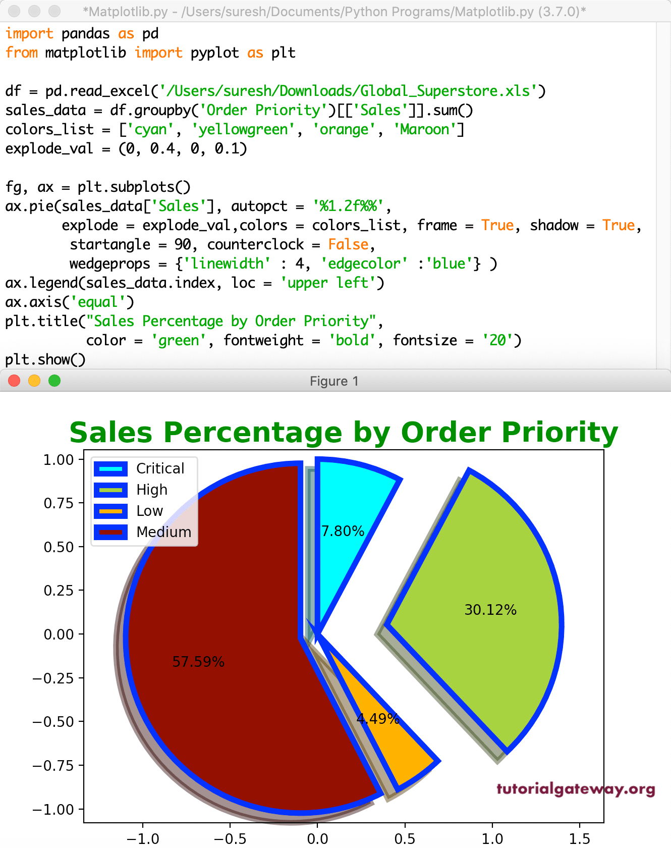
We forgot to mention the ax.axis(‘equal’) in all our previous examples. It will make sure the pie chart is rounded. Sometimes, your chart might look oval, and overcome the issue you have using this.
import pandas as pd
from matplotlib import pyplot as plt

df = pd.read_excel('/Users/suresh/Downloads/Global_Superstore.xls')

sales_data = df.groupby('Order Priority')[['Sales']].sum()

colors_list = ['cyan', 'yellowgreen', 'orange', 'Maroon']

explode_val = (0, 0.4, 0, 0.1)

fg, ax = plt.subplots()

ax.pie(sales_data['Sales'],
    autopct = '%1.2f%%',
    explode = explode_val,
    colors = colors_list,
    frame = True,
    shadow = True,
    startangle = 90,
    counterclock = False,
    wedgeprops = {'linewidth' : 4,
           'edgecolor' :'blue'}
    )
ax.legend(sales_data.index, loc = 'upper left')
ax.axis('equal')

plt.title("Sales Percentage by Order Priority",
     color = 'green', fontweight = 'bold', fontsize = '20')
plt.show()
