How to Format Stacked Bar Chart in Power BI with an example? Formatting the Stacked Bar Chart includes changing the Stacked Bar Colors, Title text, position, Data labels, Axis Fonts, Background Colors, etc.
To demonstrate the Stacked Bar Chart formatting options, we are going to use the Stacked Bar Chart that we created earlier. Please refer to the Power BI Stacked Bar Chart article.
How to Format Stacked Bar Chart in Power BI
Please click on the Format button to see the list of formatting options that are available for this Stacked Bar Chart. For more charts >> Click Here!
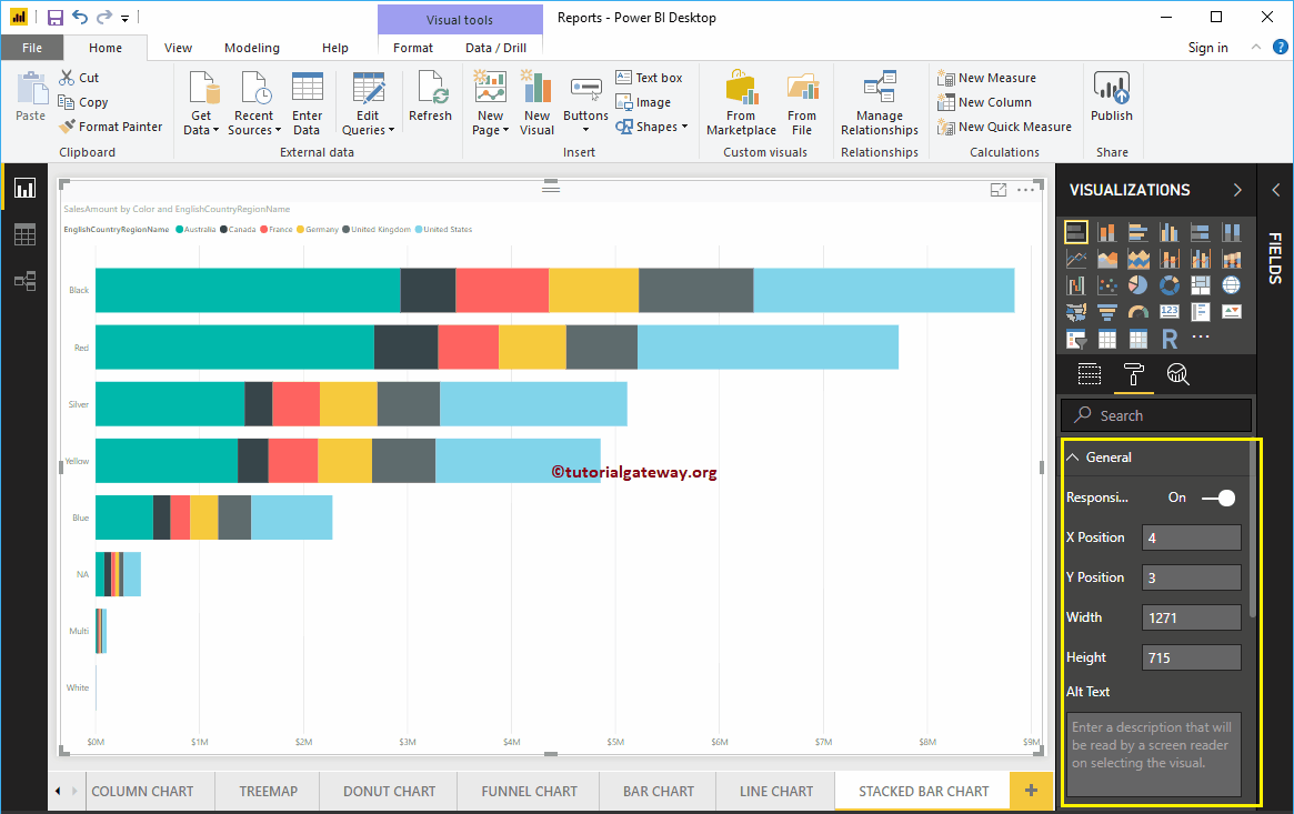
Format Stacked Bar Chart General Section
Use this General Section to Change the X Position, Y Position, Width, and height of a Stacked Bar Chart
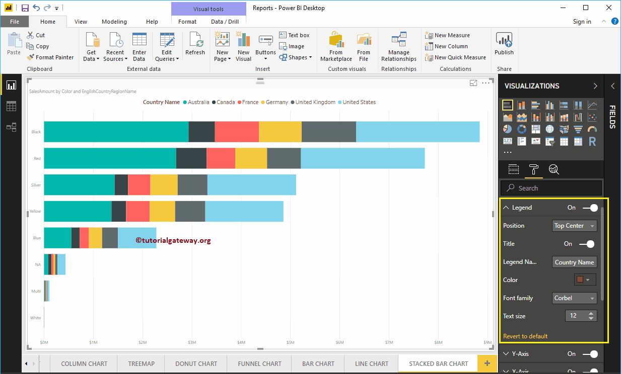
Format Legend of a Stacked Bar Chart in Power BI
To display or enable the Legend, Please select the Power BI Legend region and toggle the option from Off to On. You can use the Position drop down box to change the legend position.
As you can see from the screenshot below, we added the Legend Title as Country Name and Legend Position as Top Center. Next, we also changed the Color to Brown, the Font family to Corbel, and the text size to 12.
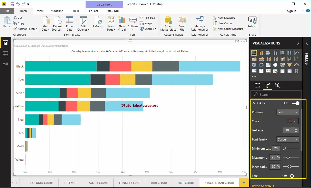
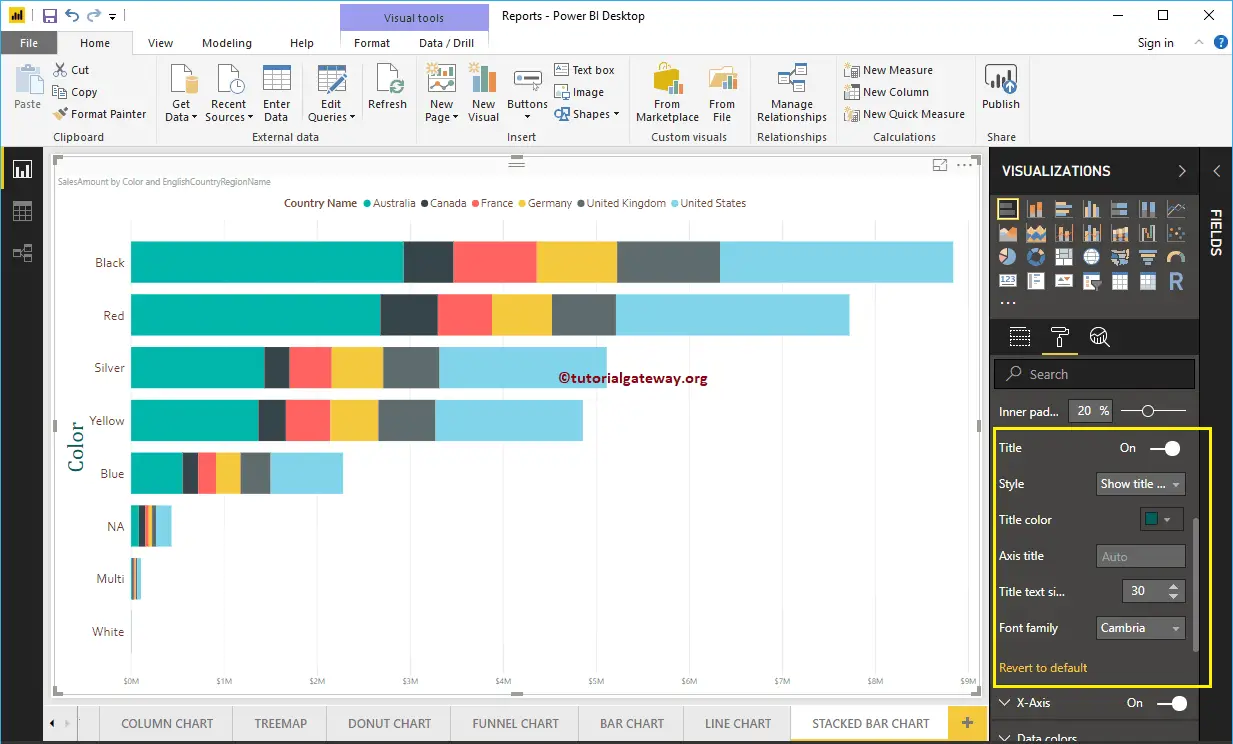
The Y-Axis of a Stacked Bar Chart
As you can see from the screenshot below, we changed the Y-Axis label’s Color to Brown, the Text Size to 18, Font style to Corbel. You can use Minimum category width, Maximum Size, and Inner Padding options to change the bar widths
By default, the Y-Axis title is set to Off, but you can enable it by toggling Title under the Y-Axis section to On. Let me change the Title Color to Green, the Title Text Size to 30, and the Font style to Cambria.
Format X-Axis of a Stacked Bar Chart in Power BI
As you can see from the below screenshot, we changed the Color to Brown, the Font style to Corbel, the Text Size to 20, and the Display Units to Thousands (default is Auto).
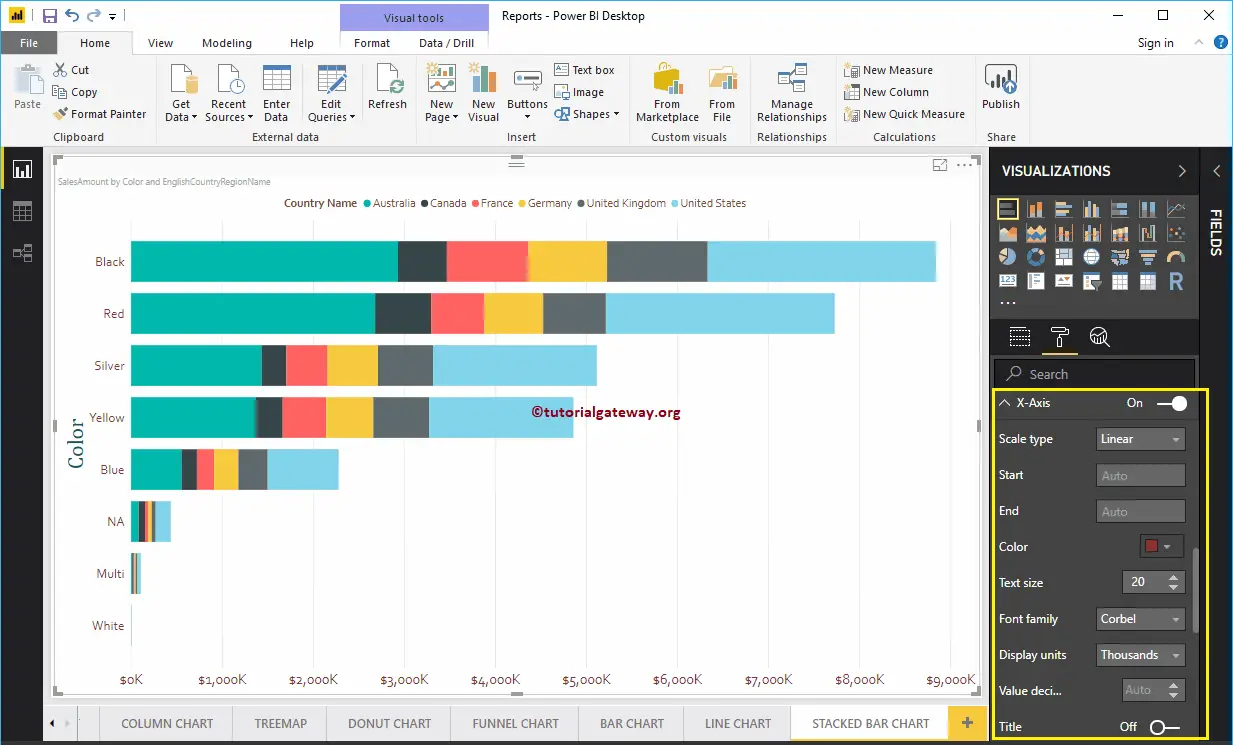
By default, the X-Axis title is set to Off, but you can enable it by toggling Title to On. Let me change the Title Color to Green, Font style to Cambria, and Font Size to 30.
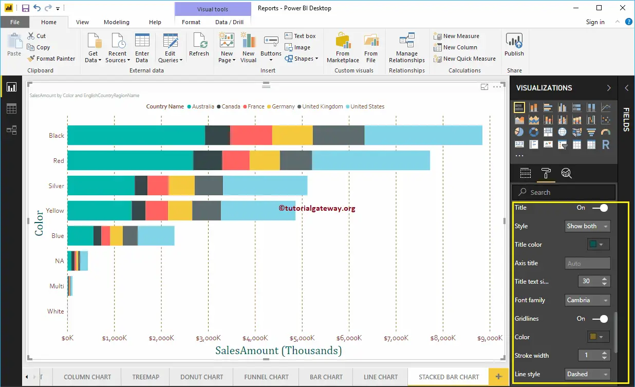
By toggling the Gridlines option from On to Off, you can disable the Stacked Bar chart Gridlines.
- Color: You can change the Gridlines color.
- Stroke Width: Use this to change the Gridlines width.
- Line Style: Choose a line style such as Solid, dotted, or dashed.
Format Power BI Stacked Bar Chart Data Colors
By default, Power BI allocates some default colors to each bar. Let me change the Color of the United States to Pink.

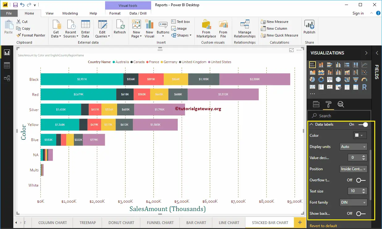
Enable Data Labels for Stacked Bar Chart
The Stacked Bar chart Data Labels display the information about each individual group of a horizontal bar. In this case, it displays the Sales Amount of each country. To enable data labels, please toggle the Data labels option to On.
Let me change the Color to White, the Font family to DIN, and the Text Size to 10
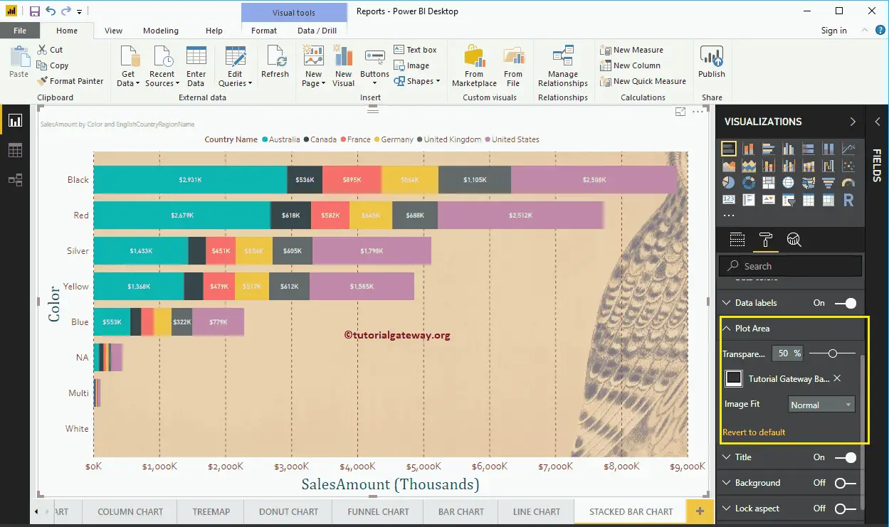
Format Stacked Bar Chart in Power BI Plot Area
You can add Images as the Background of a Stacked Bar Chart using this Plot Area section. For the demonstration purpose, we added one image as the Plot Area Background.
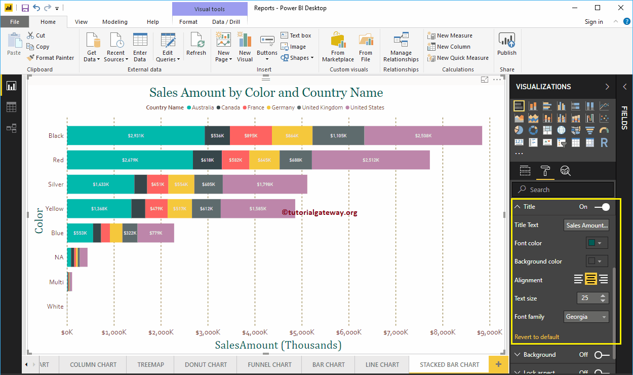
Format Stacked Bar Chart in Power BI Title
By toggling the Title option from On to Off, you can disable the Bar Chart title. As you can see from the screenshot below, we changed the Title Text to Sale Amount by Color and Country Name.
We also changed the Font Color to Green, the Font Family to Georgia, the Font Size to 25, and the Title Alignment to the center. If you want, you can add the background color to the title as well.
Format Background Color of a Stacked Bar Chart
You can add the Background color to a Bar Chart by toggling the Background option to On. For the demonstration purpose, we added the background color.

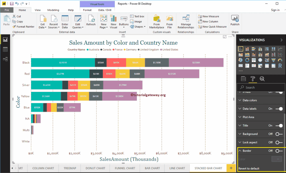
Format Border of a Stacked Bar Chart
You can add Borders to a Line Chart by toggling the Border option from Off to On.