SSRS Column charts are useful for comparisons. By seeing the Column Chart, one can understand the business without any further concerns.
For example, compare product Sales of this year with the previous year, Monthly / Yearly performance of an employee, customer orders compared to last year or last month or last week, etc.
In this article, we will show you how to create and configure the Column chart with an example. The below screenshot will show you the Data Source and Dataset we used for this SSRS Column Chart Report.
SQL Command we used in the above screenshot is:
-- Query for the Column Chart
SELECT PivotTable.SalesTerritoryCountry,
       [2010] AS [Year 2010],
       [2011] AS [Year 2011],
       [2012] AS [Year 2012],
       [2013] AS [Year 2013],
       [2014] AS [Year 2014]
FROM (
      SELECT Ter.SalesTerritoryCountry,Dt.CalendarYear ,Fact.SalesAmount
      FROM DimSalesTerritory AS Ter
	INNER JOIN FactInternetSales AS Fact ON
	       Ter.SalesTerritoryKey = Fact.SalesTerritoryKey
	INNER JOIN DimDate AS Dt ON Dt.DateKey = Fact.OrderDateKey
    ) AS SourceTable

PIVOT (
     SUM (SourceTable.SalesAmount) FOR  SourceTable.CalendarYear IN
	   ([2010],[2011],[2012],[2013],[2014] )
      ) AS PivotTable
Create a Column Chart in SSRS
When you drag and Drop the Chart from Toolbox to Design space, a new window called Select Chart Type will be opened to select the required chart from the available ones.

In this example, we select the Simple Column Chart, as shown in the screenshot below.
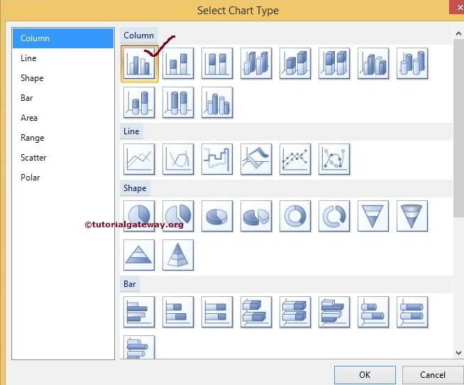
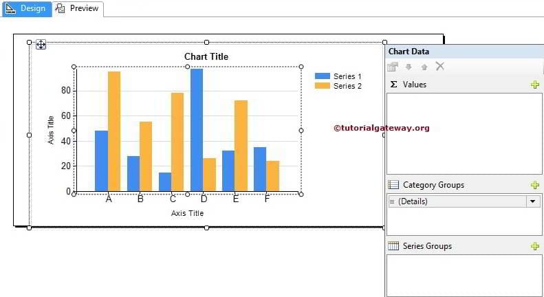
Once you click the OK button, the Column chart will display in the design region with dummy data. Click on the empty space around the SSRS Column Chart will open the Chart Data window.
- Values: Any Numerical (Metric) value such as sales amount, Tax, Total Sales, Customer count, etc. All these values will be aggregated using an aggregate function (Sum, Count, etc.) because we are grouping them with the category group items.
- Category Group: Please specify the Column name on which you want to partition your Column Chart.
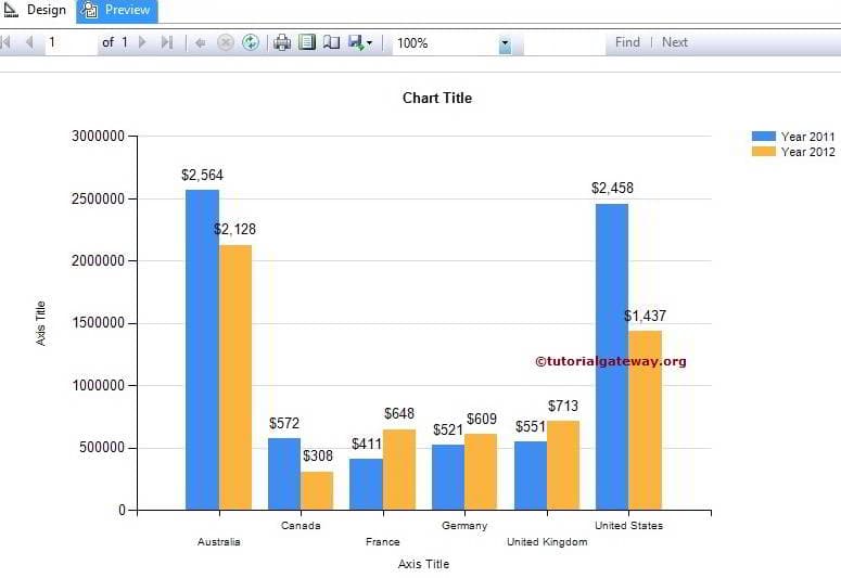
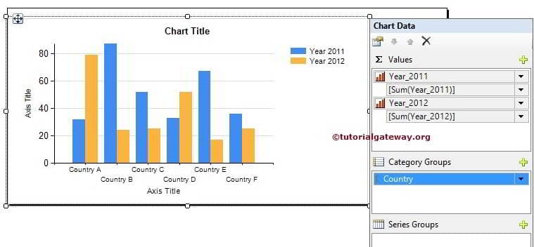
In this example, we will create a Column chart for the Years 2011 and 2012 Sales by country. So, Drag and drop the Years 2011 and 2012 columns from the dataset to chart data values and Country Names in the category group.
Click on the Preview button to see the SSRS column chart report preview.
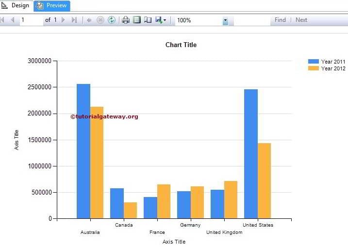
If you observe the above screenshot, It is providing a perfect result. However, we cannot identify the exact amount of Sales for each country. To resolve these situations, We have to use Data Labels.
To add Data labels to the column chart in SSRS, Right-click on the Blue bars (representing 2011 Year). Then, select the Show Data Labels option from the context menu to show the values.
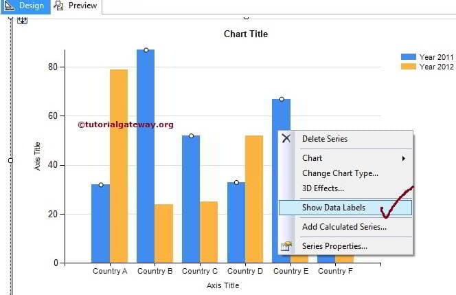
Second, Right-click on the Yellow bars (representing 2012 Year). Next, select the Show Data Labels option from the context menu to show the values.
Please refer to Formatting Column-Chart to understand the steps involved in formatting the above-specified column chart with a practical example.
Click on the Preview button to see the Column Chart report preview.