This SSRS article shows how to create a Bar Chart, Show Data Labels, change default bar colors, and format its font and colors with an example. To demonstrate this example, right-click on the Datasets folder to create a new DataSet. Writing the below code inside the SSMS shows the data set that we use for this example.
The Sql query that we used above SSRS example is:
SELECT Geo.EnglishCountryRegionName AS Country,
       SUM(Fact.TotalProductCost) AS TotalCost, SUM(Fact.SalesAmount) AS Sales
FROM FactInternetSales AS Fact  INNER JOIN DimCustomer
ON DimCustomer.CustomerKey = Fact.CustomerKey JOIN DimGeography AS Geo
ON DimCustomer.GeographyKey  = Geo.GeographyKey
GROUP BY Geo.EnglishCountryRegionName
SSRS Bar Chart
To add a Bar Graph, right-click the report area, choose Insert, and then the chart option from the context menu. Otherwise, drag and drop the chart from the toolbox to the report area.

Select the Bar chart from the window and click OK to add to the report area.
- 100% Stacked Bar Chart
- 3D Clustered Bar Chart
- Stacked Bar Chart Example 1 and Example 2.

Use the Plus button or drag the fields to the Values and Category Groups section. Here, we added the Sales column to the Values and Country column to the Category Groups section.

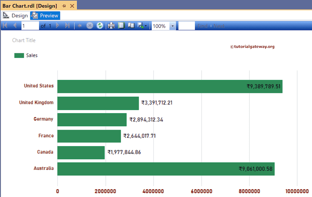
Click the Preview tab to see the SSRS Bar Chart report.

Here, we used the toolbar to format the bar chart font and color of the X-axis, Y-axis, data labels, and legend. However, you can use the properties window to format the report. Next, right-click on the bars and select the Show Data Labels option to add labels.

Right-click the Data Labels and select the Series Label Properties option to format bar chart Numbers as Currency.

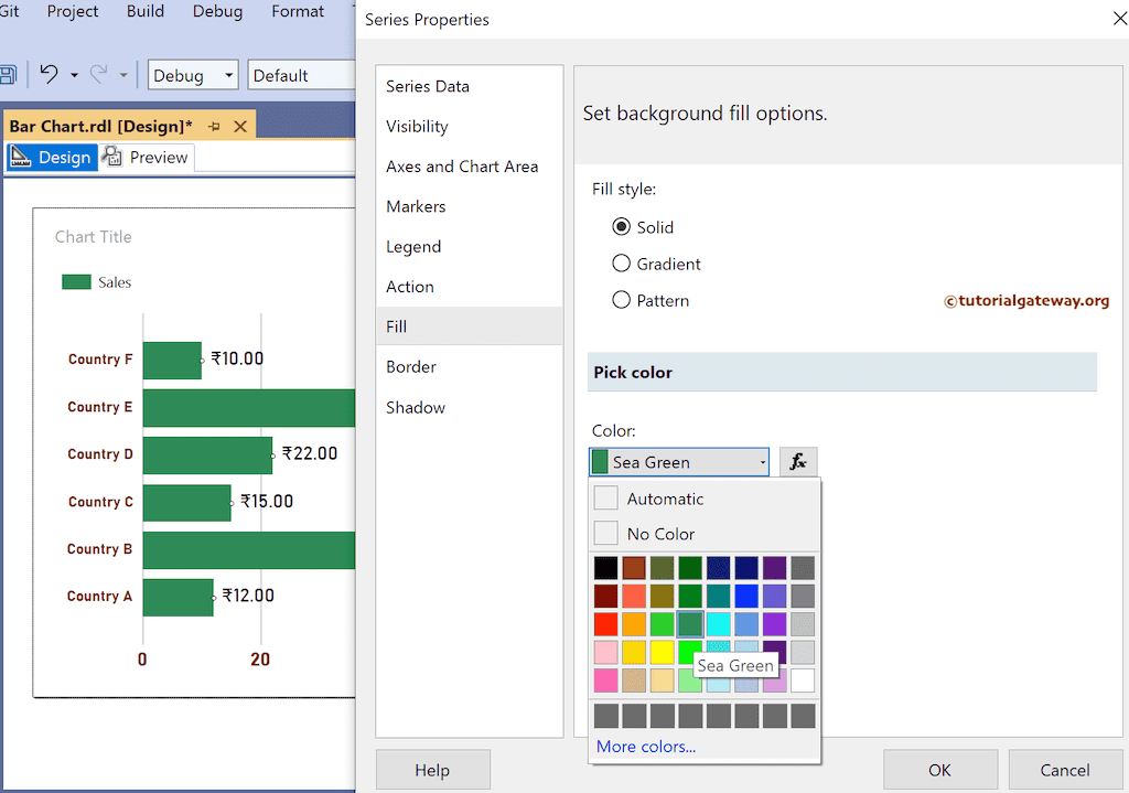
To change the default bar color, right-click and select Series properties. Next, go to the Fill tab, pick Fill styles Solid, and choose the color per your requirement.
Click the preview button to see the SSRS Bar chart.
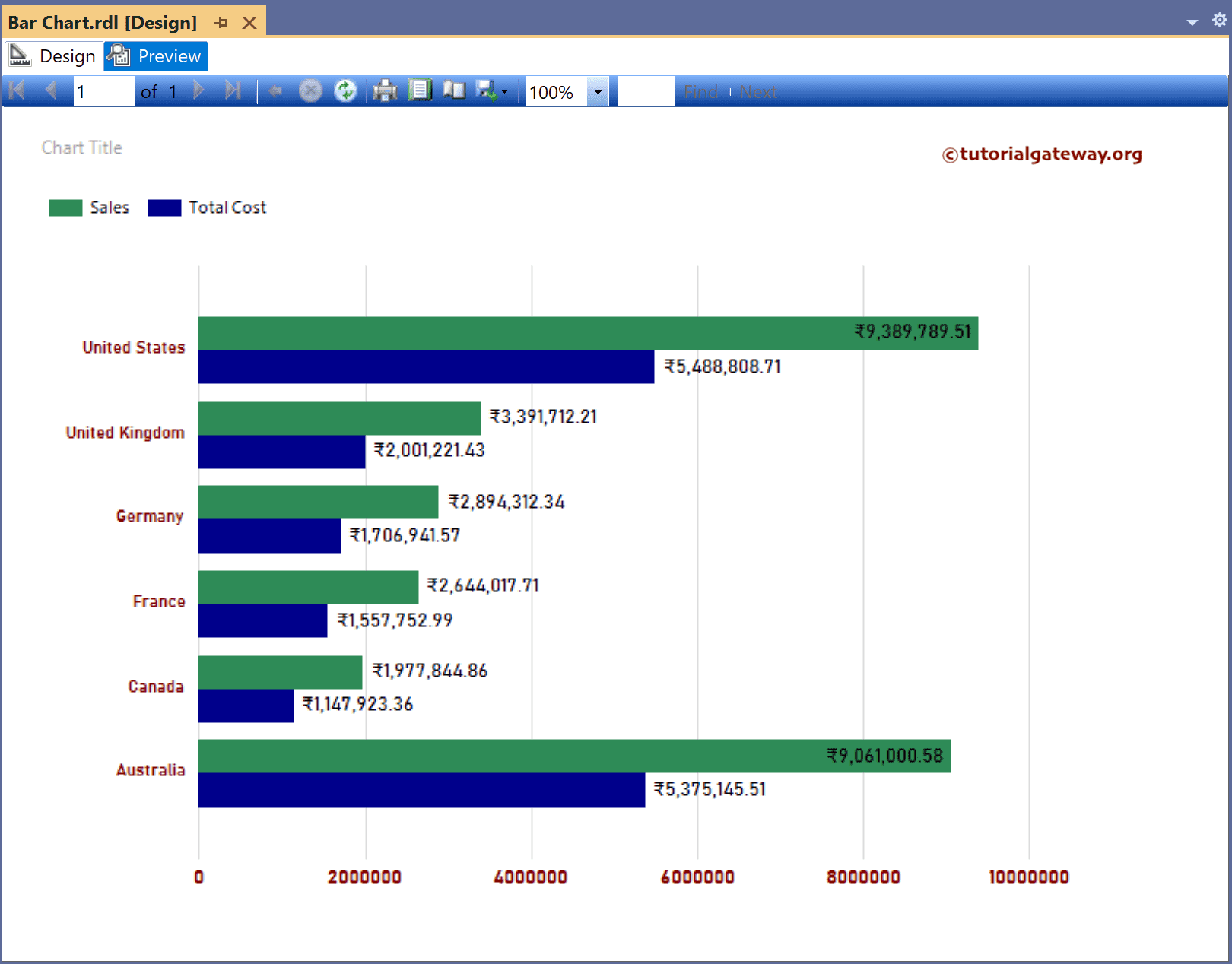
To compare multiple measure values horizontally, let me add the Product Cost column to the Values section and enable Data Labels for the Product cost.

Preview the SSRS Bar Chart report to compare two measures.