In this article, we will show you how to create a Stacked Bar Chart in SSRS, How to change the Chart Title, Legend Position, Legend Title, Stacked Bar Chart Font style, Chart Model, and Display Data Labels on Stacked Bar Chart in SSRS or SQL Reporting Services with an example.
For this SSRS stacked bar chart example, we are going to write the Custom Query against the SQL Server Data Source. The query that we are going to use for this report. Please type the above query inside the SQL Management Studio to see the Data that it’s going to return.
-- SQL Query that we use in SSRS Stacked Bar Chart
SELECT Cat.[EnglishProductCategoryName] AS ProductCategory,
       SubCat.[EnglishProductSubcategoryName] AS ProductSubCategory,
       Prod.EnglishProductName AS ProductName, Prod.Color,
       Fact.OrderQuantity, Fact.TotalProductCost, Fact.SalesAmount, Fact.TaxAmt,
       Fact.[Freight] FROM FactInternetSales AS Fact
   INNER JOIN DimProduct AS Prod ON Fact.ProductKey = Prod.ProductKey
   INNER JOIN DimProductSubcategory AS SubCat ON Prod.ProductSubcategoryKey = SubCat.ProductSubcategoryKey
   INNER JOIN DimProductCategory AS Cat  ON SubCat.ProductCategoryKey = Cat.ProductCategoryKey
In this example, we are going to create a Stacked Bar Chart to display the Order Quantity grouped by product Color, and grouped by the Product Category. The above code shows the Data Source (Adventure Works DW) and Dataset (query) we used for this Stacked Bar Chart Report.
Create a Stacked Bar Chart in SSRS
In the report design, we can add a Stacked Bar Chart by dragging the Chart property from the SSRS Toolbox to the Design space. Or, we can right-click on the report designer to open the context menu. From the context menu, please select the Insert -> Chart option.

Once you select the Chart option, a new window called Select Chart Type will be opened to select the required chart from the available ones. For this SSRS example, we are selecting a Stacked Bar Chart.
- Bar Chart
- 100% Stacked Bar Chart
- 3D Clustered Bar Chart
- Stacked Bar Chart Example 2.

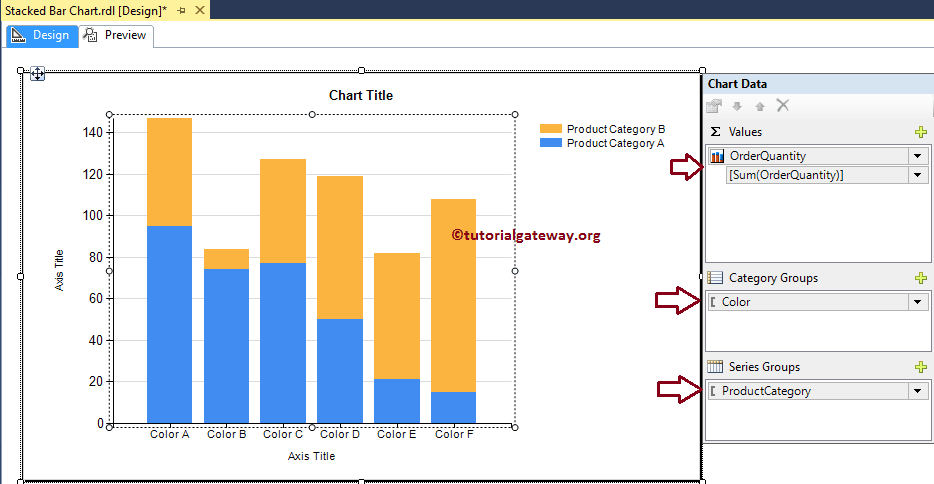
Once you click on the OK button, the Stacked Bar Chart will display in the design region with dummy data. Click on the empty space around the Stacked Bar Chart will open the Chart Data window
- Values: Any Numerical (Metric) value such as Total Sales, Sale Amount, Number of Customers, Tax, etc. All these values will be aggregated using an aggregate function (Sum, Avg, Count, etc). It is because we are grouping them with the category group items.
- Category Group: Please specify the Column name on which you want to partition your Stacked Bar Chart.
- Series Group: Please specify the Dimension here. It will further group the individual category
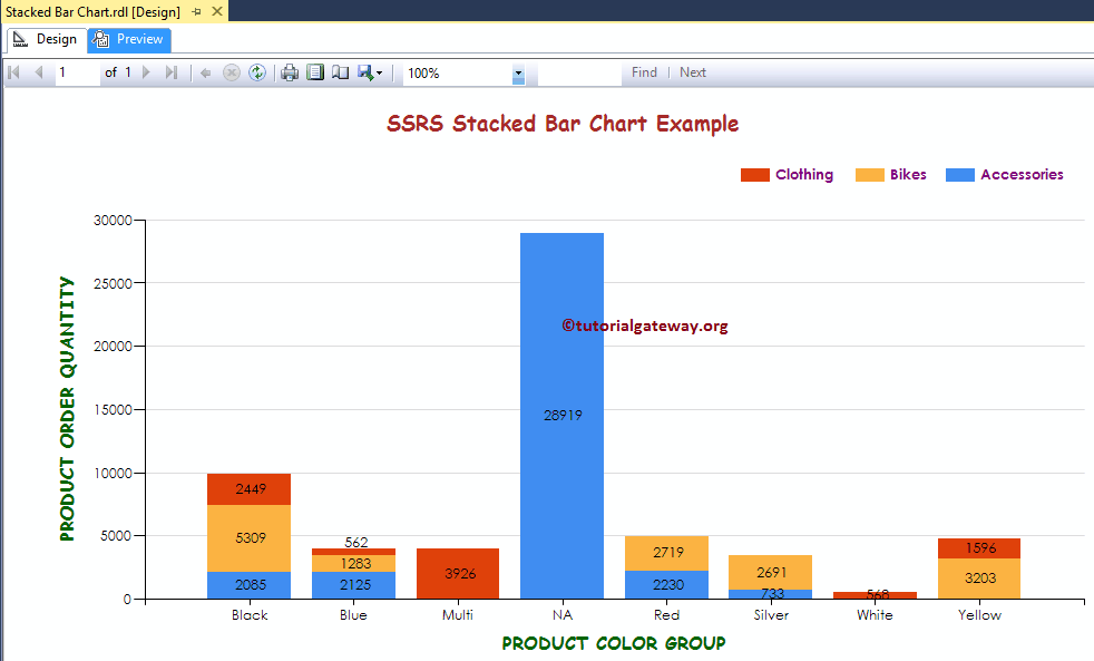
As we said before, In this example, we create an SSRS Stacked Bar Chart to find the number of orders by color grouped by the product category.
So, Drag and drop the Order Quantity column from dataset to chart data values, Product Color to category group, and Product Category to Series Group.
Click on the Preview tab to see the report preview.
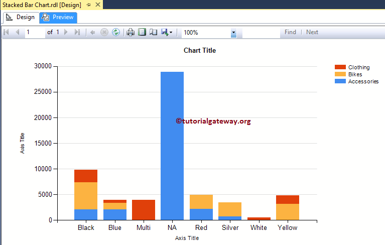
If you observe the above screenshot, we are unable to identify the exact Order Quantity. So, let us add the Data Labels.
Format Stacked Bar Chart in SSRS
The following list of examples will show you the steps involved in formatting the Stacked Bar Chart.
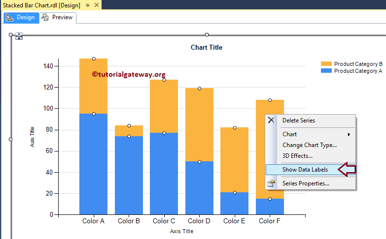
Add Data Labels to Stacked Bar Chart in SSRS
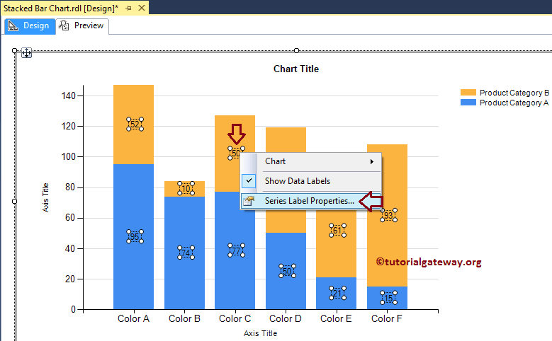
Right-click on the Stacked Bar Chart, and select the Show Data Labels option from the context menu to show the values
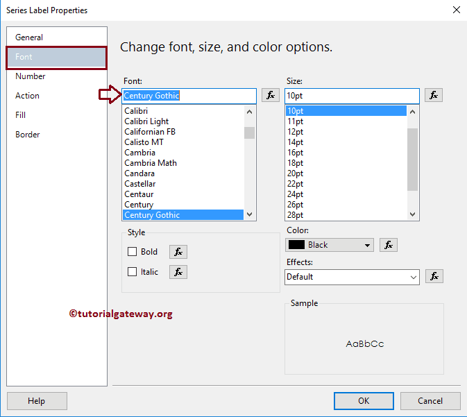
Next, let me format the Font of Data Labels. To do so, Please select the Data labels, and right click on it will open the context menu. Next, please select the Series Label Properties option from it.
Here we are changing the font to Century Gothic, the font size to 10pt
Change Axis properties of a Stacked Bar Chart in SSRS
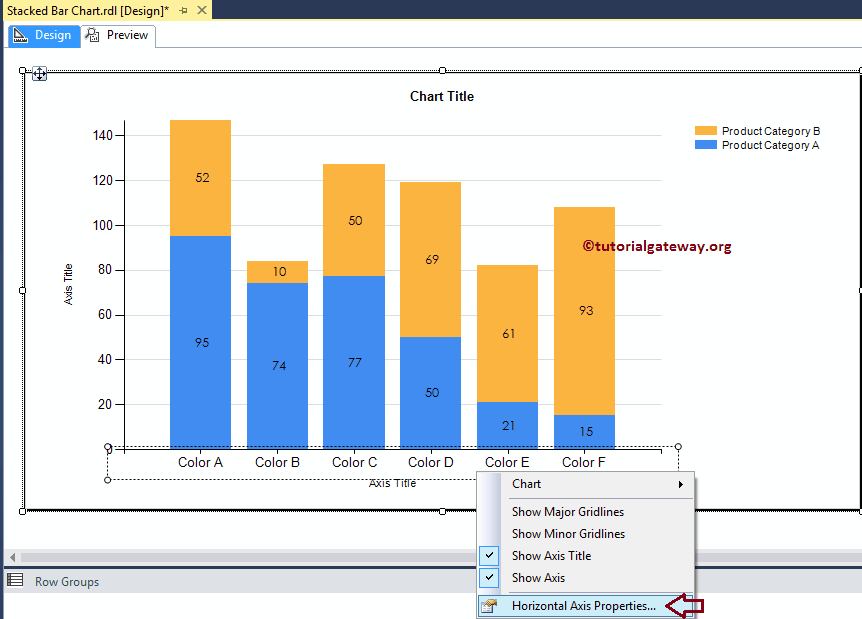
Right-click on the Axis of a Stacked Bar Chart, and select the Horizontal Axis Properties.. option from the context menu to format the Axis values.
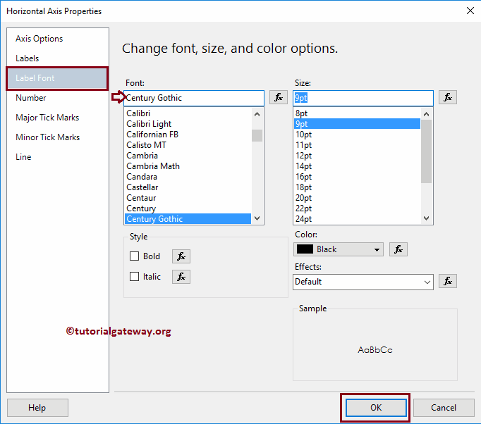
Here we changed the Font style and font size of the Horizontal Axis. Please use the same technique to change the font of the vertical Axis
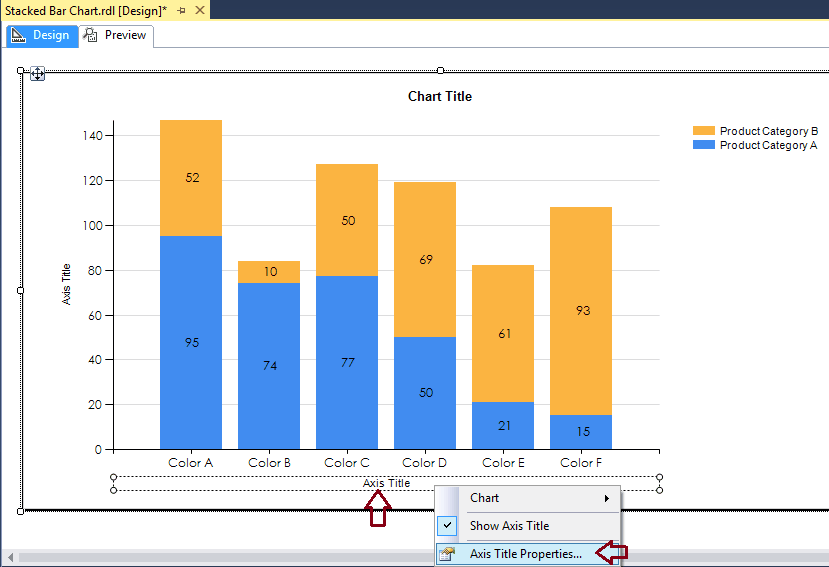
Change Axis Titles of a Stacked Bar Chart in SSRS
To change an Axis title, select the Axis title region, and change the title as per your requirement. Or, right-click on it will open the context menu. Please select the Axis Title properties.. option from it.
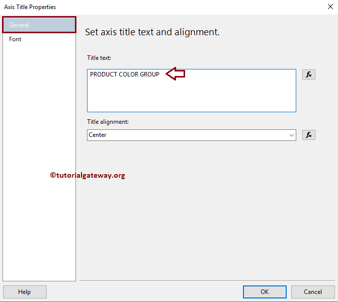
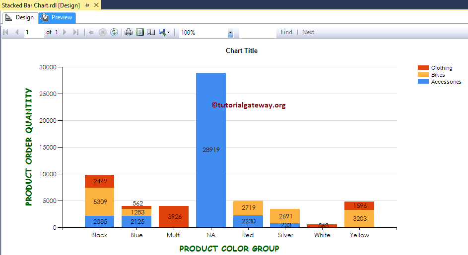
This will open a new window called the Axis Title Properties window. Under the General section, we can change the Title text as per our requirements. For now, we are changing it to PRODUCT COLOR GROUP
Under the Font tab, we can change the font style, size, and color. For now, we are changing the Color to Dark Green, the Font to Comic Sans MS, the Size to 12pt, and the style to Bold.
Please apply the same properties to Y-Axis, as well. Once you complete, click on the Preview tab to see the report preview.
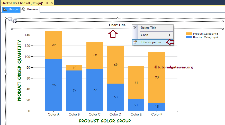
Change SSRS Stacked Bar Chart Title
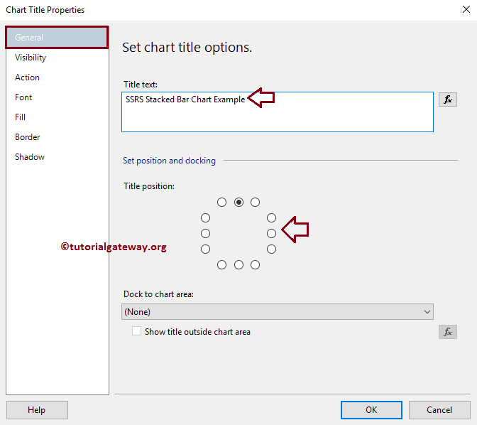
To change a Stacked Bar Chart title, Please select the Chart title region, and change the title as per your requirement. OR, right-click on it will open the context menu. Please select the Title properties.. option from it.
Here we are changing the title as the Stacked Bar Chart Example because the report is displaying the same
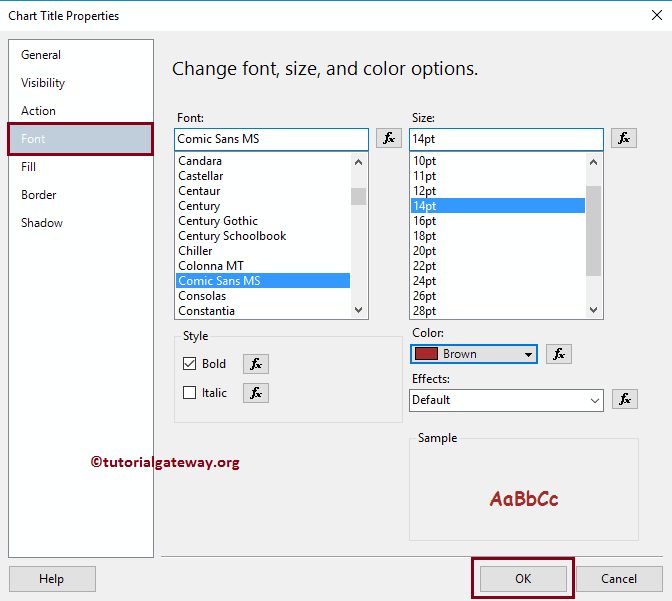
Format SSRS Stacked Bar Chart Title Font
Within the Font tab, we can change the Font Size, Font Family, Font Style, and Color of a Stacked Bar Chart Title. Here, we are changing the font to Comic Sans MS, Font size to 14pt, and colour to Brown
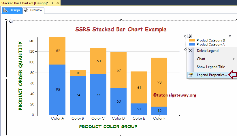
Format Legend of a Stacked Bar Chart in SSRS
To format the Legend region, Please Select the Legend region, and right-click on it will open the context menu. From the menu, please select the Legend Properties option.
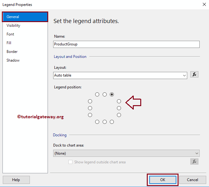
It opens a new window called the Legend Properties Window. Within the General Tab, we have an option called Legend Position to change the Legend Position by changing the dot positions. For now, we are changing the position from the default right corner to the Middle.
Under the Font tab, we can change the Font style, size, and color of a Legend. For now, we are changing the Color to Purple, Font to Century Gothic, Size to 10pt, and style to Bold
Click OK button to close the Properties window, and hit the preview tab to see the report preview
Different Stacked Bar Charts in SSRS
SQL Server Reporting Services allows us to change the chart type even after creating a Stacked Bar Chart. To do so First, select the Stacked Bar Chart, and right-click on it will open the context menu. Please select the Change Chart Type… option
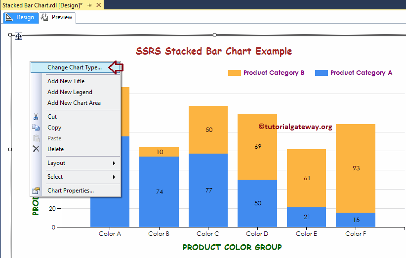
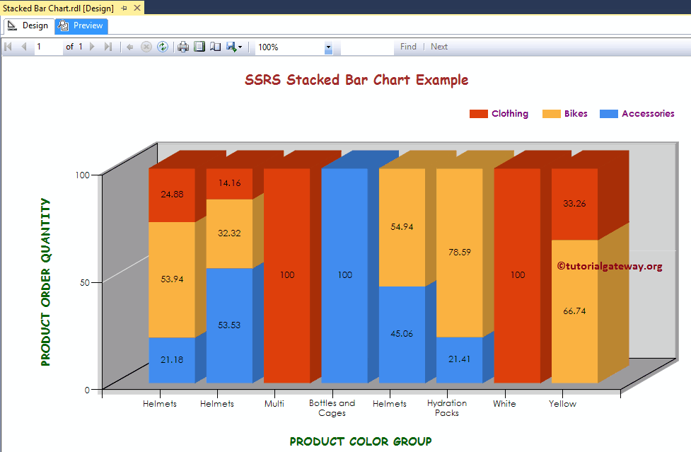
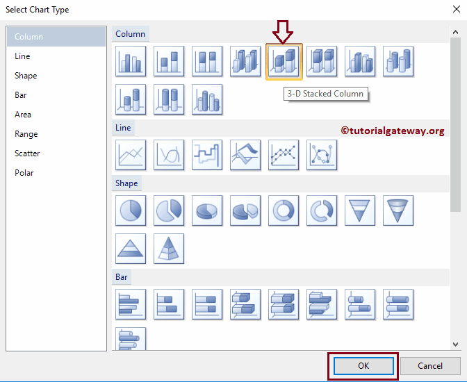
Once you select the Change Chart Type… option, it will open a new window called Select Chart Type to select the change. Here we are selecting the 3D Stacked Column Chart
Click on the preview tab to see the report preview
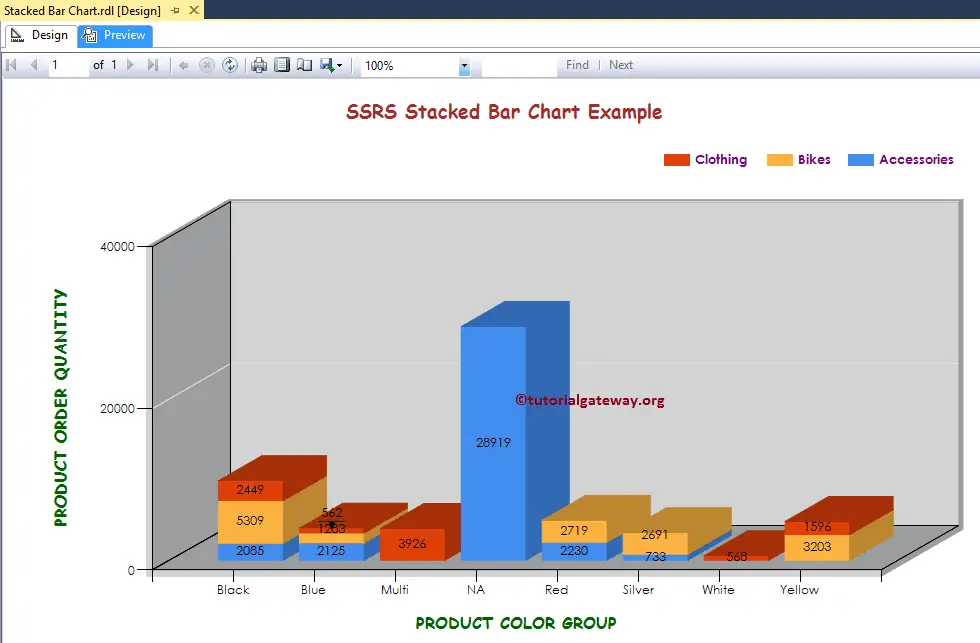
From the above screenshot, you can observe that We successfully changed the Chart Type from 2D Stacked Bar Chart to 3D Stacked Bar Chart
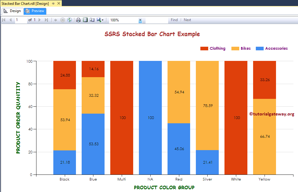
This time we are going to change the SSRS Chart Type from 3D Stacked Bar Chart to 100% Stacked Column Chart
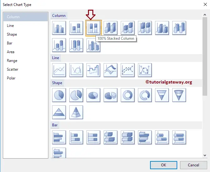
Click on the preview tab to see the report preview. As you can see, it is showing the percentage by series group
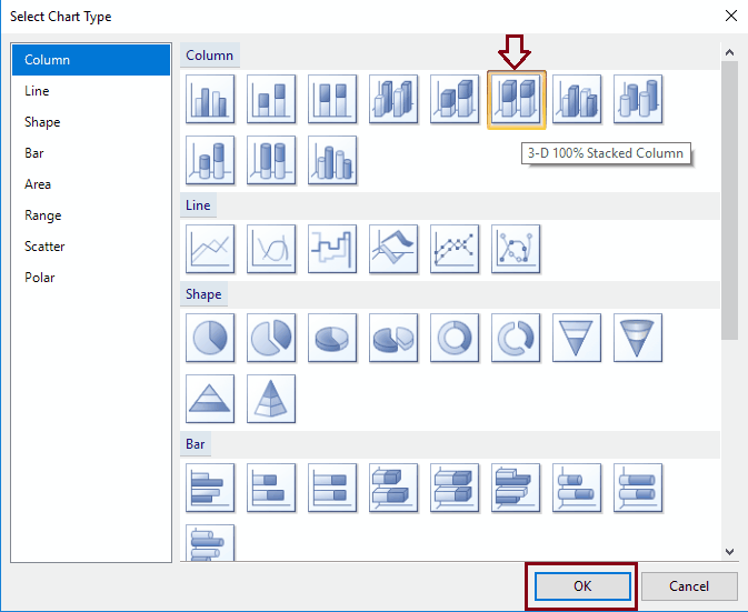
This time we are going to change the Chart Type to 3-D 100% Stacked Column chart
Click on the preview tab to see the Stacked Bar Chart preview