This SSRS article shows how to create a Stacked Bar Graph, Show data Labels, and format fonts and colors with an example. To demonstrate this example, right-click on the Datasets folder to create a new DataSet.
Writing the below code inside the SSMS shows the data set that we use for this Stacked Bar Graph example.
The Sql query that we used above SSRS example is:
SELECT Terry.SalesTerritoryGroup AS Territory,Prod.Color,
	SUM(Fact.SalesAmount) AS Sales,SUM(Fact.TotalProductCost) AS TotalCost
FROM DimProduct AS Prod
   INNER JOIN FactInternetSales AS Fact  ON Prod.ProductKey = Fact.ProductKey
   INNER JOIN DimSalesTerritory AS Terry   ON Terry.[SalesTerritoryKey] = Fact.[SalesTerritoryKey]
GROUP BY Terry.SalesTerritoryGroup, Prod.Color
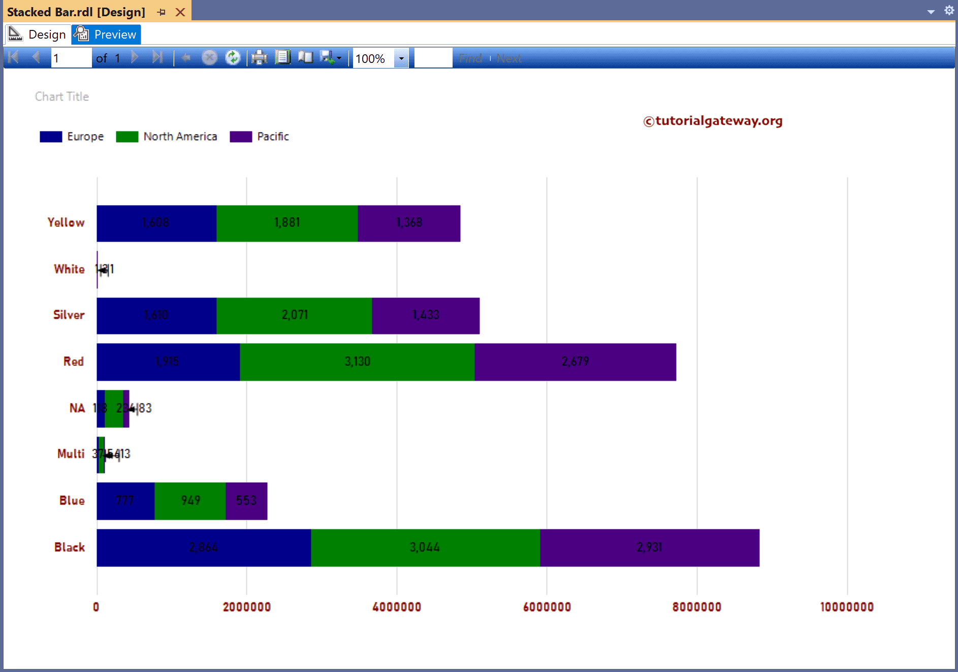
SSRS Stacked Bar Graph
To add a Stacked Bar Graph, right-click the report area, choose Insert, and then chart the option from the context menu. Otherwise, drag and drop the chart from the toolbox to the report area.

Select the Stacked Bar Graph from the window and click OK to add to the report area.
- Bar Chart
- 100% Stacked Bar Chart
- 3D Clustered Bar Chart
- Stacked Bar Chart Example 2.

Use the Plus button or drag the fields to the Values, Category Groups, and Series Groups sections. Here, we added the Sales column to Values, the Color column to Category Groups, and Territory to the Series Groups section.

Next, use the toolbar or the properties window to format the X and Y-axis fonts and colors. Right-click on the Stacked Bar Graph and select the Show Data Labels option to add labels.

Right-click the Data Labels and select the Series Label Properties option to format Stacked Bars Numbers to show values in Thousands.

Preview the SSRS Stacked Bar Graph report.

Either change the palette property to change the colors or right-click the bars and choose the Series Properties option.
Go to the Fill tab and use the expression by clicking the ƒx.
=iif(Fields!Territory.Value = "Europe", "DarkBlue",
	iif(Fields!Territory.Value = "North America","Green",
	"Indigo"))

Preview the report.