In this article, we will show you the steps involved in the Formatting Column Chart in SSRS. It includes how to change the Column Chart Title, Legend Title, Legend Position, Column Chart Font, Column Chart Model, Column Chart Type.
We will also explain, How to Display Percentage Values as Labels on the Column Chart and Calculate the Average of the Column Chart in SSRS or SQL Server Reporting Services with an example.
Formatting Column Chart in SSRS
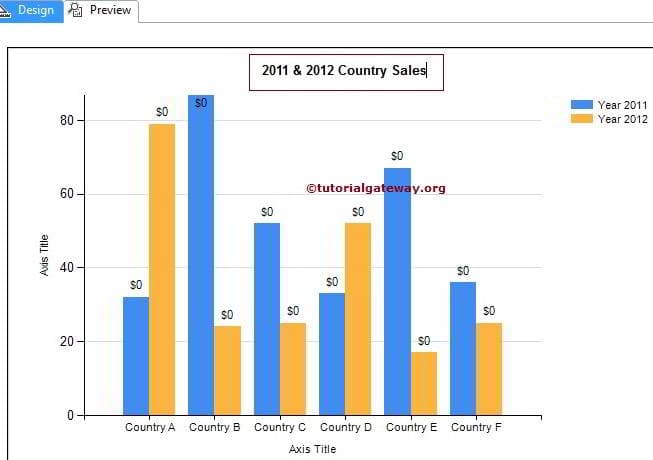
To explain the available Format options, We are going to use the below-shown report. Please refer to the Column Chart article to understand the Data Source and Dataset we used for this SSRS report.
Change the Title of a Column Chart in SSRS
To change the Column Chart title, Please select the Chart title region as we have shown in the below screenshot. Now, change the title as per your requirements. Here we changed to 2011 & 2012 Country Sales because the report displays the same.
Format Legend Position of a Column Chart in SSRS
Select the Legend region, and right-click on it will open the context menu. From it, please select the Legend Properties option
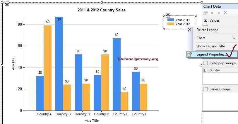
TIP: To display the Column Chart Legend title, Please select the Show Legend Title option from the above screenshot
Within the General Tab, change the Legend Position by selecting those dot positions.
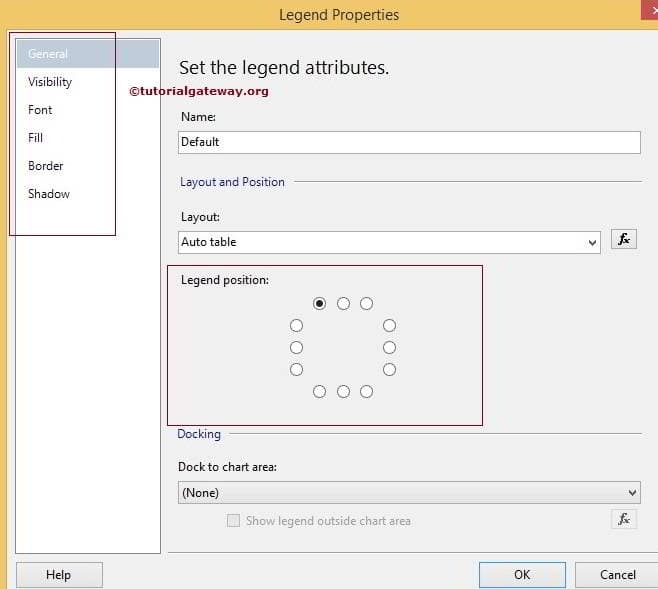
Next, we can change the Font Size, Font Family, Font Style, and Color of a Column Chart Legend using the Font Tab and so on.
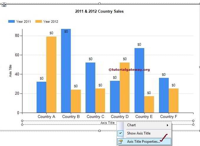
Change Axis Titles of a Column Chart in SSRS
Select the Axis Title region and right-click on it will open the context menu. From the menu, please select the Axis Title Properties option as shown below screenshot.
Once you select the Axis Title Properties option, a new window called Axis Title Properties to configure the Title Text, font, etc. For now, we are changing the title text to Countries and alignment to Center
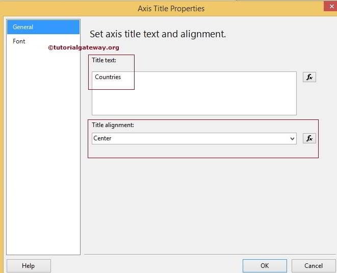
Next, We can change the Font Size, Font Family, Font Style, and Color of a Column Chart Axis using the Font Tab. Please change the Vertical Axis title also.
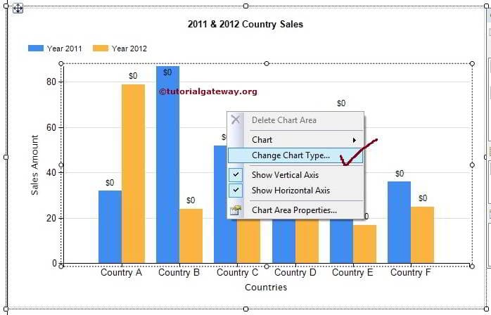
Change Column Chart Type in SSRS
The reporting service allows us to change the chart type even after creating the chart. First, select the Column chart and right-click on it will open the context menu. Please select the Change Chart Type… option from the context menu
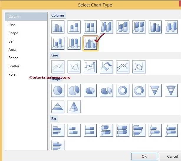
Once you select the Change Chart Type… option, it will open a new window to select the new chart. Here we are selecting a 3D Column chart. Click OK to finish.
Formatting Horizontal and Vertical Axis of a Column Chart in SSRS
Select the Horizontal Axis region and right-click on it will open the context menu. From the menu, please select the Horizontal Axis Properties option as shown in the below screenshot.
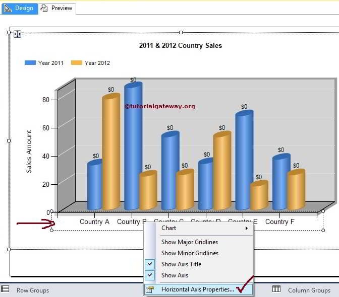
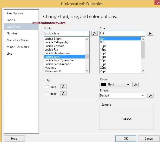
Once you select the Horizontal Axis Properties option it will open a new window to format the properties. Here we are changing the select Label fonts. You can try others as well.
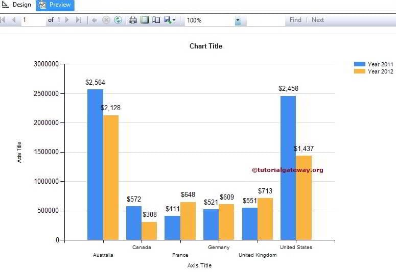
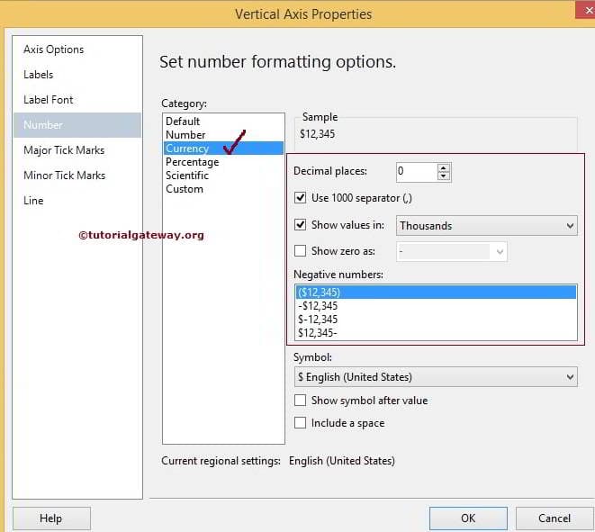
Now, select the Vertical Axis and go to the Vertical Axis Properties option to configure them. Here, We formatted the Numeric values by changing them to currency.
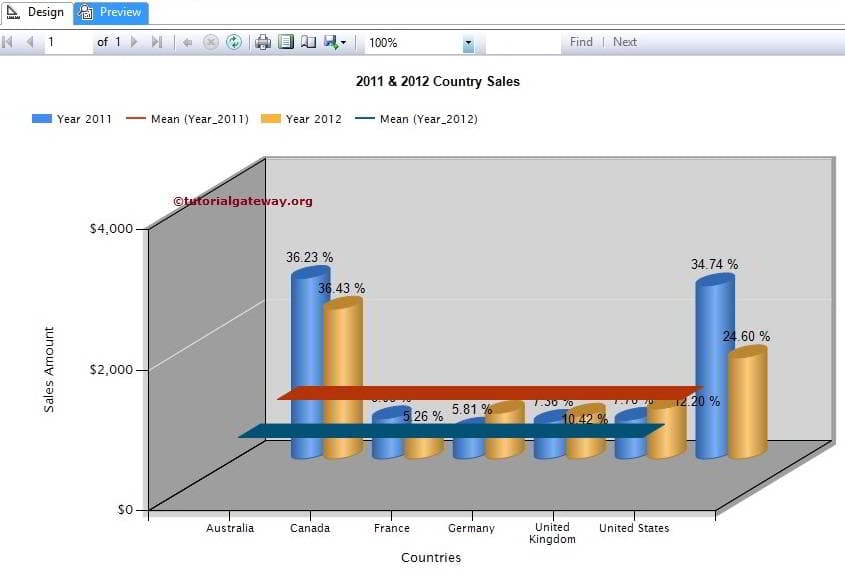
Click OK button and preview the report.
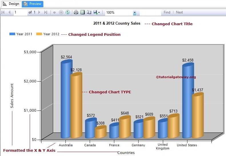
From the above screenshot, you can observe that We successfully changed and formatted the Column Chart
Display Percentage Values as Data Labels in SSRS Column Chart
First, select the data labels of the Year 2011 on the Column Chart and then right-click on them will open the context menu. Please select the Series Label properties… option from the context menu
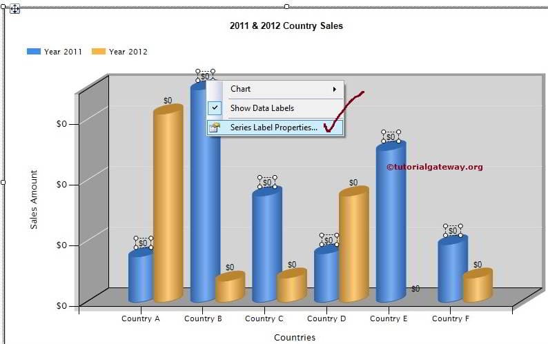
Within the General Tab, Please select the Label data to #PERCENT from the drop-down list. Once you select the percent a pop-up window will be displayed asking, Do you want to set UseValueAsLable to false or not? Please select Yes because we are changing the default value to percent
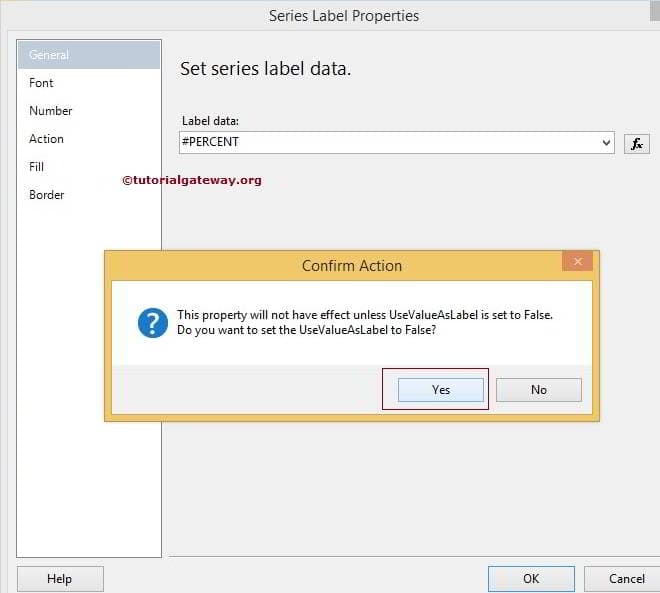
Click OK to finish configuring percentage values for the Year 2011. Now, Repeat the same process for the Year 2012
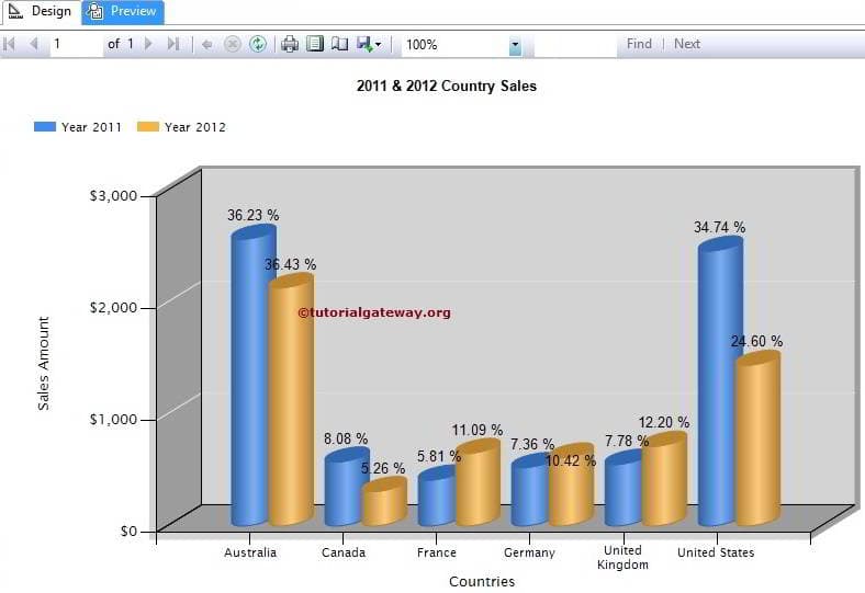
We successfully displayed the Percentages as Column Chart Label
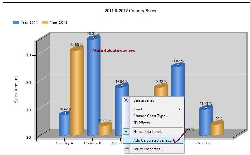
Calculating the Average of a Column Chart in SSRS
First, select the data labels of the Year 2011 on the Column Chart and then right-click on them will open the context menu. Please select the Add Calculated Series… option from the context menu
Once you select the Add Calculated Series… option it will open a new window called Calculated Series Properties.
Here we are going to calculate the Mean so select Mean from the drop-down list as shown below. You can try others as well
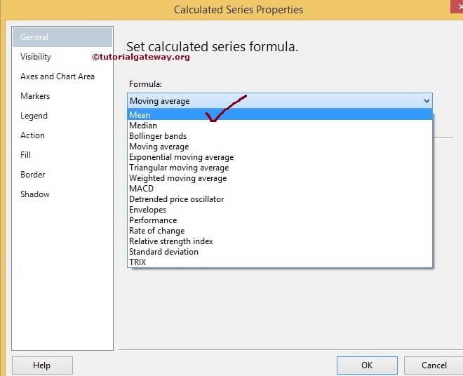
Click OK to finish calculating the Average for the Year 2011. Now, Repeat the same process for the Year 2012
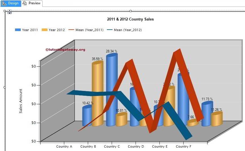
Click on the preview button to preview the SSRS Column Report.
Comments are closed.