This SSRS article shows how to add custom colors to the vertical rectangular bars in a column chart using switch case expression with an example. To demonstrate this example, right-click on the Datasets folder to create a new DataSet.
Writing the below code in SSMS shows the data set we use for this Add custom colors to the SSRS Column Chart example.
The Sql query that we used for this SSRS example is:
SELECT Geo.EnglishCountryRegionName AS Country,
       SUM(Fact.SalesAmount) AS Sales
FROM FactInternetSales AS Fact  INNER JOIN DimCustomer
ON DimCustomer.CustomerKey = Fact.CustomerKey
JOIN DimGeography AS Geo ON DimCustomer.GeographyKey = Geo.GeographyKey
GROUP BY Geo.EnglishCountryRegionName
How to add Custom Colors to the SSRS Column Chart?
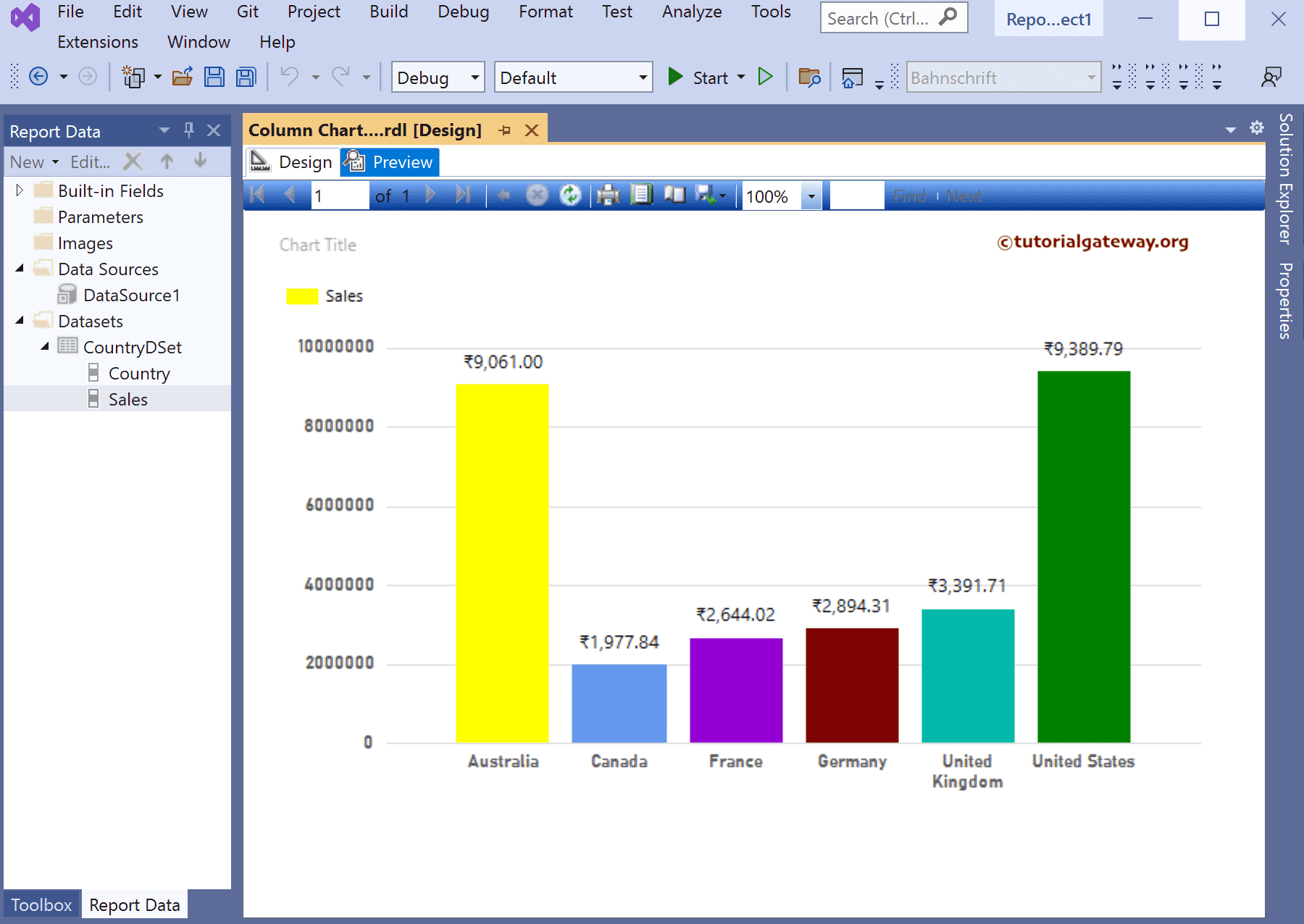
Drag Chart from toolbox to report area and select column chart from the window. Next, add the Sales field to Values and the Country field to the Category Groups section. Next, right-click on the vertical bars and select the Show Data Labels option to add labels.

There are two ways to change the column chart colors. The first one is from the report properties window, and the second option is the series properties window.
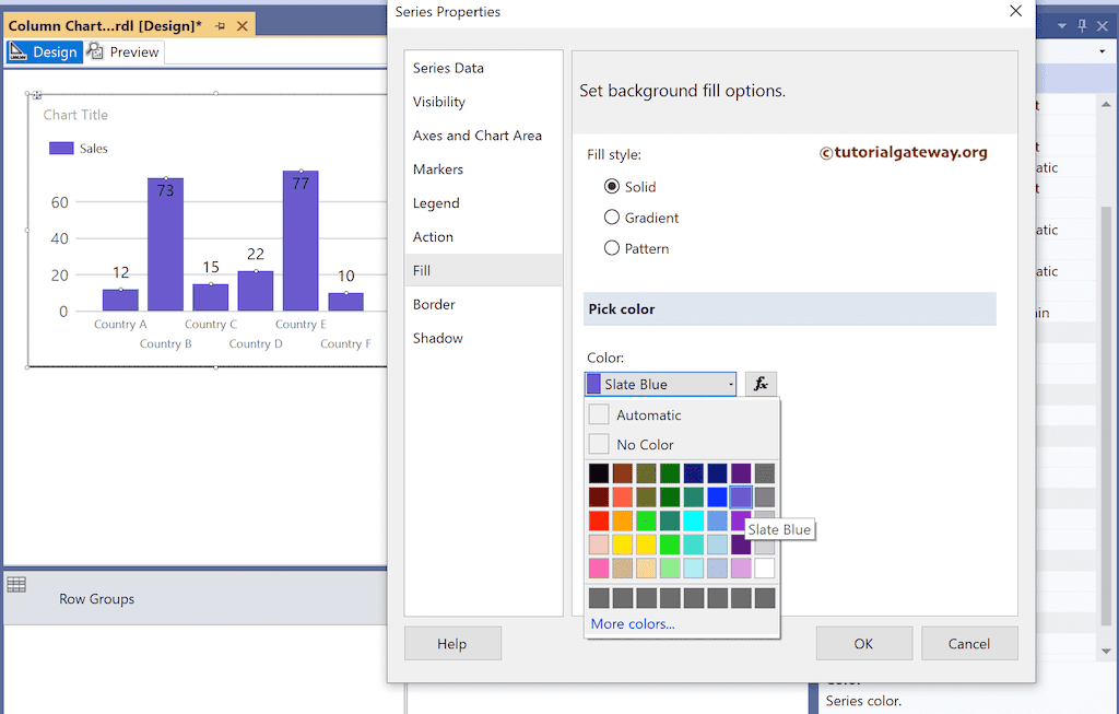
Select or click on the bar, change the Color property from Automatic to required color, or use the expression to show custom colors. In this example, we use the series properties option, so right-click the vertical bars and choose the Series Properties option from the context menu.

Next, go to the Fill tab, select Fill Styles Solid, and pick the color reflecting the original report.
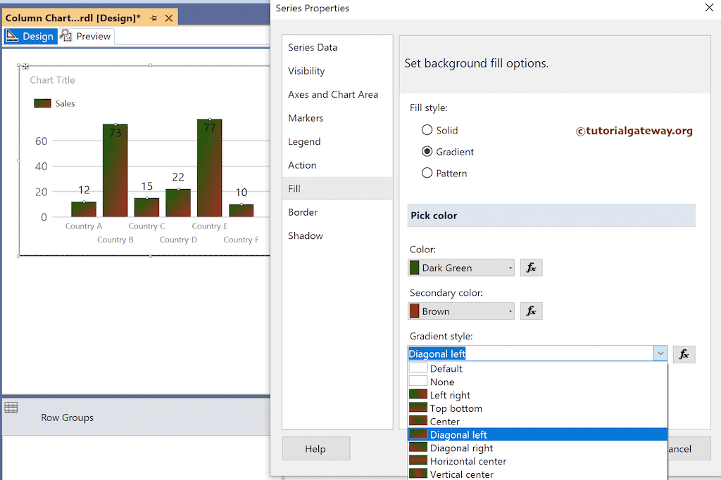
If you change the Fill Style to Gradient, you can select the first, second colors, and gradient styles.
If you choose the fill style as Pattern, use the drop-down list to select the pattern. As you can see, we have chosen the Solid Diamond as the Pattern style and colors as Lime and Marron.

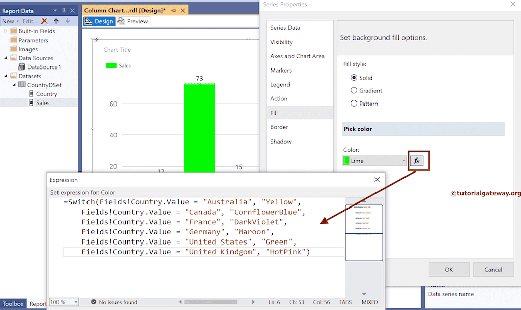
To add the complete custom colors to the SSRS column chart, click the ƒx button to write the below switch expression.
This expression assigned an individual color to every country.
=Switch(Fields!Country.Value = "Australia", "Yellow",
	Fields!Country.Value = "Canada", "CornflowerBlue",
	Fields!Country.Value = "France", "DarkViolet",
	Fields!Country.Value = "Germany", "Maroon",
	Fields!Country.Value = "United States", "Green",
	Fields!Country.Value = "United Kindgom", "HotPink")
Preview the report.