In this article, we will show you the step-by-step approach to creating SSRS dashboard reports that hold a different kind of reports with an example. For this SSRS Dashboard example, we are going to use the Shared Data Source and Shared Dataset.
Writing the below code inside the SSMS will show you the Data Source, and Dataset that we used to create this SSRS dashboard. The Custom Query we used against the SQL Server Data Source for this Dashboard report is:
-- Query that we use in Dashboard
SELECT Cat.[EnglishProductCategoryName] AS ProductCategory,
       SubCat.[EnglishProductSubcategoryName] AS ProductSubCategory,
       Prod.EnglishProductName AS ProductName, Prod.Color,
       Fact.OrderQuantity, Fact.TotalProductCost, Fact.SalesAmount,
       Fact.TaxAmt, Fact.[Freight]
FROM FactInternetSales AS Fact
   INNER JOIN DimProduct AS Prod ON Fact.ProductKey = Prod.ProductKey
   INNER JOIN DimProductSubcategory AS SubCat ON Prod.ProductSubcategoryKey = SubCat.ProductSubcategoryKey
   INNER JOIN DimProductCategory AS Cat
      ON SubCat.ProductCategoryKey = Cat.ProductCategoryKey
How to Create Dashboard Reports in SSRS
In this example, we will show you how to create Dashboard reports in SSRS. Or, steps involved in creating SSRS Dashboard.
To demonstrate the Dashboard creation, we will add One pie, a Column, and an Area Chart to the dashboard.
Add Pie Chart to SSRS Dashboard Example
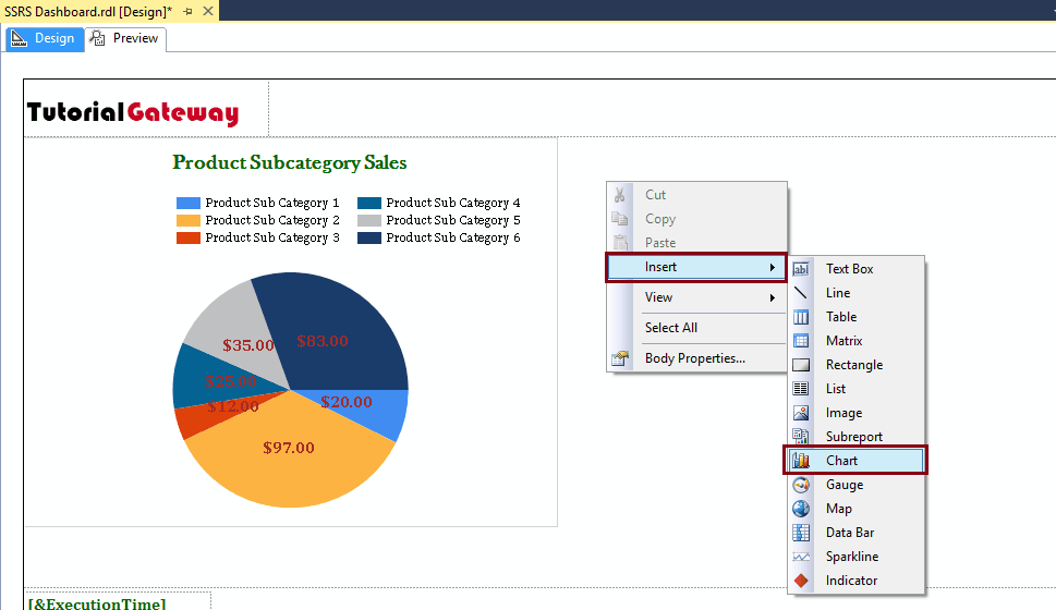
We can add any Chart by dragging the Chart property from the Toolbox to the Design space. Or, we can right-click on the report designer to open the context menu.
Please select the Insert -> Chart option from the context menu, as we showed below.

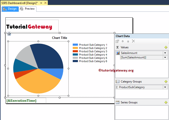
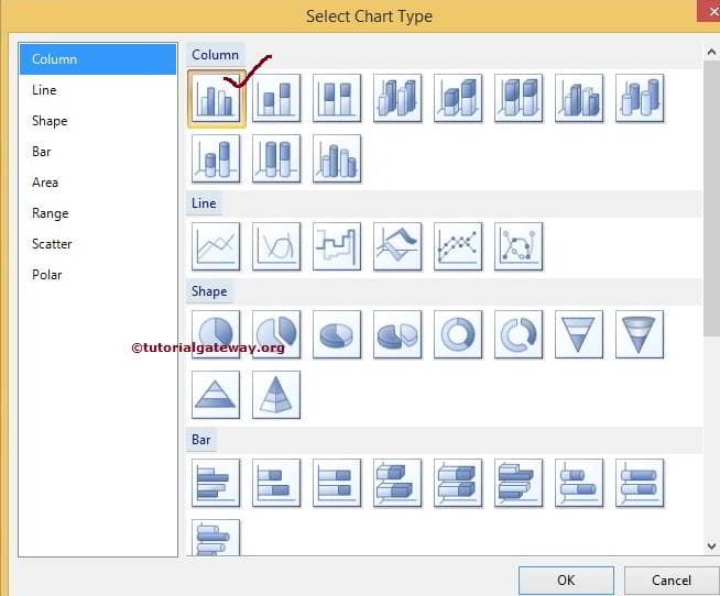
Selecting the Chart option will open a new window called Select Chart Type. For this example, we selected a Pie Chart. Next, Click on the empty space around the Pie Chart will open the Chart Data window.
For now, we want to create a Pie chart to display the Sales by Product Subcategory. So, Drag and drop the Sales Amount column from the dataset to chart data values and Product Subcategory in the category group. I suggest you refer Pie Chart to understand the steps in detail.
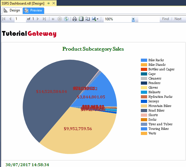
Next, we did some formatting to the Pie Chart to look neat and clean. Please refer to the Formatting Pie Chart article to understand the steps involved in formatting labels, legends, and pallets.
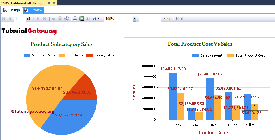
Click on the Preview button to see the report preview of SSRS Dashboard. As you can see from the below screenshot, there are too many Product subcategories to display in the Pie Chart. So let me add a Filter to view the product Subcategories that only belong to Bikes.
Add Filters at Dataset level in SSRS Dashboard
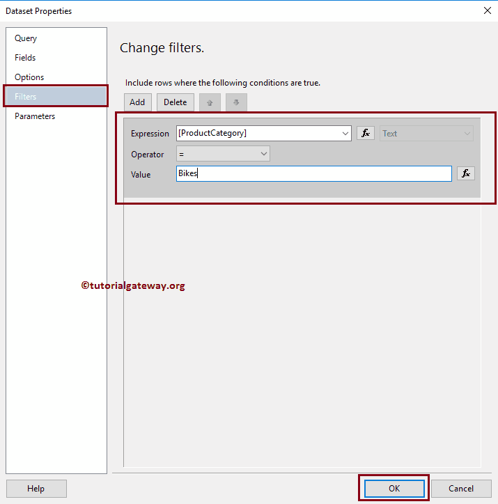
Please select the Dataset on which you want to apply filters from the Report data tab, and right-click on it will open the context menu. Please select the Dataset Properties.. option from it. Once we choose that option, a new window called Dataset Properties will open. Please select the Filters tab, and click on the Add button.
In this example, We are going to display the Charts whose [Product Category] is Bikes so, Please select the [Product Category] as an Expression and Operator as Equals to, and Value as Bikes. I suggest you refer Filters at Dataset Level article to understand the Filters.
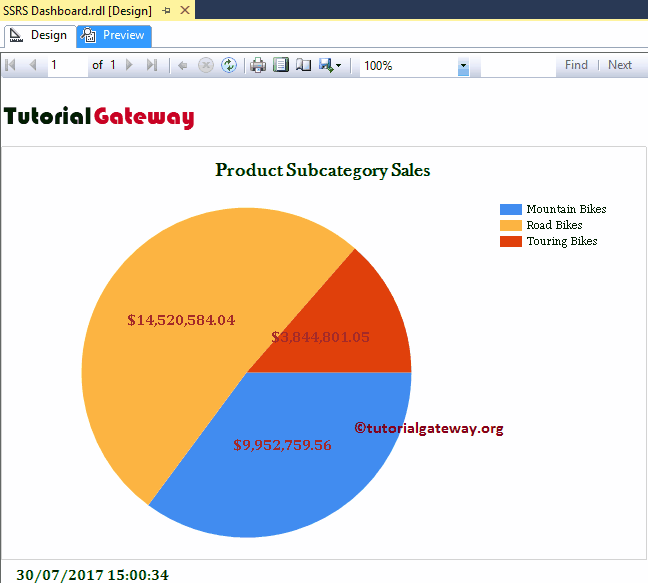
Click OK to apply the Filters at the Dataset level, and click on the preview tab to see the report preview. From the below screenshot, you can see that the Pie Chart displays the product subcategories that belong to the Bikes Category.
Add Column Chart to SSRS Dashboard Example
Next, we will add a Column Chart beside the previously created Pie Chart in the Dashboard. For this, right-click on the open space beside the Pie Chart to open the context menu. Please choose the Insert -> Chart option from it.
Once you select the Chart option, a new window called Select Chart Type opens. Here, select the Column Chart.
Click on the empty space around the Column Chart will open the Chart Data window. Here, we want to create a Column Chart to display the difference between the Sales Amount and the Total Product Cost by Product Color.
So, Drag and drop the Sales Amount, and Total Product Cost columns from the dataset to chart data values, and Product Color in the category group.

Let me apply some formatting techniques to the Column Chart. Please refer Formatting Column Chart to understand the steps involved in formatting the column chart with an example.
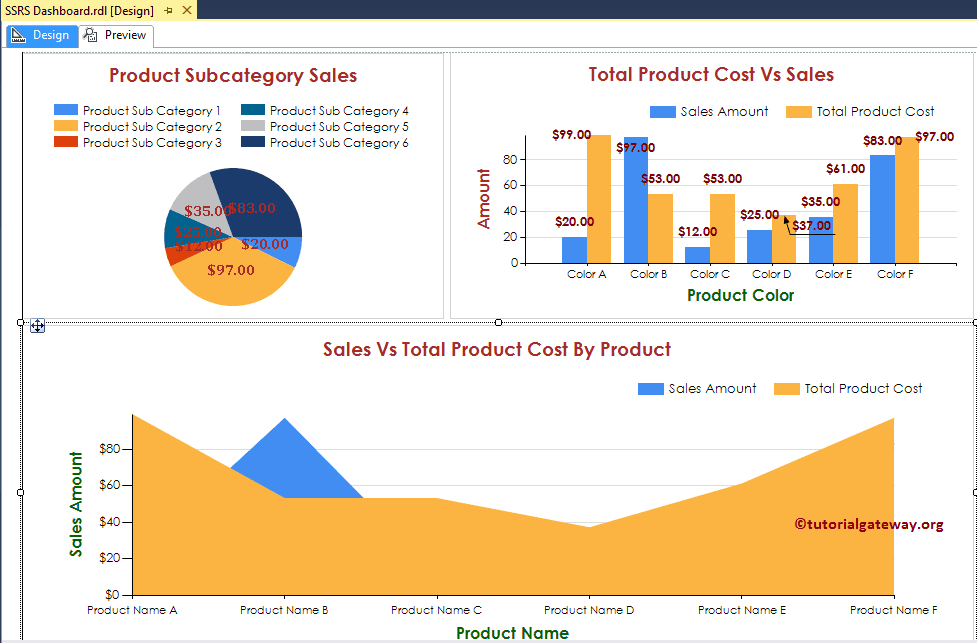
Let me show you the SSRS dashboard preview
Add Area Chart to SSRS Dashboard Example
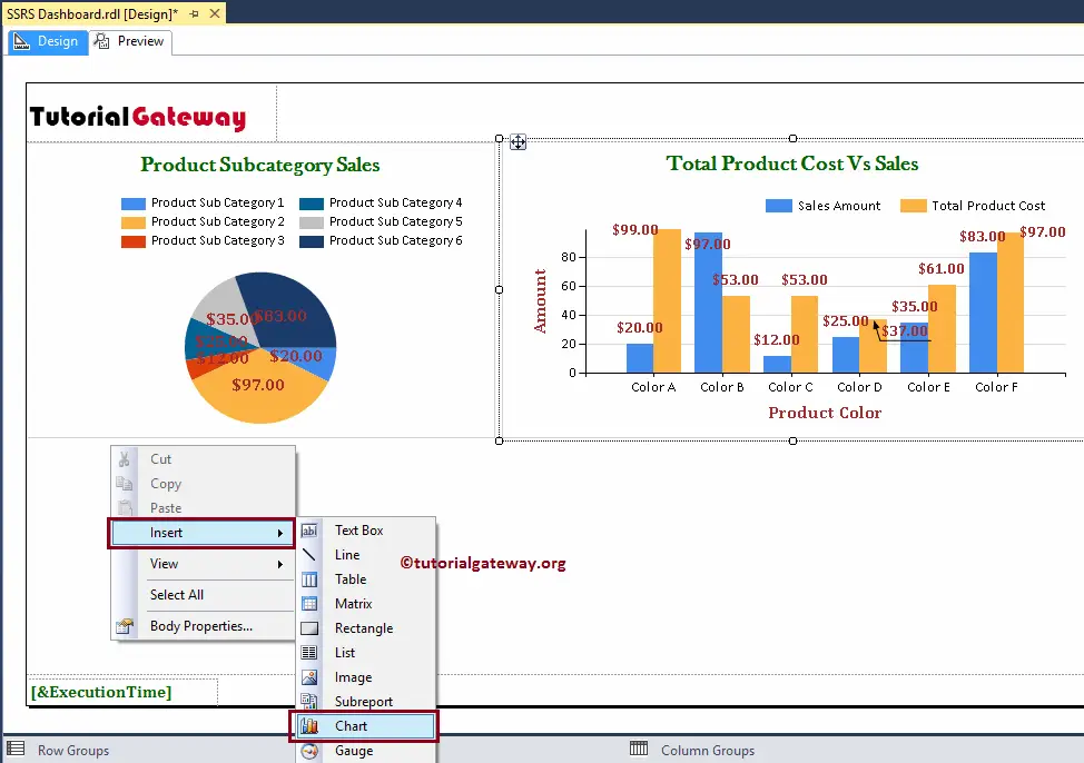
Lastly, we will add an Area Chart to the Dashboard. As you can see, we added it below the previously created Pie Chart, and Column Chart.
For this, right-click on the open space below the Pie Chart to open the context menu. Select the Insert -> Chart option.
Here, we are selecting an Area Chart. Click on the space around the Area Chart will open the Chart Data window. Here, we want to create an Area Chart to display the difference between the Total Product Cost and Sales Amount by Product name.
So, Drag the Total Product Cost, and Sales Amount columns from the dataset to chart data values, and Product Names in the category group.
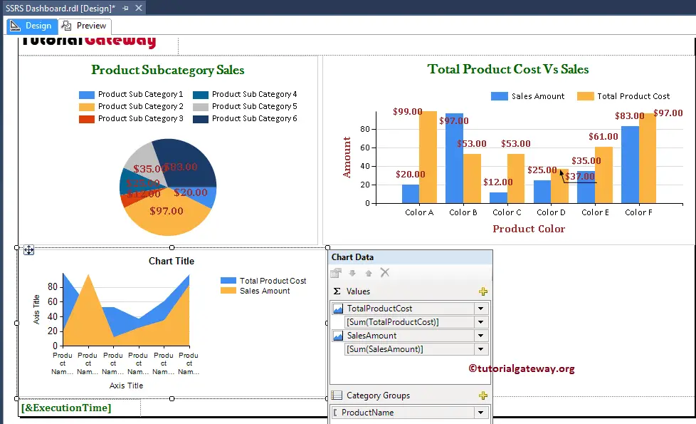
Next, we did some formatting to the Area Chart to look neat and clean. Let me adjust the Charts in the SSRS dashboard so that we can view it as a Group.
NOTE: You can also use the Rectangle Report Item to place the Charts in the Dashboard. It can give further formatting options.
Let me show you the SSRS Dashboard Report preview.
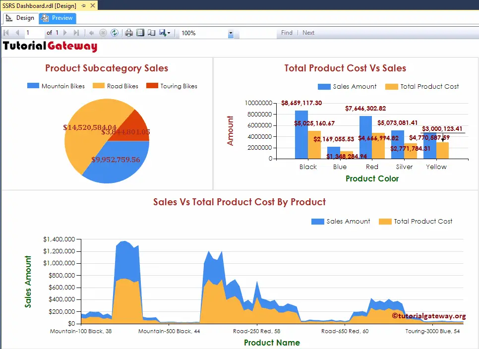
We successfully created an Dashboard that holds a Pie Chart, a Column Chart, and an Area Chart.