This article shows how to modify or format the Pie Chart Legend Title, Legend Position, Title, Font, Pie Chart Model, Pallet, and Display Percentage Values as Labels on Pie Chart in SSRS with an example.
To explain the available SSRS Pie Chart Format options, We are going to use the below-shown report. Please refer to the Pie Chart article to understand the Data Source and Dataset we used for this SSRS report.
Formatting Pie Chart in SSRS
Following are the list of available options for formatting Pie Chart in SSRS
Change Pie Chart Title in SSRS
To replace the Pie Chart title, select the Chart title region
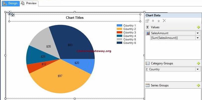
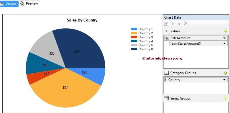
Now, change the Pie Chart title as per the need. Here, we renamed it as Sales By Country because the report is presenting the same
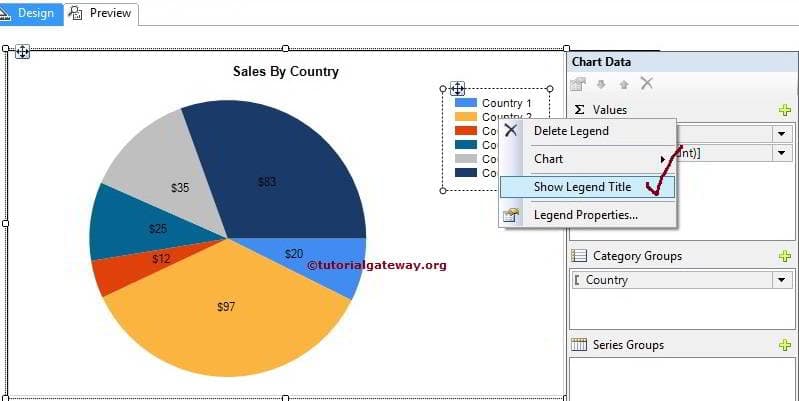
Show Pie Chart Legend Title in SSRS
To view the Pie Chart Legend title, Please select the Legend region, and right-click on it will open the context menu. From the menu, select Show Legend Title option
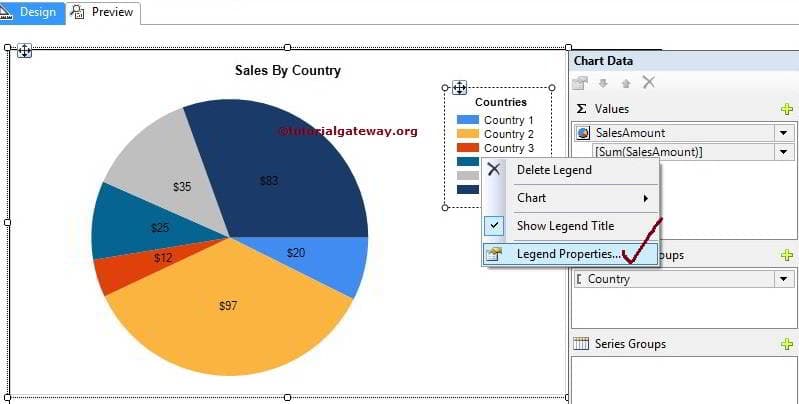
Please rename the Legend title as per your requirement. Here we named it as Countries
Format Font and Legend Position of a Pie Chart in SSRS
Select the Legend region, and right-click on it will open the context menu. From the menu, please select Legend Properties
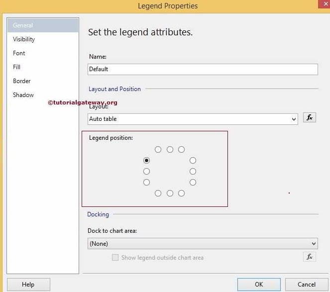
Within the General Tab, an option called Legend Position. Use this to adjust the Legend Position by select those dot position
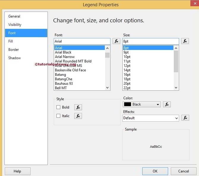
Next, use the Font tab to change the Font Family, Font Size, Font Style and Pie Chart Legend Color
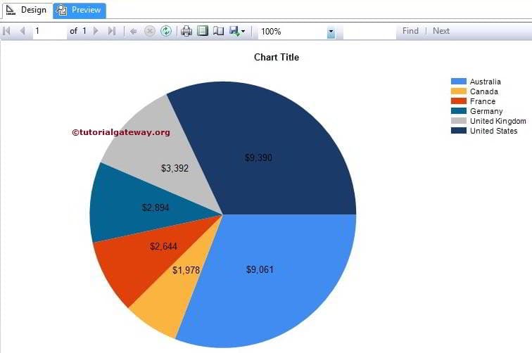
Change to 3D Pie Chart in SSRS
SSRS allows us to change the chart type even after creating the chart. First, select the Pie chart, and right-click on it will open the context menu. Please select the Change Chart Type… option from it
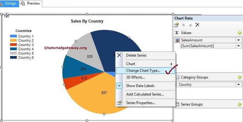
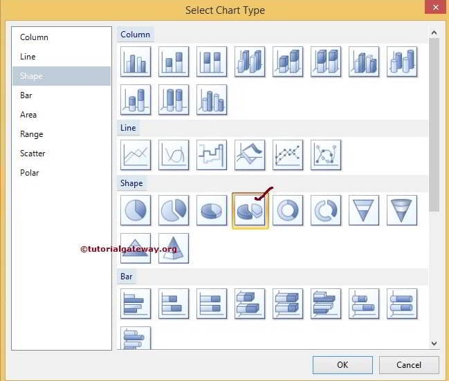
Once you select the Change Chart Type… option, it will open a new window to choose the change. Here we are a select 3D Pie chart
Click the Ok button and see the report
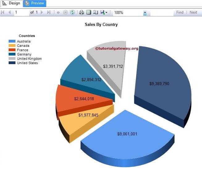
From the above screenshot, you can see that we successfully replaced the Chart Type
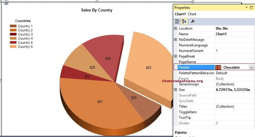
Change the Palette of a Pie Chart in SSRS
We can change the Pallet and Pie Chart Color in SSRS. First, choose the Chart and go to properties. Here, change the Pie color by selecting the Palette property as shown in below image
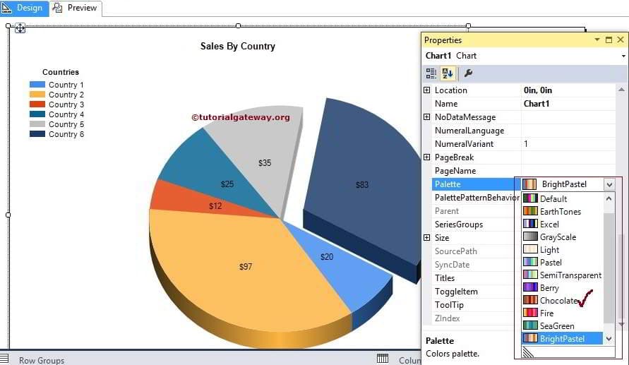
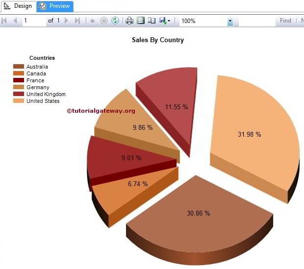
Here we chose the Chocolate color
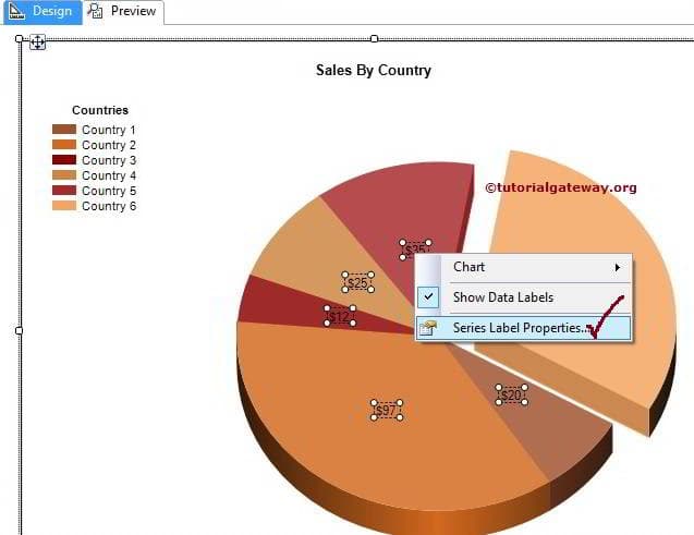
Display Percentage Values on SSRS Pie Chart
First, select the Pie Chart data labels, and right-click on them to open the context menu.
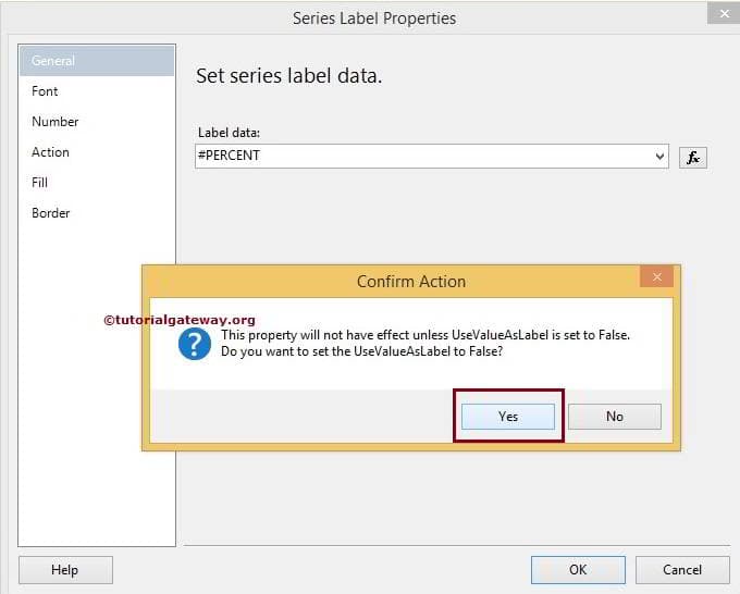
Within the General Tab, Please select the Label data to #PERCENT from the drop-down list. Once you select the percent, a pop-up window will display asking, Do you want to set UseValueAsLable to false or not. Please select Yes because we are changing the default value to percent
Click Ok and click on the Preview button to see the SSRS formatted Pie Chart Preview. As you can see from the below, we successfully displayed the Percentages as Pie Chart Label.