This SSRS article shows how to create a standard and 3D 100% Stacked Column chart, Show Data Labels, and format fonts and colors with an example. To demonstrate this example, right-click on the Datasets folder to create a new DataSet.
Writing the below code inside the SSMS shows the data set we use for this 100% Stacked Column Chart example.
The Sql query that we used above SSRS example is:
SELECT Terry.SalesTerritoryGroup AS TerGroup,Terry.SalesTerritoryRegion AS Region,
       Cust.EnglishOccupation, Cust.Gender, Cust.MaritalStatus, SUM(Fact.SalesAmount) AS Sales
FROM FactInternetSales AS Fact INNER JOIN DimSalesTerritory AS Terry
      ON Terry.[SalesTerritoryKey] = Fact.[SalesTerritoryKey]
INNER JOIN DimCustomer AS Cust ON Cust.CustomerKey = Fact.CustomerKey
GROUP BY Terry.SalesTerritoryGroup, Terry.SalesTerritoryRegion,
Cust.EnglishOccupation, Cust.Gender, Cust.MaritalStatus
SSRS 100% Stacked Column Chart
To add a 100% Stacked column, right-click the report area, choose Insert, and then choose the chart option from the context menu. Otherwise, drag and drop the chart from the toolbox to the report area.

Select the 100% Stacked column Chart from the window and click OK to add to the report area.

Use the Plus button or drag the fields to the Values, Category Groups, and Series Groups sections. Here, we added the Sales column to Values, Region to Category Groups, and Marital Status field to the Series Groups section. Next, right-click on the 100% stacked columns and select the Show Data Labels option to add labels.

Use the toolbar or the properties window to format the 100% stacked column chart font, the color of the X-axis, Y-axis, data labels, and legend. Next, click the preview button to see the SSRS 100% Stacked column chart.

Under the Series Groups section, let me add the Gender under the Marital Status field and click the preview button.

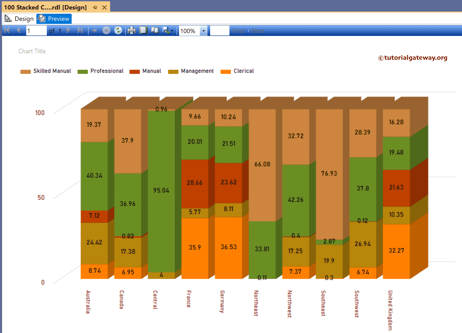
Let me remove the Gender and Marital Status fields from the Series Groups section and add the English Occupation column.

Preview report.

Change the Palette to an Earth Tone.

If you see the report preview, it shows the alternative country names. So, let me set the Label’s Angle to 90 and change the Labels Auto Fit to True.

Now, if you look at the preview, it shows all the country names.

Right-click on the chart and choose the Change Chart Type option. Next, select the SSRS 3-D 100% Stacked Column Chart from the window.

Preview the report.